Material UI is the oldest React component library still in wide use. The repository was created on 18 August 2014, it has 99,044 GitHub stars, and @mui/material is installed more than 7.2 million times a week. That's a genuinely enormous installed base.
It's also losing ground faster than those numbers suggest. MUI's downloads keep growing in absolute terms, but React's are growing faster, and shadcn/ui's CLI went from 0.4 million monthly downloads in September 2024 to 34.6 million in August 2026. The React ecosystem is expanding around MUI rather than through it.
So MUI isn't fading, and anyone telling you it's dead hasn't checked. But that context is the reason this blog post exists.
Untitled UI React launched recently, into a very different ecosystem. Tailwind CSS had won, copy-paste distribution had replaced npm packages as the default for UI development, and "looks like a Google product" had stopped being a compliment.
We build one of these two libraries, so we'll say that up front and then be as fair as we can about the other. MUI is excellent at things we don't do at all, and we'll point at them plainly.
Untitled UI vs. MUI: which should you use?
MUI is an npm package implementing Google's Material Design 2, free under MIT, with paid MUI X tiers from $299 per developer per year for the Data Grid. It runs on Emotion. Untitled UI React is source code you own, built on Tailwind and React Aria, brand-neutral, with 5,000+ components and a Figma kit. Choose MUI when the grid is the product, Untitled UI React when design is.
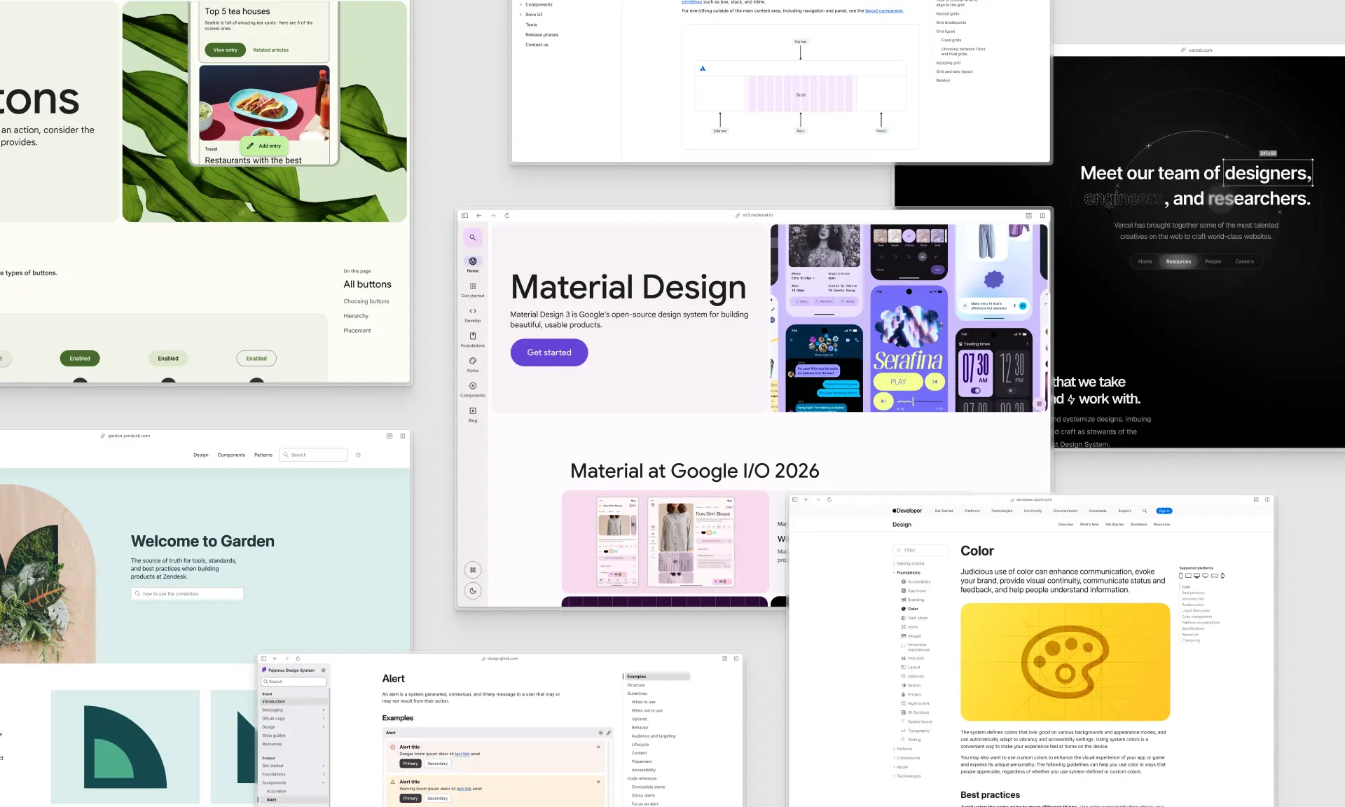
The design part is the one people underestimate. MUI's own getting-started page states plainly: "Material UI supports Material Design 2." Google announced Material Design 3 in 2021, and MUI's 2026 roadmap post doesn't mention it at all. So in 2026 you're adopting a design language two major versions behind its own author.
Key takeaways
- MUI Core is free; the part you probably want isn't.
@mui/materialis MIT forever. The Data Grid features most teams migrate for sit behind MUI X at $299, $599 or $1,399 per developer per year. - Material Design 2 is still the spec. Confirmed on MUI's own docs, with an open tracking issue and no MD3 support shipped.
- The data grid is a genuine, unmatched capability. Row grouping, aggregation and virtualization over very large datasets have no equivalent in the copy-paste world, ours included.
- Architecture is the root difference. A package you consume through an API versus files you own and edit.
- Pigment CSS is not the escape hatch people think it is. MUI's own 2026 roadmap says it "is not being developed at the moment."
If you're short on time, here's how we'd decide:
- Pick Untitled UI React if: you want a modern, brand-neutral design system with 5,000+ components, 250+ finished page examples and a matching Figma library, and you'd rather own the code than depend on a package.
- Pick MUI if: the grid is the product — row grouping, aggregation and virtualized performance over very large datasets — and you need that more than distinctive visual design.
- Pick both if: you're keeping MUI X's Data Grid for a data-dense screen while moving the rest of your product onto something that looks current.
Comparison table: Untitled UI React vs. Material UI at a glance
The short version, before the detail. Every figure here was checked against a primary source in September 2026.
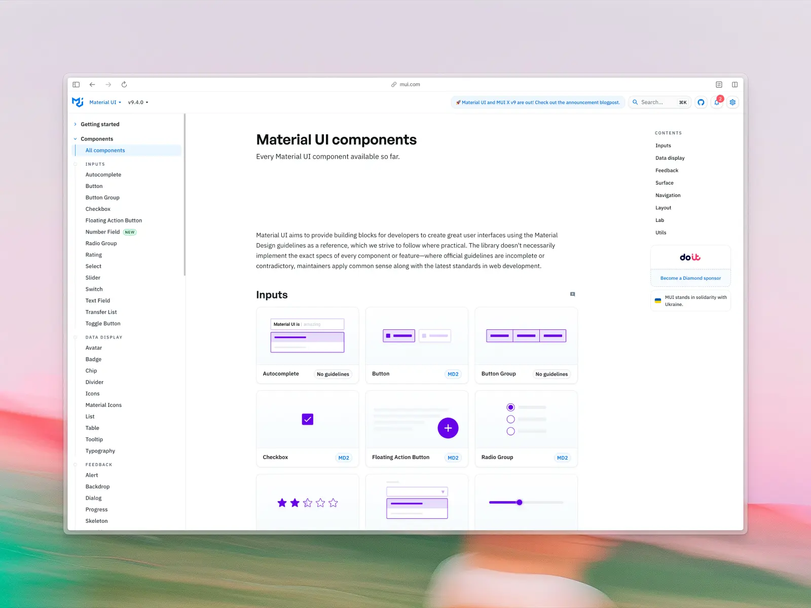
What is Material UI?
mui.com/material-ui — Open source (MIT) + paid MUI X from $299/developer/year · ★99k · npm: ~7.23M/wk
Material UI is an open source React component library implementing Google's Material Design, with around 60 UI components. It's the oldest React library in wide use, still actively developed, with commits landing daily.
The core @mui/material package is MIT licensed and free. Around it sits MUI X, a commercial layer with the Data Grid, Charts, Date and Time Pickers and Tree View, plus a Scheduler and Chat component in preview. Basic versions are free, advanced features are paid.
Material UI key features:
- Around 60 documented UI components spanning a wide range: inputs, data display, feedback, surfaces, navigation, layout and utilities, described by MUI as "a comprehensive collection of prebuilt components that are ready for use in production right out of the box."
- Material Design implementation: Google's design language, with familiarity and a documented accessibility baseline.
- MUI X for data-heavy UI: Data Grid, Charts, Date Pickers and Tree View cover patterns most libraries don't attempt.
- An extensive theming system: deep customization of palette, typography, spacing and per-component defaults, including dark mode support.
- Eight free templates: Dashboard, Marketing page, Checkout, Sign-in, Sign-in side, Sign-up, Blog and CRUD dashboard, each with a custom theme and a default Material Design 2 theme.
- An official Figma design kit from the MUI Store at $79 per concurrent editor, with a 50% discount for students, instructors, non-profits and charities.
- A large, active community: 99,044 GitHub stars, 7.23 million weekly npm downloads, and a decade of Stack Overflow answers.
Material UI pros:
- Rich set of components: a wide range, from simple buttons to complex data grids.
- Excellent documentation: comprehensive, well-organized, with plenty of examples.
- Strong community support: whatever you hit, someone hit it in 2019 and wrote it up.
- Good for enterprise applications: robust and scalable at large scale.
- Unmatched data components: MUI X's Data Grid is the most capable in React.
- Battle-tested: twelve years of production use is assurance a newer library cannot offer.
Material UI cons:
- Material Design 2 in 2026. MUI's docs confirm it implements Material Design 2, superseded by Material Design 3 in 2021. Without heavy customization, MUI products look like MUI products.
- You don't own the code. When you need behavior the props don't expose, you're overriding styles, wrestling
sx, or forking. - Runtime dependencies.
@mui/materialv9.4.0 ships 12 runtime dependencies, plus Emotion as the default styling engine. - Verbose and bundle-heavy. Customizing pre-built components means more verbose code and a larger bundle if not managed carefully.
- Per-seat, per-year pricing for the good parts. MUI X Pro is $299 per developer per year and Premium is $599, recurring, unlike the one-time purchase licenses common elsewhere.
- No marketing sections or landing pages. Eight templates is generous, but it isn't page-level coverage.
What about Joy UI?
Worth a section of its own, because Joy UI comes up constantly in MUI discussions and almost everything written about it is out of date.
Joy UI is MUI's second React library: same engineering team, same theming architecture, but implementing MUI's own visual language instead of Google's Material Design. It was pitched as the answer for teams who wanted MUI's reliability without looking like an Android app, and on the strength of that pitch a lot of people have been waiting on it.
Joy UI is on hold, and MUI says so plainly. The getting-started page states: "Joy UI is in beta and development is currently on hold. When starting a new project from scratch, we recommend Material UI over Joy UI because we can guarantee ongoing support."
MUI's 2026 roadmap post is blunter still: "Joy UI is currently on hold. We have no active plans or timelines to share, and the team is not focused on advancing with the project at this time."
The release record backs that up. The latest published version is 5.0.0-beta.52, from March 2025, which is around eighteen months without a release. Joy UI never reached a stable 1.0 and is still formally in beta after more than three years.
Two things that are commonly said about it and shouldn't be. Joy UI is not deprecated on npm: there's no deprecation flag and the package installs normally. And it has no GitHub star count of its own, because it lives inside the main mui/material-ui repository. Any figure you see attributed to Joy UI specifically is really Material UI's.
For scale, @mui/joy does around 84,000 weekly npm downloads against Material UI's 7.23 million, so roughly 1.2%. Even Base UI, which is far younger, is well ahead of it.
What this means if you were counting on Joy UI
If you picked MUI because Joy UI was coming, that plan needs revisiting for new projects. The escape route from Material Design inside the MUI family isn't Joy UI any more; MUI's roadmap points its foundational work at Base UI instead.
That leaves three options: stay on Material UI and invest real theming hours (what most Joy UI users end up doing), drop to Base UI and build your own design layer, or move to a system that already has a brand-neutral design language, which is the case we make for Untitled UI React below.
If you have Joy UI in production today, there's no emergency. It works, it's MIT licensed, and nothing has been removed. But you're on a beta with no maintainer attention, and that's a materially different risk profile from the one you signed up for.
Joy UI was also never finished: no Figma kit, a narrower component set than Material UI, and less documentation, which matters for React applications you expect to maintain for years.
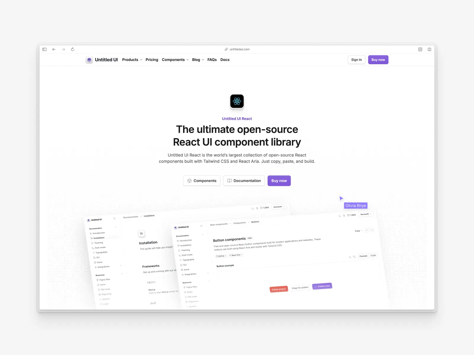
What is Untitled UI React?
untitledui.com/react — Open source + paid from $349 (lifetime access) · ★1.9k
Built on React 19.2 with Tailwind CSS v4.3, React Aria v1.20 and TypeScript v5.9, Untitled UI React is the largest collection of open source React components in the world. The library launched recently and has already reached v8.0.
The philosophy is the opposite of MUI's: a design system that arrives as source code. The CLI installs a component, the file lands in your repo, and it's yours. No wrapper API, no theme object between you and the markup.
It's based on Untitled UI Figma, the largest and most popular Figma UI kit in the world, with 380,000+ designers and 3,650+ 5-star reviews. Every one of the React components is built in sync with that design kit, and both get free updates for life.
Untitled UI React key features:
- 5,000+ components and sections: a comprehensive collection covering base UI components, application UI and marketing website sections.
- 250+ page examples: 120 application pages (40 dashboards, 40 settings, 40 informational) and 105 marketing pages, all production-ready.
- Built on React Aria: Adobe's React Aria handles accessibility, keyboard behavior and interaction, with 34 locale bundles covering 32 languages.
- A deep semantic token layer: every token carries an explicit light and dark value, with names like
text-primaryandbg-brand-solid. - Styled with Tailwind CSS: no CSS-in-JS runtime, no styling engine to configure, no Emotion in your dependency tree.
- Custom CLI tool: pick a brand color, run
npx untitledui@latest init --nextjs, and you have a full project scaffolded. - MCP server with semantic search: seven tools backed by multimodal embeddings, so agents search by appearance rather than name.
- Figma UI kit in sync: when a component ships in React, it ships in Untitled UI Figma, built on Auto Layout. Included, not a separate purchase.
- 2,000+ icons, avatars and logos: 1,100+ free icons via npm, 4,600+ in the PRO version, plus 370+ avatars, 180+ company logos and 261+ country flags.
Untitled UI React pros:
- Modern design out of the box: brand-neutral, themed to you rather than to someone else's spec.
- You own every file: edit or delete anything, with no version bump that breaks your login page.
- Incredibly comprehensive: the coverage means you're editing rather than inventing.
- Figma UI kit parity: included in the one-time purchase and kept in sync, not sold separately, which few of the best UI kits can say.
- Accessibility-focused: React Aria is tested against VoiceOver, JAWS, NVDA and TalkBack.
- One-time purchase: a single payment with lifetime updates, rather than a recurring per-seat fee.
Untitled UI React cons:
- Manual updates. You own the code, so you pull in improvements yourself. MUI handles that with a version bump.
- No grid engine. Our tables are designed tables, not a data grid with row grouping, aggregation and million-row virtualization.
- Can be overwhelming: solo developers and smaller projects may find the scale is more than they need.
- PRO version for full access: the free version has hundreds of UI components, but the advanced UI components and 250+ page examples are in the pro version.
- Tailwind is a prerequisite. If your team doesn't use Tailwind CSS and doesn't want to, MUI's theme object will feel more natural.
It suits teams already on Tailwind CSS who want finished pages out of the box. Here's a 60-second overview:
Much of Untitled UI React costs nothing: a huge part is 100% free and open source, and you can use it in unlimited commercial projects. Start with the documentation, then browse the free React UI components.
How we compared them
We didn't write this blog post to declare a winner. MUI is the library most React developers reach for by default, and "should we move off MUI?" is a question we get asked constantly, usually by teams whose product works fine but looks like every other admin panel.
Every figure here was checked against a primary source in September 2026: MUI's own documentation and pricing pages, the @mui/material package manifest on npm, the npm downloads API, GitHub, the MUI Store, and our own codebase.
Where a number is a marketing claim, we say so. Where MUI is better, we say that too, and there are places where it isn't close. Anything we could not verify from a primary source, we left out.
Architecture: a dependency you consume vs. code you own
This is the difference the rest of your UI development follows from.
MUI is an npm dependency. You install @mui/material, import its pre-built components, and customize through a theme object and the sx prop. Upgrades arrive as version bumps. The component internals live in node_modules, and when you need something the API doesn't expose, your options are style overrides, styled() wrappers, or forking.
Untitled UI React is source code. The CLI writes React components into your repo. There's no API boundary between you and the markup, so "can I change this?" is never a question. It's your file.
Both models are legitimate, and the best practices differ for each. The package model gives large teams centralized upgrades and a smaller repo. The copy-paste model gives you total control and no vendor in your dependency tree. Which is right depends on where your development process hurts most: maintenance burden, or being blocked.
Verdict: a genuine tie, and the most important decision you'll make. If you want upgrades handled for you and your customization needs are modest, MUI's model is a real advantage. If you've ever spent a day fighting a component's internals through style overrides, you already know why the industry moved toward code ownership.
Why does Material UI look dated?
Because it implements Material Design 2, and the fact comes from MUI's own documentation rather than from us: "Material UI supports Material Design 2."
Material Design 2 was released in 2018. Google announced Material Design 3 in 2021 and has been shipping it across its own products since. MUI's docs landing page phrases it as "Material UI currently adopts Material Design 2" and points at an open tracking issue, and its free templates ship with a default Material Design 2 theme.
It's worth being precise about the direction of travel too. MUI's own 2026 roadmap post, published in January 2026, doesn't mention Material Design 3 at all. Its stated foundational focus is Base UI, the unstyled primitive library the same company builds.
This matters in two ways. The obvious one is that MUI products look like MUI products: the elevation shadows, the ripple effects, the uppercase buttons, the specific blue. It's a coherent and well-executed look, and it is instantly recognizable as not-yours.
The subtler one is that you're inheriting design decisions made for a spec its own author has moved on from. Every hour spent theming MUI away from Material Design is an hour spent fighting the library's defaults rather than building.
Untitled UI React's design language is deliberately brand-neutral: a clean, modern aesthetic refined across eight major versions, built to be themed to your brand rather than to carry someone else's. Change one color scale from --color-brand-25 to --color-brand-950 and the entire system re-themes with minimal effort.
The honest trade-off: familiarity is worth something. Material Design is understood by every developer and most users, and for an internal tool nobody is judging on aesthetics, "recognizable" can beat "distinctive."
Verdict: Untitled UI React, decisively, unless familiarity is what you want. If your product competes on how it looks, shipping a 2018 design spec in 2026 is a handicap you'll spend real money undoing.
How MUI compares to Ant Design, Chakra UI and Fluent UI
MUI isn't the only packaged React library: Ant Design, Chakra UI, Fluent UI and Mantine occupy the same slot. Each installs as a dependency and hands you pre-built components behind an API, along with a design language you adopt.
- Ant Design: 98,966 stars, ~2.67 million weekly downloads, 79 components, MIT, now v6. Ant Design is built for enterprise applications, with the best data display after MUI X. Ant Design's first-party design assets are Sketch, and every Figma resource on its docs is third-party.
- Chakra UI: 40,553 stars, ~1.72 million weekly downloads, MIT, and the friendlier option for product teams. The v3 rewrite moved to compound components on Ark UI, and Chakra UI is migrating off runtime Emotion. A free official v3 Figma kit ships on Figma Community, putting it ahead of Ant Design on design process.
- Fluent UI: Microsoft's, implementing Fluent 2 across Microsoft 365 and Copilot. Fluent UI React v9 is current, MIT, around 377,000 weekly downloads, with free Figma kits for web, iOS and Android. For web applications inside the Microsoft ecosystem, Fluent UI is the only library here that looks native; outside it, Fluent UI is as strange a choice as Material UI is outside Google's. Mind the naming: Fluent 2 is the design language, Fluent UI React v9 is the code, and v8 is still widely deployed.
- Mantine: 145 components, 82 hooks, MIT, no paid tier. It has no official Figma kit, which among the best UI kits in this category is conspicuous.
Below them sit the headless libraries: Radix UI, Base UI and React Aria Components ship behavior and no styling. Radix UI is worth knowing even if you never install it, because Radix UI was the default under shadcn/ui until July 2026.
The trade is identical across all of them: upgrades arrive as a version bump, and you give up the ability to edit the component. Which way that falls depends on whether your development process is constrained by maintenance capacity or by design ambition.
Component coverage and page examples
MUI's all-components page lists around 60 documented components across a wide range: inputs, data display, feedback, surfaces, navigation, layout and utilities. It's a well-chosen set of pre-built components covering every standard UI development pattern.
Untitled UI React publishes a comprehensive collection of 5,000+ components and sections. That figure counts components together with their designed variants, which is how a system of this size is counted. Every size, color, state and icon configuration is drawn and specified in the design process rather than left for you to derive, so composing a screen takes minimal effort.
The category coverage is where the difference is real:
- 428 marketing website sections across 18 categories, including 44 hero headers, 42 features sections, 40 footers, 36 contact sections, 26 testimonial sections and 22 pricing sections. MUI has no equivalent.
- Rich text editors, video players, QR codes, color pickers, gradient pickers and image pickers, none of which exist in
@mui/material. - 46 modal variants and 20 slideout menus for confirmation, integration, share and create flows.
- Email templates, credit cards, illustrations and mobile app store buttons.
On finished pages the gap is starker. MUI ships 8 free templates. Untitled UI React ships 250+ page examples, including 40 dashboards and 40 settings pages in two distinct layout families.
MUI's answer is the MUI Store, where third-party admin templates sell for roughly $39 to $69 each, alongside several free ones. They're built by different vendors to different standards, which is a different proposition from a single coherent system. For marketing websites specifically there's nothing on offer at all.
Verdict: Untitled UI React, by a wide margin on breadth and page-level coverage. MUI wins on focus, which simplifies a development process. Sixty well-chosen pre-built components you fully understand beat 5,000 you'll never open, and its component set is the more disciplined one.
Building a real analytics app: dashboards, charts and data grids
Most "enterprise" comparisons collapse into one question about data grids. Too narrow: shipping analytics web applications means charts, metric cards, filter bars, activity feeds and the pages holding them.
Untitled UI React ships the screens. 40 dashboard pages across two layout families, plus a wide range of parts: line and bar charts, pie charts, radar charts and activity gauges, 16 metric cards, 12 tables, 8 filter bars, 18 progress steps, 4 activity feeds and 4 tree views, responsive and themed for light and dark, so a dashboard takes minimal effort.
MUI gives you the primitives and one dashboard template. Charts live in MUI X, not the free core, and metric cards, filter bars and activity feeds are yours to design. For marketing websites, nothing at all.
MUI ships the grid engine. MUI X covers patterns most libraries don't attempt, and @mui/x-data-grid alone does around 2.16 million weekly npm downloads. Basic versions are MIT and free; advanced tiers unlock tree data, row grouping, aggregation and virtualized performance over very large datasets.
That last capability is the dividing line. If your users spend the day inside one spreadsheet-like surface with grouping and aggregation over a million rows, MUI X is the most capable option in React.
The cost: MUI X Pro is $299 per developer per year, Premium $599, Enterprise $1,399 from 15 seats. Those are perpetual licenses with 12 months of maintenance, so you keep what you bought but stop receiving updates unless you renew.
On scope: Data Grid, Date and Time Pickers, Charts and Tree View are stable. Scheduler and Chat are in preview; Rich Text Editor, Upload and Gantt are roadmap items, not shipped products.
Verdict: Untitled UI React for analytics products, MUI for grid-centric tools. If you're building a dashboard someone looks at, we ship that screen, a better user experience out of the box, and MUI ships the parts. If the grid is the product, MUI X wins, and that should outweigh everything else here.
Styling and theming
MUI themes through a JavaScript theme object and the sx prop, powered by Emotion. You define a palette, typography scale, spacing, and per-component default props and style overrides in one config, and the library applies them everywhere.
A note on precision, because this gets repeated wrongly: Emotion is listed as an optional peer dependency in @mui/material's manifest. In practice it's required. MUI's own install docs describe Emotion as the default styling engine and the install command includes it.
It's a genuinely powerful system, and for teams who think in JavaScript rather than CSS it's more natural than utility classes. The cost is a CSS-in-JS runtime, and styles that live in a theme object rather than next to the markup.
If you've heard that Pigment CSS is the zero-runtime way out, check the date. MUI's own 2026 roadmap post says: "Pigment CSS is not being developed at the moment. While we still believe in the potential of the ideas behind it, progressing further would require a different approach."
@pigment-css/react is on v0.0.31 with around 22,000 weekly downloads, against Emotion's 21 million. Treat it as a paused experiment, not a migration path.
Untitled UI React styles with Tailwind CSS and semantic CSS variables, currently Tailwind CSS v4.3. There's no runtime, no styling engine to configure, and the styles sit on the element you're looking at, which makes small changes minimal effort.
Theming runs through semantic tokens organized into text, background, foreground and border families, which follows current theming best practices, each declared twice, once for light mode and once for dark. That's how dark mode support works without a second stylesheet.
Verdict: Untitled UI React on performance and directness, MUI on centralized control. A theme object genuinely is better when you want one place to change everything across a large team's development process. Tailwind is better when you want to see what an element does by reading it, and when you'd rather not ship a styling runtime in production web applications.
Developer experience: what it's like to work in each
MUI's developer experience is excellent right up to the boundary, and the boundary is the thing worth understanding before you commit. The docs are among the best in open source, the types are thorough, the API is consistent across 60-odd UI components, and a decade of Stack Overflow answers means most problems are solved.
Pre-built components arrive working, the developer experience is consistent, and the theme object gives large teams one place to change everything. For large teams, that centralization is worth real money.
The boundary is the component itself. When a design needs something the props don't expose, you move from writing code to negotiating with it: sx overrides, styled() wrappers, specificity fights, then a fork. It's a developer experience cliff rather than a slope, and the most common reason teams start looking.
Untitled UI React's developer experience is flatter. There's no API boundary, because the component is a file in your repo, so a change is minimal effort. The cost: no centralized theme object either, so changing shared behavior means editing the shared file, and improvements don't arrive automatically.
Styling is the other daily difference. MUI is CSS-in-JS, with styles in a theme object or an sx prop, expressed in JavaScript. Untitled UI React is Tailwind CSS, with styles as classes on the element and CSS variables underneath for the color layer.
Neither is better, they suit different heads. If your team thinks in JavaScript, the theme object is more natural. If they'd rather read what an element does without leaving the markup, Tailwind CSS wins.
Tailwind CSS also means no styling runtime, which removes a category of hydration and server-rendering friction from React applications. MUI's Emotion runtime is why its App Router setup needs a cache provider.
Dark mode support in React applications is similar effort, different shape. MUI handles dark mode in the theme object; Untitled UI React redeclares its CSS variables under a dark selector, so component classes never change. Both give you dark mode support without a second stylesheet.
Dependencies, bundle size and lock-in
MUI is a runtime dependency by design, and @mui/material v9.4.0 brings 12 runtime dependencies with it: clsx, csstype, react-is, @mui/types, @mui/utils, prop-types, @mui/system, @babel/runtime, @popperjs/core, react-transition-group, @mui/core-downloads-tracker and @types/react-transition-group. Plus Emotion in practice.
That's not a scandal; it's what a mature package library looks like, and it rarely disrupts a development process. But it is a real difference. Tree-shaking helps, and MUI documents how to optimize imports, but you are shipping a component library's runtime and you can't opt out of the parts you don't use as cleanly as you can with files you own.
Untitled UI React has no component-library runtime at all, because the files are yours. We do take third-party dependencies where the problem is genuinely hard: Recharts for charts, motion for animation, embla-carousel-react, input-otp, qr-code-styling, TipTap for rich text editors and shiki for code snippets.
Animation is worth a note, because Framer Motion is a common hidden dependency in this category. We use motion, the library formerly published as Framer Motion, and only in the components that need it. Chakra UI required Framer Motion outright until v3 dropped it. If you're auditing bundle weight, Framer Motion is one of the packages most likely to be in there without anyone having chosen it deliberately.
Anyone claiming a zero-dependency chart component is either writing their own SVG renderer or not counting carefully.
The lock-in difference is the one that matters long-term. Walking away from Untitled UI React means keeping files you already own. Walking away from MUI means rewriting every component's API surface.
Verdict: Untitled UI React. Fewer moving parts you didn't choose, and a genuinely cheaper exit.
Accessibility
Both libraries take accessibility seriously and both follow WAI-ARIA patterns and accessibility best practices. This is not a section where one of them is negligent.
MUI's accessibility comes from its own implementation, refined over a decade of production use and issue reports. That longevity is worth something real: a lot of edge cases have been found and fixed by a very large user base.
Untitled UI React's comes from React Aria, Adobe's accessibility layer, which brings a few things that are hard to build yourself:
- 34 locale bundles covering 32 languages, included in the package itself. Your Japanese users hear screen reader announcements in their own language rather than English, which is a measurably better user experience.
- 13 calendar systems, something you need as soon as a date picker reaches users beyond Europe and the US.
- RTL interaction handling, where keyboard navigation reverses correctly as well. It goes further than mirrored CSS.
- A published testing matrix: on Windows, JAWS and NVDA in Firefox and Chrome; on macOS, VoiceOver in Safari and Chrome; on mobile, VoiceOver on iOS and TalkBack on Android in Chrome.
Verdict: an edge to Untitled UI React on internationalization, otherwise close. If your product is English-only, both are solid and you should decide on other criteria.
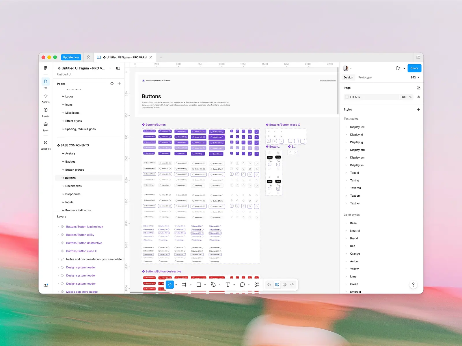
Figma and design-to-code parity
Both have an official Figma kit, which makes this closer than the equivalent comparison against shadcn/ui.
MUI sells its Figma design kit through the MUI Store at $79, licensed per maximum number of editors working concurrently in a 24-hour period, with a 50% discount for students, instructors, non-profits and charities. MUI updates the design kit alongside React releases, as the best UI kits do.
Untitled UI React is designed in, and shipped alongside, Untitled UI Figma: 10,000+ components and variants built with 100% Auto Layout 5.0, variables and smart variants, which is the bar the best UI kits are measured against.
That Auto Layout foundation is why screens resize instead of breaking. The design kit is included in the license rather than sold separately, and when a component ships in React it ships in Figma.
With 380,000+ designers and 3,650+ 5-star reviews, Untitled UI Figma is also the most widely used design system in Figma. We mention it for a practical reason, beyond bragging: the designers you hire have probably worked in it already, and what your developers install are the same components your team reviews in Figma.
Across the best UI kits, the practical differences are scale, licensing and direction. Untitled UI is a design system that produced a React library; MUI is a React library that produced a Figma design kit. That shows up in how much design detail survives the trip.
PRO LITE, a 55% lighter build of the Figma UI kit, is included free with every PRO license for teams who want a smaller file.
Do you actually need a Figma UI kit?
Not always. If nobody on your team opens Figma, a Figma UI kit is worth nothing to you.
The best UI kits matter when designers and developers are different people. Without one, a designer draws a button, a developer builds a button, and the design process drifts until the design file is decorative. With a matching UI kit, the design process and the build share one source of truth, and the team ships consistent screens, and a better user experience, with minimal effort.
What separates the best UI kits from the rest isn't component count. It's three best practices worth checking before you buy: everything built on Auto Layout so it behaves when resized with minimal effort (check Auto Layout first), variables and variants set up so theming works, and a UI kit updated on the same cadence as the code.
A UI kit that fails the third test starts lying to your designers the week after it's published.
AI and agent workflows
This is where the eleven-year age gap in UI development shows most.
MUI's advantage in any development process is training data. A decade of MUI code on GitHub means every model knows the API cold, and an agent asked for a Material UI dialog will produce working code without help. That's real and shouldn't be dismissed.
Its disadvantage is structural: components live in node_modules behind an API. An agent can write MUI code, but it can't read and modify the component itself, because the component isn't in your repo. Customization lands as sx overrides and theme config rather than as edits to the thing being customized.
Untitled UI React brings tooling built for agents:
- An MCP server with multimodal semantic search, seven tools, so agents can match on how a component looks rather than what it's called.
- Shipped agent rules in CLAUDE.md, GEMINI.md and AGENT.md. Agents stick to the best practices of the design system rather than making up their own.
- One-click launches into v0, Bolt, Lovable, Replit and StackBlitz with the library pre-installed, so a prototype is minimal effort.
- Docs published as raw markdown: any docs URL returns its source as plain text once you append
.md. An agent reads the page itself and skips scraping the rendering. - Open code, which is the part that matters most. The component is a TypeScript file in your repo, which is exactly what language models are good at reading and editing.
Verdict: Untitled UI React on architecture, MUI on familiarity. Agents know MUI better; agents work better with code they can actually see.
Is Material UI free, and what does MUI X cost?
Both have a real free version, and the paid models are structured very differently for product teams.
MUI's core is MIT licensed and free forever: around 60 components, perpetual production use, no seat counting. The commercial layer is MUI X, priced per developer per year:
- Community — free: the MIT core and basic MUI X components, with community support.
- Pro — $299/developer/year: MUI X Pro components and advanced Data Grid features.
- Premium — $599/developer/year: everything in Pro plus the Premium Data Grid features.
- Enterprise — $1,399/developer/year: priority support with guaranteed response times, available from 15 seats.
Each is a perpetual license with 12 months of maintenance. In MUI's own words, it "offers the right to keep using your licensed versions forever in production and development," but updates and support stop unless you renew.
Untitled UI React's free version is MIT licensed: open-source UI components, with the full React library sold as the PRO version, a one-time purchase with lifetime updates:
- FREE: open-source React components, CLI, starter kits, dark mode support, and 2,000+ icons and logos.
- PRO SOLO — $349: one user gets Figma sync, 250+ page examples, and the full 5,000+ component library.
- PRO STUDIO — $999: up to 8 users.
- PRO BUSINESS — $2,499: up to 20 users.
- PRO ENTERPRISE — $8,999: unlimited users, private GitHub repo and Storybook access, SSO and SCIM 2.0, audit log, Enterprise EULA and onboarding support.
The payment model differs too. MUI X is a subscription in practice: a perpetual license with twelve months of maintenance, so updates stop unless you renew. Untitled UI React is a one-time purchase with lifetime updates on both the React library and the Figma UI kit.
Over time that compounds. Five developers on MUI X Pro pay $1,495 a year, about $7,475 over five years. The same team on PRO STUDIO pays $999 once, and lifetime updates mean that number doesn't move. If they need the Premium Data Grid, though, there is no Untitled UI equivalent at any price.
Verdict: Untitled UI React on total cost, MUI on free-tier generosity. MIT forever with no seat counting is a strong offer, and for a team that never touches MUI X, MUI costs nothing.
Community, ecosystem and long-term support
We'll be straightforward, because the numbers are the numbers.
MUI has 99,044 GitHub stars, 7.23 million weekly downloads of @mui/material, thousands of lifetime contributors, and twelve years of accumulated Stack Overflow answers, blog posts and third-party templates. Whatever problem you hit, someone hit it in 2019 and wrote it up.
There's also a detail worth knowing: several of the people behind Base UI, the unstyled primitives library that became shadcn/ui's default in July 2026, come from the MUI team, alongside people from Radix UI and Floating UI. MUI's own 2026 roadmap names Base UI as where its foundational work is going.
A full-time team ships a comprehensive collection of coordinated updates across React, Figma, icons, avatars and logos, backed by 380,000+ designers using Untitled UI Figma and 3,650+ 5-star reviews. Looking at the developer side specifically, the library launched recently and its React repo already has 1,918 GitHub stars.
Verdict: MUI, comfortably, on developer ecosystem. If community size and the odds that your exact problem is already answered are your top criteria, this one isn't close.
What about shadcn/ui?
The question we get most often after "should we leave MUI" is "should we go to shadcn/ui", so it deserves a straight answer.
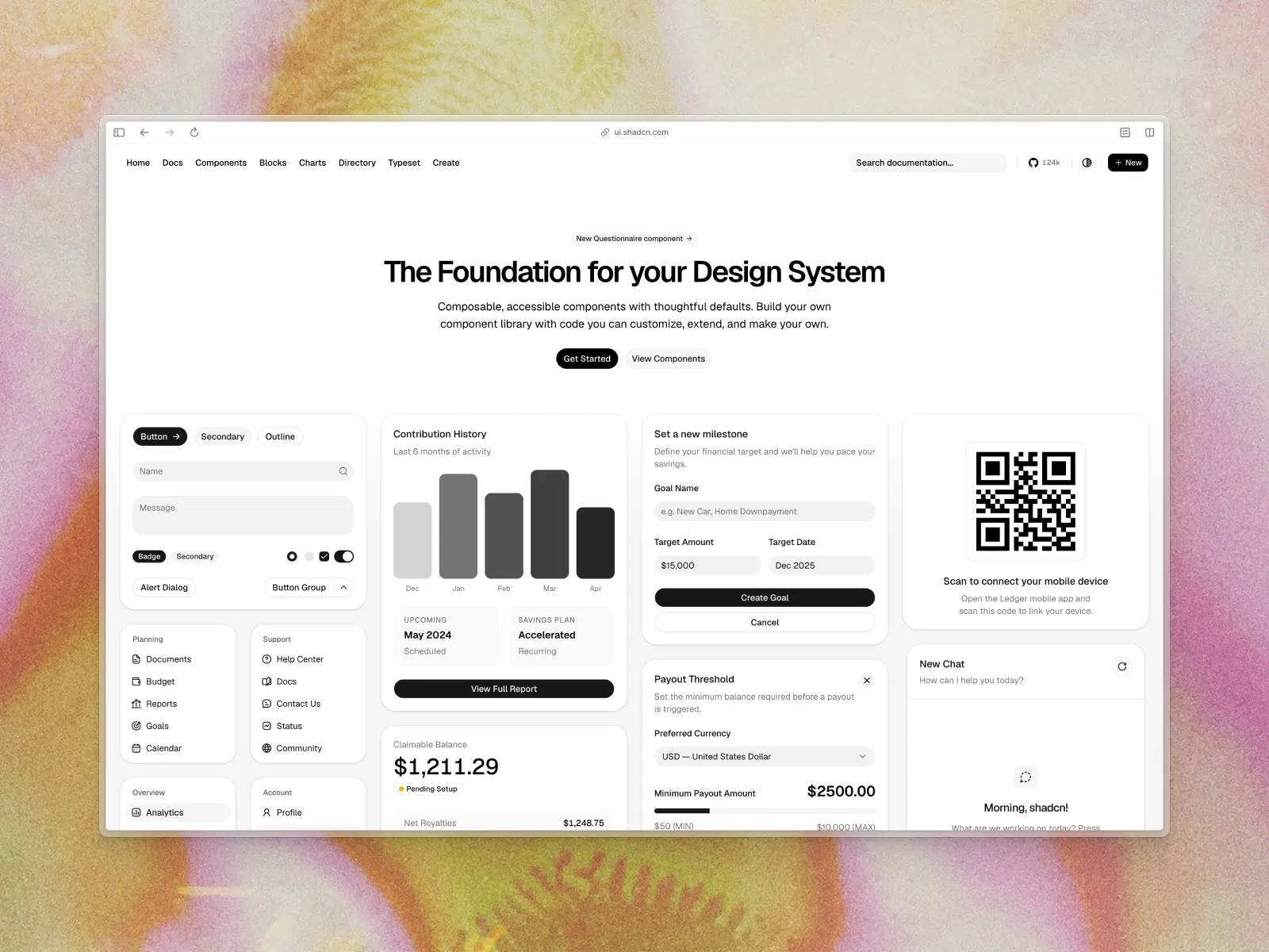
shadcn/ui is the most widely used open source React component library in 2026 by attention: 123,709 GitHub stars and over 7.3 million weekly CLI downloads. It popularized the copy-paste model both it and Untitled UI React use, where the CLI writes the source file into your repo instead of installing a package.
For a team leaving MUI, shadcn/ui is a genuinely strong option and it's free under MIT with no seat counting. It's also the thing every AI coding tool emits by default, which matters more to a development process than it sounds.
Two things to weigh before you assume it's the destination. First, shadcn/ui ships 64 base components and around 60 blocks, of which exactly one is a dashboard, and it has no marketing sections at all. If you're leaving MUI because you want finished screens rather than more primitives, that gap is the same gap.
Second, because every AI tool generates shadcn/ui with its default styling, a very large number of products now look identical. Leaving Material Design for the shadcn/ui look solves the "our app looks like everyone else's" problem for about a year.
Worth knowing too: shadcn/ui no longer means Radix UI. Base UI became its default primitive layer in July 2026, with Radix UI still fully supported and React Aria added as a third option in the same month. A shadcn/ui project initialized today is running Base UI unless you asked for otherwise, and a Radix UI project from last year is not being left behind.
We've written that comparison in full: Untitled UI vs. shadcn/ui, and a wider list in best shadcn/ui alternatives in 2026.
What migrating off MUI actually costs
Everyone writes "migrate from MUI" and nobody costs it. Here's the honest ledger, plus the best practices that keep a migration moving, because going in with the wrong number is how migrations stall halfway and leave you maintaining two systems.
The sx prop becomes Tailwind classes. This is the bulk of the work and it's mechanical rather than hard. Every sx={{ mt: 2, display: 'flex' }} becomes className="mt-4 flex". A coding agent does most of it correctly, with minimal effort from you. Budget a day per substantial route, less once your development process has the muscle memory.
The theme object becomes CSS variables. Your palette, typography scale and spacing map across cleanly. Per-component default props and style overrides don't, because there's no central place to put them any more. That's the conceptual shift, not a technical one: in MUI you change a component everywhere from the theme, and afterwards you change the component file itself.
Component APIs don't map one to one. Most are close enough to be obvious. A few aren't, and Autocomplete is the one that catches people, because MUI's does a lot in one component.
Some things have no equivalent at any price. MUI X's Data Grid pro features, the advanced Date Picker behavior, and the Charts if you're on the paid tier. Identify these first, because they determine whether this is a migration or a partial migration.
Emotion leaves, and that's a real win. Removing the CSS-in-JS runtime is the part teams underestimate. You lose the cache provider, the App Router workarounds, and a category of hydration bugs. For React applications on the App Router this alone is sometimes the reason to move.
Your designers need the Figma kit on day one. If they're working from MUI's UI kit, they need the new one before engineering starts, not after. Product teams that skip this ship half a migration and then rebuild it.
The realistic shape for web applications: marketing websites and auth flows first, because they're isolated, visible and where designers care most, and a better user experience there pays back fastest. Then settings, onboarding and billing. Data-heavy screens last, or never. Large teams should expect a quarter of part-time work for a mid-sized product, not a sprint.
The thing that makes this tractable is that both libraries can run side by side. You are never forced into a big-bang rewrite, and a partial migration that leaves MUI on three grid screens forever is a perfectly good outcome.
Can you use Untitled UI React and MUI together?
Yes, and this is a more common migration path than a clean switch, usually because product teams want to keep MUI X's Data Grid while moving the rest of the product onto something that looks current.
It works, but two things need deciding up front.
- You will ship both runtimes. MUI brings Emotion and its own dependency tree, and that doesn't go away because most of your screens are Tailwind now. Budget for the bundle cost in your development process, and keep MUI scoped to the screens that genuinely need it.
- The design languages will fight. Material Design's elevation, ripples and type scale don't sit quietly next to a neutral system. Theme MUI toward your design tokens, which its theme object is good at, rather than hoping the seam won't show.
The pattern that works: let MUI own the data-grid screens and let Untitled UI React own everything else. Marketing pages, settings, onboarding, billing, empty states and modals have no MUI dependency worth keeping, and those are the screens users judge you on.
Our short advice, and the best practices most teams land on: don't rewrite a working data grid. Migrate the surface area where design quality is the product, and leave the grid alone until there's a reason to touch it.
Which is better for your kind of project?
The abstract comparison runs out of usefulness at some point in real UI development, so here's the split across a wide range of what you're actually building.
Data-heavy internal React applications: MUI, clearly. Back offices, operations consoles, admin panels where users live inside a grid all day. MUI X's Data Grid has no equivalent, the free version covers the rest, and nobody is judging the product on its design language. For this kind of UI development the pre-built components are the whole point.
Customer-facing SaaS web applications: Untitled UI React, for most product teams. You need dashboards, settings, billing, onboarding and empty states that look deliberate, and Material Design 2 in 2026 works against you on every one of them.
A better user experience here is mostly a design problem rather than a component problem. The components work in both; the difference is whether the screens they compose into look like designers decided how they should feel.
Marketing websites and landing pages: Untitled UI React, and MUI isn't really in the race. MUI has no marketing sections at all, because it was never built for marketing websites. Untitled UI React ships 428 of them across 18 categories, plus 20 landing pages and 10 pricing pages.
Products inside the Microsoft ecosystem: Fluent UI, over both. If your web applications sit next to Microsoft 365 or Copilot, matching Fluent UI's Fluent 2 is worth more than any other consideration in this post, and Microsoft ships free Figma kits to go with it. Fluent UI is a narrow recommendation, but inside that niche it's the obvious one.
Prototypes and internal experiments: whatever your team already knows. The design gap doesn't matter in something nobody ships, and switching cost is the only real cost to your development process. This is also the right place to trial a library before committing it to new projects.
A design system as the deliverable: neither. Drop to Base UI, Radix UI or React Aria Components and build the layer yourself, following the same best practices. MUI's own roadmap points at Base UI for exactly this.
Conclusion
Choosing between Untitled UI React and Material UI in 2026 comes down to one question: is your product judged on how it looks, or on what it can do with data?
If it's data, MUI is the stronger foundation, and MUI X's Data Grid is a capability we don't have. If it's design, Material Design 2 in 2026 is a handicap for designers, and a comprehensive collection of 5,000+ modern components with 250+ finished pages and a matching Untitled UI Figma library, one of the best UI kits available, is a different kind of head start.
Both have open source free tiers for unlimited commercial use. What sits behind the paywall differs: MUI's is the Data Grid, ours is the PRO version, with the advanced React components, the 250+ pages and dark mode designed rather than derived.
Whatever you choose, build one screen with each and see which you're still enjoying on day three. Every number in this blog post was checked against a primary source in September 2026, and the MUI X pricing and Joy UI situation are worth re-checking before you commit.
If this blog post helped, the wider roundup is the natural next read: the best React UI component libraries in 2026, our comparison of Untitled UI React and shadcn/ui, or our ranking of the best Figma UI kits.
Weighing the headless route? We've compared Untitled UI React and Base UI and Untitled UI React and React Aria Components, plus a list of the best shadcn/ui alternatives.
For Tailwind teams, the best Tailwind Plus alternatives covers the same ground from the CSS side, and our roundup of React dashboard templates is the shortcut if dashboards are the job. Earlier than picking a library? Our guide on what a design system actually is is the better start.
More best practice guides
This post is an exert from Untitled UI Figma, world's largest Figma UI kit and design system. Untitled UI includes tips and best practices right in the Figma file to help you level up as a designer. You can preview Untitled UI Figma here .
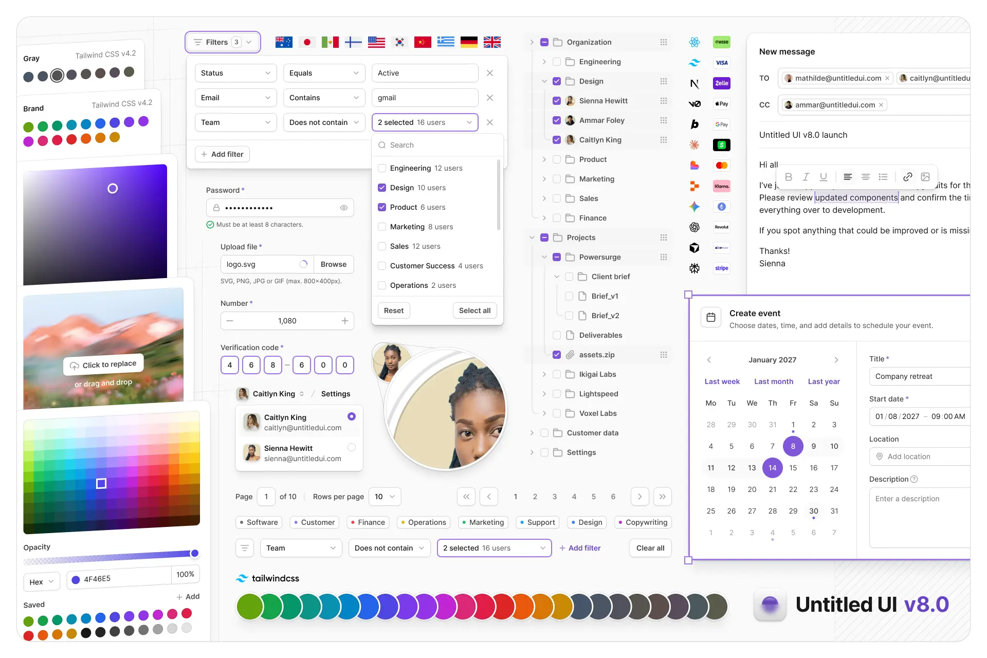
Untitled UI Figma is meticulously crafted with 100% Auto Layout 5.0, super-smart variants, Figma's newest variables features, and with accessibility in mind.
It's a great example of Figma design system best practices and is the most popular and highest-rated Figma UI kit on the internet with 3,650+ 5-star reviews!
They've also released Untitled UI Figma PRO LITE, which is a premium and lightweight version of the full Untitled UI Figma PRO STYLES kit and have included it for free. It's 55% lighter, faster, and is designed to include everything you need and nothing you don't. It's perfect for moving fast and for smaller projects!
Untitled UI was designed to be the "ultimate" UI kit and the perfect starting point for any kind of project—from beautiful marketing landing pages, all the way to complex dashboards and web apps—Untitled UI has thought of absolutely everything so you don't have to.
The team behind Untitled UI are constantly making updates and improvements to the UI kit and recently announced they've completely refactored Untitled UI to take advantage of Figma's latest features released at Config 2023, Framework 2024, Config 2024, Config 2025, and Config 2026. This includes all the latest Figma features such as color variables (dark mode), spacing, radius, typography, and effects variables, Auto Layout 5.0, min/max widths, Auto Layout wrapping, and much more.
You can check out a full preview of the design kit, or check out the 100% free UI kit here (which is more advanced than most UI kits in its own right!). If you're short on time, here's a 60-second overview: