A UI kit is a collection of reusable, pre-built user interface components, styles, and templates (buttons, inputs, icons, typography, color styles, and page layouts) that designers use to build websites and apps faster and more consistently, instead of creating every element from scratch.
If you're thinking about trying a UI kit for designing interfaces and websites in Figma, this guide covers what they are, what's inside a good one, and how to tell whether one will actually speed you up.
Used well, a good UI kit is an invaluable asset that speeds up your process from wireframing and ideation right through to the final product. It can 10-100x your workflow by saving the time and money usually spent rebuilding the same components over and over again. In practical terms, you get a finished prototype without spending weeks on brand-new design components first. That holds whether you work in Figma, Sketch, or Adobe XD, and whether you're on smaller projects or large digital products.
Key takeaways
- A UI kit is a library of ready-made components and styles. A design system is a UI kit plus the documentation, guidelines, and code that explain how and when to use it.
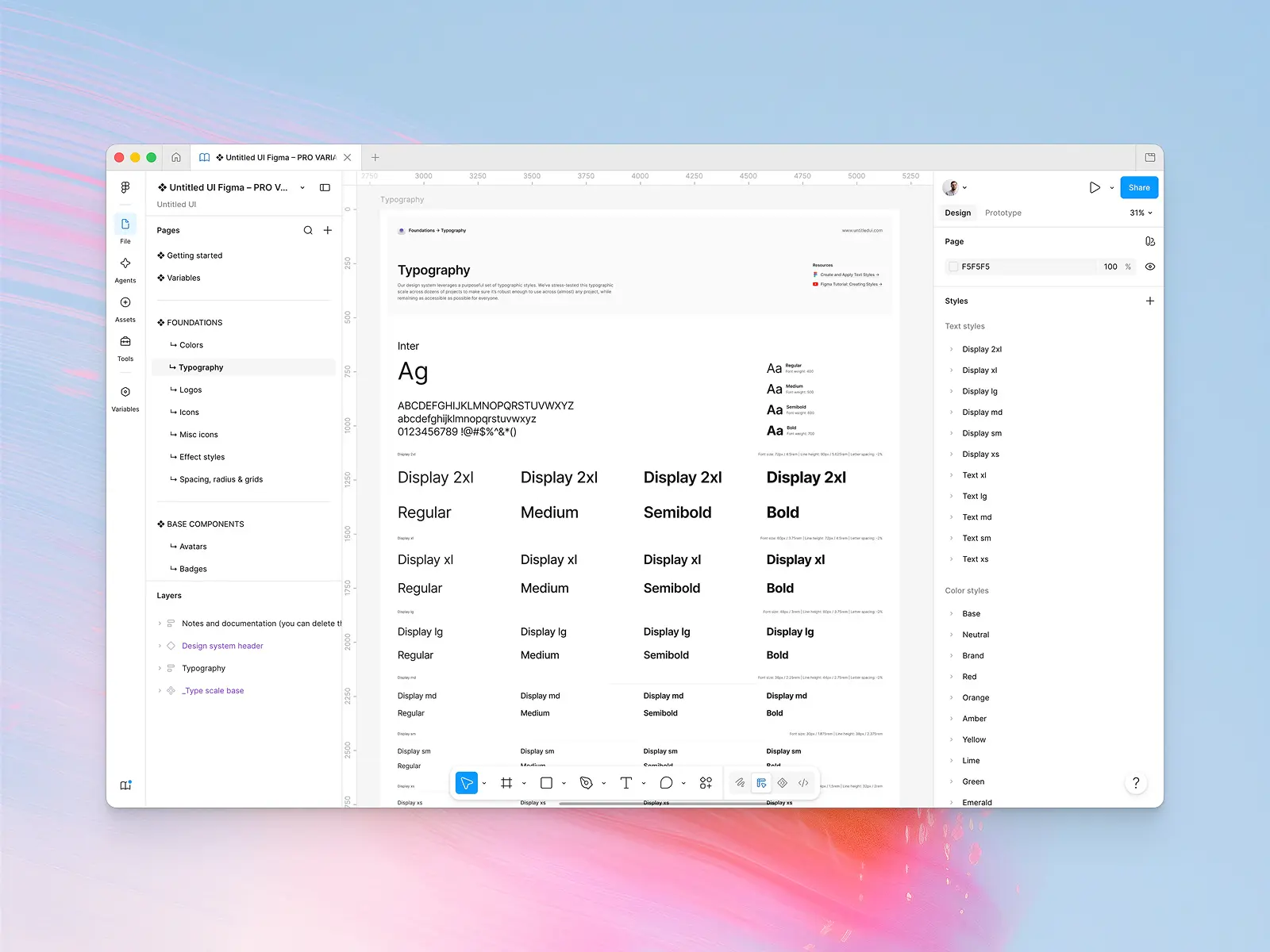
- Good UI kits include three layers: foundations (color palettes, typography, spacing), pre-built components (buttons, input fields, radio buttons, navigation bars), and templates (landing pages, dashboards, and marketing sections).
- They're best for solo designers, freelancers, and small design teams who want speed and visual consistency without building a design system first.
- Judge a UI kit by how it's built (Auto Layout, variants, variables) rather than how it looks in a screenshot.
Below we cover what a UI kit includes, the main types, benefits, pros and cons, how UI kits compare to design systems and component libraries, examples, how to choose one, and how to build your own.
What is a UI kit?
A UI kit (short for user interface kit, also called a UI design kit) is a large collection of pre-designed elements: reusable, ready-to-use components, templates, styles, and other design assets used to design user interfaces for websites, mobile apps, and other digital products. Think of it as a starter library: everything you'd otherwise build at the start of every project is already made, organized, and ready to drop onto the canvas.
The point of a user interface kit is that the pre-made components are already built and tested. You're assembling screens from ready-to-use components rather than drawing every button, input field, and navigation bar from scratch, and every screen shares the same design language from the first frame.
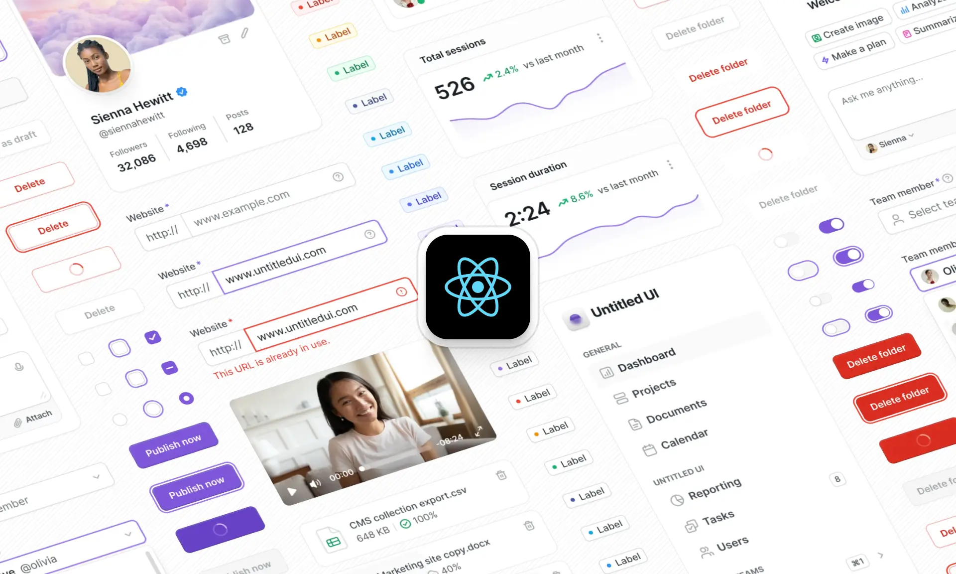
Most modern user interface kits are built for Figma, though UI kits also exist for Sketch, Adobe XD, and as code libraries for frameworks like React and Tailwind CSS. Some UI kits ship both: a Figma file and matching code components, so designers and developers work from the same source (Untitled UI Figma and Untitled UI React are built this way).
What does a UI kit include?
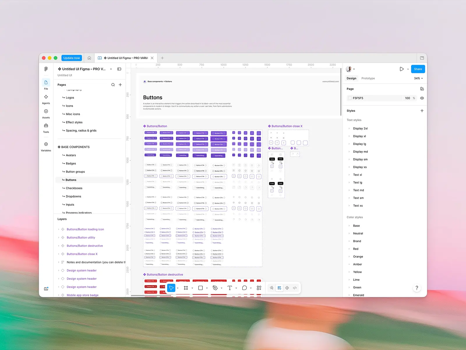
Not every UI kit contains the same design elements, but a well-built one has three primary layers:
Foundations (styles and design tokens)
- Color styles and color palettes, usually a primary color, neutrals, and semantic colors for success, warning, and error states, often with light and dark mode variables
- Typography styles (type scale, weights, line heights)
- Spacing and radius scales
- Effect styles such as shadows and blurs
- Icons (see our picks for premium icon sets too)
Components
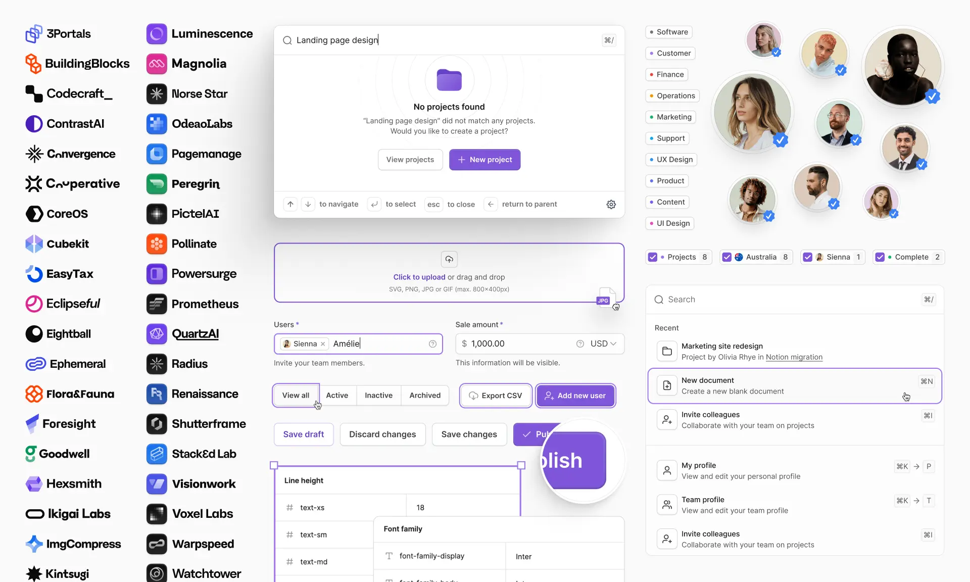
- Buttons, badges, and avatars
- Form controls: input fields, checkboxes, radio buttons, toggles, and dropdowns
- Navigation bars, sidebars, tabs, and breadcrumbs
- Interactive elements such as tooltips, progress bars, modals, alerts, notifications, and other feedback states
- Tables, cards, pagination, and other layout UI elements
- Widgets, illustrations, and other visual elements
Templates and layouts
- Landing pages, page templates, and dashboard layouts
- Marketing sections (headers, pricing, testimonials, footers)
- Responsive design grids and breakpoints for desktop, tablet, and mobile
- Code components (HTML/CSS, React, Tailwind) in UI kits that include them, such as the Untitled UI React components
Quality varies a lot. Some UI kits are just a handful of design elements like icons and checkboxes; others cover everything you need to design modern web apps, mobile apps, and marketing sites. Similarly, not all UI kits include code components, and not all are built with the Figma features (Auto Layout, variants, variables) that make a UI kit fast to work with. The best UI kits treat every element, from the primary color down to a single radio button, as a proper component with states and variants rather than a flat drawing.

Types of UI kits
UI kits are usually grouped by what they're for. The main types you'll come across:
- Web app and dashboard UI kits. Data tables, charts, sidebars, navigation bars, settings pages, and admin layouts for SaaS products, internal tools, and other digital products. If you also need the code side, see our roundup of React dashboard templates.
- Mobile UI kits. Built for iOS and Android patterns, including native components, safe areas, and platform-specific navigation. Apple and Google publish official UI kits for their platforms.
- Landing page and marketing UI kits. Pre-built sections (hero, features, pricing, FAQ, footer) for assembling landing pages and marketing websites quickly.
- Wireframe UI kits. Low-fidelity, greyscale UI elements for mapping out structure, flows, and user experience before visual design.
- Framework-based UI kits. Figma UI kits that mirror a code library such as Tailwind CSS, Bootstrap, or Material Design, so designs translate directly into code (see our list of the best React component libraries for the code side). Popular with teams building on AI-assisted "vibe coding" workflows too.
- Full design systems. Comprehensive UI kits like Untitled UI Figma that cover foundations, components, and templates for web, dashboards, and marketing in one file.
Whatever the type, the value is the same: pre-designed elements you can drop in and restyle instead of building them yourself first. UI kits are also split by design tool. Most modern UI kits are Figma-first, but Sketch and Adobe XD UI kits still exist for teams on those tools, and a Figma UI kit won't open in Adobe XD (or vice versa), so check the tool before you check anything else.
Why do I need a UI kit?
The first benefit is obvious: you save time.
Whichever UI kit you choose, you can edit components and styles as you design and prototype, instead of building them from scratch at the start of each new project. Hundreds of hours of "hidden" work go into creating these design assets at the beginning of a project. On a large project, or as part of a larger design system, it's easy to underestimate how much of that work there is.
Components like navigation bars, dropdown menus, and radio buttons are fiddly to build well in Figma and take a long time to create from square one, so pulling pre-built components from an existing UI kit is far more efficient. That hidden cost repeats on every project. If your UI kit includes icons and social media buttons, you can reuse them as many times as you need instead of making them one by one and dealing with inconsistencies.
Lastly, if you're new to UI design or still learning Figma, a great UI kit is an underrated way to learn best practices from the start by reverse-engineering how well-built components work. Pair it with a few good UI design books or a Figma course and you'll progress quickly.
What are the benefits of UI kits?
- Speed up your design process. Everything you need is already there. Spend less time building components and more time designing the best possible solution.
- Maintain visual consistency. A good UI kit comes with reusable, consistent components and styles already set up, so every screen looks the same and your work stays organized and maintainable from day one.
- Become a better designer. Learn best practices and how to build complex components the right way from professional UI and web designers. It's one of the fastest ways to improve your UI design skills.
- Focus on the details. A quality UI kit frees up time for the fine details, such as spacing, states, and micro-interactions on individual design elements, that separate an average design from a great one.
- Design websites and mobile apps. Comprehensive UI kits work across a huge range of design projects, from simple landing pages to complex Android and iOS prototypes, and you can reuse and improve them project after project.
- Improve the user experience. Pre-built components and interactive elements already follow usability and accessibility best practices (contrast, touch targets, focus states), so the user experience starts from a higher baseline than hand-drawn UI elements.
- Make changes quickly. Starting from a UI kit means you edit main components and styles once. Update a button component and it updates everywhere it's used.
- Hand off to developers more easily. UI kits with matching code components or design tokens give developers and other team members a direct reference, reducing back-and-forth during build.
Pros and cons of using a UI kit
Before choosing a UI design kit, it helps to know its general strengths and weaknesses. Here's a short list of the most relevant ones.
Pros of using a UI kit
The biggest one is that you save a lot of time and money. Instead of buying single components or spending hundreds of hours building them from scratch, you invest once in a UI kit and reuse its components and templates as often as you need.
They're very easy to use, and reuse. If you'll use the same ready-to-use components across multiple prototypes, you'll get your money's worth quickly.
A good UI kit also keeps your workflow consistent by acting as a single source of truth for every component, style, and layout, which is exactly what design teams need to keep a consistent look across products. Everything is neatly organized, so you spend less time hunting for design assets and more time designing.
Cons of using a UI kit
There are more pros than cons, but it's only fair to point out the most obvious disadvantages.
A UI kit can only offer a finite set of design elements. Some include thousands of pre-built components, but no single UI kit will cover every need across every project. If a client asks for a dropdown style that isn't in your UI kit, you'll need to customize the existing dropdown, build a new one, or borrow from another UI kit.
You also need to check that a UI kit is made for your platform. If you're building a native iOS or Android app, look for mobile UI kits that follow that platform's patterns rather than a generic web UI kit, and check that it handles responsive design properly if you're covering both.
UI kits can also be overly stylized, which limits creativity if you're not careful. Because a UI kit typically includes "everything you need", it's easy to follow its defaults without asking what's best for your specific project. And if the UI kit's aesthetic is far from your brand's, you can spend more time restyling than you save. The fix is to choose UI kits designed to be neutral, with simple styling that suits any project and leaves room for your own design language.
Ultimately, if your client is particularly demanding or no UI kit suits your specific needs, you may end up doing the thing you were trying to avoid: building your own component library and UI kit from scratch.

UI kit vs design system vs component library
These three terms overlap, and people often use them interchangeably. They're not the same thing.
A UI kit is a collection of UI components, styles, and templates, usually in a design tool like Figma. A design system includes that UI kit plus everything else that makes up a product's design language: documentation, usage guidelines, design principles, accessibility rules, brand and writing guidelines, and matching code. A component library is the coded implementation of those components (for example, a React component library like Untitled UI React, or a Tailwind library) that developers use to build the product.
The main difference between a UI kit and a design system is documentation: clear guidelines, examples, and rules for how to use the components correctly. With that guidance in place, product teams move faster and stay consistent across every part of their designs and brand.
A few practical differences:
- Usability: UI kits suit designers creating prototypes and visual designs. Design systems suit product teams because they include what non-designers and other team members need to work effectively, such as developer documentation and design principles. A great design system is accessible to everyone so anyone can make updates.
- Short-term vs long-term: UI kits are perfect for smaller projects and simple products that don't need extra documentation. For long-term, complex digital products, a design system eventually becomes necessary for design teams, developers, and project managers to work efficiently and consistently.
- Consistency: both give you a consistent look, but a design system also enforces design principles and user experience standards across teams through documentation, not just shared components.
- Library changes: Changes to a UI kit are simple, especially in Figma. If the UI kit is well built, one change to a component or style updates across the entire library. Changes to a design system are usually more work because they also touch documentation and code.
Many teams start with a UI kit and grow it into a design system as the product and team scale. UI kits like Untitled UI Figma are built for exactly this path, with a matching React component library so the design and code sides stay in sync.
Examples of UI kits
Now that we've covered what UI kits are, here are seven popular UI kits to get started, in the same order as our full ranking. Most popular UI kits include free versions, which are useful for exploring what suits your project and are valuable free design resources in their own right.
We go into far more detail on these and 23 other popular UI kits in our post on the best Figma UI kits and design systems, including free UI kits and UI kits specifically for mobile apps and Material Design.
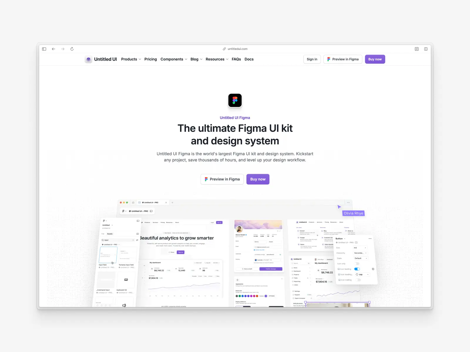
1. Untitled UI Figma
untitledui.com/figma — Free Figma UI kit or $129 (lifetime access)
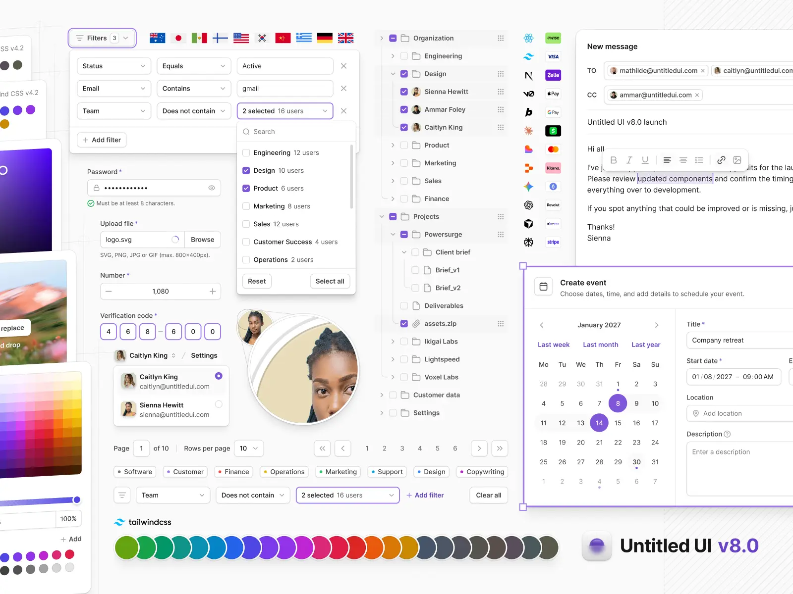
Untitled UI Figma is the largest and most popular Figma UI kit and design system in the world, with 10,000+ components and variants. It's meticulously crafted with 100% Auto Layout 5.0, super-smart variants, Figma's newest variables features, and with accessibility in mind.
It's a great example of Figma design system best practices and is the most popular and highest-rated Figma UI kit on the internet, with 3,650+ 5-star reviews.
Untitled UI was designed to be the "ultimate" UI kit and the perfect starting point for any project, from marketing landing pages all the way to complex dashboards and web apps. It has thought of everything so you don't have to, and it pairs with Untitled UI React, an open-source React component library built to match, so the design and code sides stay in sync.
The team behind Untitled UI constantly updates and improves the UI kit and recently announced a complete refactor to take advantage of Figma's latest features released at Config 2023, Framework 2024, Config 2024, Config 2025, and Config 2026. That includes color variables (dark mode), spacing, radius, typography, and effects variables, Auto Layout 5.0, min/max widths, Auto Layout wrapping, and much more.
They've also released Untitled UI Figma PRO LITE, a premium, lightweight version of the full Untitled UI Figma PRO STYLES UI kit, included free. It's 55% lighter, faster, and designed to include everything you need and nothing you don't. It's perfect for moving fast and for smaller projects.
You can check out a full preview of the UI kit, or grab the 100% free UI kit here (which is more advanced than most paid UI kits in its own right). If you're short on time, here's a 60-second overview:
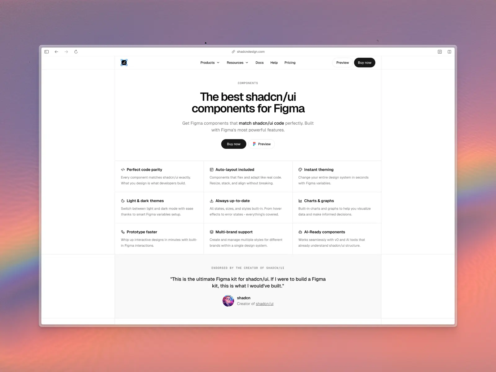
2. shadcn/ui kit for Figma
shadcndesign.com — From $119 per user
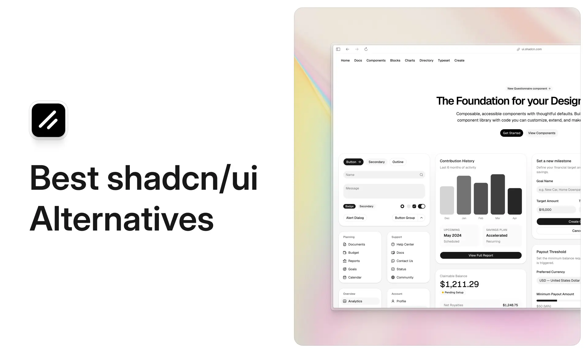
If your developers build with shadcn/ui, this (unofficial) Figma UI kit by Matt Wierzbicki is the closest match you'll find. Every component mirrors the shadcn/ui code exactly, with Auto Layout, variants, theming variables, light and dark mode, and even charts, so the usual design-to-code mismatch disappears.
Pricing starts at $119 for personal use of the Figma UI kit, with additional licenses that add code access and a Figma plugin. It's the best option on this list for teams that need design speed and developer alignment at the same time.
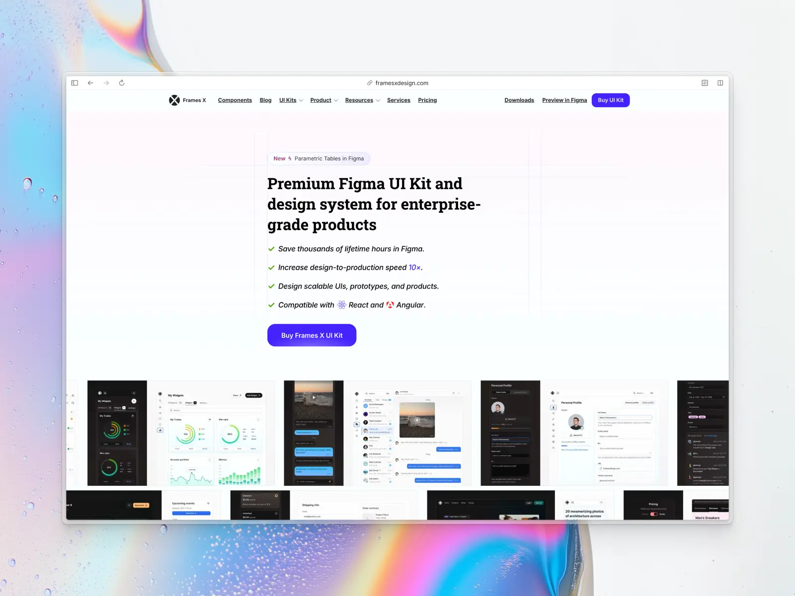
3. Frames X - UI Kit & Design Handbook
buninux.lemonsqueezy.com — From $129 per user
This mid-weight UI kit contains 3,500+ Figma components, 500+ website layouts, 130+ dashboard templates, color styles, and icons suitable for creating mobile and web apps.
The Personal license is $129 (1 user), the Team license is $259 (up to 3 users), and the Enterprise license is $999 for unlimited users. All tiers are lifetime licenses with free updates.
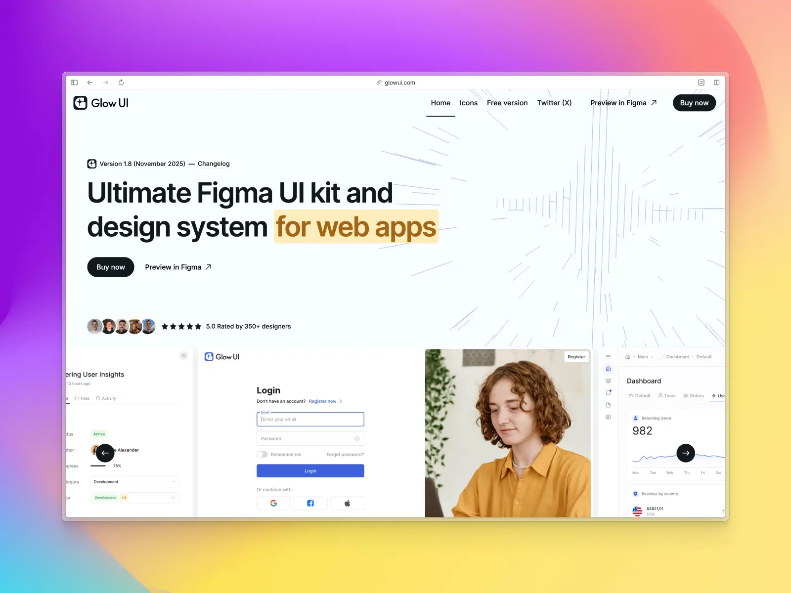
4. Glow UI
glowui.com — Free or from $72 per user
Glow UI is a large, general-purpose Figma UI kit and design system built for SaaS products and web apps. The PRO version ships 6,500+ components and variants, 450+ variables, 800 styles, 440+ icons, and 40+ responsive page templates, all built on Figma Variables from the ground up so theming and dark mode work properly.
There's a useful free version on Figma Community with 3,600+ components (single user, no dark mode or templates). PRO starts at $72 for one seat and scales to $999 for unlimited users, paid once. One thing to watch: the most recent published version is 1.8 from November 2025 and there's no public changelog to check against.
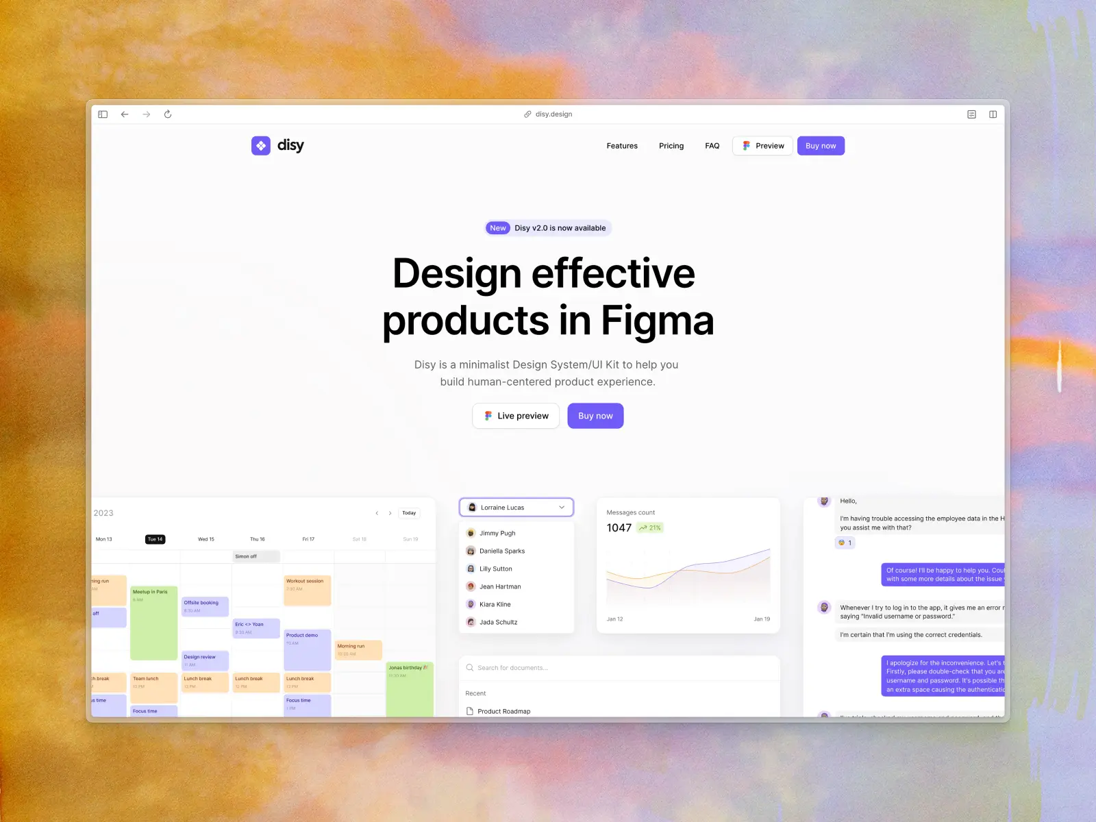
5. Disy Design System
disy.design — From €48 per user
With 400+ handcrafted components built with Auto Layout and a large icon set, Disy is an easy-to-use, well-organized design system suited to both small and large UI projects. Pricing starts at €48 for lifetime access.
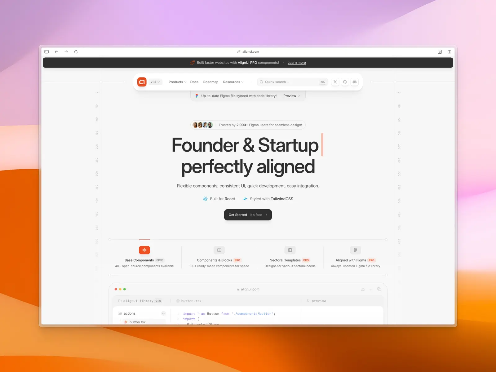
6. AlignUI Design System
alignui.com — From $119 per user
If you're designing dashboards or data-heavy SaaS products, AlignUI is one of the most modern options available. Launched in December 2023, it includes 5,900+ components, unique widgets, dashboard examples, and thorough documentation, and it's fast to work in even at that size.
The solo license is $119, with team licenses available for larger teams. You can preview the full UI kit on their website before buying.
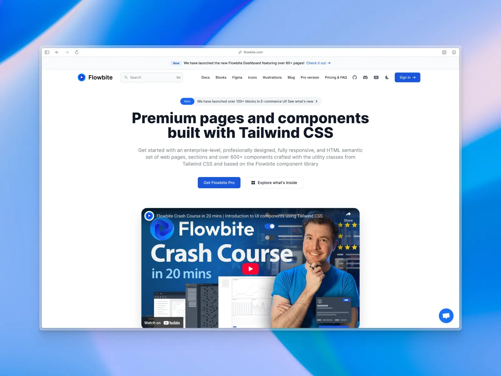
7. Flowbite
flowbite.com — From $169 per user
Flowbite is a Figma design system that mirrors the Flowbite Tailwind CSS component library, with hundreds of UI elements, 27 responsive page examples, and matching Tailwind CSS classes. There's a free edition, and paid Designer and Developer editions start at $169 and $299 respectively.
How to choose the right UI kit
A pretty screenshot tells you very little. Before buying or adopting a UI kit, check the things that decide whether it's the right UI kit for your specific needs, or one that costs you time:
- How it's built. Look for 100% Auto Layout, proper component variants, and Figma variables for color, spacing, and typography on every one of the pre-made components. This is what makes a single style change update every instance.
- Platform and tool fit. Web, mobile, or both? Figma, Sketch, or Adobe XD? A web UI kit won't give you native iOS or Android patterns.
- Coverage. Does it include the components and templates your design projects actually need (tables, charts, navigation bars, dashboards, landing pages, marketing sections), or just the basics like buttons and input fields?
- Responsive design. Do the templates come with tablet and mobile breakpoints, or only a desktop layout?
- Neutral styling. Neutral UI kits are easier to rebrand with your own primary color and type. Heavily stylized UI kits look great in previews but take longer to adapt.
- Maintenance. Check the changelog. A UI kit that hasn't been updated since the last major Figma release will fall behind quickly.
- Code counterpart. If developers will build from your designs, a UI kit with a matching code library (React, Tailwind, etc.) removes a lot of handoff friction. Untitled UI Figma pairs with Untitled UI React for exactly this reason.
- Licensing. Per-user or team? Lifetime or subscription? Can you use it for client work? Read the license before you buy.
- Free preview. Good UI kits let you try a free version or full preview before committing.
Choosing the right UI kit up front saves far more time than switching UI kits halfway through a project.
How to use a UI kit in Figma
Once you have a UI kit, using it is simple:
- Duplicate or add the UI kit. Open the UI kit from the Figma Community and choose "Open in Figma" to duplicate it, or enable it as a library. Figma's own curated UI kits (including Apple's iOS and Google's Material 3 UI kits, both covered in our Figma UI kits roundup) live under Assets > Libraries > UI kits.
- Set up your foundations first. Swap the UI kit's primary color, color palettes, typography, and radius variables to match your design language before you start laying out screens. Every component updates automatically, which is how you get visual consistency across every screen.
- Build from instances. Drag ready-to-use components from the Assets panel into your designs and use variant properties to switch states, sizes, and styles on interactive elements like buttons, inputs, and menus.
- Detach sparingly. Detaching an instance breaks its link to the main component, so you lose automatic updates. Customize with properties and overrides where you can.
- Keep the UI kit updated. If you're using it as a library, accept published updates so you benefit from fixes and new components.
How to create a UI kit
Rather than using an existing UI kit, you can build your own from scratch. Here are the most important steps for creating a personalized UI kit in Figma:
- Plan how you'll use the UI kit. What is your use case? If it's for your own design projects, build ultra-flexible pre-designed elements you can reuse later. If you plan to sell the UI kit, research popular UI kits and decide what kind of UI kit you're building from the start.
- Select a platform. Once you know the use case (mobile app design, web design, dashboard design, etc.), it's easier to plan the UI kit's structure.
- Plan the structure. Spend real time categorizing your Figma file and keeping it organized, especially if other designers or larger product teams will use it.
- Define foundational styles. Set your color palettes (starting with a primary color and neutrals), type scale, spacing system, and radius scale first, ideally as Figma variables. Every component and element uses these foundations, so this is one of the most important steps.
- Design components from scratch. Start with the smallest UI elements (buttons, input fields, checkboxes, radio buttons) and build up to navigation bars, cards, and page templates. Explore similar UI kits for inspiration, then build each component from a blank canvas using Auto Layout and variants, so your own pre-made components behave like the ones in a professional UI kit. You can also add prototyping interactions at the main component level to save time when prototyping later.
- Test responsive design early. Check components and templates at tablet and mobile widths before you build hundreds of screens on top of them.
- Document as you go. Even light usage notes and a few design principles turn a UI kit into the beginnings of a design system, and make it far easier for new team members to pick up.
What is a design system?
A design system is a collection of reusable UI components, along with clear guidelines, examples, and frameworks for how to use them correctly, and matching code components. Design systems often encompass the entire visual language of a product or company, including brand guidelines, design principles, UX guidelines, developer documentation, design process guides, and writing style guides.
When you change something in a design system, whether a style, a component, or a process, it should cascade to every asset where the system is used (a website, an internal proof of concept, a mobile app) as well as the relevant documentation.
Design systems are always evolving. In this sense, a design system acts as a single source of truth and helps product and design teams large and small stay consistent while designing and building quickly at scale. Like a UI kit, it helps you stay on top of each step of the design process and keeps your design uniform.
When you start a new product, web page, proof of concept, or mobile app, you pull components from the existing design system's library instead of copying them from old projects. A design system also makes rebranding or updating the user experience of an existing product far easier. For a deeper look, see our guide on what a design system is.
Recap
After defining UI kits, covering their benefits, and separating them from design systems and component libraries, what's the verdict? Are UI kits worth it? Our answer is simple: absolutely. A well-built user interface kit is one of the highest-leverage design assets a designer can own. Pick the right UI kit for your platform and specific needs, and it pays off on every design project after the first.
If you want to see what a modern one looks like, try the free Untitled UI Figma UI kit, or keep an eye on our blog for more on UI kits and design systems.
More best practice guides
This post is an excerpt from Untitled UI Figma, world's largest Figma UI kit and design system. Untitled UI includes tips and best practices right in the Figma file to help you level up as a designer. You can preview Untitled UI Figma here.
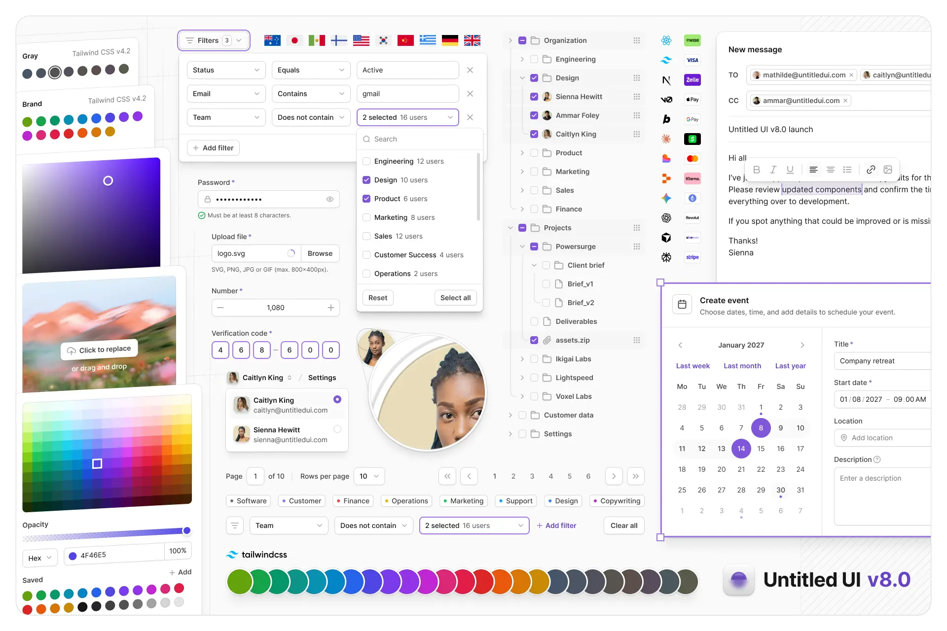
Untitled UI Figma is meticulously crafted with 100% Auto Layout 5.0, super-smart variants, Figma's newest variables features, and with accessibility in mind.
It's a great example of Figma design system best practices and is the most popular and highest-rated Figma UI kit on the internet with 3,650+ 5-star reviews!
We've also released Untitled UI Figma PRO LITE, which is a premium and lightweight version of the full Untitled UI Figma PRO STYLES kit and have included it for free. It's 55% lighter, faster, and is designed to include everything you need and nothing you don't. It's perfect for moving fast and for smaller projects!
Untitled UI was designed to be the "ultimate" UI kit and the perfect starting point for any kind of project—from beautiful marketing landing pages, all the way to complex dashboards and web apps—Untitled UI has thought of absolutely everything so you don't have to.
We're constantly making updates and improvements to the UI kit and recently announced that we've completely refactored Untitled UI to take advantage of Figma's latest features released at Config 2023, Framework 2024, Config 2024, Config 2025, and Config 2026. This includes all the latest Figma features such as color variables (dark mode), spacing, radius, typography, and effects variables, Auto Layout 5.0, min/max widths, Auto Layout wrapping, and much more.
You can check out a full preview of the design kit, or check out the 100% free UI kit here (which is more advanced than most UI kits in its own right!). If you're short on time, here's a 60-second overview: