








Figma UI component
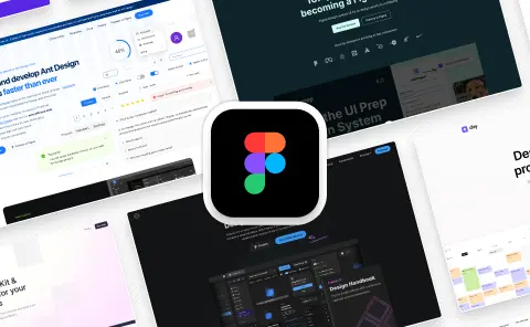
Figma blog post page examples
Below are some examples of responsive blog post pages created in Figma. These cover a wide range of different marketing websites and layouts. Swap out components to customize and experiment.


Figma UI components
Foundation Figma components and styles
Icons, styles, design annotations—everything you need to build the foundation of a great Figma design system.












Figma UI components
Figma base components
Buttons, inputs, avatars—all of the base components you need for modern product design and websites.















Figma UI components
Shared Figma assets
Device mockups and useful utility pages—all of the shared assets you need for modern product design and websites.













Figma UI components
Application UI/Dashboard examples
Dashboard, settings, form layouts—useful examples for everything you need to design modern dashboards and products.



Figma UI components
Application UI/Dashboard Figma components
Modals, tables, alerts—everything you need to design modern and beautiful apps, dashboards and products.




































Figma UI components
Marketing website examples
Landing pages, blogs, sign up pages—useful examples for everything you need to design modern marketing websites.


























The ultimate UI kit for Figma
What is Untitled UI?
Untitled UI Figma is the largest UI kit and design system for Figma in the world. Here's everything great about Untitled UI in just 60 seconds. Plus, some cool music.


Join 380,000+ designers

















Untitled UI is the best $ I've spent on my business in a long time. I'm going to keep using it and recommending it to every designer I know.

Sam Pierce Lolla
Founder, Shuffleboard

Over the years we've featured hundreds of UI kits on UXCrush, but Untitled UI is by far the most comprehensive and detailed I've seen yet. A must have for any designer!

Luca Vavassori
Founder, UXCrush
I've used all UI kits on the market. I can say without a doubt that the Untitled UI kit is the best on the market. It covers everything a designer needs in a modern and efficient way.

Murat Alpay
Product Designer, @imuratalpay
Incredible, and keeps getting better. I’ve tried dozens of UI kits and Untitled UI is the only name you should care about. It stands head and shoulders above the rest.

Jérémy Franck
Designer, @jrmyfranck
Such a beautiful, detailed, and extensive UI kit. Untitled UI is the perfect foundation for any project. I highly recommend this huge time saver.

Adham Dannaway
Product Designer, Practical UI
Untitled UI has been an amazing resource that I'm learning to rely upon to spin up ideas in no time. I think I might launch a startup pretty soon by mistake here!

Riccardo Buzzotta
Senior Product Designer, Spotify
The sheer scale, details, and organization of this kit is mind-blowing. It covers nearly everything a Designer could need in a modern, efficient and systematic way.

Corey Moen
Senior Brand Designer, Webflow
I'm super impressed with this. I love poking around in other peoples UI Kits to see how they think. This is probably one of the most comprehensive I've seen.

Matt Walker
Design Systems, Mailchimp
I'm super excited to use this for quick mockups of ideas in Figma. We're always trying to streamline our design process so we can move fast! Definitely recommend.

Jenny Chu
Head of Product, Eucalyptus
Untitled UI is easily the best UI kit I've used so far. It has an insane amount of components that are all incredibly well-built. I don't even know how many hours this will save.

Sunny Trochaniak
Founder, NewPulse Labs
The attention to detail and thought Jordan has put into this UI kit is unparalleled.

Dan Mcleay
Lead Designer, Fox Sports
Untitled UI is incredibly well-organized and the attention to detail is great. I highly recommend this kit to any designer that wants to create beautiful designs fast.

Tom Bekkers
Founder & Creative Director, Flowbase
What an awesome Figma kit... it's an absolute game changer. This is the perfect base for any design system. The size and attention to detail is next level.

Dan Anisse
Co-founder, Relume
We've been using Untitled to build Himalayas 2.0 and have finished a complete redesign in just a few days. It has everything we need already pixel-perfect.

Abi Tyas Tunggal
Co-founder, Himalayas














