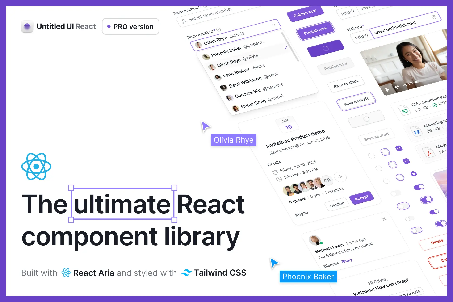
Variables and Auto Layout 5.0!
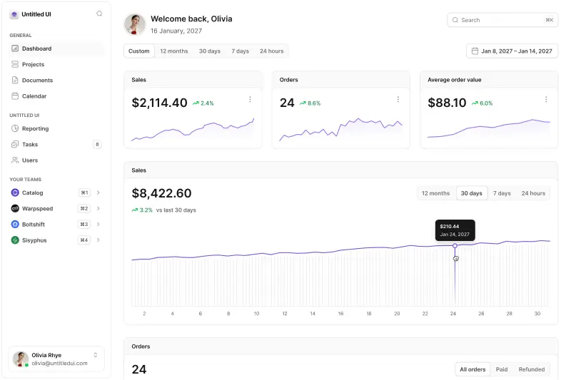
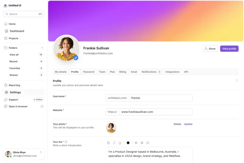
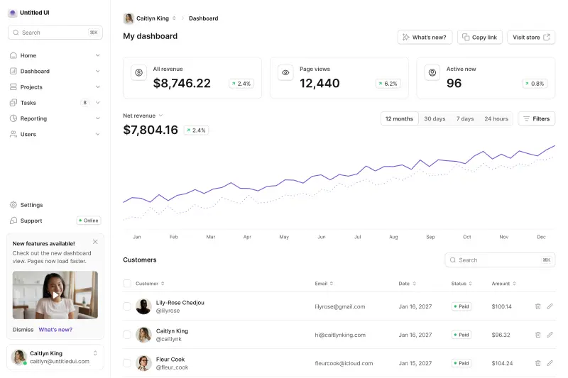
Dark mode is here! This is our biggest update yet.
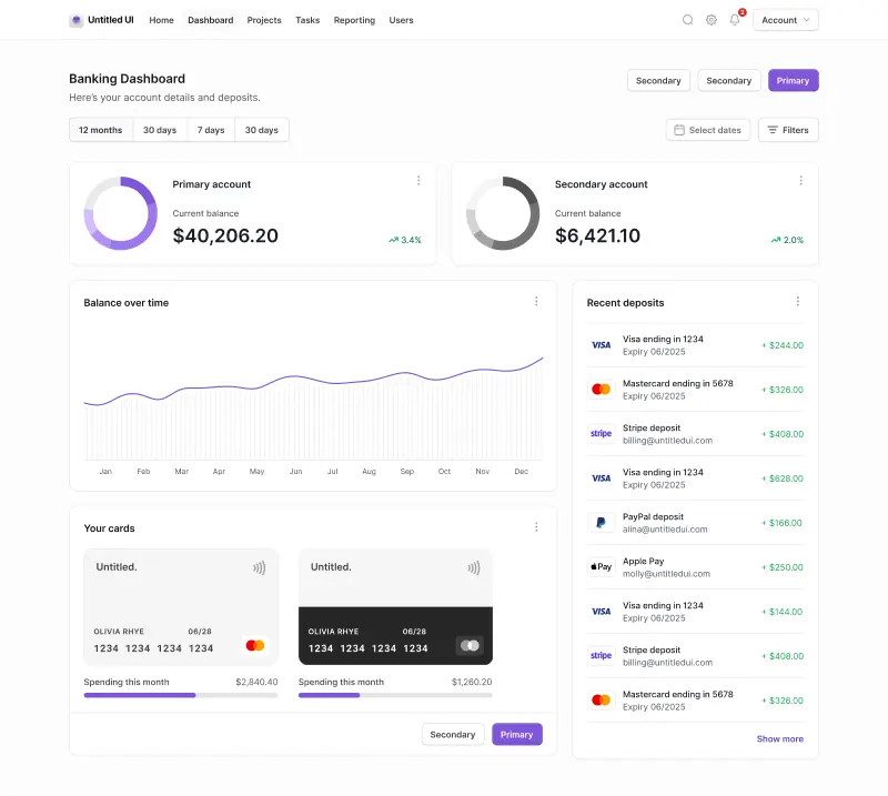
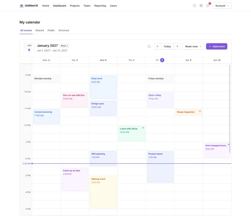
We’ve completely refactored Untitled UI to support Figma’s latest features announced at Config 2023, including color variables (dark mode), spacing and radius variables, Auto Layout 5.0, min/max widths, Auto Layout wrapping, and much more.
What’s new in version 4.0
As always, we won't cover every pixel, but here are the main updates:
- Dark mode is here! Switch any component, layout, or page to dark mode with one click.
- Carefully designed, powerful, and easy-to-use color variables.
- Useful spacing, radius, and width variables.
- Huge Auto Layout 5.0 updates, including dynamic container max-widths and Auto Layout wrapping for more responsive designs.
- Truncated text wrapping added to components (e.g. blog cards) for perfect balancing of dynamic content in your designs.
- Scoping set up for all variables, making them easier to find and apply to your designs.
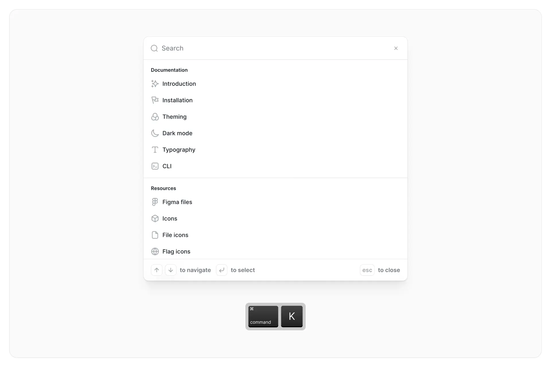
- We've added keywords to all icons for faster searching. Looking for a file icon, but can't remember what it was called? Now you can search file, attachment, text, paper, pdf, or report.
- Improved button components so they remain perfectly optically balanced when used with icons (hat tip to @JordanAmblin for this awesome tweak!)
- Destructive buttons have been moved to their own component so the main button component contains fewer variants and is easier to maintain (this also makes it lighter to use across the system).
- Improved accessibility contrasts across the entire system, particularly for text in components.
- Expanded, improved, and updated documentation throughout Untitled UI.
- New in-depth guide and documentation on variables, including how to use variables, how variables are named, and other best practices and tips.
- “Primary” color styles and naming convention switched to “Brand” for consistency with the variables naming convention.
- Simplified and improved hundreds of other components so they look nicer, are easier to use, and/or are more accessible.
There’s more. You now have access to three different versions of Untitled UI, depending on your project or how you prefer to work:
- Untitled UI PRO VARIABLES: Supports all the latest features announced at Config 2023, including color, spacing, radius, and width variables (including dark mode!) and Auto Layout 5.0 (min/max widths and wrapping).
- Untitled UI PRO STYLES: Supports the latest updates such as Auto Layout 5.0 (min/max widths and wrapping) but does not include variables for those who prefer to keep their workflow simple.
- Untitled UI PRO LITE: Our lightweight version of the full Untitled UI PRO STYLES kit has also been updated to support Auto Layout 5.0 (min/max widths and wrapping). It’s 55% lighter and faster and is designed to include everything you need.
Why have we released three different versions?
As we mentioned, we’ve split the Untitled UI PRO into three different versions:
- Untitled UI PRO VARIABLES
- Untitled UI PRO STYLES
- Untitled UI PRO LITE
Why? This was a pragmatic decision so you can choose which system works best for your workflow or project. Designers and teams should feel empowered, not overwhelmed. If you aren’t using design tokens or variables already in your projects, it can be easy to feel overwhelmed.
If building and maintaining 3x versions of the same file sounds like an insane amount of work, please know that it was! However, we firmly believe using variables is not the best approach for everyone. It’s okay to continue using styles if you want to — we’ll dive into this more below.
We will continue to update a non-variables version of Untitled UI for the foreseeable future so you can continue to work with styles if you prefer to. It’s just as up-to-date with all the other new features announced at Config 2023.
Similarly, we first introduced PRO LITE way back in v2.6 as a premium and lightweight version of the full Untitled UI PRO STYLES kit. It's 55% lighter, and faster, and is designed to include everything you need and nothing you don't. It's perfect for moving fast and for smaller projects and is an incredibly powerful UI kit in its own right.
Do I need to use variables?
Variables are an exciting and powerful new feature in Figma. They bring another level of functionality, scalability, and flexibility to an already incredible design tool and bridge the gap between design and development even further.
The most commonly asked question we get from designers is, “Do I need to use variables?”. The answer is no. You don’t have to if you don’t want or need to.
It’s easy to get caught up in shiny new tools and design tokens have been one of Figma’s most anticipated features. However, implementing, managing, and using variables brings another level of complexity to the design process and your design projects. Adding, editing, and applying variables in Figma is more time-consuming than using styles. Anyone who tells you otherwise hasn’t used them in real projects.
The way we think about it is this; if you’re a large team, you’re already using design tokens in your design to development workflow, or absolutely need to have dark mode for every component and layout, then it probably makes sense to invest the time and effort to implement and use variables, just like it would make sense to use tokens in development.
If you’re a solo operator, a small team, have a simple product, want to move as fast as possible, or simply don’t care too much for dark mode (hint: not every product needs dark mode), sticking with styles probably makes more sense! At least for now. Don’t feel like you need to use variables simply because it’s a brand new feature.
Another important thing to consider is that variables are still in open beta, which means they’re still ironing out bugs and are adding more functionality (more on this below).
The decision whether or not to use variables is entirely up to you. This is one of the reasons we released different versions of Untitled UI 4.0 — one using variables and one using styles. Try them both and see which suits your workflow better!
Do variables replace styles?
Perhaps the second most commonly asked question we get from designers is, “With variables, should I still use styles?”. Right now, the answer is, “We’re not sure, so keep them for now.”
The main reason this is the answer is because it’s directly from Figma’s team. Styles in Figma are still useful because they can reference multiple values at once, while variables only support one raw value. Also, styles support gradients and effects, while variables don’t yet.
It’s not clear yet how the relationship between styles and variables will evolve over time and over the course of variables beta. Styles still have their purpose for now and you should keep them in your files. The good news is that if you’re using variables, you can reference those variables in your styles so your variables act as the single source of truth.
Variables currently in open beta
If you’re new to variables, we suggest reading through the ❖ Variables documentation page included in the file. We cover everything from how to learn variables, how variables work within Untitled UI, why we made specific decisions, plus best practices and mistakes to avoid when using variables in your projects.
Because variables are so new, even the Figma team are still figuring things out. There are no defined industry standards and there isn’t a lot of practical documentation or best practice guidelines on how to use variables effectively.
It’s important to note that variables were introduced at Config 2023 and are still in open beta. This means it has plenty more room to grow and evolve as the Figma team iron out any bugs and add missing features.
We’ve been working hard to incorporate all the available features into Untitled UI but keep in mind that there are still some key features and functionality missing from variables that will likely be introduced soon. We’ll incorporate these into Untitled UI as quickly as possible.
If you’re on the fence about whether to switch to using variables yet or wait until this feature is out of beta, these are some key missing features to be aware of:
1. Support for additional properties
This is the most obvious missing feature from variables. Currently, you cannot use and apply variables to certain key properties in designs including:
- Gradient fill colors
- Stroke widths
- Effect colors such as shadows
- Layer opacities
- Independent radius values, and more.
2. Image variable type
This is the most obvious missing feature from variables. Currently, you cannot apply variables to certain key properties including stroke widths, effect colors (shadows etc.), layer opacities, independent radius values, and more.
3. Typography variable type
Figma are exploring how they want to support typography variables. Typography variables will likely provide you with a way to easily switch key typography properties across modes such as typefaces and sizing.
For example, you may want to set up typography scales to dynamically switch between breakpoints in your designs.
4. Extended collections
Figma have noted that this will be an enterprise-only feature, but soon Figma will support extended collections. This will provide teams with a way to handle theming for sub-brands with brand-specific overrides.
Thanks for reading this far! We’re excited about these 1% incremental improvements and we’re already working on the next update. Stressing these small details compounds over time.
Variables is still in open beta so we’re expecting more changes and updates soon. We’ll do our best to implement improvements into the system as soon as possible.
In other news, Untitled UI turned 2 years old last week! I truly appreciate the overwhelming support for this li’l side project. I genuinely love working on it and look forward to dedicating more time to it.


