


One of the most difficult steps when starting new design projects in Figma is creating a color palette, but it doesn't have to be!
We often get asked about our method for generating color palettes, so we've written the ultimate guide to creating color palettes in Figma. We'll cover everything from color theory, accessibility, contrasting colors, and our step-by-step guide to creating practical and useful color palettes in Figma for your web design and UI design projects.
Let's begin!
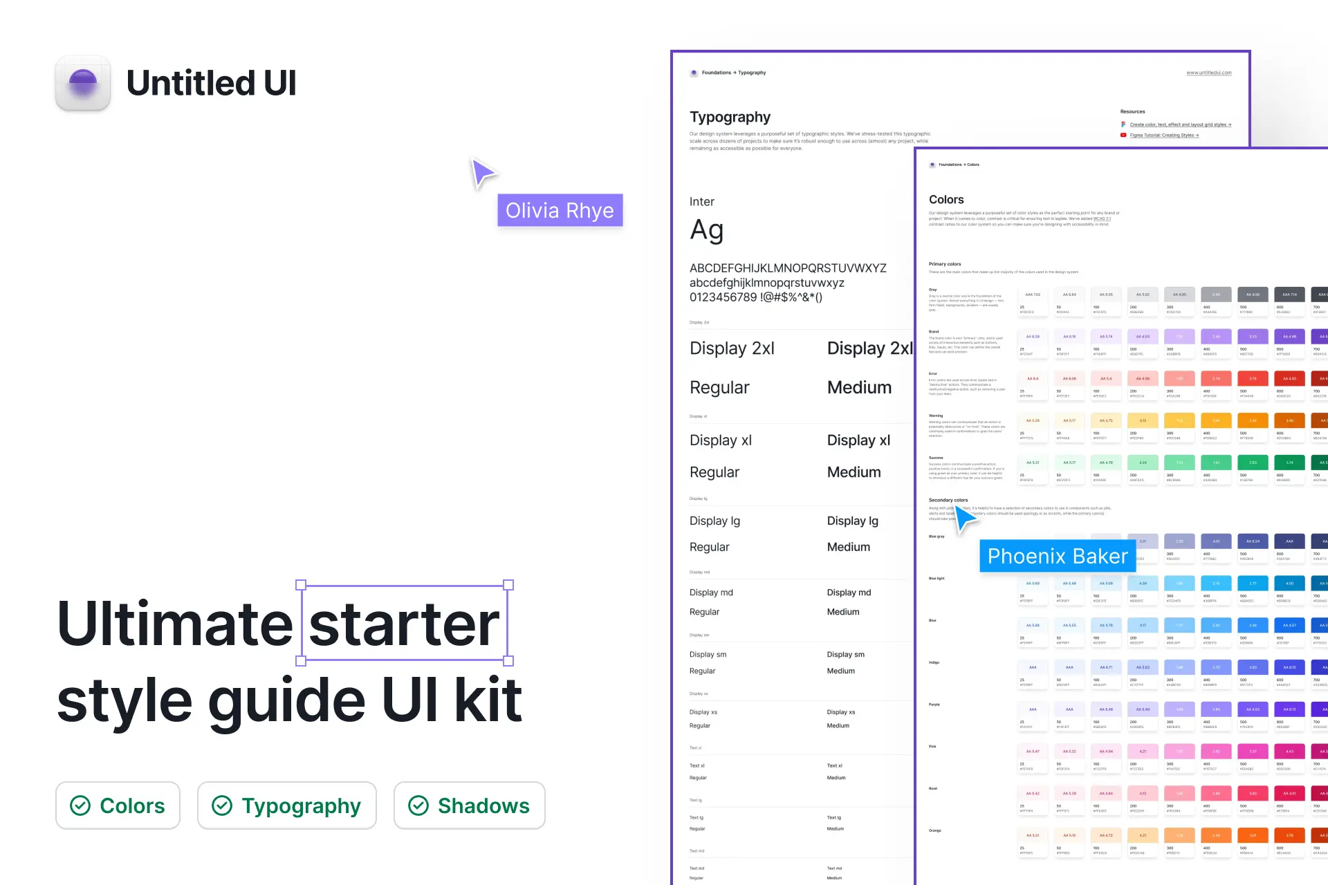
Get the free color palette Figma library
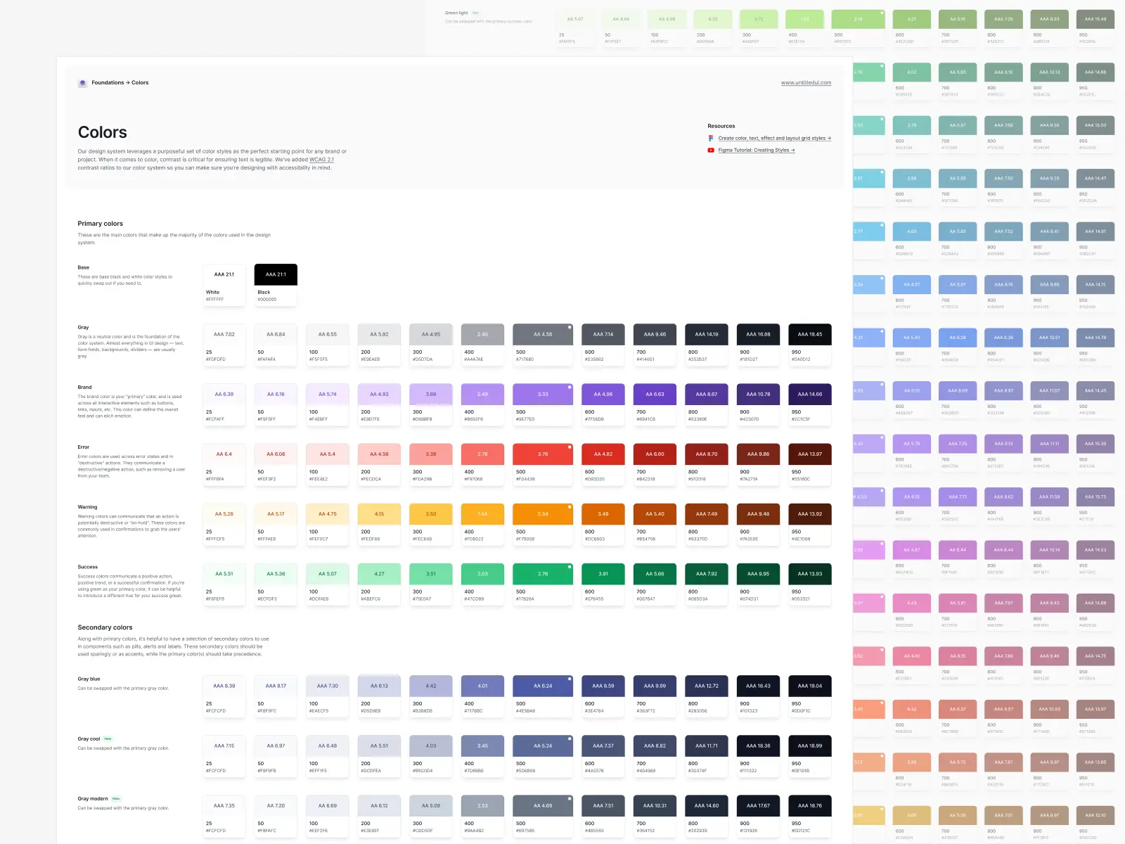
We've shared the ultimate starter style guide and color palette from Untitled UI on Figma Community to help you get started. This color system is a purposeful set of neatly organized color styles—the perfect starting point for any brand or project.
Duplicate this file via Figma Community → ❖ Ultimate starter style guide UI kit – Untitled UI
Getting your color palette right
Colors in UI design can speak in ways that are every bit as powerful as copy. Your color palette not only affects how your designs looks but can elicit emotion and reflect the personality of your brand.
Colors also play an important role in how your designs "look & feel". They're essentially the first impression. While color can be subjective, it's clear that good color palettes can attract and convert users. Bad color palettes, on the other hand, can turn away users and even make designs inaccessible and unusable.
What is a color palette?
A color palette is simply a set of primary colors (or main colors) and secondary colors that work well together, combined to form a brand. In Figma, your color palette can be set up as either color styles or as color variables. Don't worry, we'll get into how to create color styles soon!
Defining the right color palette for a design project is one of the most important steps in the design process, but it can be quite difficult to get right.
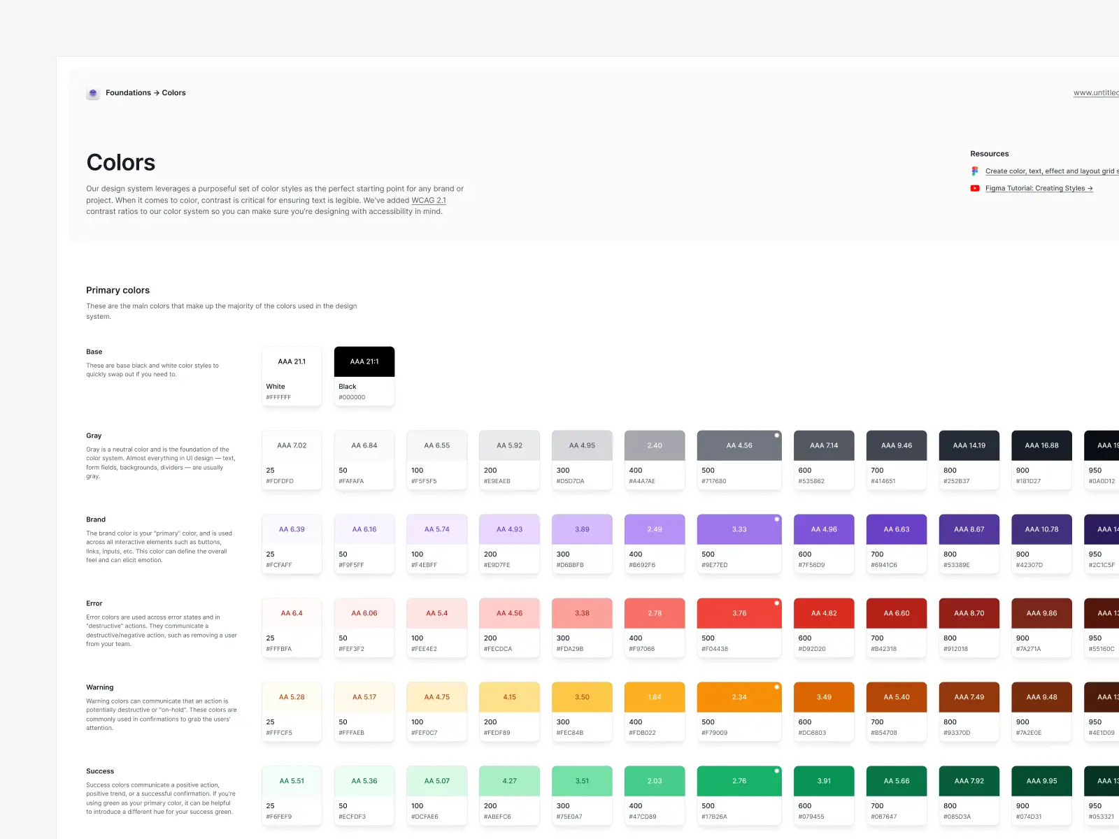
A good color palette should contain neutral colors (usually grays), primary colors (also known as brand colors), and accent colors (also known as secondary colors). It's also good to include feedback colors (green for success and red for failure), especially if forms are an essential part of the functionality.
Neutral colors
Gray is a neutral color and your gray color palette is the foundation of the color system. It's one of your main colors simply because almost everything in UI design—text, form fields, backgrounds, dividers—are usually gray.

Brand colors
This is your "brand" color which is used across all interactive elements such as buttons, links, inputs, etc. This color palette is one of your main colors and can define the overall feel and can elicit emotion. You can have more than one primary color but start with one.
Accent colors
These act as "secondary colors" or "supporting colors" to your primary color palette. These are useful for grabbing attention or supporting your primary/brand color. They're also useful for components such as labels and badges.

Feedback colors
Feedback colors emphasize different semantic states. They're used to provide visual feedback and/or warnings to users as they use your interface.
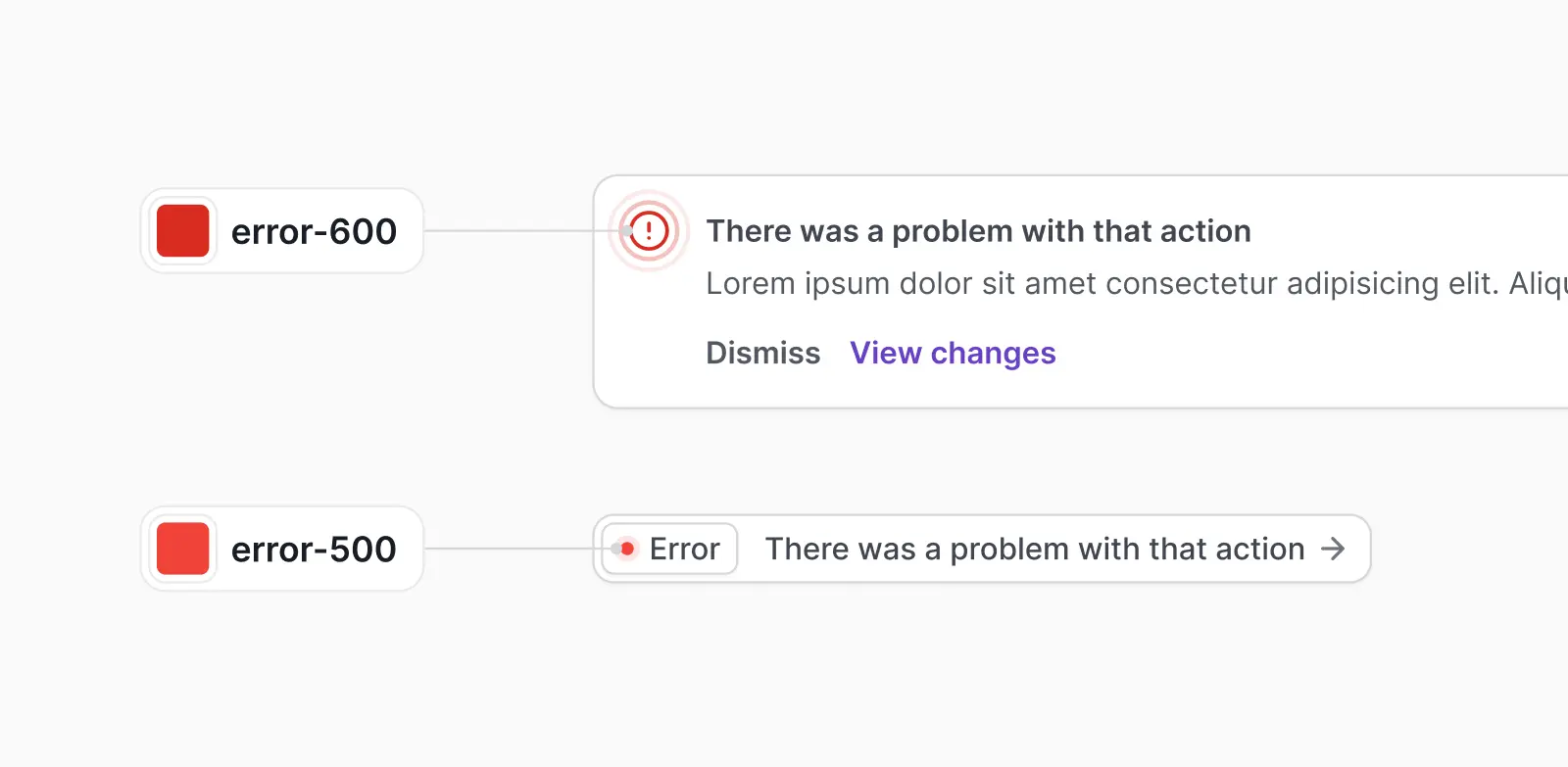
Error colors
Error colors are used across error states and in "destructive" actions. They communicate a destructive/negative action, such as removing a user from your team.
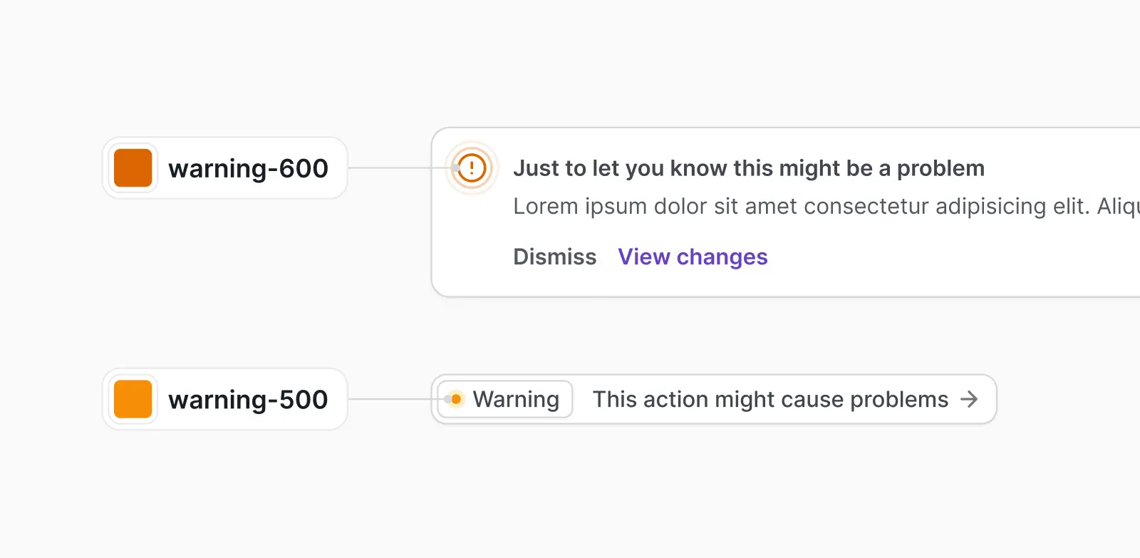
Warning colors
Warning colors can communicate that an action is potentially destructive or "on-hold". These colors are commonly used in confirmations to grab the users' attention.
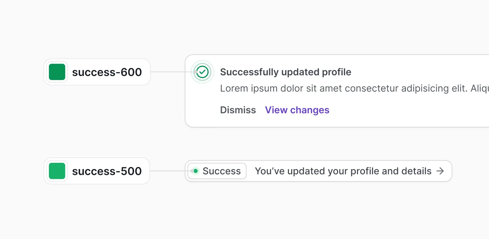
Success colors
Success colors communicate a positive action, a positive trend, or a successful confirmation. If you're using green as your primary color, it can be helpful to introduce a different hue for your success green.
Define your color palette at the start
We recommend defining your color palette at the start of your design projects rather than making it up as you go. It's much harder to go back and set everything up later.
A lot of designers fall into the trap of using the color picker or color wheel when designing UI; using hex codes instead of setting up color styles. Having the freedom to choose unlimited colors from a color wheel in your designs might sound easier, but it only results in inconsistencies, a lack of hierarchy, and a confusing mess for the user.
Defining a color palette instead of a bundled mess of hex codes, even just a simple one, is essential for the design process. It will save huge amounts of time and headaches down the track. This only gets more important as you start handing designs over to devs to implement—how are they supposed to know which hex codes to use for different use cases if your designs look like this?

When defining your color palette, it might feel like a waste of time figuring out specific shades of every color you're working with. However, it won't be long until you're in need of more colors as your component library grows and evolves. It's a much better idea to define these properly from the start, so you don't box yourself into a limited color palette.
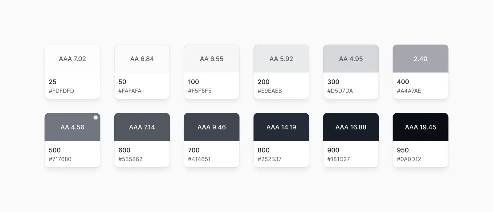
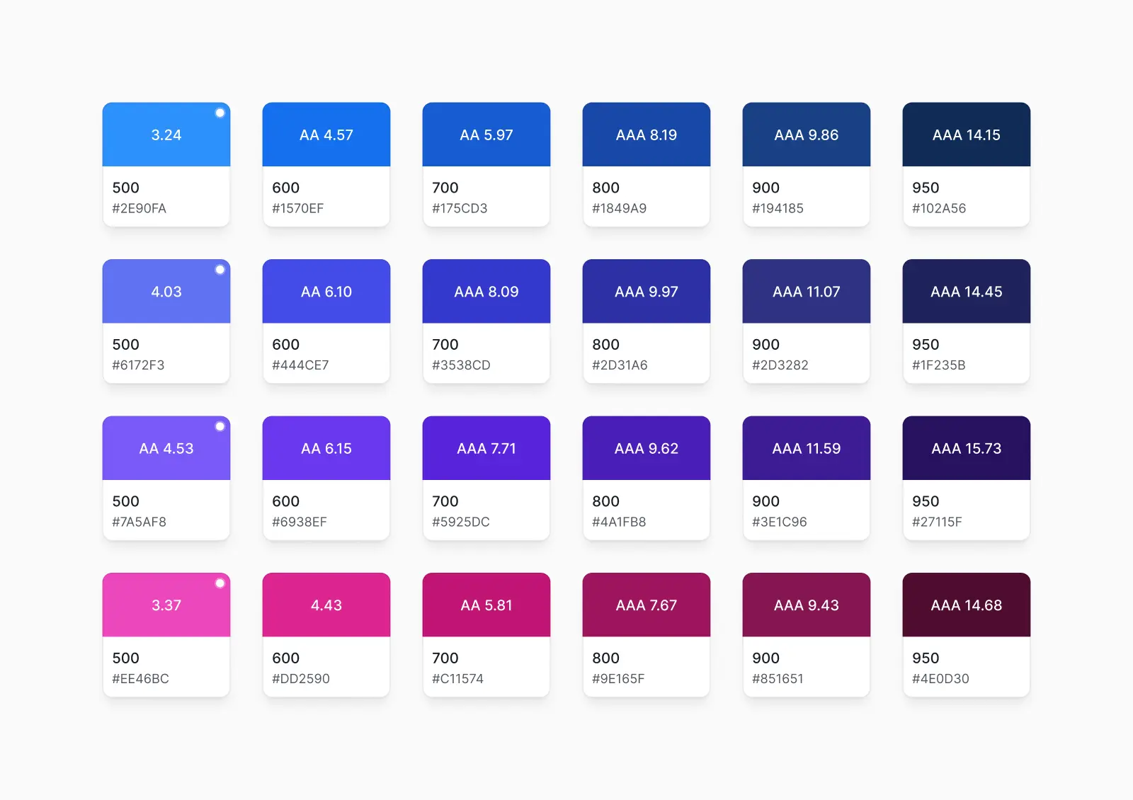
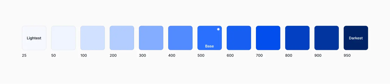
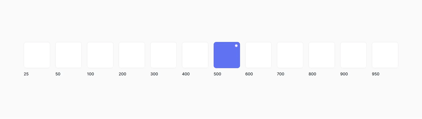
Aim for 8-12 shades of each color
You don't need 50 different hex codes and shades of gray in your color palette. This will only create a paradox of choice where you won't be sure which gray to choose for different use cases.
Similarly, it's easy to fall into the trap of not setting up enough shades of gray in your color palette. While this might work for a while, you'll quickly run into instances where you need something "a little lighter" or a "little darker" for careful UI design work.
We recommend aiming for 8-12 shades of different colors in your color palette and using them intentionally and consistently across all of your components. For example, always use gray-300 for input field borders and gray-200 for dividers:
Having 8-12 shades is particularly useful for the gray and neutral colors in your color palette because they are used so often in your designs—text, form fields, backgrounds, dividers—are usually gray.
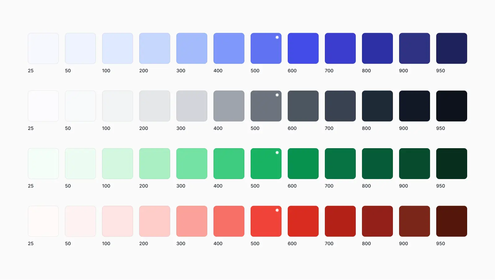
We recommend 12 shades for each color
From our experience, a color palette that uses 12 shades of each color is the perfect amount and covers everything you need for modern UI and web design:
This may sound like a lot, but you'll be surprised how easy it is to quickly establish a pattern. It's much easier to define your color palette before you start than it is to realize you need a larger color palette later on.
Untitled UI is based on a color palette that uses 12 shades of each color:

This naming convention is based on the popular Tailwind CSS and Material Design color naming conventions. It is made up of the color (e.g. blue or success) and a numeric scale from 25-950 (25 is the lightest and 950 is the darkest).
How to create your color palette in Figma
Now we'll get into our step-by-step guide for creating color palettes in Figma.
If you've used Untitled UI before, you will see it is already set up with a purposeful color palette of neatly organized color styles. The default Untitled UI color palette is designed to be the perfect starting point for all types of design projects.
However, if you already have brand colors or want to create a custom color palette, follow this guide to create a dynamic scale of 12 shades for each color in Figma.
Step 1: Define your brand or primary color
The first step is to define the base color for your brand. This is also known as your primary color and will sit at brand-500 on the scale. This is the first step because we will use this base color (brand-500) to define the hex codes for all of the lighter and darker shades of your brand color in your color palette (brand-25 to brand-950):
What if you already have a color you would like to work with?
But what if you already have hex codes or colors that you want to work with? Perhaps you've been given a style guide or a limited color palette to work with that already has a brand color.
If this color is too light or too dark to be the base color (brand-500), you can use this color to create your base color. Place the color on this scale as accurately as you can by comparing it to a similar color in the color palette

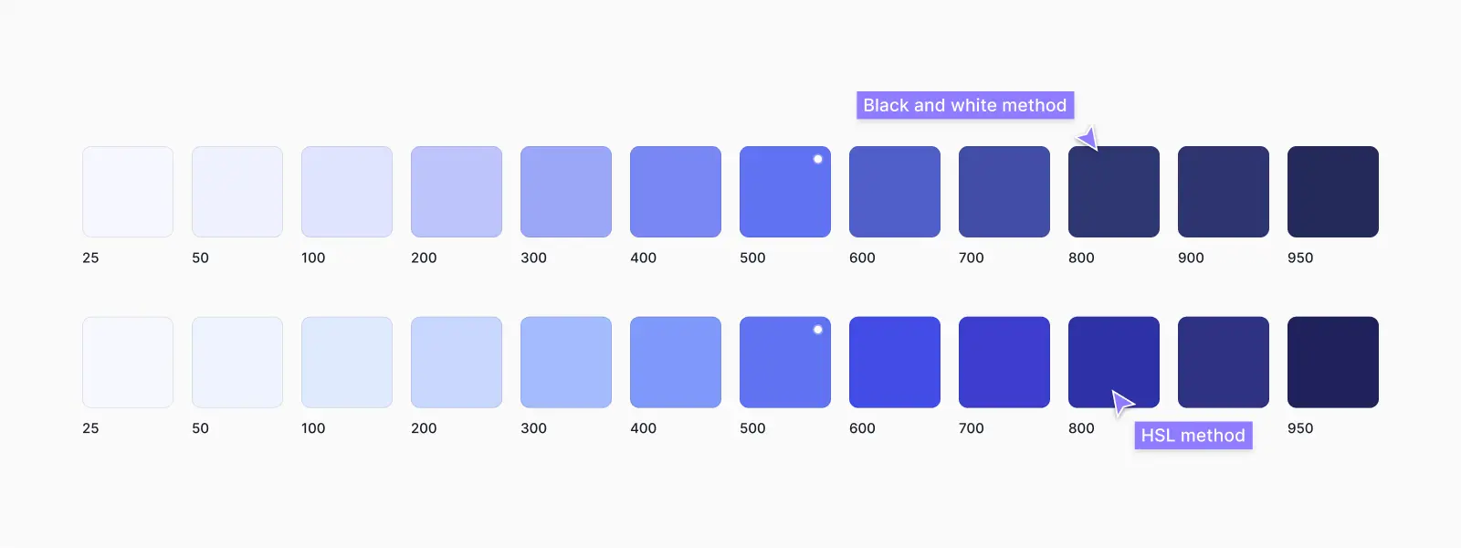
Adjust lightness and saturation in HSL
You can then copy this color and tweak it to find the base color at brand-500. Do this by adjusting the color model values in Figma, specifically lightness and saturation in the HSL values instead of hex codes. The aim here is to adjust these values in your starting color until it matches optically with other colors at the 600 shade:
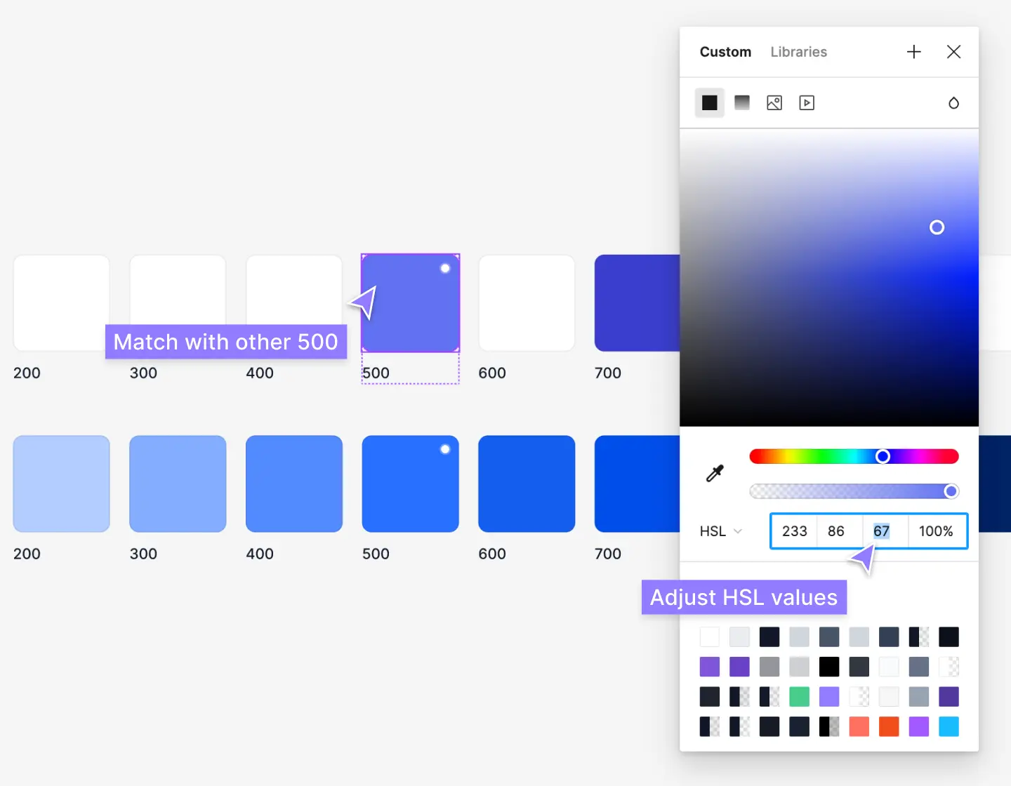
This is not an exact calculation/formula, unfortunately! The matching depends largely on the hue and every color behaves differently. For example, a blue-500 color with -10 lightness to create a blue-400 does not necessarily mean it'll match optically with a purple-500 color with -10 lightness to create a purple-400.
One is likely to look "brighter" than the other and needs to be tweaked by a human. You'll have to use your eyes until it "looks" right alongside contrasting colors and other colors in the color palette.
Start with the lightness values first and then tweak the saturation values after. Too much saturation tends to make colors look "brighter" than other colors in your palette, while too little can make them look too muted and dull. Saturation has less impact at the lighter and darker ends of your color scale where you may need more saturation for color to come through.
Step 2: Define brand-25 and brand-950
Adjust the lightness and saturation in the HSL values to define your lightest (brand-25) and darkest (brand-950) colors:
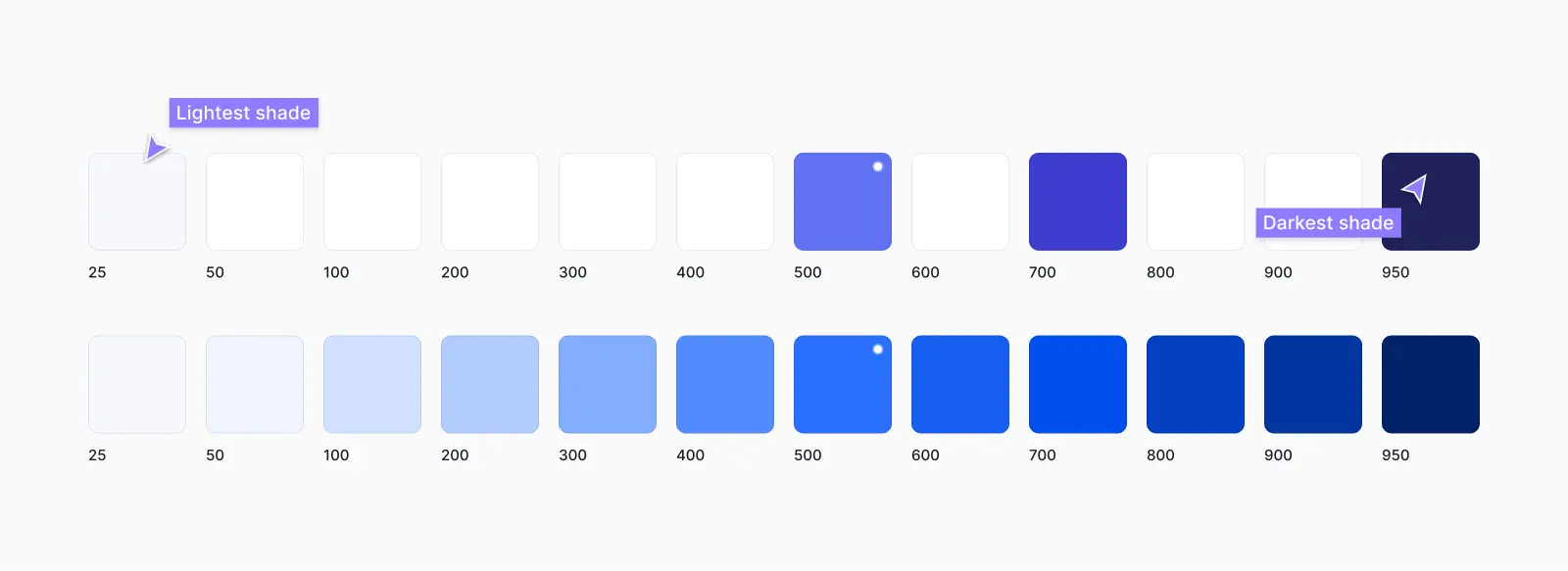
This is the same method as above, but it should be much easier to match optically with other colors in the color palette. Generally, lighter shades from 25-100 are used for backgrounds, and darker shades from 900-950 and used for high-contrast text.
Once again, this isn't an exact science. You'll likely need to adjust the saturation as well and just tweak them until you're happy with them.
Step 3: Fill in the gaps
The next step is to fill in everything in between! Use the same HSL values method as above to pick shades in between. It's usually easier to start with brand-200 and brand-700 first and then move on to the others.
This might take some time. The goal here is to create a smooth balance across the scale, while ensuring the color scale matches optically with other colors in your color palette. They should "look" like they're the same lightness and brightness:

Step 4: Repeat for your neutral and accent/secondary colors
Once you're happy with your brand color scale, you can move on to your neutral (gray) colors, as well as your secondary colors and feedback colors. The process is the same, but this time you should also pay close attention to the saturation of the other colors in your color palette.
Remember, more saturation tends to make colors look "brighter", while less makes them look muted. If your brand color is bright and playful with high saturation, you may have to adjust your other colors accordingly so they "look right" and work well together:
Alternative methods to create your color palette in Figma
Creating your color palette in Figma from scratch can be time-consuming! We recommend the method above, but another common method for creating color palettes in Figma is by placing squares with a white background or a black background over your base color with varying levels of transparency for each square.
The overlay squares have the effect of creating a new color. You can then use the color picker to find the exact hex codes of each shade:
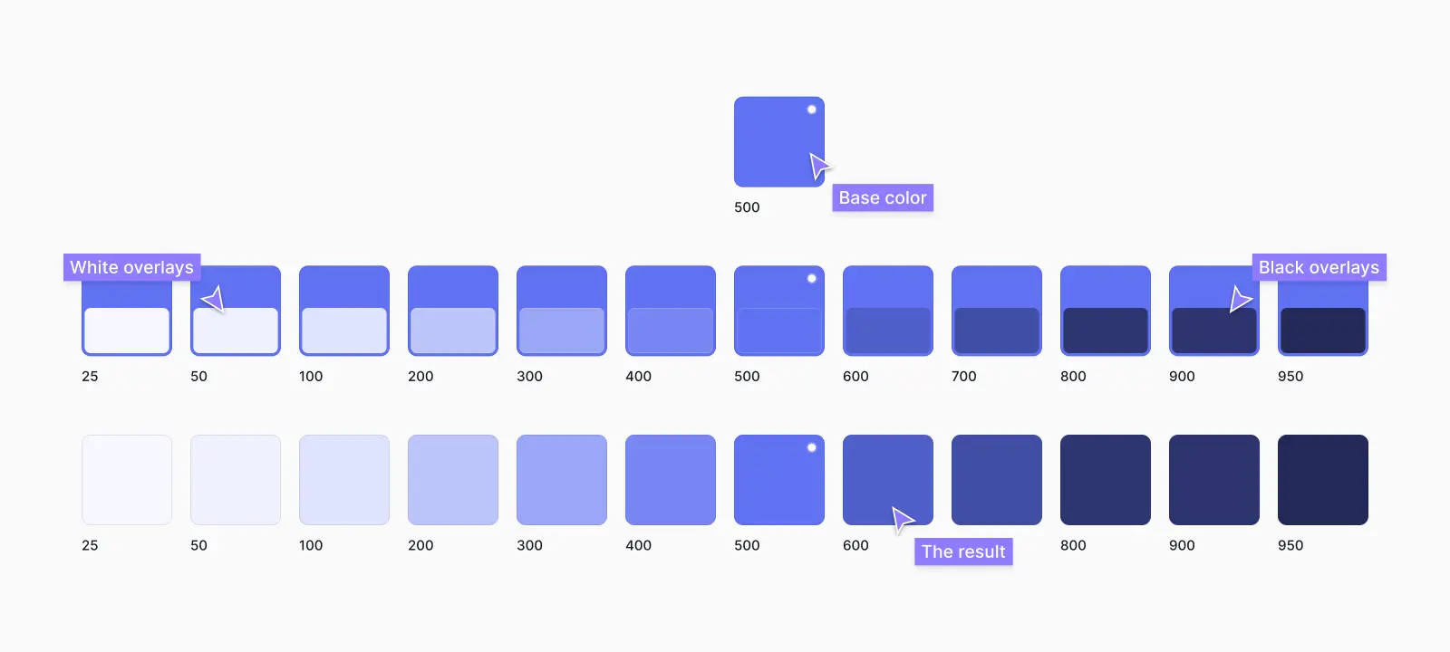
While this approach is relatively easy, we generally don't recommend it because it lacks finer control over the saturation values in your colors. This is particularly evident when defining the darker end of your color scale (600-950):
This method can also be inconsistent when creating large color palettes because every color behaves differently depending on the hue. Therefore, using the same transparency values for the squares across different colors will not have the same results.
Using online color palette generators
There are hundreds of color palette generators on the web. We've found that most of these are too limited. They either spit out unusable color combinations, don't provide you with enough usable shades of colors, or both.
Popular color palette generators like coolors.co can be useful for coming up with ideas, but modern UI requires a much larger range of colors to work with.
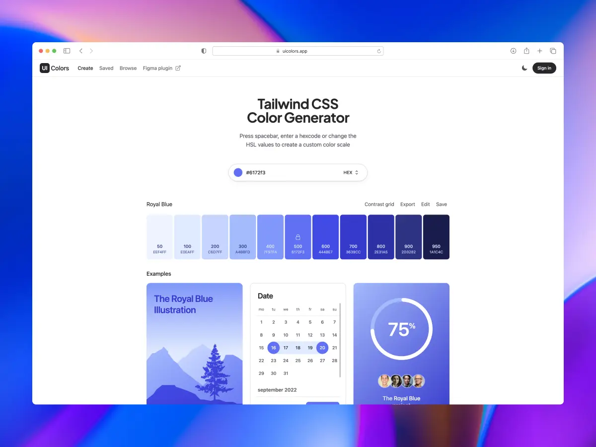
The best online color palette generators
We recommend sticking to color palette generators that are made specifically for Tailwind CSS and Material Design because they generate 8-12 shades of each color. You can copy the hex codes from these squares into Figma. Here are some of our favorites:
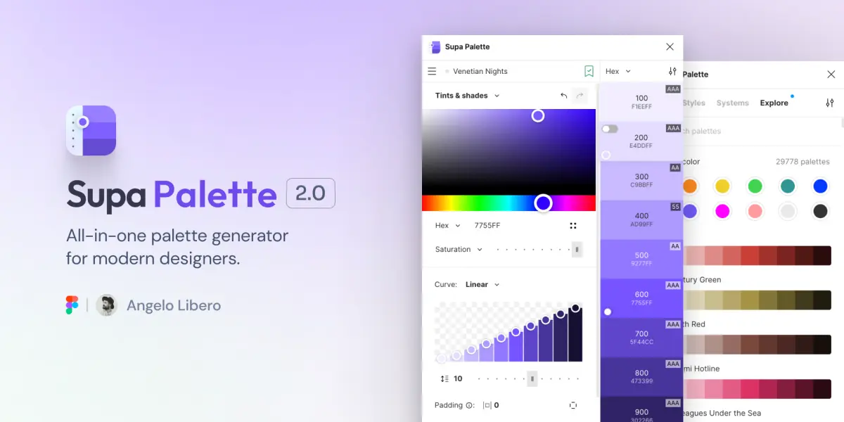
The best color palette generator Figma plugin
Recently, there have been some incredible Figma Community plugins that can help you generate color palettes.
Supa Palette by Angelo Libero is our favorite Figma plugin for generating color palettes. It's insanely useful for exploring different color palettes and generating your custom color palette. You can even access 15 popular color systems to find something that works for your project.
You can install this Figma plugin via Figma Community and try it out.
Fine-tune your color palette in Figma
Online color palette generators can save you a lot of time, but they generally don't take into account secondary colors or the different ways the colors will work with existing colors in your color palettes.
You can always fine-tune your color palette in Figma so it works well with other secondary colors using the HSL method above.
How to set up styles for your color palette in Figma
Figma has recently introduced Figma variables at Config 2023, which (kind of) replace styles. If you're completely new to Figma, don't worry too much about variables just yet! Generally, at the start of each project, you will decide whether or not you want to work with Figma styles or a mixture of Figma styles and Figma variables.
If you're interested in learning more about variables, we recommend checking out Figma's YouTube tutorial Figma tutorial: Intro to variables and their documentation Guide to variables in Figma. We've also written a detailed guide on variables and some best practices in Untitled UI. Preview Untitled UI in Figma and check it out.
We're not going to get into variables in this guide. Here's how to set up styles for your color palette in Figma:
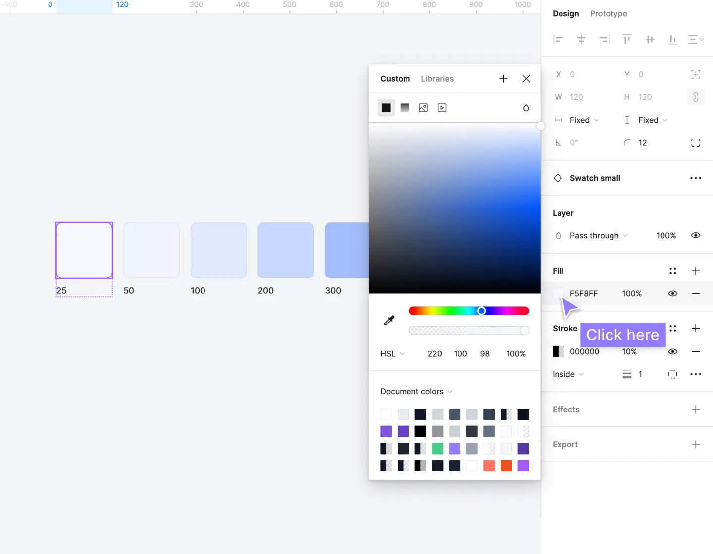
Step 1: Open the color picker modal
Arrange your color palette as squares in Figma and select one. It's easiest to start at brand-25.
In the right sidebar, go to fill and click on the style icon. This will open up the color picker modal:
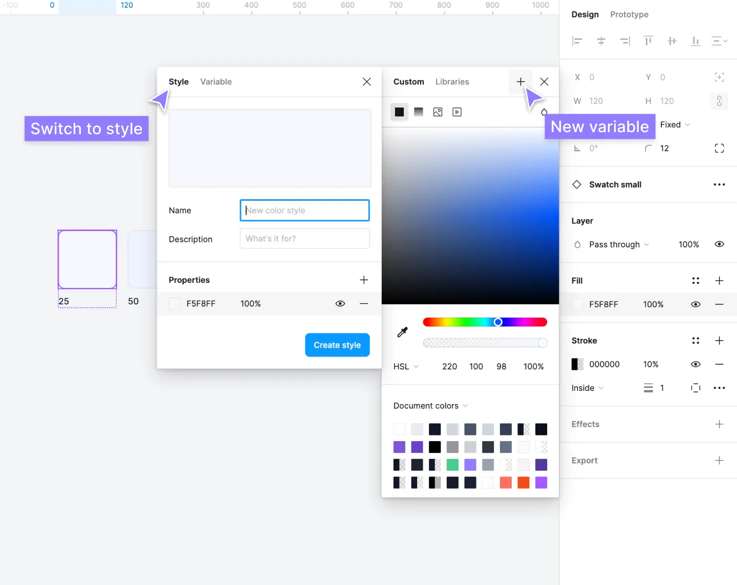
Step 2: Create a new style
At the top of the color picker modal, you'll see a plus icon to create a new variable. This will open a second modal. At the top of this modal, switch to style to create a new style:
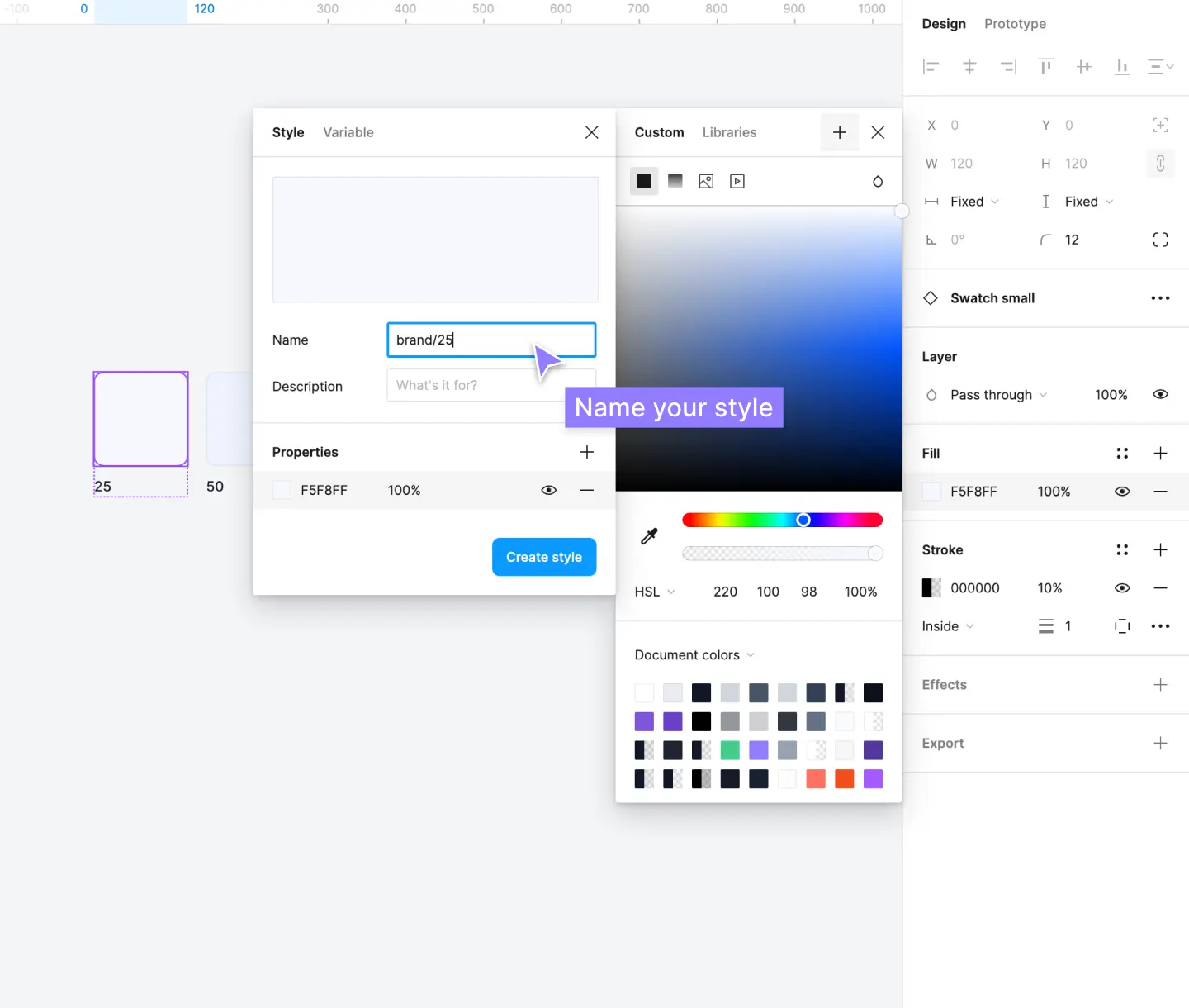
Step 3: Name the color style
Give the color style a name. Use the naming convention color and shade on a scale from 25 to 950 as shown above. For example, brand/25.
When you separate a style name with a slash "/", this instructs Figma to group the styles into a folder. You can rearrange and group these styles via the styles panel later on if needed:
Step 4: Repeat for all colors in your color palette
Repeat for each square one-by-one. Easy as that! Once you've completed all of the colors in your color palette, you'll have these set up as neatly organized folders in Figma.
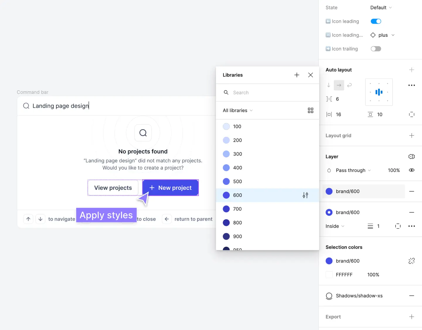
From here, you can use these styles locally in a design project, or publish them as a Figma library to use in multiple design projects:
Check color accessibility as you use your color palette
When choosing the right colors in UI and web design, accessibility should always be front of mind. Contrasting colors, such as text on a background, should always be easy to read.
Many designers ignore basic color theory and accessibility fundamentals and design products that don't meet basic accessibility standards. Google now even penalizes websites with low-contrast text and inaccessible color palettes!
It doesn't have to be complicated. Good practice simply involves making sure color combinations are as suitable for everyone—older users, visually impaired, color-blind, and others (including users on low contrast, low-quality displays). Great UI design should be easy to "see" for everyone.
Color accessibility and contrasting colors ratios is mostly tied to text. More specifically, how legible or easy-to-read text is on a screen. Ensuring all of your design components and contrasting colors have sufficient contrast levels will go a long way for users with vision problems.
As you use your color palette in your design projects, ensure that the shades you're using pass the WCAG 2.1 Guidelines below.

About WCAG 2.1 Guidelines
A great way to make sure your designs are accessible is to check the Web Content Accessibility Guidelines (WCAG) 2.1 contrast ratio for all text elements in components. You can dive pretty deep into this, but at the most basic level WCAG 2.1 guidelines are categorized into three different levels based on how accessible they are:
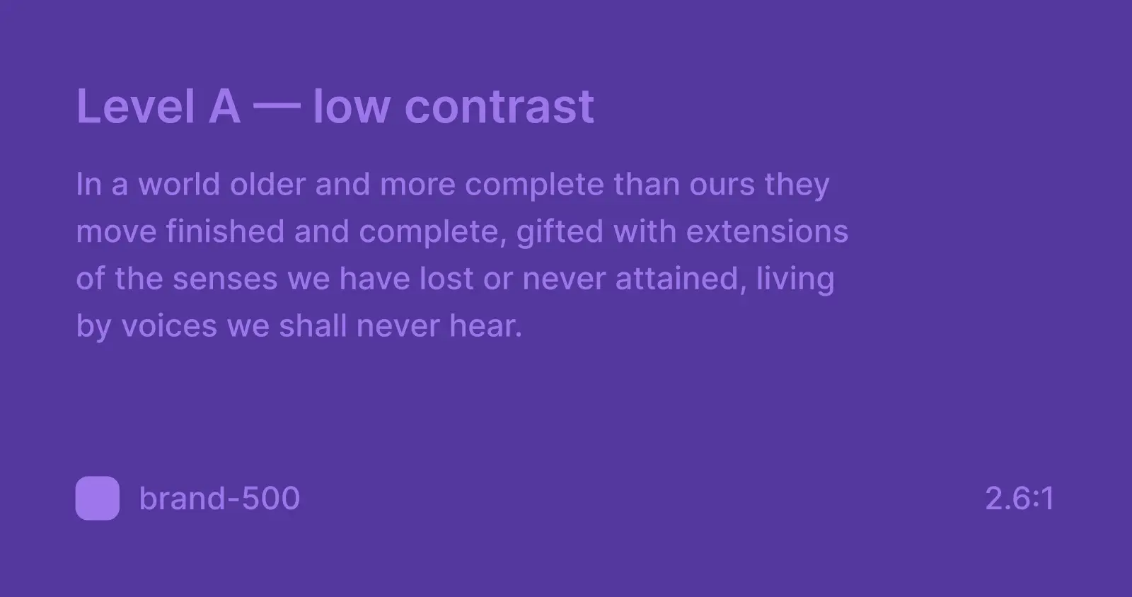
Level A — low contrast — less than 4.5:1
Not suitable for any text elements. You can generally ignore the contrasting colors between decorations and non-important parts.
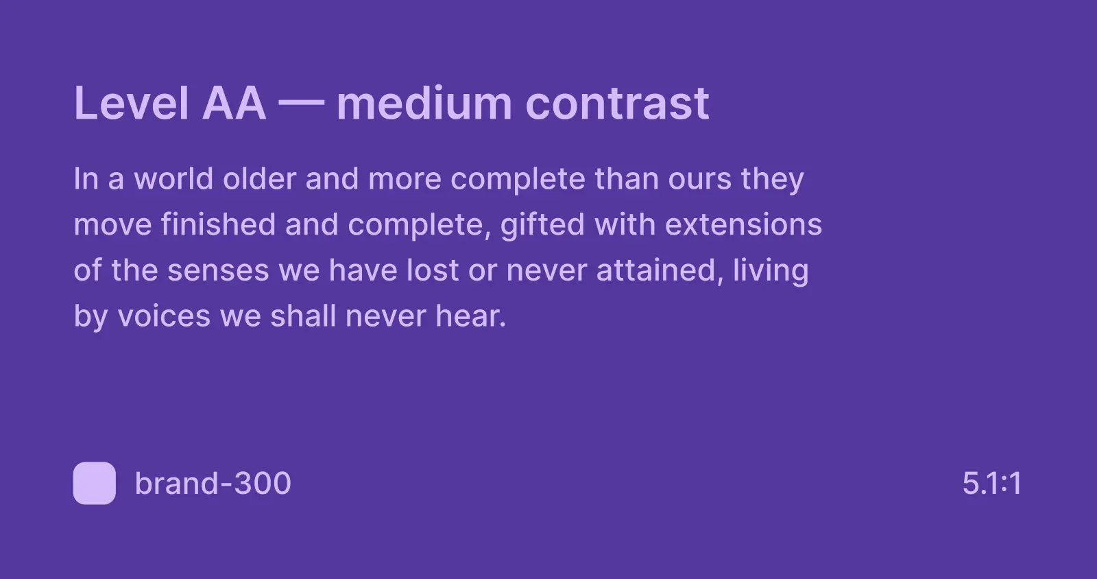
Level AA — med contrast — more than 4.5:1
A minimum level of contrasting colors accessibility for all your most crucial UI elements (text, buttons, forms etc.) This should be the default.
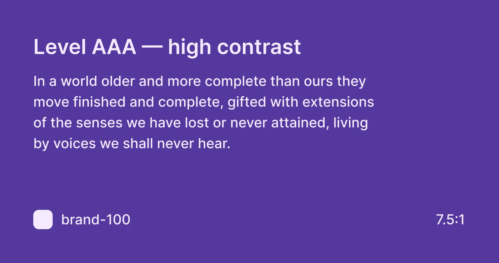
Level AAA — high contrast — more than 7:1
Super-high contrast ratio isn’t a requirement, but it’s a nice-to-have—strive for it where possible, but not 100% necessary.
How much contrast do you need?
As a good general rule, maintain at least a 4:5:1 contrast ratio (WCAG AA) for all of your most crucial UI elements (text, buttons, forms, etc.). Meeting the AA requirement is sufficient for the majority of users and compensates for the loss of contrast sensitivity by users with 20/40 vision loss.
Quickly test contrast in your designs
There are a bunch of online tools that allow you to check contrasting colors and their ratios by entering a foreground and background color. WebAIM is a popular one.
There are also some free Figma plugins in Figma Community to check color combinations and contrast ratios right in Figma as you design. These allow you to check the color contrast ratios of all visible text in a frame by selecting them in Figma:
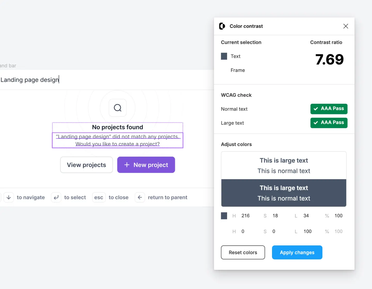
We like Figma plugins that also show you the specific color contrast ratio, along with the rating, so you can see when you make improvements. Here are some of our favorites:
Get the free color palette Figma library
We've shared the ultimate starter style guide and color palette from Untitled UI on Figma Community to help you get started. This color system is a purposeful set of neatly organized color styles—the perfect starting point for any brand or project.
Of course, you don't have to use this color palette in your own design projects, but we recommend exploring it to help you learn how to set up a practical and useful color palette in Figma.
You can duplicate this Figma file and even publish it as a library to use across all your design projects:
- Duplicate to your Figma account
- Publish your copy as a library
- Enable your library in your files for instant access to your color palette
Duplicate this file via Figma Community → ❖ Ultimate starter style guide UI kit – Untitled UI
You can always edit your color palette
That's it! We hope this guide on creating color palettes in Figma was useful. The beauty of setting up styles in Figma is that you can always tweak and edit your color palette as you go.
Don't be afraid to experiment with this—you may find that your initial brand colors are too saturated, or your neutral (gray) color palette is too light and is causing accessibility issues.
More best practice guides
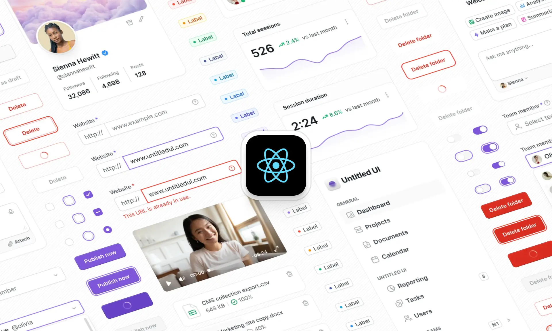
This post is an exert from Untitled UI Figma, the largest and most popular Figma UI kit and design system in the world. Untitled UI includes tips and best practices right in the Figma file to help you level up as a designer.
Untitled UI Figma is the largest and most popular Figma UI kit and design system in the world. It's meticulously crafted with 100% Auto Layout 5.0, super-smart variants, Figma's newest variables features, and with accessibility in mind.
It's a great example of Figma design system best practices and is the most popular and highest-rated Figma UI kit on the internet with 2,200+ 5-star reviews!
They've also released Untitled UI Figma PRO LITE, which is a premium and lightweight version of the full Untitled UI Figma PRO STYLES kit and have included it for free. It's 55% lighter, faster, and is designed to include everything you need and nothing you don't. It's perfect for moving fast and for smaller projects!
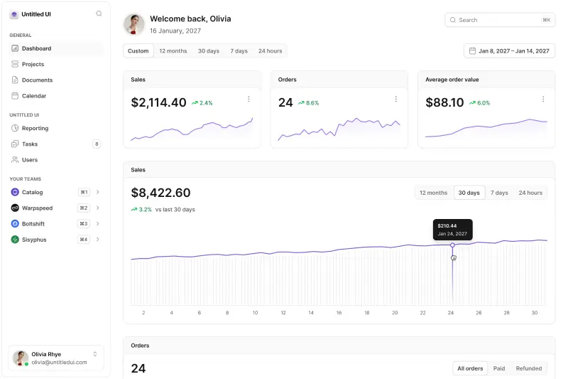
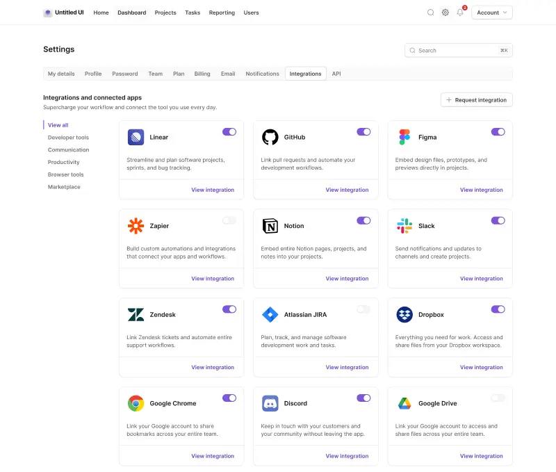
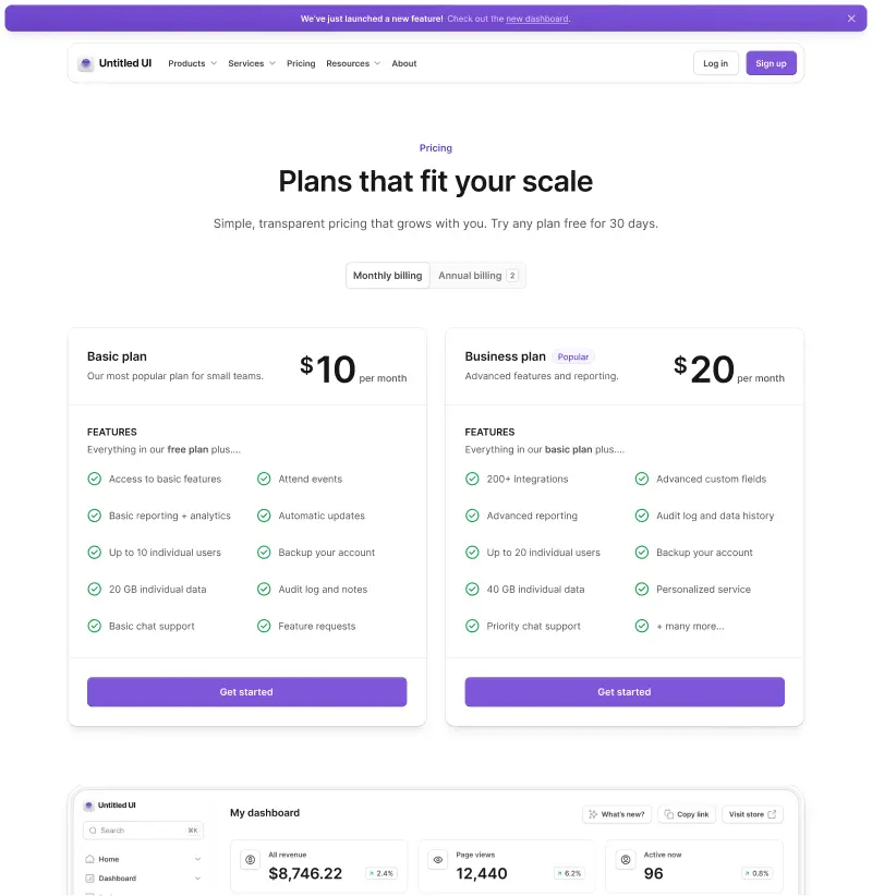
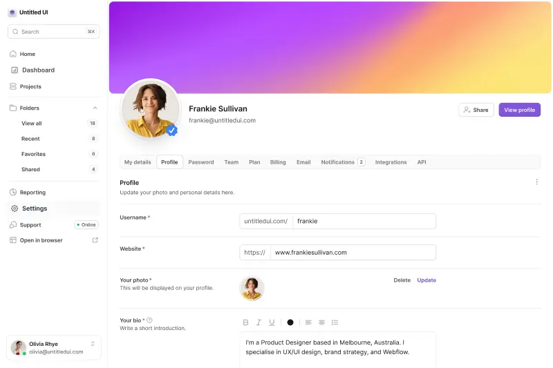
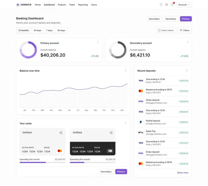
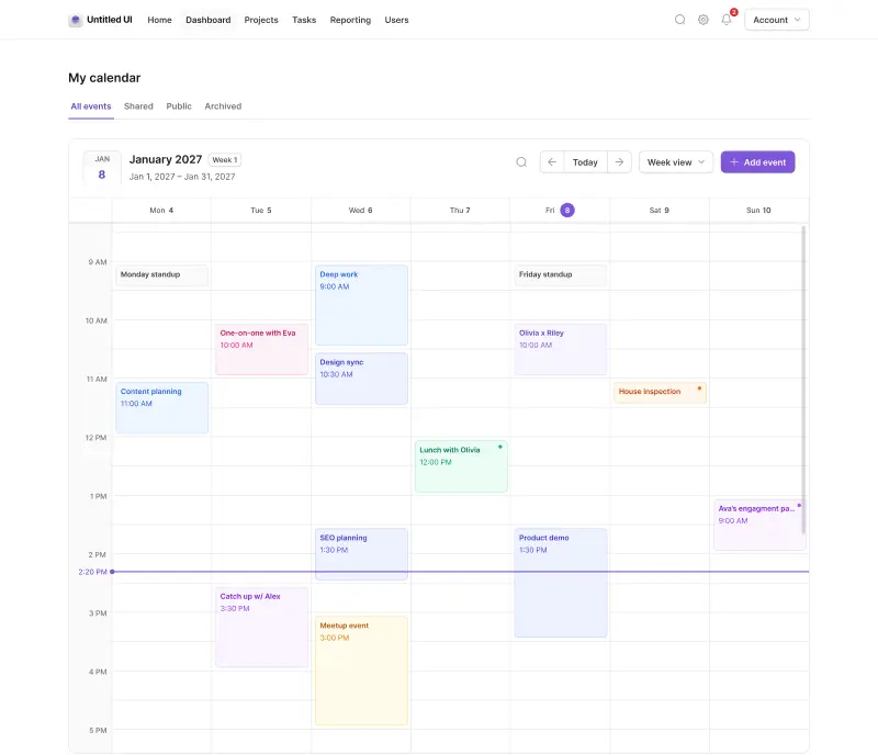
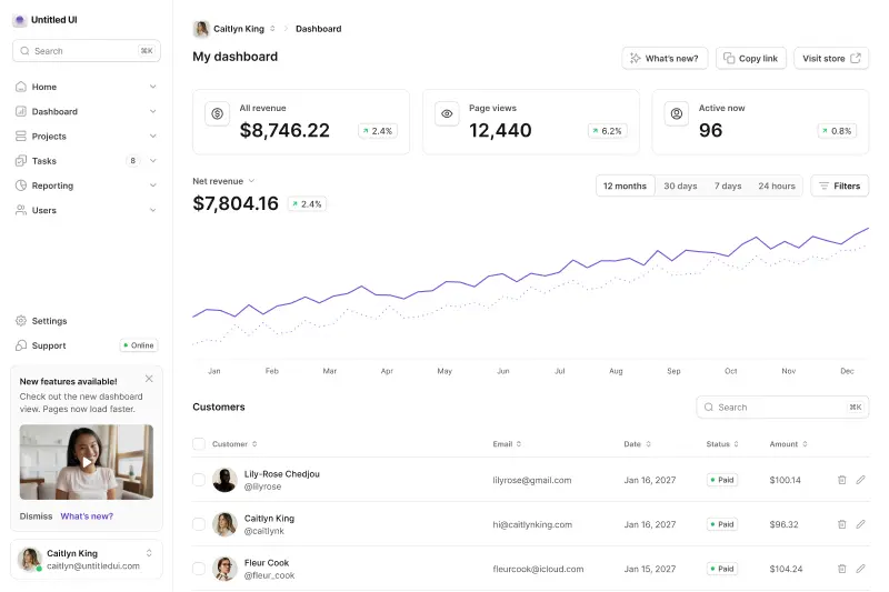
Untitled UI was designed to be the "ultimate" UI kit and the perfect starting point for any kind of project—from beautiful marketing landing pages, all the way to complex dashboards and web apps—Untitled UI has thought of absolutely everything so you don't have to.
The team behind Untitled UI are constantly making updates and improvements to the UI kit and recently announced they've completely refactored Untitled UI to take advantage of Figma's latest features released at Config 2023, Framework 2024, Config 2024, and Config 2025. This includes all the latest Figma features such as color variables (dark mode), spacing, radius, typography, and effects variables, Auto Layout 5.0, min/max widths, Auto Layout wrapping, and much more.
You can check out a full preview of the design kit, or check out the 100% free UI kit here (which is more advanced than most UI kits in its own right!). If you're short on time, here's a 60-second overview:
Untitled UI blog
More design resources


Untitled UI is the best $ I've spent on my business in a long time. I'm going to keep using it and recommending it to every designer I know.
Over the years we've featured hundreds of UI kits on UXCrush, but Untitled UI is by far the most comprehensive and detailed I've seen yet. A must have for any designer!
I've used all UI kits on the market. I can say without a doubt that the Untitled UI kit is the best on the market. It covers everything a designer needs in a modern and efficient way.
Incredible, and keeps getting better. I’ve tried dozens of UI kits and Untitled UI is the only name you should care about. It stands head and shoulders above the rest.
Such a beautiful, detailed, and extensive UI kit. Untitled UI is the perfect foundation for any project. I highly recommend this huge time saver.
Untitled UI has been an amazing resource that I'm learning to rely upon to spin up ideas in no time. I think I might launch a startup pretty soon by mistake here!
The sheer scale, details, and organization of this kit is mind-blowing. It covers nearly everything a Designer could need in a modern, efficient and systematic way.
I'm super impressed with this. I love poking around in other peoples UI Kits to see how they think. This is probably one of the most comprehensive I've seen.
I'm super excited to use this for quick mockups of ideas in Figma. We're always trying to streamline our design process so we can move fast! Definitely recommend.
Untitled UI is easily the best UI kit I've used so far. It has an insane amount of components that are all incredibly well-built. I don't even know how many hours this will save.
The attention to detail and thought Jordan has put into this UI kit is unparalleled.
Untitled UI is incredibly well-organized and the attention to detail is great. I highly recommend this kit to any designer that wants to create beautiful designs fast.
What an awesome Figma kit... it's an absolute game changer. This is the perfect base for any design system. The size and attention to detail is next level.
We've been using Untitled to build Himalayas 2.0 and have finished a complete redesign in just a few days. It has everything we need already pixel-perfect.