


The typography system is one of the most foundational parts of user interface design. Choosing the right fonts for your designs is not about just choosing web safe fonts or the best free fonts. If your users are unable to read your websites due to bad typography or small sizes, you can say goodbye to them immediately. That’s why even a rudimentary understanding of typography means you can determine for yourself the best fonts for modern UI design and for different design projects.
Text is never just text. It often goes unnoticed in good design, but good type design and a the perfect font can elicit emotion, guide attention and even create a typographical identity. I've always felt that good typography is the most undervalued and underappreciated elements in modern product and UI design.
Bad typography, by contrast, sticks out. Even to non-design-oriented folks, bad typography is easy to spot. It reflects badly on the brand and leads to a poor user experience, even if users can’t pinpoint why...
Often, designers fall back on trends rather than carefully considering the best fonts for creative projects. Partly because good typography skills are difficult to master. Paired with great copywriting, understanding the basics of effective typography is a powerful force multiplier to help you stand out, choose the perfect font for each project, and improve user experiences.
Font choices can be hard and it's easy to fall back on "safe fonts" like Roboto, Times New Roman, or Lato. These are web safe fonts that are tried and true, but they can make your UI design look dated. We've written this post to help you choose the absolute best free fonts for modern web design. Each typeface listed in this post is free to use for both personal projects and commercial use.
But first, let's spend a bit of time on typography basics to help you make the most of modern fonts.
What does “Display” mean?
A display text style or display typeface is intended for use at large sizes for headings, rather than for extended passages of body text. Website headers are a great example of where a display typeface should be used.
As a general rule, “text” styles should be used for the majority of informational copy and body copy (paragraph text, labels, UI elements) and small sizes in user interfaces, while larger “display” styles should be reserved for headings (H1-H6).

Base font size
Defining your base font size is an important step for responsive design. The base font size refers to the “default” or “primary” font size used in a website or app. The base font size usually applies to most paragraphs, labels, menus, and lists.
Most modern UI and web utilizes a base font size of 16px. This is always a good default to start from as it is legible for users to read text on screen.
Ultimately, you want the body text on your phone (when held at a natural distance) to be as readable as the text in a well-printed book (when held at a natural – usually slightly farther – distance).

Line height
Determining the correct line height for a text styles is important to ensure legibility. Determining the correct line height can differ between different typefaces and sizes, so it’s important to adjust and experiment until it looks and “feels” right—it’s not an exact science.
As a general rule (and a good starting point), body text should be between 1.5 to 2x the text size, depending on the width and length of the content. For example, if your body text is 16px, set the line height to 1.5 or 24px.
To complicate things further, there is an inverse relationship between font size and appropriate line height—the larger the text, the smaller the line height should be. As a general rule for display text (headings etc.), aiming for 1 to 1.25x is usually a safe bet. For example, if your display text is 60px, set the line height to ~1.2 or 72px and see how that looks.
We’ve stress-tested Untitled UI’s typographic scale across dozens of projects to make sure it’s robust enough to use across (almost) any project.

Optimizing letter spacing for display text
Often, typefaces are designed with an intended usage in mind—they're optimized to be a display typeface (for larger headings), or body text (smaller body copy etc.) In general, text type is designed to be legible and readable at small sizes.
Don't worry, you don't necessarily need to choose a separate typeface for display and text. Many typefaces can be used for both. Inter is an excellent choice—it's clean, consistent, and uncomplicated design features make it suitable for use at all sizes.
However, if you're using the same typeface for both body text and display test, it is often a good idea to tweak letter spacing to the display text style to make it more legible in larger sizing. Don't go overboard though, a little goes a long way and helps display text look and feel tighter.
Unfortunately, Figma only allows you to define a % value for letter spacing in text styles, which doesn't mirror CSS. If you're handing designs to a developer or building a design yourself, you'll need to define either a hard-pixel value or a rem/em value (e.g. -0.1em).

Choosing the right fonts for your project
In order to implement a good typography system, the first thing is to choose an appropriate font family. Every year, thousands of new typefaces are released, and it can be hard to choose the right one for your project.
Here's the thing: you should ignore 99% of these new fonts. This might sound hyperbolic, but 99% of modern fonts are low-quality and are usually just tweaked versions of popular font families in an effort to make a bit of money.
Here are a few tricks you can use to start picking out high-quality typefaces right away.
Look for fonts with at least five weights
When choosing a modern font for web design, a great indicator of quality is the number of font weights the typeface comes in. A good font will come with at least four—usually light, regular, medium, semibold, and bold (with italic versions of each)—and indicates it's been crafted with a little more care and attention to detail.

This isn’t always true, but as a general rule, typefaces that come in a lot of different weights tend to be crafted with more care and attention to detail than typefaces with fewer weights. It's also a great idea to check that the typeface includes all the special characters you'll need (such as punctuation marks), and multilingual support (different languages) if you need them!
Keep it simple
If you’re just starting out, a safe bet is to stick with tried and true typefaces that have stood the test of time. A neutral sans-serif typeface will never let you down. This is a good way to pick the right fonts until you get more experienced with picking the right font for each design project.
It can be tempting to seek out different fonts, script fonts, or other unique fonts for every project. Perhaps you've seen web designers revive vintage fonts or a combination of serif and sans-serif fonts. If you're comfortable tackling this—great! Keep in mind that this can be incredibly hard to get right. If you're just starting out, keep it simple and stick with using the font choices recommended in this post.

If the font you're considering is popular and already used by great designers or companies who value good UI design, it's likely a good font.
While it might not be the most ambitious choice, you can always swap things out later once you've laid the foundations and are more comfortable!
Learn from the best
Another good approach to choosing good fonts for web design is to pick a typeface that a large design-focused company is already using—you can bet that they’ve done the research and chosen a high-quality typeface.

In this example, you can inspect Stripe and discover they’re using Söhne, a high-quality sans-serif typeface from Klim Type Foundry.
In this example, Söhne is a paid font, which means you’ll need to purchase a license to use it in a project. Not every project needs a super premium font! Many type foundries will permit you to download a free version or a “test” font to experiment before purchasing. If you're considering investing in a premium typeface, we recommend you try out both the free version as well as some similar free modern fonts in your designs first before making a decision—often, they're so similar it's not worth the investment.
Fewer fonts are best
When looking for the best fonts for your UI design, it can be tempting to pair fonts. Perhaps you can't decide between a few great fonts or you're considering a serif and sans-serif combination?
Whatever you decide, it's a good idea to limit your designs to using just one typeface. Multiple different fonts in a design can quickly look messy and cluttered unnecessarily.
If you absolutely need to, use a maximum of two. Often, you'll find that modern fonts come with enough variable weights to effectively act as several fonts at once.
Whichever fonts you do decide on, limit yourself to using just one or two at a time. Sometimes just using one font at various weights can be just as effective as using multiple fonts.
28 best free fonts for modern UI design
Most lists go a little overboard with recommendations. As we've covered, you probably don't need a library of hundreds of fonts—here are our picks for the best high-quality (and free) typefaces that are an excellent choice for almost any UI design project:

1. Inter (free)
Inter is a free, open-source sans-serif typeface designed by Swedish designer/programmer Rasmus Andersson. It was designed to work well on screens as a UI font and features a large x-height. Inter is an incredibly useful typeface that works well as both a display typeface as well a body text.
The family is available in nine weights with matching italics, as well as a variable font version. Inter is 100% free for personal projects and commercial use.

2. DM Sans (free)
DM Sans is a low-contrast geometric sans serif design, intended for use at small sizes which makes it an excellent choice for UI design. The DM Sans project was commissioned by Google from Colophon Foundry and is free for personal projects and commercial use.
DM Sans supports special characters and a Latin Extended glyph set, enabling typesetting for English and other multilingual support. It was designed by Colophon Foundry, which started from the Latin portion of ITF Poppins, by Jonny Pinhorn.

3. Satoshi (free)
Satoshi is a popular modernist and geometric sans serif font created by Deni Anggara, a Jakarta-based typeface and graphic designer. Satoshi made its debut on Fontshare in March 2021. It’s a great all-rounder font for any type of creative projects or UI design thanks to its stark contrast.
We love Satoshi stylistically because it combines both Grotesk-style styles, but with a more geometrically-designed twist. Satoshi is available in 10 static and two variable styles and supports 135 languages. It's 100% free for personal projects and commercial use.
It's important to note that Satoshi does have a slightly lower x-height at 66%. This means it's a typeface not specifically designed for legibility at very small sizes, but it still maintains enough legibility to make it a great choice for UI design.

4. Mona Sans (free)
Released in November 2022, Mona Sans is a beautiful and versatile sans serif typeface by GitHub. This font family was designed alongside Indonesian studio, Degarism, and is 100% open source! It's designed specifically for product design, web design, and print, and pairs perfectly with Mona Sans's sidekick, Hubot Sans (see below).
This typeface was inspired by "industrial-era grotesques" and comes with an impressive 24 different styles with matching italics and variable fonts across three variable axes: weight (ultra thin to extra heavy), width (condensed to expanded), and slant (regular to italics). Experimenting with these variables unlocks an insane number of possible styles and uses. This truly is an incredibly useful (and free) typeface.

5. Hubot Sans (free)
Hubot Sans is Mona San's "robotic sidekick" with clean and geometric accents. It's noticeably less neutral than Mona Sans, with a modern technical and idiosyncratic feel. It's perfect for display use, headers, and quotations.
Just like Mona Sans, this typeface includes an impressive 24 styles with matching italics and includes a variable font that unlocks thousands of possibilities and variations in a single file. GitHub were generous enough to make both of these typefaces 100% free for commercial use—you can use both of these font families in all your projects.

6. Public Sans (free)
Public Sans is a strong, neutral, and free sans typeface designed specifically for UI design and web design. Public Sans was Developed by the United States Web Design System and was updated to include a variable font in May 2022.
Public Sans is originally based on the hugely popular open source Libre Franklin. While it shares many similarities with Libre Franklin, it has a more modern and neutral feel, with regularized stroke weights and non-rounded vertices. If you're a fan of Apple's system font, SF Pro Text, you'll probably love Public Sans—it's designed to be most similar to SF Pro Text in its overall size and appearance (but is 100% open source and free for personal projects and commercial use).

7. Switzer (free)
Switzer is a one-of-a-kind neo-sans serif font that was originally introduced as “Volkart” on Indian Type Foundry’s website and made its debut on Fontshare’s platform in 2021. This Latin script, neo-Grotesk font has 18 different styles, out of which nine are matching italics.
Although its usage in single-word or single-line designs can be somewhat delicate, it will ultimately depend on how you’ll implement its lowercase. Switzer is a great choice for modern UI design, particularly information-dense dashboards and smaller screen sizes, because it has a high x-height of 79%. We love it because it feels modern and ultra-premium.
Switzer is free for both personal use and commercial use.

8. Geist Sans (free)
Launched in October 2023, Geist Sans is the new brand font from Vercel, who builds products for developers and designers.
Vercel partnered up with the team at Basement Studios (creators of Basement Grotesque) to first launch Geist Mono. The mono version is designed to be used in code editors, diagrams, terminals, and other textbased interfaces where code is represented, and pair perfectly with Geist Sans which they released right after.
Geist Sans is a sans-serif typeface designed for legibility and simplicity. It's perfect for UI design. We love it because it's a simple, modern, geometric typeface that brings together all the core principles of classic Swiss typography. If you love typefaces like Inter and Univers, you're going to love Geist Sans. Use it for everything from UI design to headlines, logos, posters, and other large display sizes.
It's a very versatile typeface and comes with a variable font format, as well as 9 fixed weights ranging from ultra light to ultra black. Vercel have generously made Geist Sans 100% free and open source.

9. Space Grotesk (free)
Space Grotesk is a proportional sans-serif typeface variant based on Colophon Foundry's fixed-width Space Mono family (2016). Originally designed by Florian Karsten in 2018, Space Grotesk retains the monospace's idiosyncratic details while optimizing for improved readability at non-display sizes.
Space Grotesk is free for both personal use and commercial use.

10. Figtree (free)
Figtree is a minimal and geometric sans serif design designed by Erik Kennedy, founder of the courses Learn UX Design and Learn UI Design. It was commissioned by Google Fonts and licensed under Open Font License. Figtree is a variable font that supports 280+ Latin languages and has 7 weights. Figtree’s most distinctive letters are y, f, and t—each letter has unabashed curves, giving out a free, casual vibe to this font.
We love this font because it's a great balance between simplicity and friendliness. In Erik's own words, "Figtree is minimalist but not stiff, casual but not silly." Figtree is free for personal projects and commercial use.

11. Aileron (free)
Aileron is a clean neo-Grotesque sans serif typeface designed by Sora Sagano from Dot Colon type foundry.
This typeface is heavily inspired by Helvetica, with some subtle changes like circular dots and periods to afford it a softer and friendlier feel. Aileron is available on Adobe Fonts, but you can also download it directly from the Dot Colon website. It comes with 8 weights from ultra light to black (with matching italics) and is incredibly useful for UI design and websites. It's a free font family that you can use in projects. If you find it useful, you can support the creator by buying them a coffee.

12. Nacelle (free)
Nacelle is is a neo-Grotesque sans serif and the "redesigned" version of Aileron (Sora Sagano from Dot Colon). While it keeps the same Helvetica-esque neo-Grotesque styling, it has been subtly refurbished to feel more natural.
Just like Aileron, it comes with 8 weights and matching italics. It's a truly beautiful and neutral typeface that is perfect for clean UI design. It's 100% free for personal use and commercial use but you can thank the creator by buying them a coffee.

13. Neue Haas Grotesk (kind of free)
Neue Haas Grotesk was the original name for Helvetica, which has evolved and tweaked over the years. Christian Schwartz from Commercial Type released Neue Haas Grotesk to bring back the original Helvetica typeface and set history right. It's just perfect and looks incredible for neutral and modern UI design.
This typeface is available on Adobe Fonts, which means you'll need an Adobe CC subscription to use it for personal use and commercial projects. We've tried to only include 100% free fonts on this list but Neue Haas Grotesk deserved a mention because it's so great.

14. Aktiv Grotesk (kind of free)
Aktiv Grotesk is a minimal 21st-century interpretation of a grotesque sans-serif typeface designed in 2010 by Bruno Maag, founder of Dalton Maag. This typeface is available for on Adobe Fonts, which means you'll need an Adobe CC subscription to use it for personal use and commercial projects. Like Neue Haas Grotesk above, Aktiv Grotesk is available on Adobe Fonts which means it's not technically free, but we love it so much that we wanted to include it.
Grotesque fonts have been hugely popular over the last few decades and are always popular for UI design because of their neutrality and legibility. Aktiv Grotesk is an authoritative but neutral grotesque sans which makes it a great modern option for UI design. It's been described as a “Helvetica killer”, which Bruno openly despises as the "vanilla ice cream" of a designer’s type library.

15. HK Grotesk (kind of free)
HK Grotesk is a gorgeous and neutral sans serif typeface crafted by Alfredo Marco Pradil and Hanken Design Co. It's inspired by the "classical grotesques" and is specifically designed for small text, making it great for UI design.
HK Grotesk comes in 9 styles with matching italics and is open source and free to use. Hanken Design Co. have also released a paid version of their free typeface called HK Grotesk Pro.

16. Futura PT (kind of free)
Futura PT is a geometric sans serif typeface originally designed by Paul Renner in 1927 for Bauer company. It was revolutionary design for the 1920s because most books and print design in Germany was using heavy blackletter script.
Futura PT has stood the test of time and has been consistently updated and maintained for almost 100 years now. It's the favorite typeface of directors Wes Anderson and Stanley Kubrick and is the primary typeface used by Volkswagen since the 1960s. In recent years, Futura PT has seen a resurgence in popularity for usage on the web and for UI design. It'll be a classic for the next 100 years.
Like Neue Haas Grotesk, Futura PT is available to download via Adobe Fonts. This means it's not technically free—you'll need an Adobe CC subscription to use it for personal use and commercial projects.

17. Work Sans (free)
Work Sans is a free, open-source typeface designed by Australian type designer, Wei Huang. It was commissioned by Google Fonts and released in 2015. Work Sans is free for personal projects and commercial use.

18. Open Sans (free)
Open Sans is an open-source, humanist sans-serif typeface designed by Steve Matteson and released in 2011. The five weights with matching italics make Open Sans extremely versatile and useful for a wide range of applications.
It is a ubiquitous font on the web, used by everyone from Google to WordPress. I’ve even heard it referred to as the “flat design” font. I like to think of Open Sans as the new Arial.
Open Sans, like the name suggests, is open-source and 100% free for both personal use and commercial use.

19. General Sans (free)
General Sans is a friendly and quirky geometric sans design by Norwegian type designer, Frode Helland via Indian Type Foundry.
Comparing it to other geometric sans like Montserrat, General Sans has distinctive personality and is noticeably more compact, more rational, and stricter. It saves on space without looking too condensed. This makes General Sans a great choice for UI design, particularly dense mobile app design.
It was originally released by Fontstore 2017 and moved to Fontshare in March 2021, where it's 100% free for commercial use.

20. Poppins (free)
Poppins is a geometric sans-serif typeface published by Indian Type Foundry in 2014. It was released as open-source and is available for free on Google Fonts for personal projects and commercial use. While Poppins cops a little slack on Twitter for being overused in UI and web design, we think it's a great option if you're looking for a clean geometric option.
Indian Type Foundry describes Poppins as “an internationalist take on the geometric sans genre.” It supports both Latin and Devanagari languages and is available in nine weights with matching italics.

21. Outfit (free)
Outfit is an interesting and minimal geometric sans-serif font designed by On Brand Investments Pty Ltd and Santiago de Chile-based type designer Rodrigo Fuenzalida. It was commissioned by Google Fonts. Outfit is the official font used by the brand automation business Outfit.io.
This typeface is an excellent choice for both digital and print design projects. We love it for modern UI design because of its simple, clean, and distinctive geometric style. It comes in 9 different weights but notably doesn't include matching italics. It's 100% free for personal projects and commercial use and particularly useful for logos and branding materials.
If you’d like to contribute to Outfit, click here.

22. Hind (free)
Hind is a sans-serif typeface collection of fonts created by Indian Type Foundry that made its debut on Fontshare in May 2022. This open-source font family is free for personal use and commercial projects and was specifically created for user interface design and legibility on screen.
We think it's a great option for modern UI design if you're looking for something a little more humanistic and friendly.

23. Supreme (free)
Supreme is a sans serif typeface designed by graphic designer Jeremie Hornus and art director Ilya Naumoff, and was commissioned by Fontshare in March, 2021.
Supreme was initially used for tech branding and engineering but quickly rose up to become a popular and easily recognizable font for UI design due to its ability to diversify design projects without causing any distractions. While Supreme is slightly thinner while compared to some other fonts and has an x-height of 67%, it still retains its good readability at small sizes. Supreme is available in 14 static and 2 variable styles and supports 135 languages.

24. Lexend (free)
Lexend is a font family created by educational therapist Dr. Bonnie Shaver-Troup. What makes this addition special is that it was specifically designed to increase readability and improve the user experience of individuals with dyslexia and similar visual impairments.
While some of its variations (Zetta and Peta) can prove to be a bit cumbersome for smaller (compact) screen sizes, Lexend is a great choice for UI design due to its readability and accessibility. Lexend became available for free at Google Fonts in 2019, and is protected with the Open Font License.

25. Fira Sans (free)
Fira Sans was designed by Berlin-based type foundry Carrois Apostrophe and launched on Fontshare in May 2022. It contains 18 static and two variable styles.
These typefaces were created with the Mozilla FirefoxOS in mind, but they also seek to meet the readability requirements for a wide range of devices with different screen quality and rendering. Fira Sans is protected by the SIL Open Font License.

26. Be Vietnam Pro (free)
Be Vietnam Pro is a clean, modern, and functional Neo Grotesk sans serif by Vietnamese designers Lam Bao, Tony Le, and Vietanh Nguyen who set out to design a system typeface that speaks Vietnamese.
We love it for modern UI design because of its simple, clean, and distinctive geometric style and the designers actively work on improving it. Be Vietnam Pro is free for personal and commercial use.

27. Manrope (free)
Manrope is an open-source modern sans serif font family, designed by Michael Sharanda in 2018. In 2019, it was updated to include a variable font.
In Michael's own words, Manrope is "semi-condensed, semi-rounded, semi-geometric, semi-din, semi-grotesque. It employs minimal stoke thickness variations and a semi-closed aperture." It's great for UI design, particularly numeric data such as phone numbers and watch faces.
Manrope font is free for personal and commercial use.

28. Source Sans Pro (free)
Source Sans Pro was Adobe's very first open source typeface. It's a neutral and useful sans serif type family designed by Paul D. Hunt in 2012 as part of The Adobe Originals Program and in-house type foundry. It's now available on Google Fonts and is 100% free for commercial use.
Source Sans Pro is available in 6 weights with matching italics and is also available as a variable font. It's so popular that it even has its own Wikipedia page.
Discovering new typefaces
Choosing the perfect font for a project can be tricky, even if you're a seasoned web designer. However, don’t fall into the trap of thinking every project needs an ultra-premium paid typeface (which sometimes costs thousands of dollars). Start by getting comfortable with free typefaces in the project first before deciding whether or not you need to invest in a paid typeface.
Here are some other great resources to discover and find the right typeface:

Typewolf
Typewolf is an awesome (and independent) typography resource created by Jeremiah Shoaf. It's our favorite resource for discovering great and underutilized typefaces and web fonts, both free and paid. It's also a fantastic place to discover web designers and great web design from all corners of the internet.

Fonts In Use
Fonts In Use is another independent searchable archive of typographic design, indexed by typeface, format, and topic. It’s a great resource of real-life examples of typefaces in the wild and a real time-sink if you’re looking for something new.
Fonts In Use is particularly great because it features typefaces used across multiple different creative projects, including packaging designs, logos, posters, and other branding materials.

Google Fonts (free)
Google is “Making the web more beautiful, fast, and open through great typography.” Google Fonts is the most popular source for free typefaces. There are some really great open-source fonts and web-safe fonts here for pretty much any project you have, as well as some interesting unique fonts and a huge collection of serif fonts and script fonts.

Adobe Fonts (kind of free)
Adobe Fonts (formerly known as Typekit) is a great resource for finding and discovering the best free fonts, including setif fonts, script fonts, and vintage fonts. They’re not entirely free though—you’ll need an Adobe CC subscription to use these typefaces.

MyFonts
MyFonts is the largest collection of fonts on the web, with over 130,000. There are some great finds in here, but it can be a bit of a chore to wade through the not-so-premium typefaces.
More best practice guides
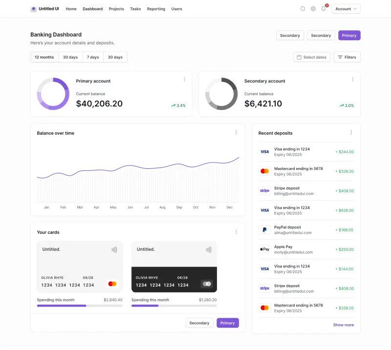
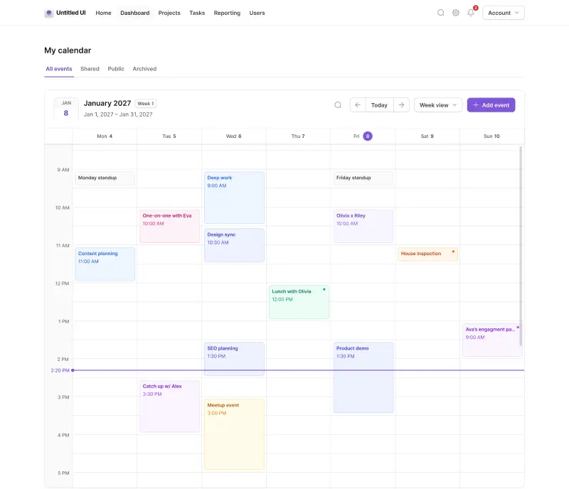
This post is an exert from Untitled UI Figma, the largest and most popular Figma UI kit and design system in the world. Untitled UI includes tips and best practices right in the Figma file to help you level up as a designer.
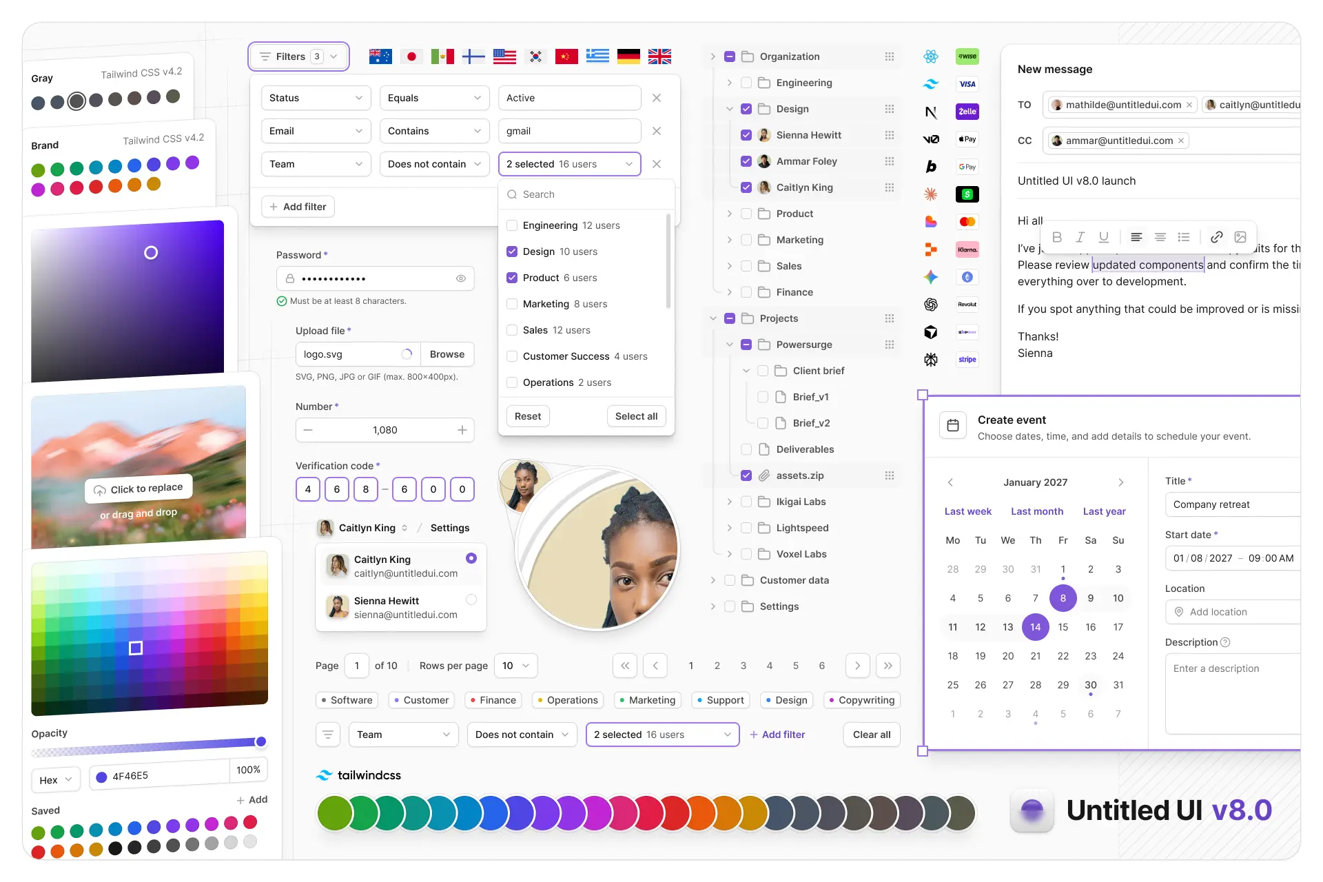
Untitled UI Figma is the largest and most popular Figma UI kit and design system in the world. It's meticulously crafted with 100% Auto Layout 5.0, super-smart variants, Figma's newest variables features, and with accessibility in mind.
It's a great example of Figma design system best practices and is the most popular and highest-rated Figma UI kit on the internet with 2,200+ 5-star reviews!
They've also released Untitled UI Figma PRO LITE, which is a premium and lightweight version of the full Untitled UI Figma PRO STYLES kit and have included it for free. It's 55% lighter, faster, and is designed to include everything you need and nothing you don't. It's perfect for moving fast and for smaller projects!
Untitled UI was designed to be the "ultimate" UI kit and the perfect starting point for any kind of project—from beautiful marketing landing pages, all the way to complex dashboards and web apps—Untitled UI has thought of absolutely everything so you don't have to.
The team behind Untitled UI are constantly making updates and improvements to the UI kit and recently announced they've completely refactored Untitled UI to take advantage of Figma's latest features released at Config 2023, Framework 2024, Config 2024, and Config 2025. This includes all the latest Figma features such as color variables (dark mode), spacing, radius, typography, and effects variables, Auto Layout 5.0, min/max widths, Auto Layout wrapping, and much more.
You can check out a full preview of the design kit, or check out the 100% free UI kit here (which is more advanced than most UI kits in its own right!). If you're short on time, here's a 60-second overview:
Untitled UI blog
More design resources


Untitled UI is the best $ I've spent on my business in a long time. I'm going to keep using it and recommending it to every designer I know.
Over the years we've featured hundreds of UI kits on UXCrush, but Untitled UI is by far the most comprehensive and detailed I've seen yet. A must have for any designer!
I've used all UI kits on the market. I can say without a doubt that the Untitled UI kit is the best on the market. It covers everything a designer needs in a modern and efficient way.
Incredible, and keeps getting better. I’ve tried dozens of UI kits and Untitled UI is the only name you should care about. It stands head and shoulders above the rest.
Such a beautiful, detailed, and extensive UI kit. Untitled UI is the perfect foundation for any project. I highly recommend this huge time saver.
Untitled UI has been an amazing resource that I'm learning to rely upon to spin up ideas in no time. I think I might launch a startup pretty soon by mistake here!
The sheer scale, details, and organization of this kit is mind-blowing. It covers nearly everything a Designer could need in a modern, efficient and systematic way.
I'm super impressed with this. I love poking around in other peoples UI Kits to see how they think. This is probably one of the most comprehensive I've seen.
I'm super excited to use this for quick mockups of ideas in Figma. We're always trying to streamline our design process so we can move fast! Definitely recommend.
Untitled UI is easily the best UI kit I've used so far. It has an insane amount of components that are all incredibly well-built. I don't even know how many hours this will save.
The attention to detail and thought Jordan has put into this UI kit is unparalleled.
Untitled UI is incredibly well-organized and the attention to detail is great. I highly recommend this kit to any designer that wants to create beautiful designs fast.
What an awesome Figma kit... it's an absolute game changer. This is the perfect base for any design system. The size and attention to detail is next level.