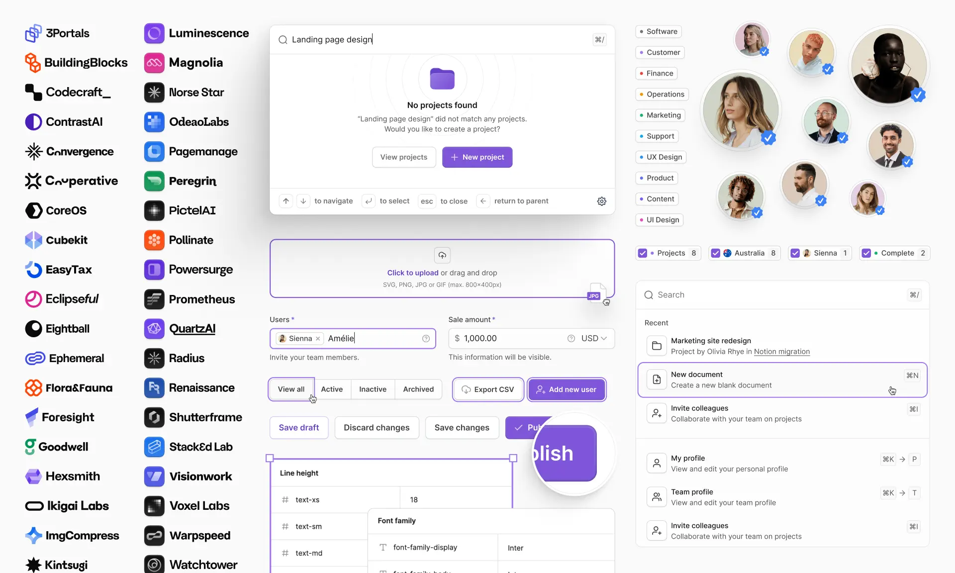
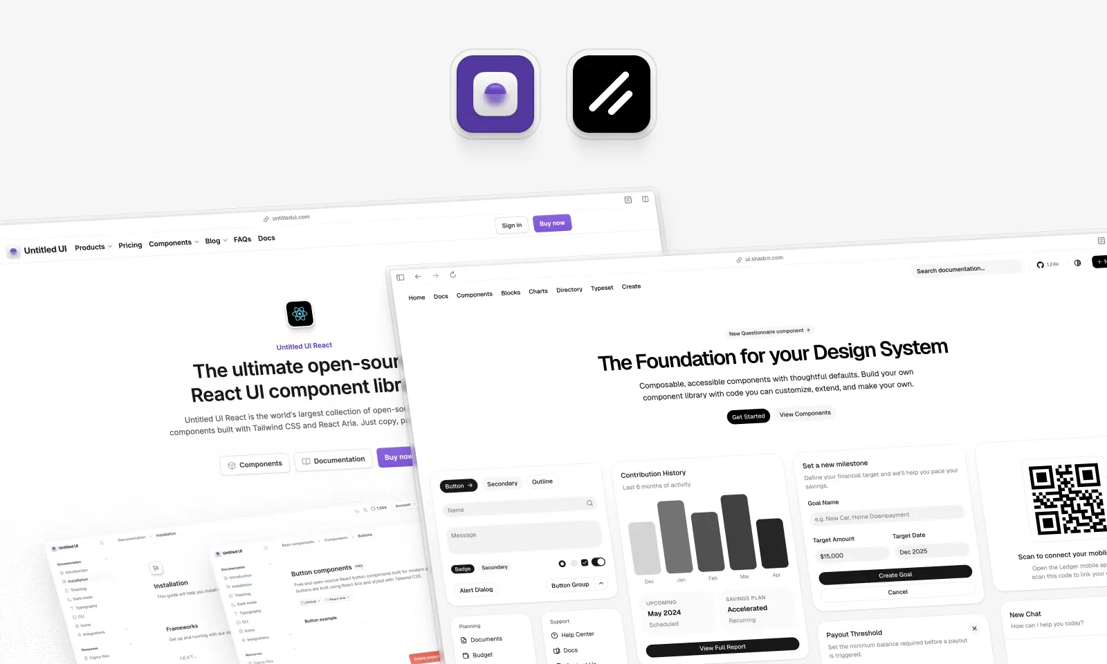
shadcn/ui and Untitled UI React are the two most common answers to the same question: how do you ship a good-looking, accessible React app without building every component from scratch?
They look similar on the surface. Both are built with Tailwind CSS. Both hand you real source code instead of a black-box npm package. Both have a CLI tool, an MCP server, and docs your coding agent can read. Neither is a runtime dependency you're stuck with.
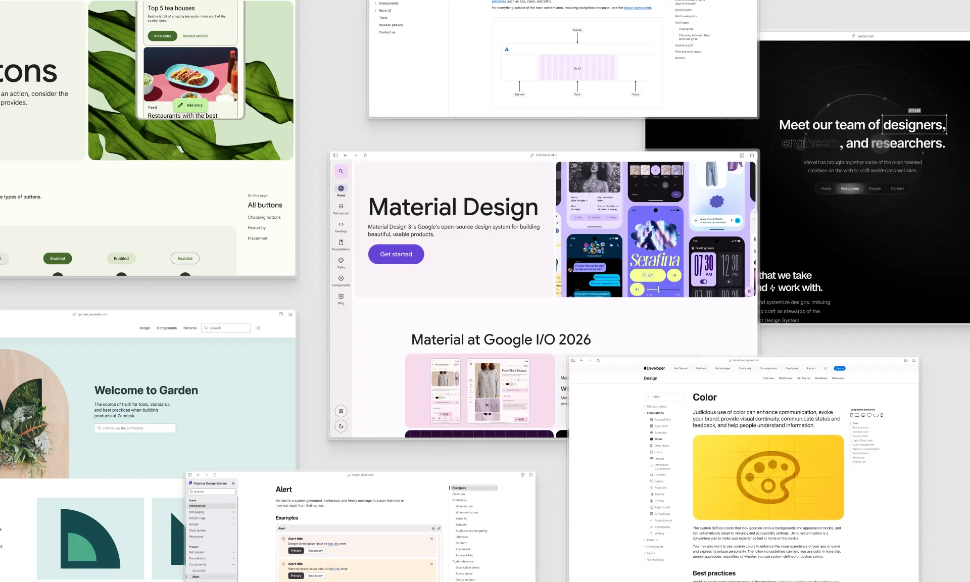
That's what separates them from traditional component libraries. Material UI, Ant Design, Chakra UI and the rest install as packages and hand you pre-styled components behind an API, Material Design and all. These two write the file into your repo instead.
But they solve different problems, and the difference matters more in 2026 than it did a year ago. shadcn/ui has spent twelve months turning itself into a code distribution platform with three primitive layers and eight styles. Untitled UI React has spent them going deeper on one meticulously designed system that stays in sync with the world's largest Figma UI kit.
We build one of these two libraries, so we'll say that up front and then be as fair as we can about the other. shadcn/ui is genuinely excellent, and there are projects where we'd tell you to use it instead.
Untitled UI vs. shadcn/ui: which should you use?
Both are copy-paste React libraries, so you own the code either way. shadcn/ui gives you 64 unstyled base components and around 60 blocks, free under MIT, defaulting to Base UI since July 2026. Untitled UI React gives you 5,000+ pre-designed components, 250+ finished pages and a matching Figma kit, free or from $349. Choose shadcn/ui to design from scratch, Untitled UI React to ship a finished design system.
The gap is easiest to see in finished screens. shadcn/ui ships exactly one dashboard block. Untitled UI React ships 40 dashboards, 40 settings pages, 20 landing pages and 10 pricing pages, all production-ready rather than demos.
Key takeaways
- Same distribution model, different starting point. Both write plain TypeScript files into your repo. The difference is how much design arrives with them.
- shadcn/ui is a platform; Untitled UI React is a system. shadcn/ui's registry protocol lets anyone publish components; Untitled UI React ships one curated, designed library.
- shadcn/ui no longer means Radix. Base UI became the default primitive layer in July 2026, with Radix still fully supported and React Aria added as a third base.
- Figma parity is the biggest structural difference. shadcn/ui's Figma files are community-contributed by its own admission. Untitled UI React ships alongside a first-party kit.
- Price is the clearest shadcn/ui win. MIT, in full, forever, with no seat counting.
If you're short on time, here's how we'd decide:
- Pick Untitled UI React if: you want the design work already done — 5,000+ components, 250+ real page examples and a matching Figma library — so your team spends its time on product instead of on spacing, states and empty states.
- Pick shadcn/ui if: you want a free, MIT-licensed foundation, you have the design time to spend on the last 30%, and you want to pull components from a large ecosystem of third-party registries.
- Pick both if: you're already on shadcn/ui and you need finished dashboards, marketing sections or page templates that would take weeks to design in-house.
Comparison table: Untitled UI React vs. shadcn/ui
Here's how the two line up across every dimension we tested, so you can scan the differences before reading the detail underneath. All figures were checked against primary sources on 15 September 2026.
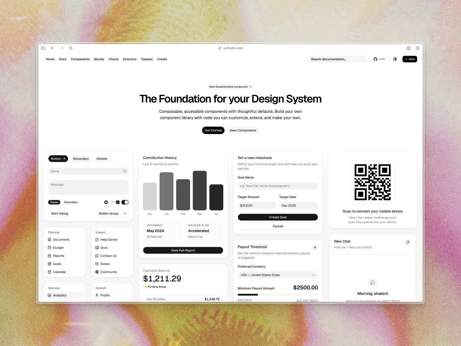
What is shadcn/ui?
ui.shadcn.com — Open source (MIT) · ★123.7k · npm (CLI): ~7.31M/wk
shadcn/ui is an open-source collection of accessible components for React, plus a code distribution system for shipping components into projects. It's built by shadcn, a design engineer at Vercel, and it's licensed under MIT.
The core idea, back in January 2023, was deceptively simple: don't publish an npm package, publish the code. You run a CLI command, the component's source code lands in your repo, and from that moment it's your file. No wrapper APIs, no theme provider fighting you, no waiting on a maintainer to accept your edge case.
That idea won. shadcn/ui now sits at 123,709 GitHub stars, the shadcn CLI does over 7.3 million npm downloads a week, and the copy-paste model has been adopted by nearly every modern React library launched since, including ours.
What changed in shadcn/ui in 2026
If your mental model of shadcn/ui is "Tailwind components on top of Radix," it's out of date. From the official changelog:
- Base UI is now the default. In July 2026, shadcn/ui made Base UI the default primitive layer for new projects. Radix isn't deprecated and still ships every update, but the CLI picks Base UI unless you pass
-b radix. - React Aria is a first-class base too. Also July 2026. Run
npx shadcn@latest init --base ariafor React Aria implementations of every component, the same foundation Untitled UI React is built on. - Eight styles: Nova, Vega, Maia, Lyra, Mira, Luma, Sera and Rhea, each a different take on density, radius and rhythm.
- Presets. Your whole design config compresses into a short code you pass to the CLI or an agent prompt.
- A registry platform. Any team can publish a
registry.json, namespace it, and install withnpx shadcn add @yourteam/component. GitHub repositories act as registries directly, and since August 2026 private repositories work too. - Chat and agent components. MessageScroller, Message, Bubble, Attachment and Marker landed in June 2026, plus a Questionnaire component for multi-step flows in August.
- shadcn/typeset. One CSS file for rendered HTML and markdown, tuned separately for docs, blogs and streaming chat.
That's a serious amount of shipping, and the distribution platform is the best in this category.
shadcn/ui key features:
- Open code by default: every component lands in your repo as a plain TypeScript file you can read, diff and rewrite.
- Three primitive layers: Base UI (default), Radix and React Aria, behind the same component API.
- 64 core components: accordions and dialogs through sidebars, charts, command menus and the new chat set.
- A real registry protocol: namespaced and GitHub registries, server-side search, and
--dry-run,--diffand--viewflags. - Five icon libraries: Lucide, Tabler, Phosphor, Remixicon and Hugeicons, selectable at init.
- OKLCH design tokens: semantic CSS variables exposed to Tailwind, with eight base colors: Neutral, Stone, Zinc, Gray, Mauve, Olive, Mist and Taupe.
- Broad framework support: Next.js, Vite, TanStack Start, React Router, Laravel and Astro templates from the CLI.
shadcn/ui pros:
- Free forever: MIT licensed, all of it, with no PRO tier and no seat counting.
- The ecosystem is enormous: third-party registries like Kibo UI, Tailark and 21st.dev plug into the same CLI, and thousands of community components are one command away.
- Every AI tool already knows it: Cursor, Claude Code, v0, Bolt and Lovable generate shadcn/ui by default, because plain files are what language models handle well.
- No lock-in to one primitive layer: choose between Base UI, Radix and React Aria, and migrate progressively with an agent skill rather than a brittle codemod.
- Excellent documentation: current, versioned per primitive layer, with an
llms.txtfor agents.
shadcn/ui cons:
- You still have to design it. You get well-built primitives with sensible defaults, not a design system. Turning 64 components into a coherent product still costs weeks.
- Very few finished pages. Around 60 blocks, but 32 are calendar variants and 16 are sidebars. There is exactly one dashboard block and no marketing sections at all.
- Ubiquitous design. Because v0, Lovable, Bolt and half of Product Hunt ship the default styling, shadcn/ui projects look generic unless you invest real time customizing them. Everyone has the same eight styles.
- No official Figma UI kit. The Figma page states plainly that "the Figma files are contributed by the community," so keeping design and code in sync is harder.
- Composition across registries is on you. A hero from one registry, a chart from another and an animation from a third leaves three design languages in one app. Marketing sites suffer most, because that's where the third-party blocks are.
- Runtime dependencies still sneak in. Several components pull third-party packages: Recharts, react-day-picker, date-fns, embla-carousel-react, cmdk, input-otp, react-resizable-panels and sonner.
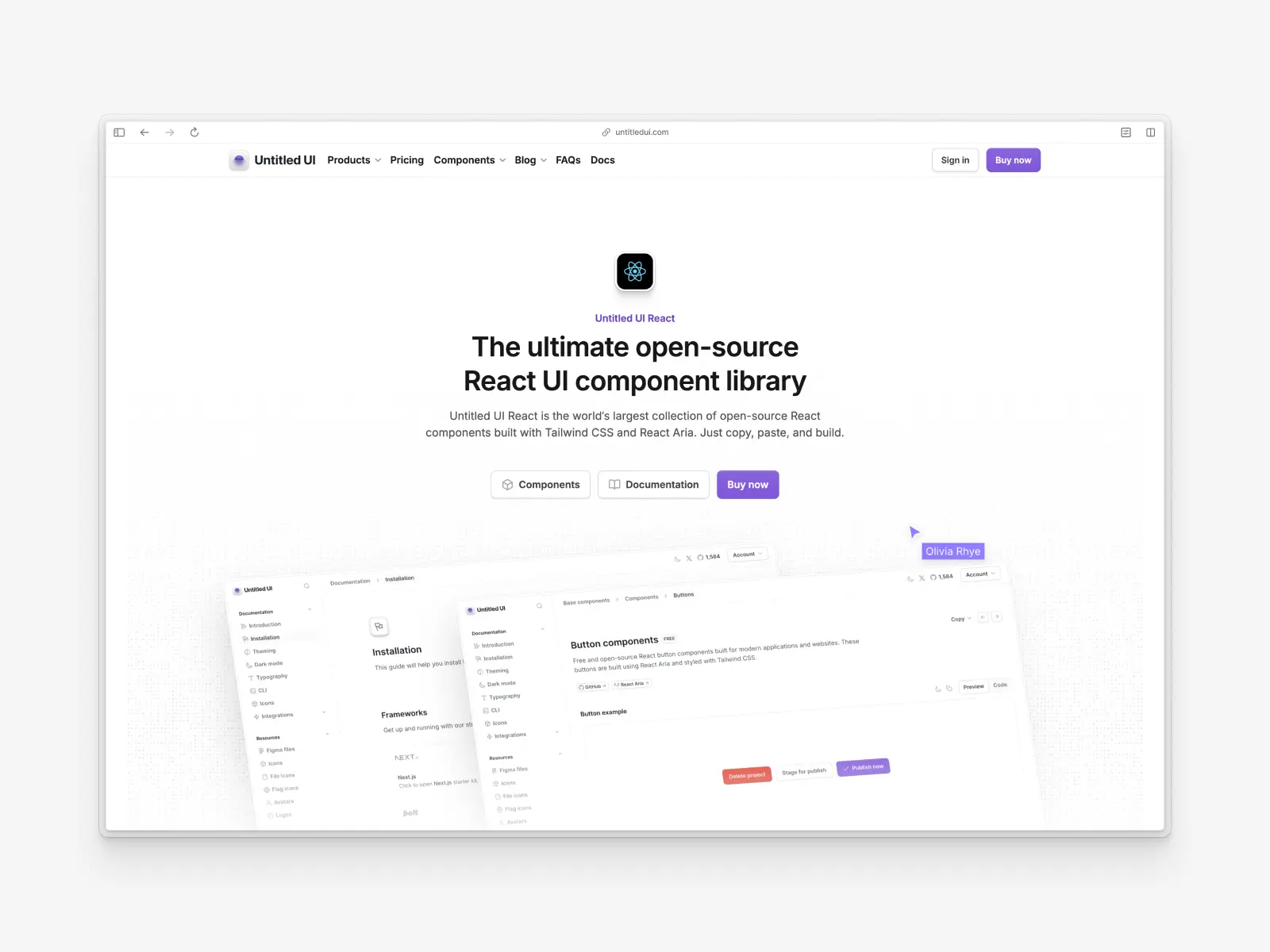
What is Untitled UI React?
untitledui.com/react — Open source + paid from $349 (lifetime access) · ★1.9k
Untitled UI React is the world's largest collection of open-source React components, built with Tailwind CSS v4.3, React Aria v1.20 and TypeScript v5.9 on React 19.2. It launched recently and is now on v8.0.
The philosophy differs from shadcn/ui's. It isn't a platform for distributing anyone's components; it's the finished thing, a design system where spacing, states, dark mode, empty states, loading states and responsive behavior are already designed.
It's based on Untitled UI Figma, the largest and most popular Figma UI kit in the world, with 380,000+ designers and 3,650+ 5-star reviews. Every React component is built in sync with the Figma library, and both get free updates for life.
Like shadcn/ui, it's copy-and-paste. The free components are MIT licensed and you own every file the CLI writes.
Untitled UI React key features:
- 5,000+ components and sections: base components, application UI and marketing website sections.
- 250+ page examples: 120 application pages (40 dashboards, 40 settings pages, 40 informational pages) and 105 marketing pages.
- Built on React Aria: Adobe's React Aria handles accessibility, keyboard behavior and cross-platform interaction, under Apache-2.0.
- A deep semantic token layer: tokens like
text-primary,bg-brand-solidandfg-error-secondary, each with an explicit value in light mode and dark mode. - Custom CLI tool:
npx untitledui@latest init --nextjsscaffolds a project with a brand color of your choice;addinstalls individual components. - MCP server with semantic search: seven tools backed by multimodal embeddings trained on description and screenshot, so agents search by appearance.
- RTL support built in: every base component uses CSS logical properties, with an
rtl:Tailwind variant. - 2,000+ icons and logos: Untitled UI Icons ships 1,100+ free icons via npm, around 264,000 downloads a week, with 4,600+ in the PRO set, plus 370+ avatars, 180+ company logos and 261+ country flags.
Untitled UI React pros:
- Incredibly comprehensive: the number of components and page examples covers almost any use case, so you're editing rather than inventing.
- High-quality design out of the box: based on Untitled UI Figma, components are meticulously designed.
- Accessibility-focused: React Aria ships 34 locale bundles covering 32 languages, with published screen reader support tested against VoiceOver, JAWS, NVDA and TalkBack.
- Figma UI kit parity: design and code are perfectly aligned, the biggest practical difference between these two libraries.
- Mature ecosystem: icons, avatars, logos, flags, starter kits, Storybook and an MCP server, all from one team.
Untitled UI React cons:
- Can be overwhelming: the scale might be too much for smaller projects or individual developers.
- Manual updates: as with every copy-paste library including shadcn/ui, you pull in improvements yourself.
- PRO version for full access: hundreds of components are free and open source, but the advanced components and 250+ page examples are in PRO.
- Not the default in AI tools: with no other context, a coding agent reaches for shadcn/ui first. Pointing it at Untitled UI React takes one step.
It suits teams already using Tailwind CSS who want production-ready components and finished pages. Here's a 60-second overview:
A huge part of Untitled UI React is free and open source. Check out the documentation and explore the free React UI components to use in unlimited commercial projects.
How we compared them
We didn't write this post to declare a winner. We wrote it because "Untitled UI or shadcn/ui?" is the question we get asked more than any other, and most answers online are three years out of date or written by someone who hasn't opened either library.
Every figure here was checked against a primary source in September 2026: the shadcn/ui changelog and component docs, the published shadcn npm package, the Base UI and React Aria docs and packages, the npm downloads API, GitHub, and our own codebase.
Where a number is a marketing claim, we say so. Where shadcn/ui is better, we say that too, and it happens more than once. Anything we could not verify from a primary source, we left out rather than repeat.
Distribution: both give you the code, but not the same way
Both libraries reject the traditional npm-package model of shipping pre-styled components you cannot reach into. When you install a component, the source file lands in your project. You own it. You can delete half of it. Nobody's minor version bump breaks your login page at 4pm on a Friday.
Both also assume Tailwind CSS. The component arrives as JSX with Tailwind classes on it, which is what makes the model work: there's no stylesheet to import, no build step to configure, and editing the design means editing Tailwind classes you can already read.
If your team doesn't use Tailwind CSS and doesn't want to, neither library is for you, and that's a fair reason to look at traditional component libraries instead. Tailwind Plus, formerly Tailwind UI, which is Tailwind Labs' own commercial blocks product, is the other option worth knowing if you like Tailwind but want blocks rather than a system.
The difference is what surrounds that file.
- shadcn/ui is a protocol.
registry.jsonis a documented schema, registries can be namespaced, and a GitHub repo can be a registry.npx shadcn add @acme/pricing-tableworks the same asnpx shadcn add button. Your custom design system rides on the same rails as the public one. - Untitled UI React is a library.
npx untitledui@latest addinstalls individual components from one curated source. There's acomponents.jsonfor aliases and monorepo paths, but no third-party registry protocol.
Verdict: shadcn/ui. If you're building a design system that other teams inside your company will consume, the registry model is a real architectural advantage in day-to-day UI development, and it's why so many libraries now publish shadcn-compatible registries instead of npm packages.
How many components does each library have?
This is where the two libraries stop resembling each other.
shadcn/ui's docs list 64 components. They're the right 64, covering essentially every standard application pattern, though several are composites rather than primitives — Data Table, Date Picker, Combobox and Typography are recipes assembled from other parts.
Untitled UI React publishes 5,000+ components and sections. That figure counts components together with their designed variants, which is how a system of this size is counted, and we'd rather explain it than let it sit there sounding inflated.
A useful bellwether when you're sizing up any UI library: check whether it ships date pickers, and check what they're built on. Date pickers are the component most often missing, because doing them properly means calendar systems, locale-aware formatting and a lot of keyboard navigation. A library that ships good ones has usually done the hard work elsewhere too.
Every size, color, state and icon configuration is drawn and specified rather than left for you to derive. A button isn't one component with a props table; it's the full matrix, already decided.
Category coverage is where the gap is real. Untitled UI React ships components that don't exist in shadcn/ui's registry at all:
- Rich text editors, video players and QR codes: the components everyone needs and nobody wants to build.
- Color pickers, gradient pickers and image pickers.
- File uploaders, tree views, filter bars and command menus.
- Activity feeds, activity gauges, metrics and progress steps.
- 46 modal variants and 20 slideout menus, covering create, share, integration and confirmation flows.
- Email templates, credit cards, illustrations and mobile app store buttons.
- 428 marketing website sections across 18 categories, including 44 hero headers, 42 features sections, 40 footers and 22 pricing sections.
Neither list is better in the abstract. But if your roadmap includes a file uploader, a tree view and a pricing page this quarter, one library has them and the other has a starting point.
Verdict: Untitled UI React, by a wide margin on breadth. shadcn/ui wins on focus. A tightly curated set has a shorter learning curve and is easier to keep consistent across a team, and if your product only ever needs twenty components that's a real advantage. The catch is that you rarely know which twenty until you're six months in.
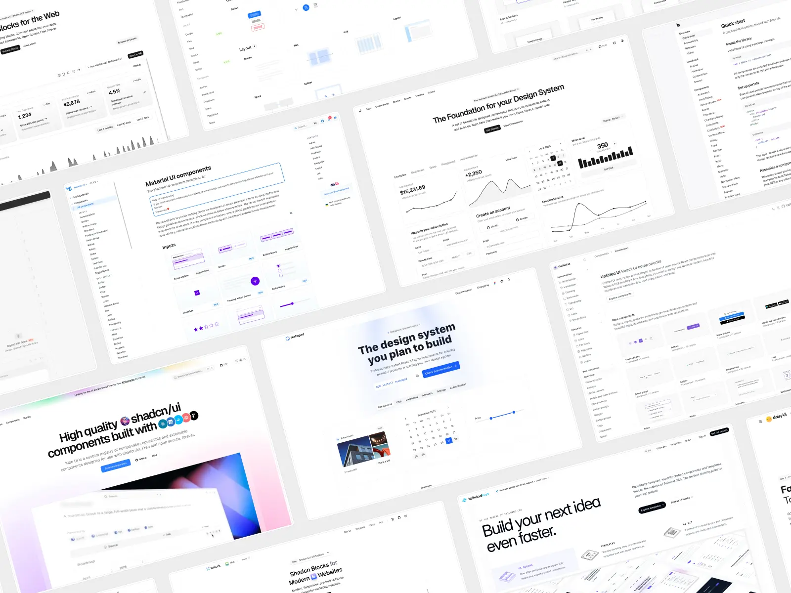
Where both sit in the wider React component library landscape
There are broadly four kinds of React UI library in 2026, and both libraries here occupy the same one.
Traditional component libraries install as an npm package and hand you pre-styled components behind an API. Upgrades arrive as a version bump, customisation is taken away in exchange, and each carries a design language you adopt whether you want it or not. MUI, Ant Design and Chakra UI all work this way.
- Material UI, usually shortened to MUI, is the biggest: 99,044 GitHub stars and around 7.23 million weekly downloads. MUI's own docs confirm it implements Google's Material Design 2, and MUI has implemented Material Design faithfully for over a decade, which is why MUI products are recognisable at a glance.
- Ant Design, the enterprise-focused Chinese library, is at 98,966 stars and 79 components. Ant Design means Ant Design, the way Material UI means Material Design.
- Chakra UI is on v3 at 40,553 stars. Microsoft's Fluent UI covers Microsoft 365 surfaces.
Headless primitive libraries give you behaviour and no styling: Base UI, React Aria Components, Radix UI and Tailwind Labs' Headless UI. Radix UI primitives were shadcn/ui's default until July 2026, and Headless UI is still widely used despite no release since April 2026.
Effect and animation libraries such as Magic UI extend a base library. Magic UI's 150+ animated components install through the shadcn CLI and assume shadcn/ui is there, so installing one is adding more shadcn components, not switching library.
Copy-paste design systems are the fourth group, where both libraries here live. You own the source code, there's no runtime, no Material Design look to theme away, and the difference is how much design arrives with the file. Tailwind Plus, called Tailwind UI until March 2025, sells blocks and bundles Tailwind Labs' Catalyst UI kit.
Two naming notes. Headless UI is Tailwind Labs' unstyled library, unrelated to Tailwind UI beyond the publisher, and Tailwind UI is now Tailwind Plus. Base UI is not the old @mui/base, nor Uber's Base Web, which owns baseui on npm.
If you want a package that updates itself, look at traditional component libraries like Material UI, Ant Design, Chakra UI or Mantine, where pre-styled components arrive ready to use. Pick Material UI if Material Design is the look you want; Ant Design is strongest for data-dense enterprise tools.
If you want to own the code, the question is how much design work you inherit. The line between groups is thin: Chakra UI v3 is built on Ark UI, shadcn/ui on Base UI, Untitled UI React on React Aria.
Almost every styled UI library in 2026 is a design layer over somebody's primitives, so "which UI library" is two decisions wearing one name. We've covered the field in our roundup of the best React UI component libraries in 2026.
Page examples, dashboards and marketing sections
Components are the easy part. Composition is where UI development actually stalls.
shadcn/ui offers around 60 blocks, and the distribution matters more than the total: 32 are calendar variants, 16 are sidebars, 10 are login and signup screens, and exactly one is a dashboard. There are no marketing sections, and the docs point you to third-party registries for anything beyond that.
Untitled UI React ships 250+ page examples, and they're not demos:
- 120 application pages: 40 dashboards, 40 settings pages and 40 informational pages, in two distinct layout families.
- 105 marketing pages: 20 landing pages, 10 pricing pages, 10 blogs, 10 blog posts, 10 about pages, 10 contact pages, 10 FAQ pages, 10 team pages, 10 404 pages and 5 legal pages.
- Shared page examples: log in, sign up, verification, forgot password, and 10 email templates. All responsive, all designed to be shipped.
If you've ever tried to design a settings page or a dashboard from scratch, you know that "we have a Card component" and "we have a finished settings page" are separated by about two weeks of work.
Verdict: Untitled UI React, decisively. This is the single biggest practical gap between the two libraries. For more on this category, see our roundup of the best React dashboards in 2026.
Which is better for accessibility, React Aria or Base UI?
Accessibility is a legal requirement in a growing number of regions and a quality signal search engines weight. Both libraries follow WAI-ARIA patterns. Neither is negligent.
Accessible components cover four separate things:
- Correct ARIA semantics, so assistive technology knows what each element is and what state it's in.
- Keyboard navigation: arrow keys inside menus, listboxes and date pickers, type-to-select, escape to dismiss.
- Focus management: trapping focus inside a modal, restoring it to the trigger on close, never leaving it on a hidden element.
- A visible focus indicator and sufficient colour contrast, which are styling concerns rather than behavioural ones.
A headless library gives you semantics, keyboard navigation and focus management, and stops there. Radix UI primitives, Headless UI and Base UI all stop at the same line. The fourth layer is yours.
Screen reader support is the part teams assume is handled. Correct semantics get you announced; good screen reader support means the announcement is useful, in the right language, and doesn't read a date picker as forty unlabelled buttons. Genuinely accessible components need all four.
Untitled UI React is built on React Aria, Adobe's accessibility layer:
- 34 locale bundles covering 32 languages, shipped in the package, so announcements aren't in English for your Japanese users.
- 13 calendar systems, which matters the moment you ship a date picker outside the US and Europe.
- RTL interaction handling, not just mirrored CSS. Keyboard navigation reverses correctly too.
- Published screen reader support, tested on VoiceOver on macOS in Safari and Chrome, JAWS and NVDA on Windows in Firefox and Chrome, VoiceOver on iOS, and TalkBack on Android in Chrome.
- Normalized cross-device interaction, so press and hover states behave identically on mouse, touch, keyboard and assistive tech.
shadcn/ui's default, Base UI, is built by people from the Radix UI, Material UI (MUI) and Floating UI teams. It's at v1.8.0 with around 9.7 million weekly downloads, follows the WAI-ARIA Authoring Practices, and is tested across browsers, devices and screen readers. Its keyboard navigation and focus management are as careful as anything in the category.
But Base UI ships no styles, and its own docs are explicit that visually indicating focus and meeting colour contrast are your responsibility. That's the right scope for Headless UI or any unstyled library, and it makes accessible components out of the box narrower than with a styled system.
The same applies to Radix UI. Radix UI primitives are still fully supported by shadcn/ui and every update ships for both. Like Base UI, they hand back the styling half: focus management is handled, the focus ring is not.
Verdict: close, with an edge to React Aria on internationalization. English-only, both are excellent and you decide on other criteria. Shipping to multiple locales, especially with dates, numbers or RTL languages, React Aria's depth is the more complete answer, and shadcn/ui now offers it as a base.
Why do shadcn/ui sites all look the same?
Here's a problem that didn't exist in 2023 and is very real now: a large share of new web apps look identical.
v0, Lovable, Bolt, Cursor and Claude Code all generate shadcn/ui by default. That's a compliment to shadcn/ui, and it happened because open code is exactly what language models are good at reading and modifying. The side effect is that the default aesthetic has become the visual signature of "generated in an afternoon." Users have started to notice, and so have investors.
shadcn/ui's answer is the eight styles: Nova, Vega, Maia, Lyra, Mira, Luma, Sera and Rhea. They genuinely differ in density, radius and rhythm, and they're a meaningful improvement. But they're eight shared starting points available to everyone, which moves the ubiquity problem rather than solving it.
Untitled UI React's answer is different: the design work is the product, not a layer of utility classes over someone else's. Base UI supplies the behaviour for shadcn/ui and React Aria supplies it for us, but neither primitive has a view about what a product should look like, the way Material UI has with Material Design.
So the design language is the thing you're really choosing between, and it's the one part neither set of primitives decides for you.
Components come from a Figma design system with 10,000+ components and variants, refined across eight major versions, with the kind of detail that takes a design team months to get right and that most libraries skip entirely — optical alignment, focus ring treatment, disabled states, empty states, loading states.
The trade-off is honest. You're adopting our aesthetic. It's clean, modern and neutral rather than opinionated like Material Design, and it themes well to a brand, but it's one design language rather than eight. If you want something visually radical, you'll be editing either way.
Theming and design tokens
Both libraries theme through CSS variables and Tailwind, and both support dark mode with no separate stylesheet. The difference is granularity.
"Theming" means three things at once: raw Tailwind classes on the element, CSS variables holding the colour values, and semantic class names that describe a role. Every design system built on Tailwind CSS is a set of decisions about the top two layers.
Get that right and a custom design system stays coherent as it grows. Get it wrong and you have utility classes with extra steps. Semantic class names are the cheapest insurance in UI development, and the first thing a custom design system needs.
shadcn/ui uses a compact set of semantic class names (background, foreground, primary, muted, accent, destructive, border, ring) defined as CSS variables in OKLCH and exposed via @theme inline. You pick a base colour at init from Neutral, Stone, Zinc, Gray, Mauve, Olive, Mist or Taupe. It has a short learning curve, and everything else stays as ordinary Tailwind classes.
Untitled UI React goes deeper: design tokens organized into text, background, foreground and border families, each declared twice, once for light mode and once for dark mode, so no token falls back to the wrong theme.
Instead of text-gray-600 you write text-tertiary; instead of bg-blue-700, bg-brand-solid. There are dedicated tokens for on-brand surfaces, hover states and subtle variants. Those semantic class names survive a rebrand; raw utility classes don't.
In v8.0 we cut that layer down rather than growing it. Switching the palette to Tailwind's native colors removed several hundred redundant CSS variables and roughly a third of the theme file's weight, with no loss of expressiveness. Changing your brand color is still one scale from --color-brand-25 to --color-brand-950 in theme.css.
The Tailwind classes still exist underneath, they just stop leaking into every file. Utility classes are wonderful until four people write them: once text-gray-600 appears in ninety files, nobody can say whether a grey means "secondary" or "disabled". Semantic class names move that decision into one file, which is most of what separates a custom design system from a folder of components.
Which is better for marketing sites, landing pages and internal tools?
Here's the split by what you're actually building.
- Marketing sites and landing pages: Untitled UI React, and it isn't close. shadcn/ui has no marketing sections at all, so marketing sites start from zero. Untitled UI React ships 428 of them across 18 categories, plus 20 landing pages and 10 pricing pages.
- Internal tools and admin panels: much closer, with an edge to shadcn/ui. Internal tools are judged on whether they work, not how they look, so the design gap matters less and the free MIT licence matters more. Its Data Table, sidebar blocks and form primitives cover most of what internal tools need. If you need row grouping and aggregation, neither is the answer and you want MUI X, the paid data-grid tier from MUI.
- SaaS products with a real user-facing surface: Untitled UI React, for the same reason as marketing sites. You need dashboards, settings pages, billing, onboarding and empty states, and those take a designer weeks.
- Prototypes and throwaway work: shadcn/ui. It's free, every AI tool emits it by default, and design ubiquity doesn't matter in something nobody ships.
- Design-system work, where the system itself is the deliverable: neither. Go one layer down to Base UI or React Aria Components and build on the primitive rather than inheriting Material Design or any other opinion.
The switching cost is low in both directions, because neither is a runtime dependency. You keep the files you have, install the new ones alongside, and replace screens as you go.
That's the quiet advantage of the copy-paste model for UI development. It turns library choice from a bet into an experiment.
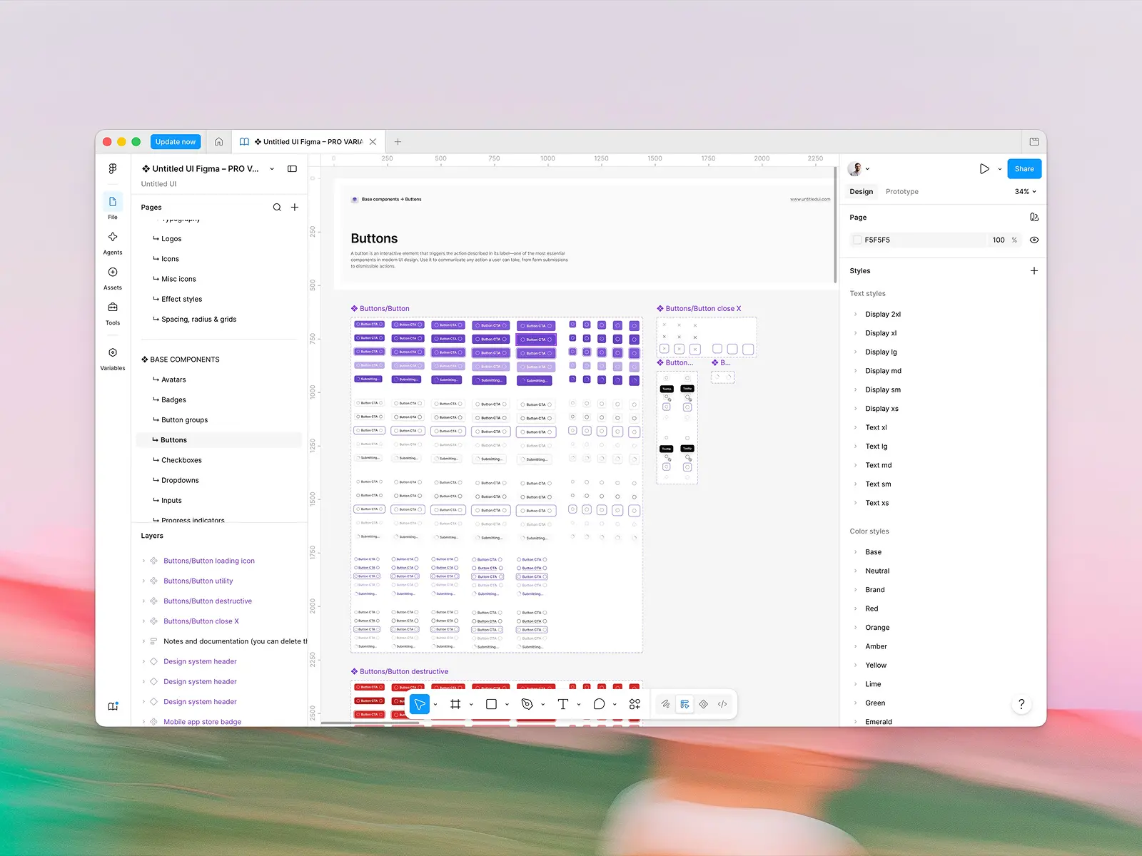
Does shadcn/ui have a Figma kit?
No official one, and this is the clearest structural difference between the two products.
The shadcn/ui docs list community files, both free and paid, with an explicit note that "the Figma files are contributed by the community." That means no guarantee of parity, no guaranteed update cadence, and no single source of truth when a component changes in code. The page even tells readers to contact the file maintainers with questions.
It's a common gap rather than an unusual one. Material UI sells a Material Design Figma kit separately at $79, so even MUI keeps design and code in separate purchases. Ant Design's first-party design assets are Sketch files, and every Figma resource its docs list is marked third-party.
Chakra UI does ship a free official v3 kit on Figma Community. Base UI and React Aria have none at all, which makes sense for an unstyled library, since there'd be nothing in the file.
Untitled UI React is designed in, and shipped alongside, Untitled UI Figma: 10,000+ components and variants built with 100% Auto Layout 5.0, variables and smart variants.
Auto Layout matters more than it sounds for a UI kit this size, because Auto Layout is what lets a designer resize a component and have the padding, wrapping and alignment behave like the coded version rather than drifting from it. A Figma kit built without Auto Layout looks identical in a screenshot and falls apart the moment anyone edits it.
When a component ships in React, it ships in Figma. Designers and developers work from the same system, and both halves get free updates for life.
It's also the most widely used design system in Figma, with 380,000+ designers and 3,650+ 5-star reviews. That matters for a reason beyond bragging: a designer you hire has probably already worked in it, and the components your team reviews in Figma are the components your developers install.
If your team's workflow is "designer mocks it in Figma, developer builds it in React," this is the difference between a handoff and a translation.
Verdict: Untitled UI React, and it's the strongest argument in the whole comparison. If nobody on your team opens Figma, ignore this section entirely. If you have designers, it's probably worth more than everything else combined.
AI and agent workflows
Both libraries are unusually well set up for agent-driven UI development, for the same underlying reason: agents are better at editing files than at reasoning about someone's abstraction. Open code is AI-friendly code.
shadcn/ui brings:
- An MCP server that lets agents list, search and install from any configured registry, including private and namespaced ones.
- An agent skill teaching agents the CLI, its flags, and the API differences between Base UI, Radix and React Aria.
- Presets in prompts, so a single preset code produces a correctly configured project.
- Default status in every major AI tool, which is worth more than any documentation.
- A migration skill that moves components between primitive layers one at a time, leaving a report and a commit per component.
Untitled UI React brings:
- An MCP server with multimodal semantic search, seven tools, with embeddings trained on both the component description and its screenshot, so agents match on how something looks rather than what it's called.
- Shipped agent rules — CLAUDE.md, GEMINI.md and AGENT.md — so agents follow the design system's conventions instead of inventing them.
- One-click launches into v0, Bolt, Lovable, Replit and StackBlitz with the library pre-installed.
- Docs published as raw markdown: append
.mdto any docs URL and you get the source as plain text, so an agent reads the page rather than scraping the rendering. - Open in ChatGPT, Claude and v0 buttons on every docs page, each handing the model the page URL and the markdown link together.
Verdict: shadcn/ui on ubiquity, Untitled UI React on search quality. shadcn/ui wins because every agent already knows it. Untitled UI React wins when your agent needs to find the right one of 250 page templates, which is a search problem rather than a knowledge problem. We covered this category in our roundup of the best UI component libraries for vibe coding in 2026.
Dependencies, bundle size and lock-in
Neither component library is a runtime dependency, unlike MUI or Ant Design, which you install and live with. But "no dependencies" is a claim worth checking on both sides, so we checked ours too.
shadcn/ui components pull third-party packages where it makes sense: Recharts for charts, react-day-picker and date-fns for calendars, embla-carousel-react for carousels, cmdk for the command menu, input-otp, react-resizable-panels and sonner for toasts. Plus your chosen primitive layer.
Untitled UI React shares several of those. But this is where the choice of primitive layer stops being an abstract preference and shows up in your package.json.
React Aria's surface area is much wider than Radix's or Base UI's. It ships stateful primitives for the hard, interaction-heavy widgets, not just the popover-and-focus-trap layer, so several categories that need a package on shadcn/ui need none on ours:
- Calendars and date pickers: shadcn/ui reaches for react-day-picker plus date-fns. Our date pickers and calendars run on React Aria's calendar primitives with
@internationalized/date, which is what gives you 13 calendar systems rather than just date maths. - Color pickers: shadcn/ui doesn't ship one. Our color pickers and gradient pickers run on React Aria's color primitives with no extra package.
- Command menus: shadcn/ui uses cmdk. Ours use React Aria plus a small keyboard-shortcut helper.
Being fair about the other direction: we carry packages shadcn/ui doesn't, because we ship categories it doesn't have. TipTap powers the rich text editors, shiki highlights code snippets, qr-code-styling draws QR codes, and motion handles animation throughout. More components means more packages. That's the trade, and it's a real one.
Verdict: a narrow edge to Untitled UI React, per component. Count total packages and we carry more, because we ship far more categories. Count packages per widget, especially the interaction-heavy ones, and React Aria's breadth means fewer moving parts you didn't choose.
Framework support and installation
shadcn/ui scaffolds templates for Next.js, Vite, TanStack Start, React Router, Laravel and Astro, and its create tool lets you build a preset visually and generate the exact setup command.
Untitled UI React's CLI tool scaffolds Next.js and Vite projects, asking for a project name and brand colour, with documented integration guides for Next.js, Vite, monorepos, Bolt, v0, Lovable, Claude and Gemini. The components are plain files, so they work anywhere React does, but the scaffolding is narrower.
Day to day the workflows are nearly identical. Both scaffold once, then you pull individual components as you need them and the source code lands in your repo. The learning curve is short on either side, and most of it is learning where your own files now live rather than learning an API.
Verdict: shadcn/ui. If you're on Laravel or Astro, this is close to a deciding factor on its own.
Is shadcn/ui free, and how much is Untitled UI React?
shadcn/ui is MIT licensed, in full, for free. There's no PRO tier, no seat counting and no upsell. For a solo developer or a bootstrapped project that's a powerful argument, and no feature comparison makes $0 stop being $0.
Untitled UI React is free and MIT licensed for its open-source components, usable in unlimited commercial projects. The full library is a one-off payment with lifetime updates:
- FREE: open-source components, CLI, starter kits, dark mode, and 2,000+ icons and logos.
- PRO SOLO — $349: the full 5,000+ component library, 250+ page examples, and Figma sync for one user.
- PRO STUDIO — $999: up to 8 users.
- PRO BUSINESS — $2,499: up to 20 users.
- PRO ENTERPRISE — $8,999: unlimited users, private GitHub repo and Storybook access, SSO and SCIM 2.0, audit log, Enterprise EULA, and specialist engineering support for onboarding.
You might be asking, "why pay for a component library when shadcn/ui is completely free?" That's a valid question, and the answer is only ever about time. $349 buys about half a day of a good product designer. Designing an app that actually looks finished — every state, every breakpoint, every empty state, across dashboards, settings pages and a pricing page — takes weeks of that same designer.
If PRO saves your team one of those weeks, it's paid for itself ten times over. If your team has those weeks and wants to spend them, shadcn/ui plus your own design work costs nothing but the calendar.
Verdict: shadcn/ui on price, Untitled UI React on value per hour saved. It depends entirely on whether your constraint is budget or calendar.
Community, ecosystem and long-term support
These are two large communities, and they're not the same community.
shadcn/ui has 123,709 GitHub stars, over 7.3 million weekly CLI downloads, an entire economy of third-party registries and paid block libraries built on its protocol, and a maintainer employed by Vercel to work on it. If you hit a problem in code, someone has already posted about it.
Untitled UI has 380,000+ designers using Untitled UI Figma and 3,650+ 5-star reviews, with a full-time team shipping coordinated updates across React, Figma, icons, avatars and logos. On the developer side specifically, the React repo is much younger and sits at 1,918 GitHub stars, having launched recently.
Verdict: shadcn/ui for developer ecosystem, Untitled UI for design community and first-party support. If you want thousands of third-party registry components, shadcn/ui isn't close. If you want one team accountable for design and code staying in sync, that's a different kind of support, and it's the kind stars don't measure.
Can you use Untitled UI React and shadcn/ui together?
Technically yes, because both write plain Tailwind files into your repo. There's no provider to conflict and no second runtime. But the hard part isn't what people expect.
It isn't composition. Dropping one library's button inside the other's dialog renders fine. The problem is overlap: shadcn/ui's 64 components and our base components cover much of the same ground, and two components with one name and different APIs is a real maintenance tax.
- The same concept, different props. shadcn/ui's Button takes
variant="destructive"and composes with a render prop. Ours takescolor="primary-destructive"withiconLeadingandhref. Neither is a drop-in for the other. - Two import paths that autocomplete identically. Both answer to "Button," which is how a codebase ends up with both on one page.
- Context doesn't cross the boundary. Our React Aria field state is invisible to shadcn/ui's form components, and vice versa. Nesting works visually until something needs to know it's inside a field, a dialog or a form.
- You may ship two primitive layers. shadcn/ui on Base UI plus our React Aria components means both are in the bundle. Initializing shadcn/ui with
--base ariaavoids that.
The rule that works: let one library own each category, and never install both versions of the same component. Pick one for your base layer, and take from the other only what it doesn't have.
That's a clean seam, because the overlap is small. Dashboards, settings pages, marketing sections, pricing pages, color pickers, file uploaders and rich text editors have no shadcn/ui equivalent.
Two more decisions up front. Pick one token layer and map the other onto it rather than maintaining two. And keep the design language consistent, because mixing two aesthetics makes a good app look unfinished.
Short advice: use shadcn/ui's registry model for distributing components internally, and Untitled UI React for the pages you'd otherwise spend a month designing.
Should you switch, or just add more shadcn components?
Worth asking before you do anything, because the honest answer is often "don't switch." A lot of teams reach for a shadcn/ui alternative when what they actually need is more shadcn components of the kind they already have, and adding a registry is a much smaller change, and a cheaper one, than any shadcn/ui alternative.
Add, don't switch, if the problem is coverage. Tailark for marketing blocks, Magic UI for animation, Kibo UI for the odd components nobody else builds, and 21st.dev for a community marketplace of shadcn/ui components all install through the same CLI tool. You keep your setup, your conventions and your learning curve, and you're still writing Tailwind CSS either way.
Switch if the problem is the design itself. No number of extra shadcn components fixes the ubiquity problem, because every registry is styled to the same defaults. Magic UI animates the same aesthetic, and a Magic UI block still looks like shadcn/ui underneath. This is the one thing adding a UI library on top genuinely cannot solve, and the only reason a shadcn/ui alternative is worth the migration.
Switch if the problem is page-level coverage. Dashboards, settings pages, pricing pages and marketing sites are not component problems, they're composition problems, and registries are mostly component-shaped. No UI library solves composition by adding more components to it.
Switch if the problem is Figma parity. If your UI development process starts in Figma, no registry gives you a maintained Figma kit on the other end of it. Auto Layout, variables and a kit someone keeps in sync with the code are not things a registry of shadcn components can supply.
The caveat on adding registries is the one from shadcn/ui's own cons list. Pull a hero from one source, a chart from another and an animation from a third, and you'll spend the time you saved making three sets of design decisions look like one product.
Conclusion
Choosing between Untitled UI React and shadcn/ui in 2026 comes down to one question: how much of the design work do you want to do yourself? Both hand you the same thing at the file level, accessible Tailwind-styled React components you own outright.
With shadcn/ui you have 64 excellent primitives and the job of turning them into dashboards, settings pages, pricing pages and empty states. With Untitled UI React those already exist, along with 46 modal variants, 428 marketing sections and a Figma library that stays in sync.
If you want to do that design work, shadcn/ui is free, its registry model is the best distribution system in the category, and its ecosystem is unmatched. If you'd rather it were already done, that's what Untitled UI React is for. If you have designers in Figma, weight design-to-code parity heavily.
A simple mental model:
- Need finished dashboards, settings pages and pricing pages this quarter? Untitled UI React.
- Have designers in Figma and need design and code to stay in sync? Untitled UI React.
- Want the design work already done, with 250+ production-ready pages? Untitled UI React.
- Shipping to many locales with dates, numbers or RTL? Pick React Aria as your base, through Untitled UI React or
shadcn init --base aria. - Want free, MIT-licensed primitives with the biggest third-party ecosystem, and have the design time? shadcn/ui.
- On Laravel, Astro or TanStack Start? shadcn/ui.
- Time-rich and budget-poor? shadcn/ui. Time-poor and shipping to a deadline? Untitled UI React.
Whatever you choose, test first. Both libraries have substantial free tiers, so build one real screen with each.
More reading: our roundup of the best React UI component libraries in 2026, and if you want a shadcn/ui alternative, our list of the best shadcn/ui alternatives and our guide on what a design system actually is.
Choosing a foundation rather than a library: Untitled UI React vs. Base UI, Untitled UI React vs. React Aria Components, and Base UI vs. React Aria Components. If Tailwind Plus, formerly Tailwind UI, was your previous answer, see the best Tailwind Plus alternatives, and the design side is ranked in our best Figma UI kits roundup.
More best practice guides
This post is an exert from Untitled UI Figma, world's largest Figma UI kit and design system. Untitled UI includes tips and best practices right in the Figma file to help you level up as a designer. You can preview Untitled UI Figma here .
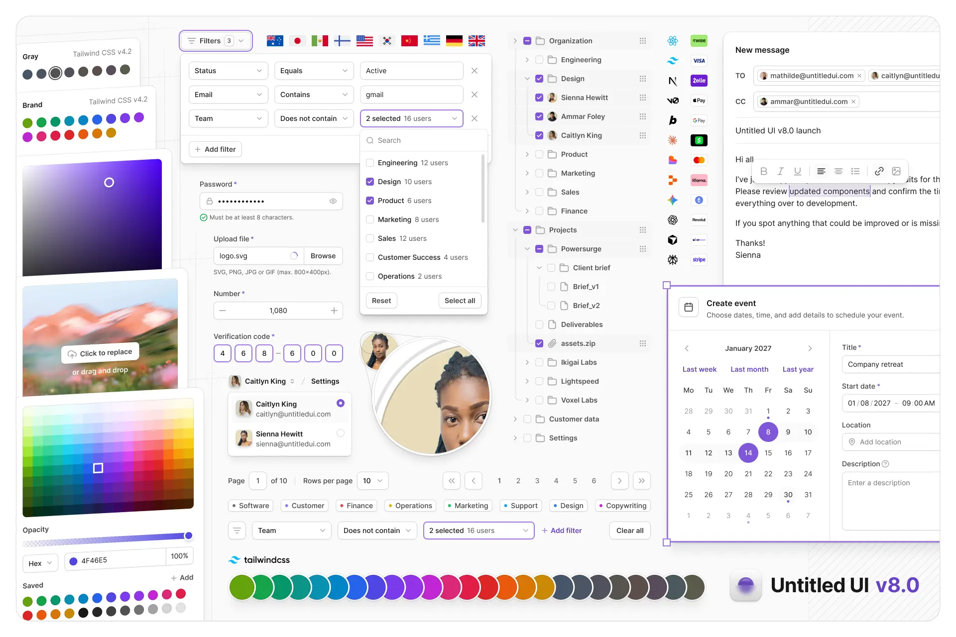
Untitled UI Figma is meticulously crafted with 100% Auto Layout 5.0, super-smart variants, Figma's newest variables features, and with accessibility in mind.
It's a great example of Figma design system best practices and is the most popular and highest-rated Figma UI kit on the internet with 3,650+ 5-star reviews!
They've also released Untitled UI Figma PRO LITE, which is a premium and lightweight version of the full Untitled UI Figma PRO STYLES kit and have included it for free. It's 55% lighter, faster, and is designed to include everything you need and nothing you don't. It's perfect for moving fast and for smaller projects!
Untitled UI was designed to be the "ultimate" UI kit and the perfect starting point for any kind of project—from beautiful marketing landing pages, all the way to complex dashboards and web apps—Untitled UI has thought of absolutely everything so you don't have to.
The team behind Untitled UI are constantly making updates and improvements to the UI kit and recently announced they've completely refactored Untitled UI to take advantage of Figma's latest features released at Config 2023, Framework 2024, Config 2024, Config 2025, and Config 2026. This includes all the latest Figma features such as color variables (dark mode), spacing, radius, typography, and effects variables, Auto Layout 5.0, min/max widths, Auto Layout wrapping, and much more.
You can check out a full preview of the design kit, or check out the 100% free UI kit here (which is more advanced than most UI kits in its own right!). If you're short on time, here's a 60-second overview: