


Designing and building data tables in Figma is a notoriously difficult task. Tables are one of the most complex components to create in Figma, especially when created using Auto Layout best practices.
One of the reasons table creation is so difficult is that there are infinite combinations and complex components and cell variations of data that needs to be displayed coherently and neatly in a small amount of space. Tables are one of the most information-dense components in UI and web design.
We've written this detailed guide to make creating tables in Figma easy! We'll cover every step of the table creation design process in Figma, including best practices for using master components and Auto Layout. We'll also dive into creating effective visual hierarchy in your table designs and more user experience best practices.
Let's begin!
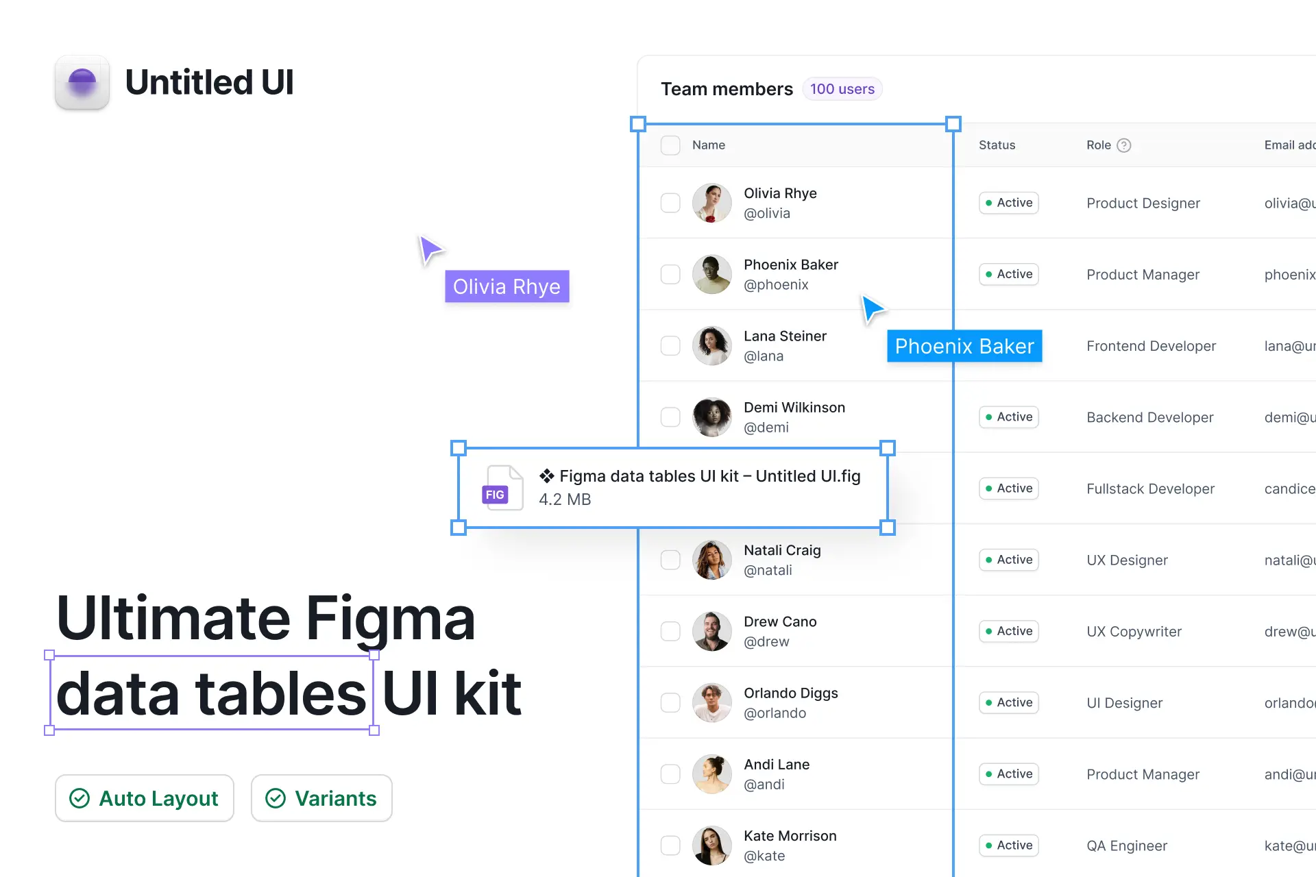
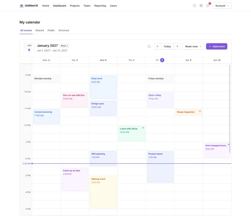
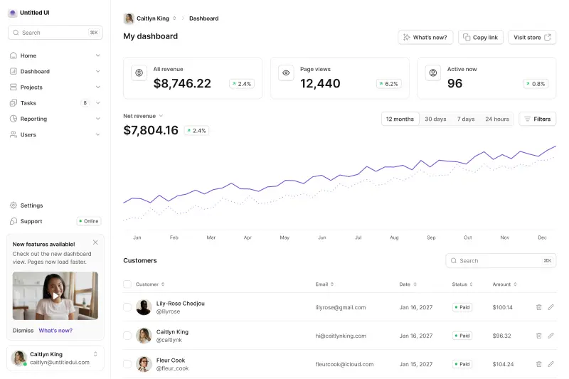
Get the free data tables UI kit in Figma Community
To make things easy for you, we've put together a free Figma data tables UI kit that you can use to follow along and use in your designs.
Duplicate this file via Figma Community → ❖ Figma data tables UI kit – Untitled UI
Best practices when creating table components
Tables are complex components because they're very information-dense. Tables contain lots of words, data, and elements competing for the users' attention, which means creating a consistent visual hierarchy between table headers, header cells, and individual cells is crucial for a good user experience.
Maintaining a clear visual hierarchy in user interface design is the most effective way to improve layouts and make them feel “designed”. A clear visual hierarchy makes content and information easier to read and scan. Consistent visual hierarchy creates familiarity between layouts and features and, ultimately, a better overall user experience.
At Untitled UI, we believe the design of tables and table components should be as minimalistic as possible as a best practice. What we mean by that is there should be no “excess” elements added to an already dense user interface. Complex components only increase eye strain and reduce readability.
Regardless of the size or content type, well-designed data table components follow some key best practices. The user should quickly and easily be able to do the following for a good user experience:
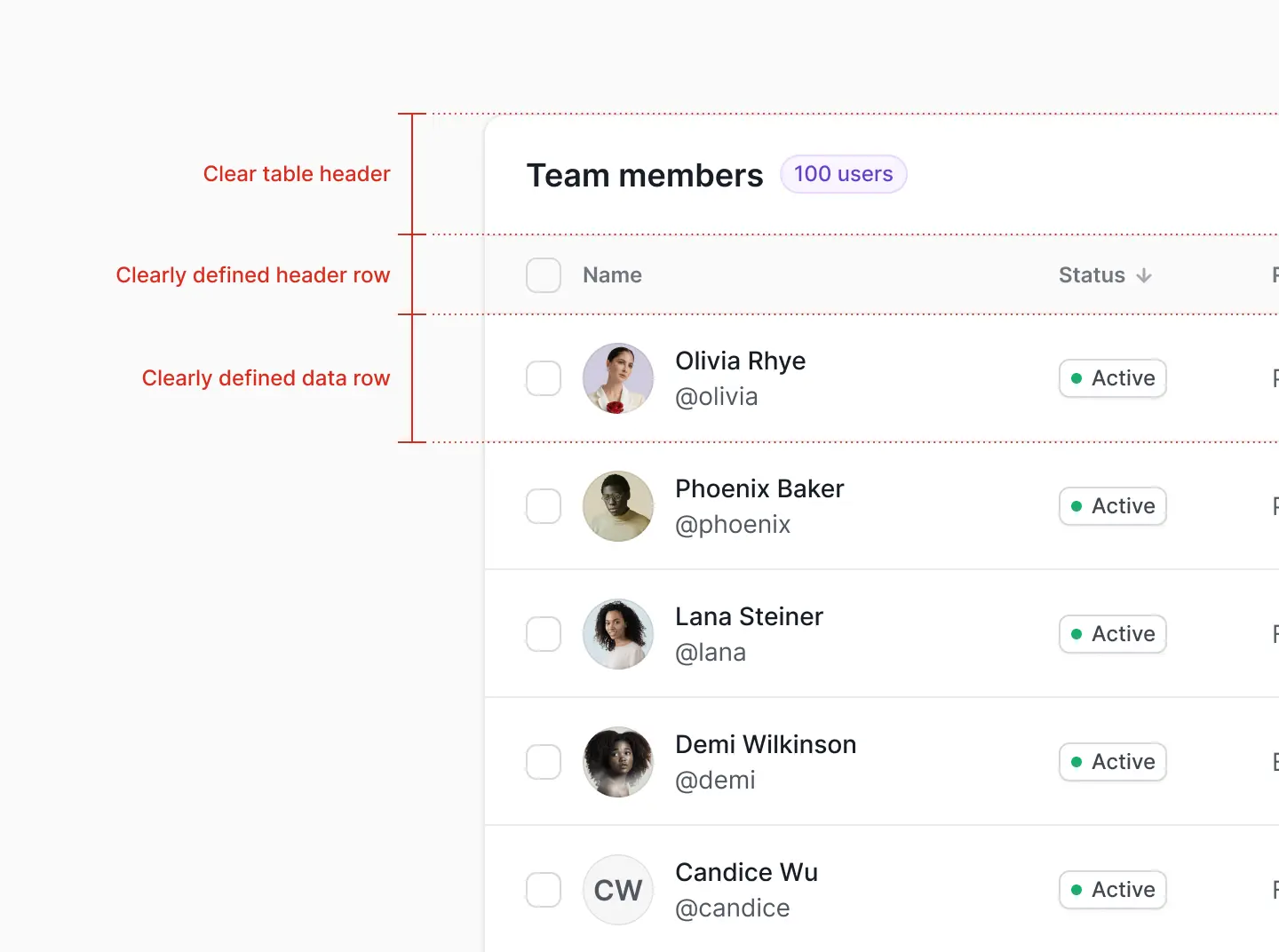
1. Maintain a clear visual hierarchy and distinguish clearly between sections in the table
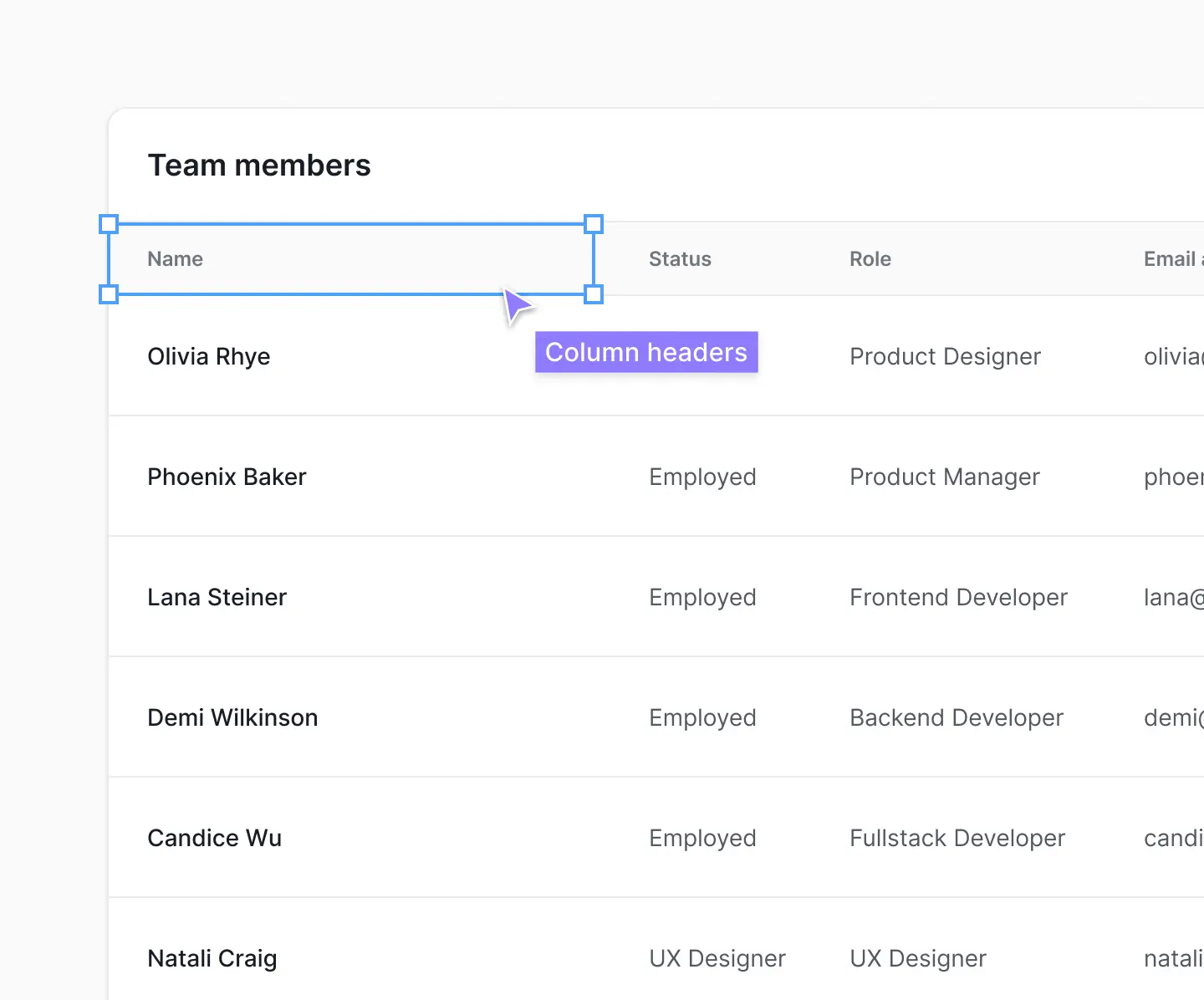
Users should be able to distinguish clearly between sections in the table. When you look at this table, your eyes should be able to instantly group information and parts of the table component together visually.
Table headers, column headers (or column titles), table rows, and individual cells should be clearly separate components. This doesn’t need to be complicated, but even Google Sheets doesn't do a great job at this by default. Table borders, dividers, and background colors usually suffice, but different styles of text color and font size go a long way to creating a clear visual hierarchy. You can take this a step further with alternating background colors for rows and header cells:
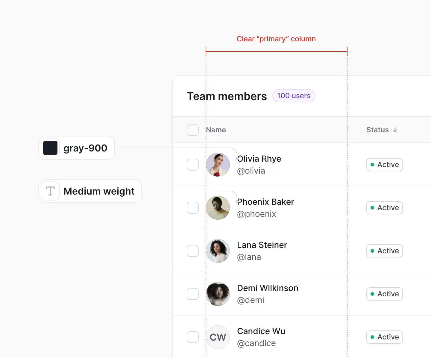
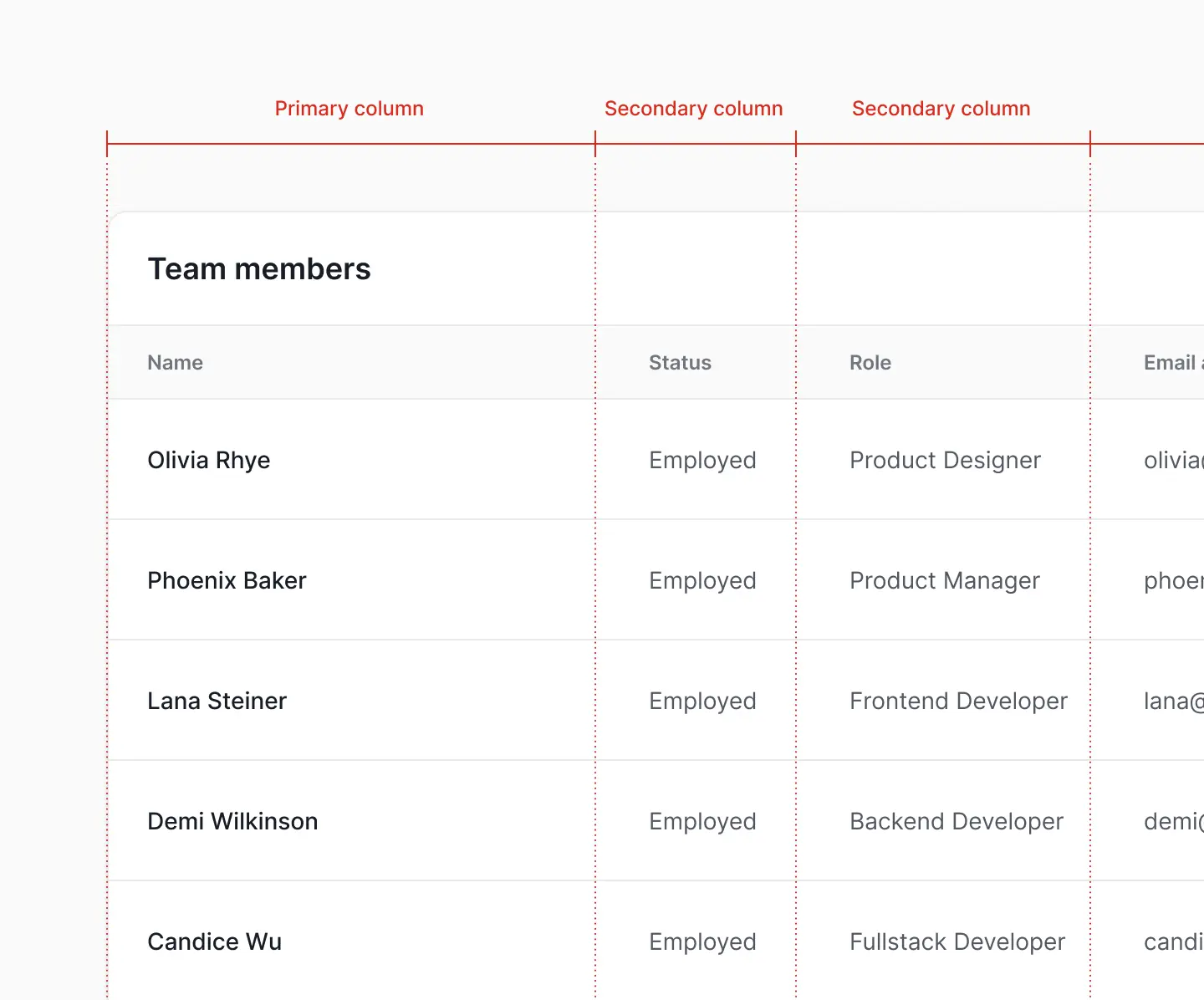
2. Have a clear “primary” table column
In your table components, there should always be a “primary” column that contains the most important data. Just like the entire table, each row should have a clear visual hierarchy horizontally as well, with the primary column (usually name, title, etc.) in a darker text color, or font size and weight to distinguish it further.
The primary column should almost always be the first column in your table row. Why? Because your eyes scan it first and it feels familiar. Don’t reinvent the wheel arbitrarily as it only creates frustration for the user:
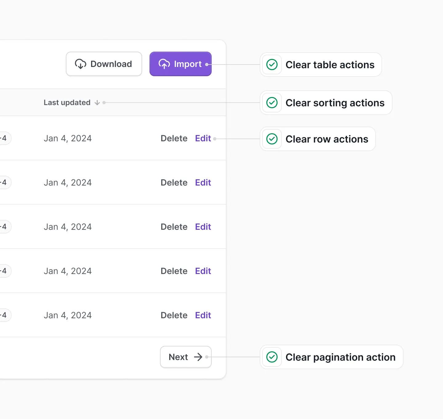
3. Be able to easily interact with the data
Users should be able to see how they can interact with the content in your table component. This includes cell states and interactive components such as search bars, buttons, bulk-select checkboxes, or dropdowns. For example, when you hover on individual column header cells in Google Sheets, a dropdown arrow appears which indicates the cell content can be clicked on:
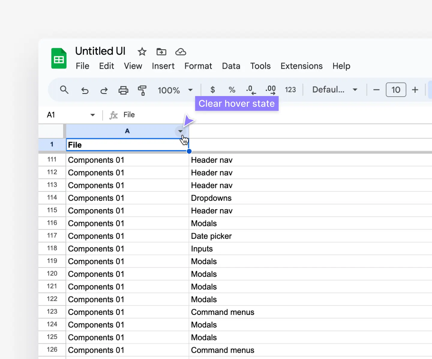
It might seem obvious, but it’s amazing how many table designs make this difficult to figure out. As a result, the user has to click around to figure out how to perform an action that should be simple, like sorting by a column via the header row:
How to create table components in Figma
Let's dive into how to create table components in Figma the right way.
To make things easy for you, we've put together a free Figma data tables UI kit that you can use to follow along and use in your designs.
Duplicate this file via Figma Community -> ❖ Figma data tables UI kit – Untitled UI
Here's our detailed step-by-step guide to creating table components in Figma:
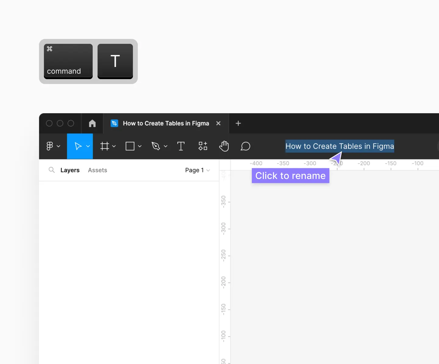
Step 1: Create a new Figma design file
Start by creating a new design file in Figma. There are a few ways to do this:
- From your Home tab in the Figma app, click + Design file button in the top right.
- Open a new tab in Figma by clicking the + icon or the keyboard shortcut ⌘ command + T.
- Type figma.com/new in the address bar or visit this link.
Click on Untitled to rename your new design file to How to Create Tables in Figma:
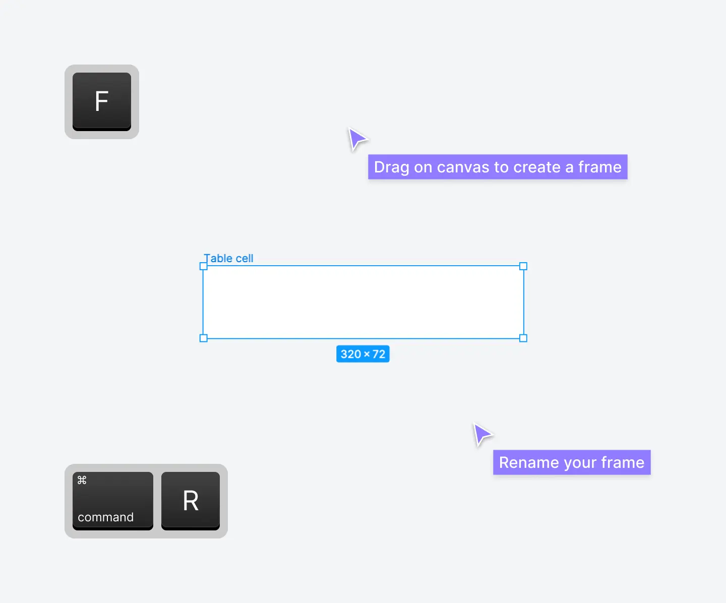
Step 2: Create a new frame
We'll start by using the frame tool to begin creating your first table cell. There are a few ways to select the frame tool in Figma:
- Use the keyboard shortcuts F or A.
- Select the frame tool in the toolbar.
Drag a frame on your canvas in the shape of a rectangle at 320px width and 72px height. Rename this frame (⌘ command + R) to Table cell. Figma will add a white background color (fill color) automatically:
Step 3: Add a text layer inside the frame
Switch to the text tool (keyboard shortcut T) and click within your frame to create a new text layer. This text layer is nested inside your frame.
Type Olivia Rhye to add text to this text layer. You can also add a fill color and text styles to this text layer via the right panel in Figma. We recommend using a dark gray text color, medium or semibold font weight, and 14px text size. 14px to 16px text is a good default size for table cells in UI design.
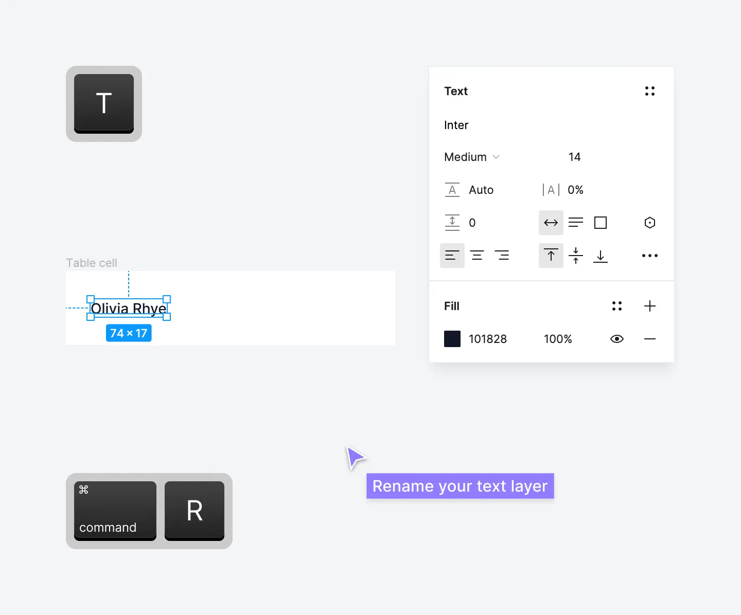
Don't forget to rename this text layer to Text (keyboard shortcut ⌘ command + R).
Pro tip: Naming layers has become a bit of a meme on X (Twitter). Usually, the people who argue about this are inexperienced and don't understand why it is a best practice in Figma.
Naming layers isn't just about being a professional and keeping designs organized for other designers and developers. Consistent layer naming instructs Figma to respect components overrides between component variants. This becomes incredibly important for complex components and as your design system grows.
Step 4: Add Auto Layout to the frame
Select the Table cell frame and add Auto Layout. With the frame selected, use the keyboard shortcut ⇧ Shift + A or click the + icon next to Auto Layout:
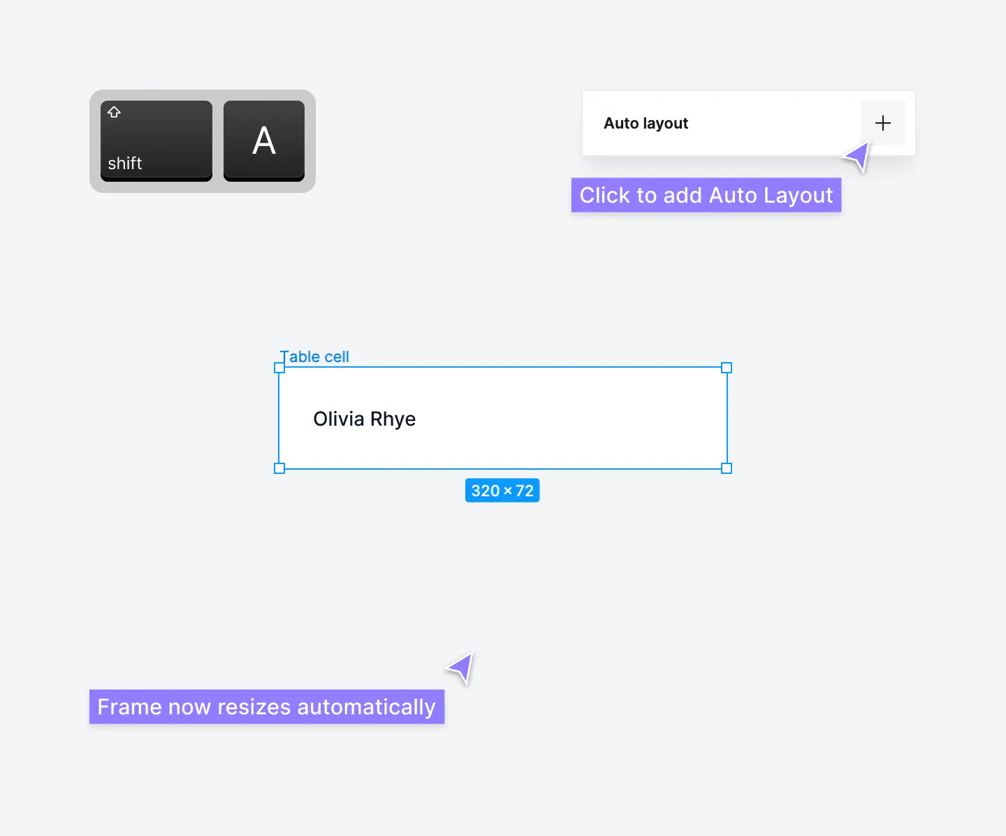
Using Auto Layout in Figma is best practice because it allows you to structure master components to grow or shrink automatically. Table cells and columns will adapt to the size of their contents and screen size. Everything adapts like magic.
If you haven't had much experience with Auto Layout yet, don't worry! Once you experience the power of Auto Layout, you'll never work any other way, especially for complex components like tables.
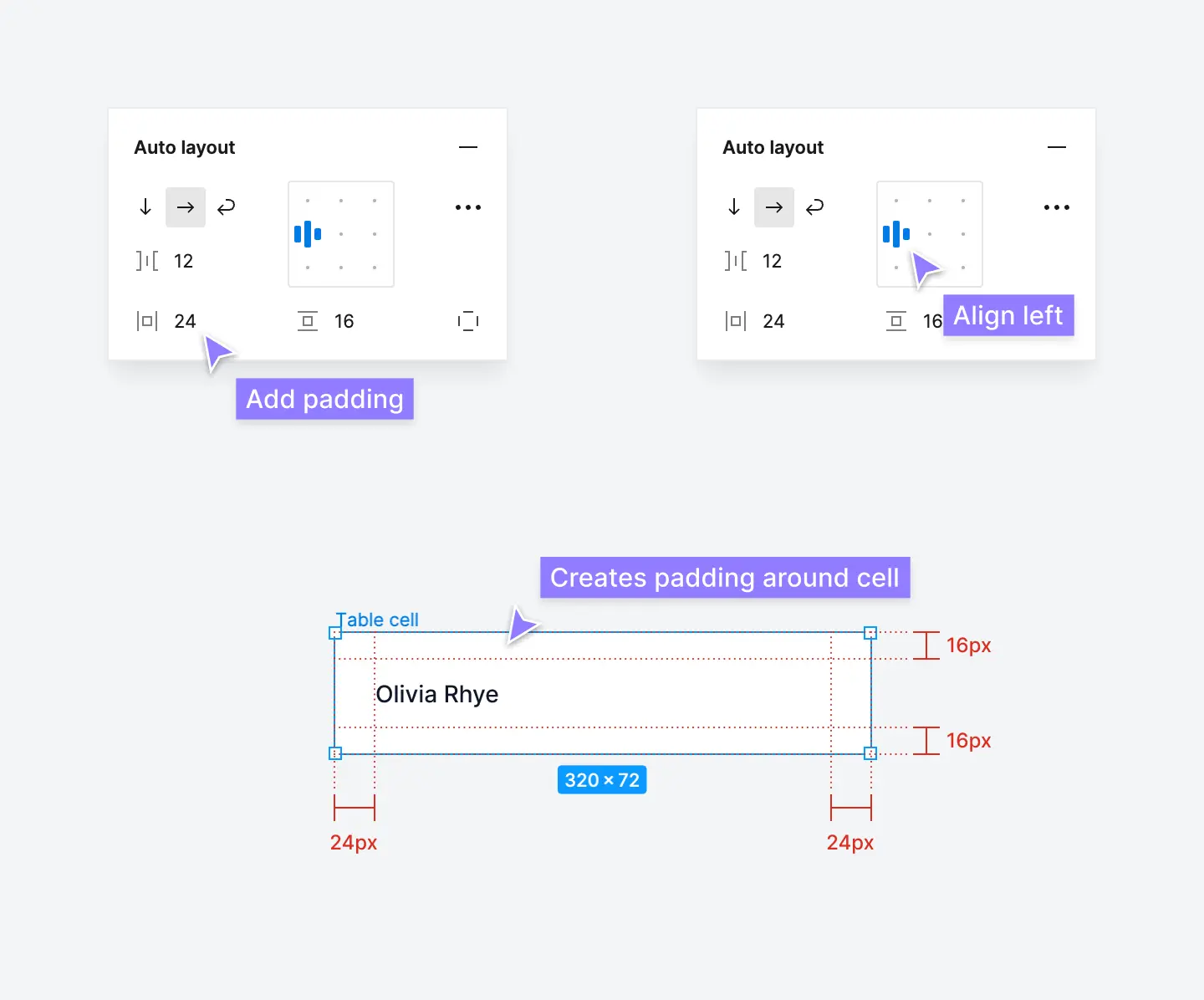
Step 5: Set table cell padding and alignment
Once you've added Auto Layout to your table cell, add cell padding. Adding padding in Figma instructs components to add space or "breathing room" between the frame and its contents within the table cell.
In the Auto Layout properties section, add 24px horizontal padding and 16px vertical padding. Also, switch the Auto Layout to align left and add a 12px horizontal gap between elements:
Step 6: Set a table cell height
We also recommend adding a specific fixed height and fixed width to the frame as well. In the Frame properties section, switch the vertical resizing to fixed height. We recommend a fixed height of 72px. 64px to 80px is a good default height for table cells in UI design:
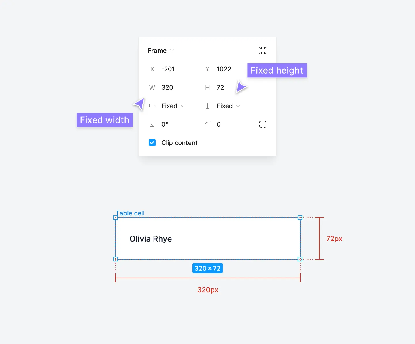
Adding a fixed height will instruct Figma to not resize the table cell based on its contents, essentially removing Auto Layout for height. In your table components, you want table rows to remain the same size, regardless of their cell contents.
Step 7: Add a border to act as a divider
Select the Table cell frame and add a bottom border by clicking the + icon next to Stroke. Set a 1px stroke weight in a light gray stroke color. You can switch this border to a single side by clicking the stroke per side icon and clicking bottom:
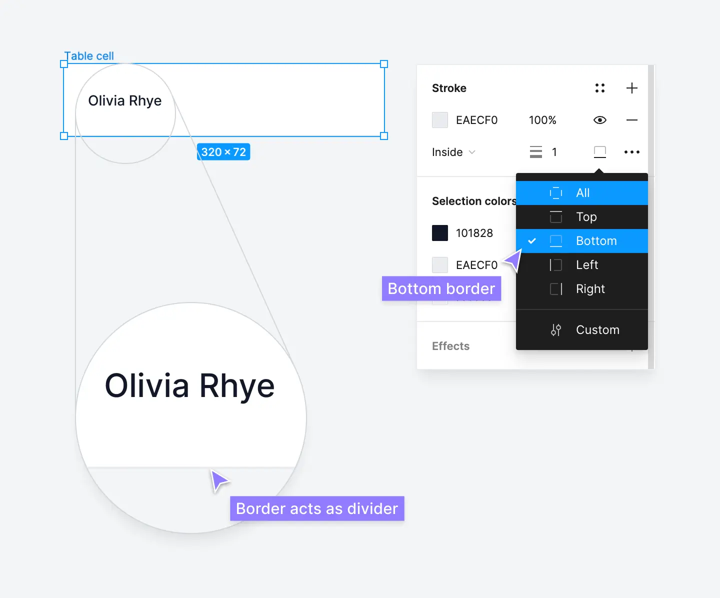
This bottom border will act as a divider between table rows in your table component. If you want to divide cells within individual rows, you can also add a left border. Adding a left border isn't necessary.
Step 8: Create a new component
Now it's time to turn this table cell into a component! Select the Table cell frame and click the create component icon at the top of your canvas. Use the keyboard shortcut ⌥ Option + ⌘ Command + K:
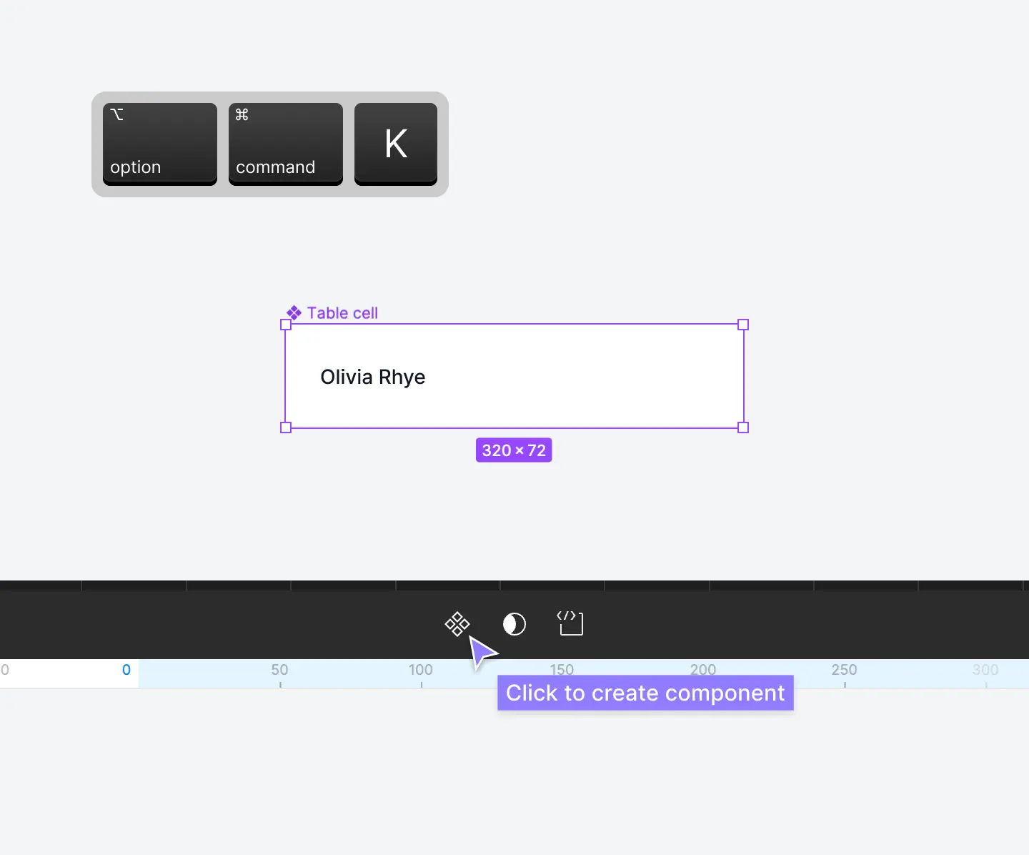
This will turn your humble table cell frame into a new master component. Figma will nest the layers within a special component frame which is identifiable by the purple icon.
You can create components in Figma to reuse thousands of times in your designs. If you're familiar with Atomic Design Methodology, this will make sense already. These table cells act like "molecules" and changes you make to master components will cascade down to everywhere they're used in your designs.
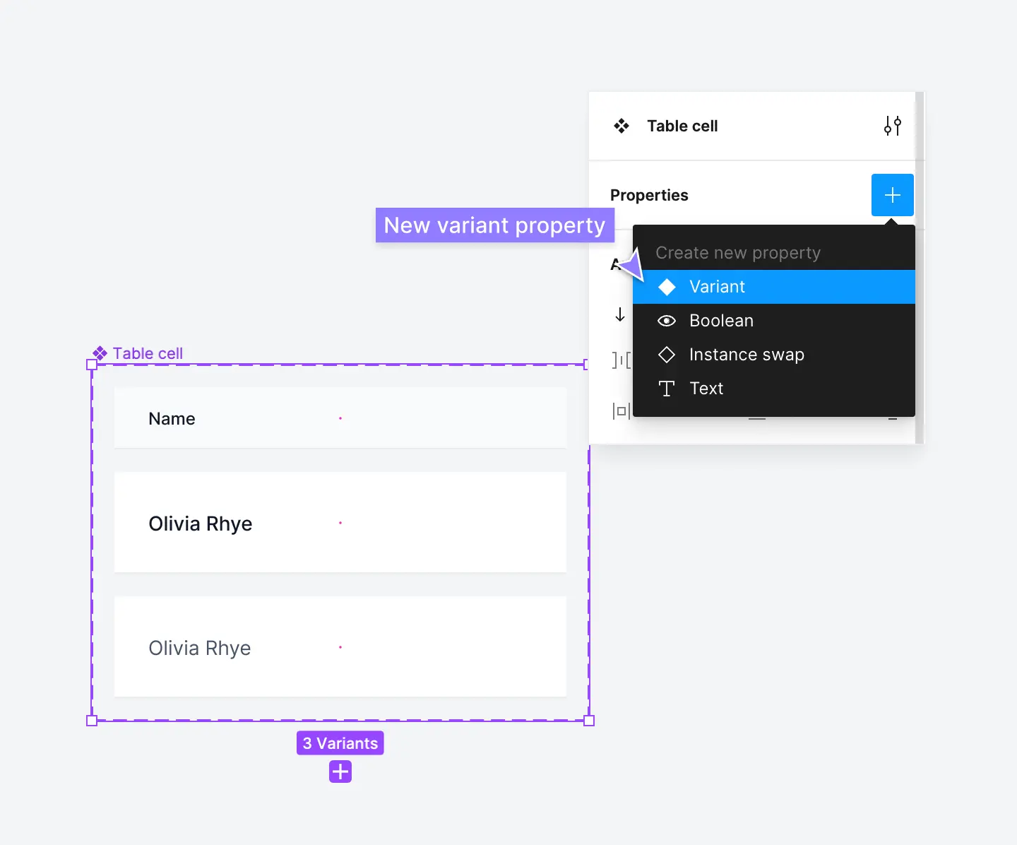
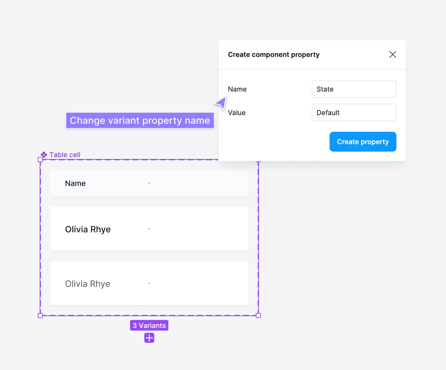
Step 9: Add a new variant property to your table cell component
Once you've created your table cell component, you can create variants of this component using variant properties. If you haven't had much experience with Figma, don't worry! It's super easy to get the hang of.
Component properties in Figma allow you to group and organize similar components into a single component. This is useful for components like table cells, where you need multiple different types of table cells that are similar with only slight differences.
Select your Table cell component and add a component variant. Click the + icon in the Properties section of the right panel and select Variant. You can also Right-click the component > Main component > Add variant:
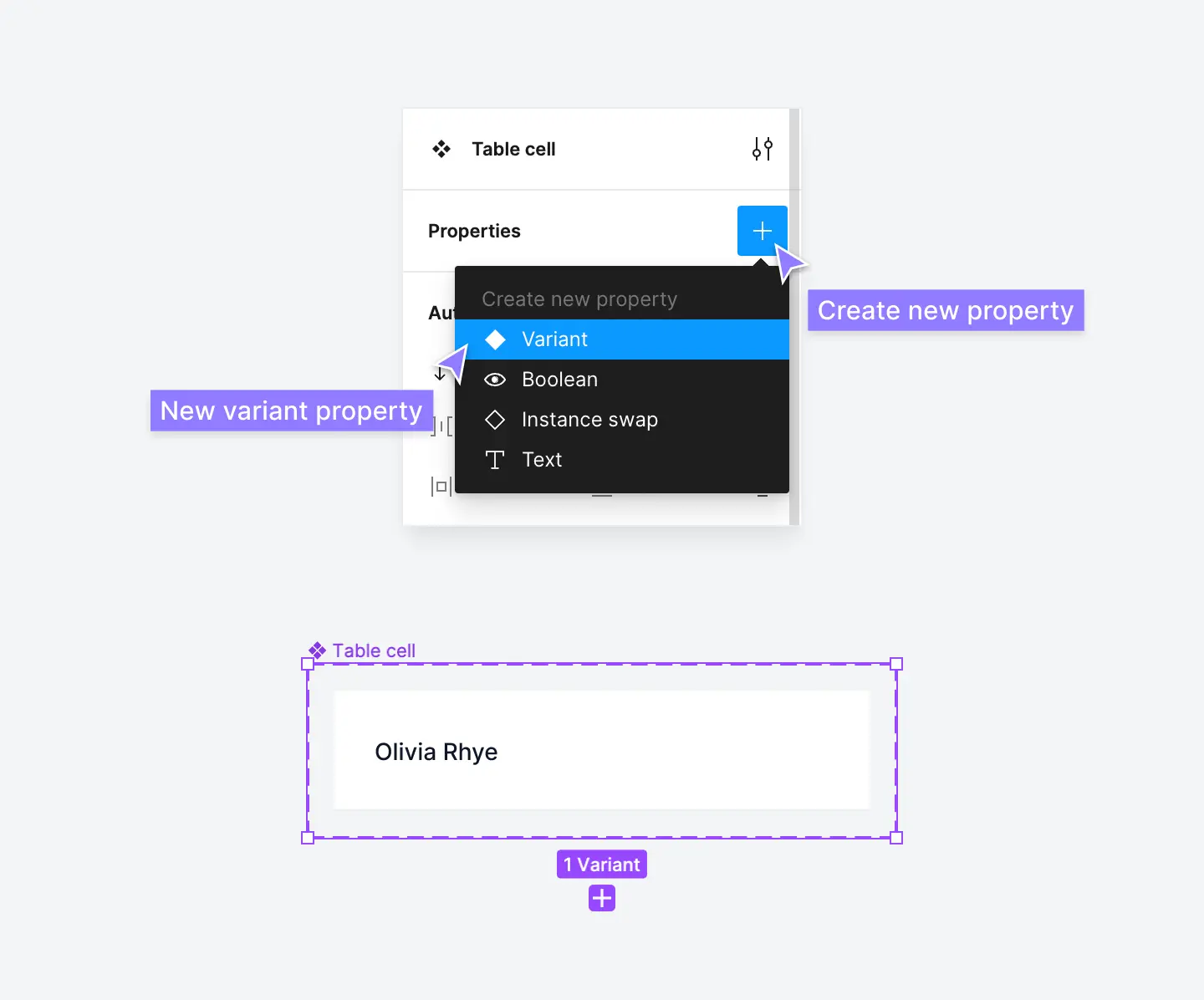
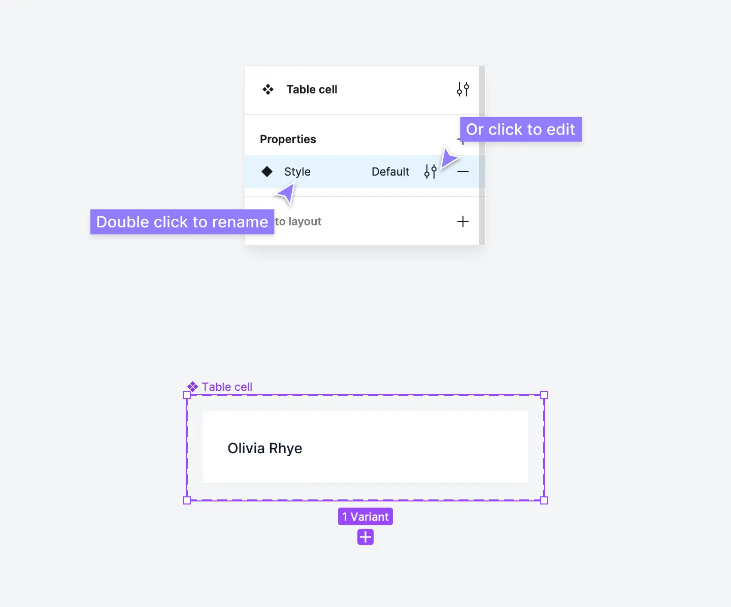
From here, double-click on the variant property name which is set to Property 1 by default and rename this to Style:
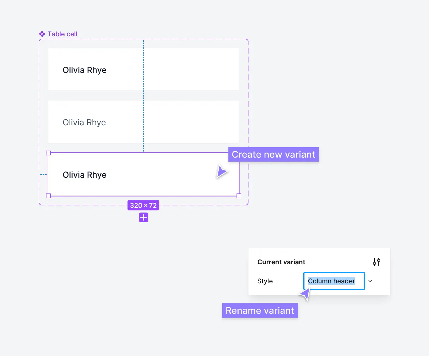
Step 10: Create a new variant of your table cell component
Because tables are so context-specific, there are infinite combinations of data and information that need to be displayed. The number of variants you need depends on how complex your table components will need to be:
As a start, we recommend creating a lead text table cell and a body text table cell. These are used to create a visual hierarchy between your primary table column and secondary table columns:
Return to your Table cell component and click the + icon to create a new variant. This will create a copy (variant) of your table cell within the same component:
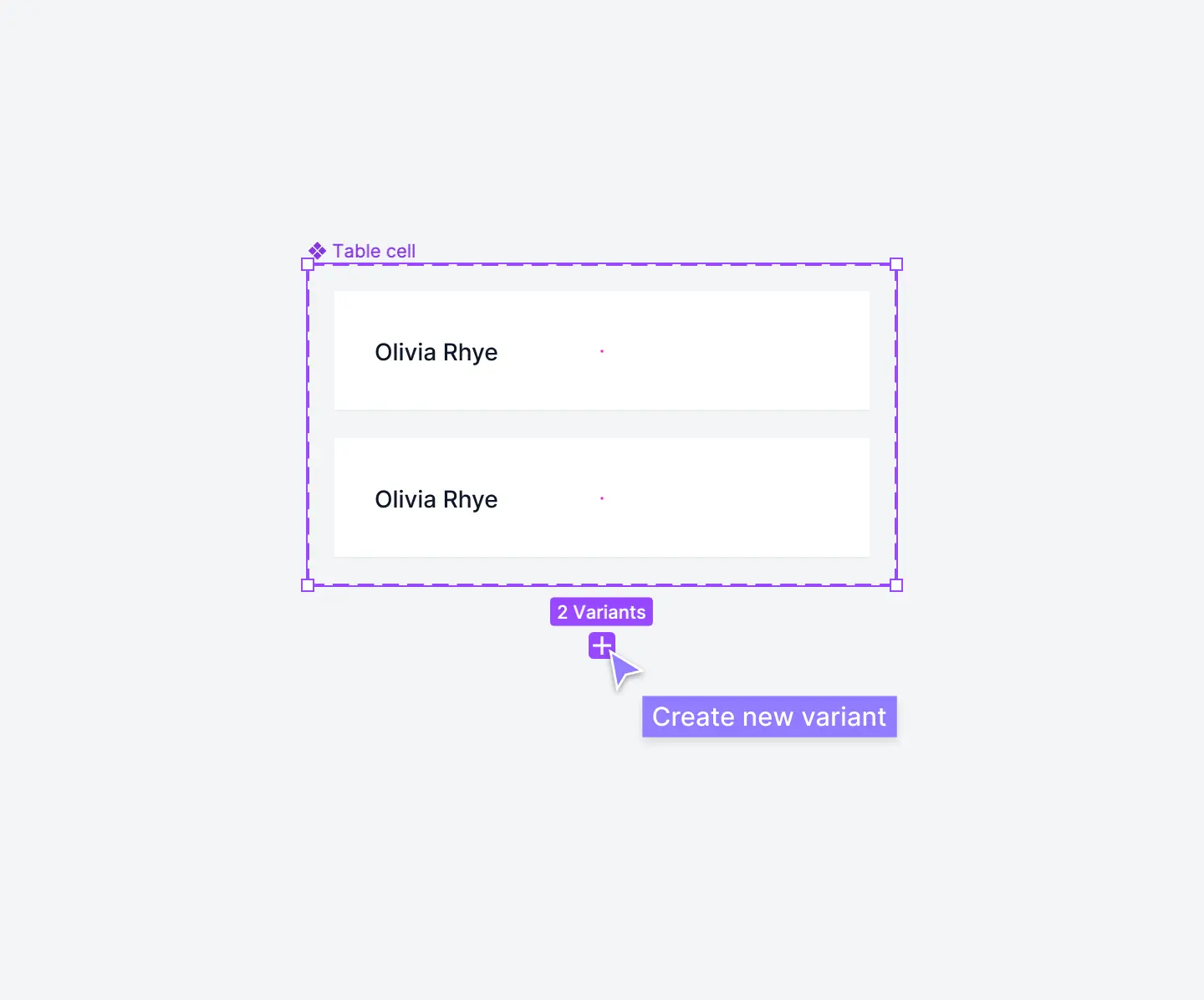
Restyle this new variant by changing the text layer fill color to a lighter gray and the text weight to regular. This creates a clear visual hierarchy between the two table cells. Select these variants and rename them to Lead text and Body text, respectively, by editing the name in the Current variant properties section:
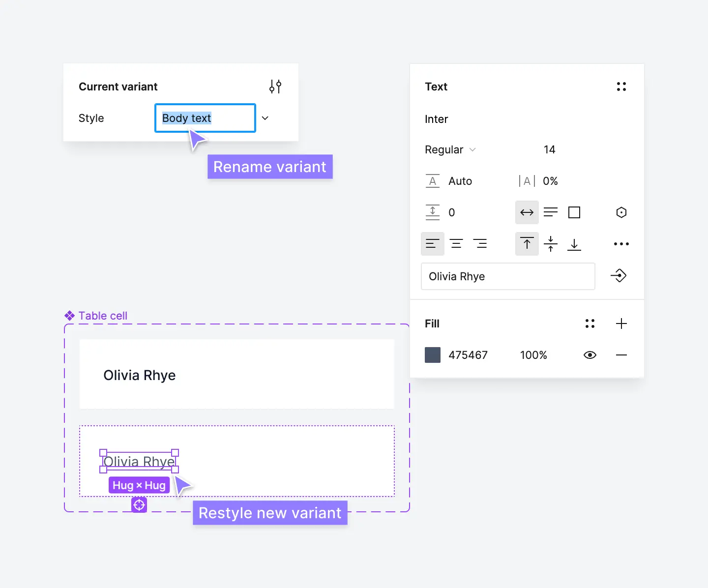
Step 11: Create a column header cell component
Once you have some basic table cell components set up, the next step is to create a column header cell. These act as "labels" for columns in your table components:
You can create this header cell component as a completely separate component. Alternatively, to keep things simple, you can also create this header cell component as a new variant of the table cell component we created above.
Follow the same step as above by clicking the + icon to create a new variant and rename it to Column header by editing the name in the Current variant properties section:
Just like we did with the Body text table cell variant, restyle this new variant to create a clear visual hierarchy between the column header and regular table cells:
- Change the text layer to a lighter gray and the text size to 12px.
- Change the background color (fill color) to a light gray.
- Change the frame fixed height to 44px and vertical padding to 12px.
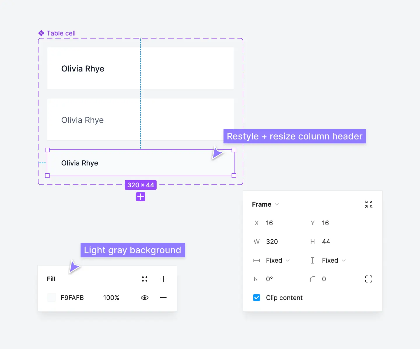
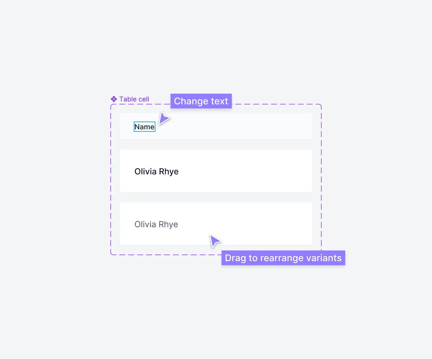
You can also change the text layer to something else such as Name to differentiate it from the other table cells. If you want to rearrange these variants inside your component, just drag them within the frame:
Step 12: Create a primary column for your table component
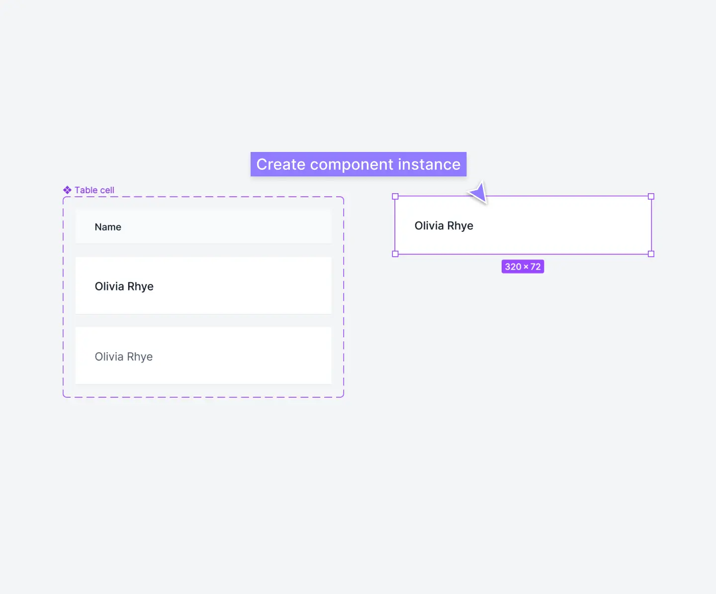
Now we've got everything we need to create a basic table component. We'll use the Lead text variant of the Table cell component to create the lead or primary column.
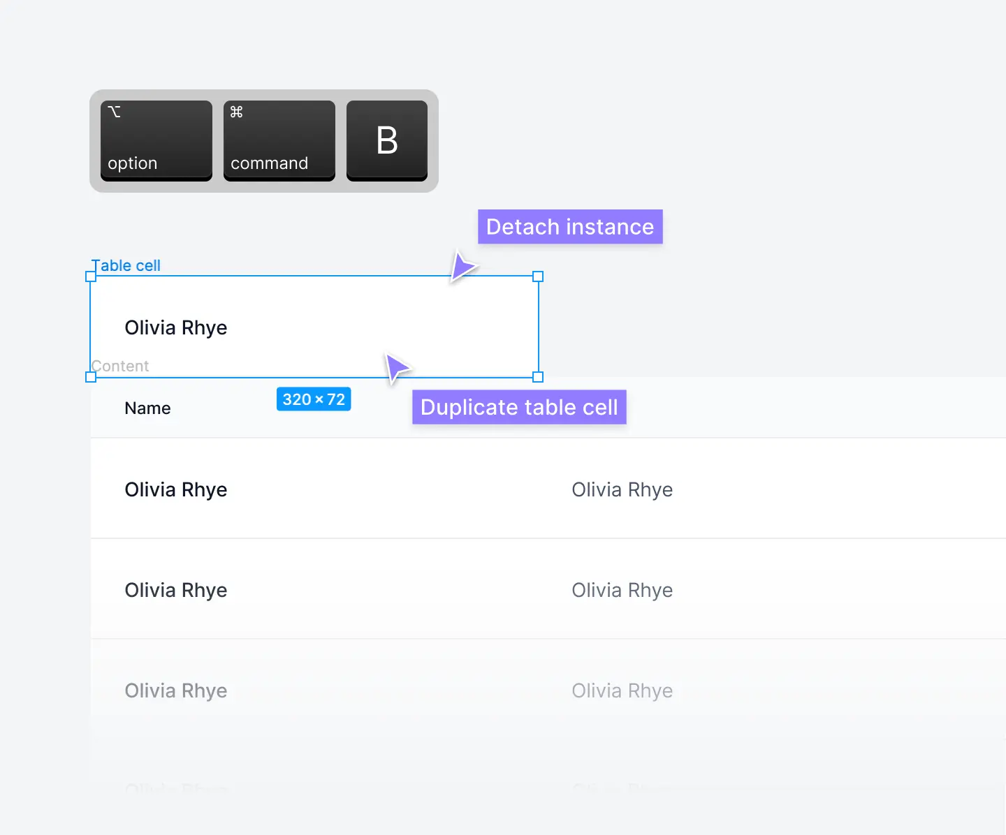
Select the Lead text table cell and hold ⌥ option as you drag it outside of the frame. This will create a copy of the master component, known as a component instance:
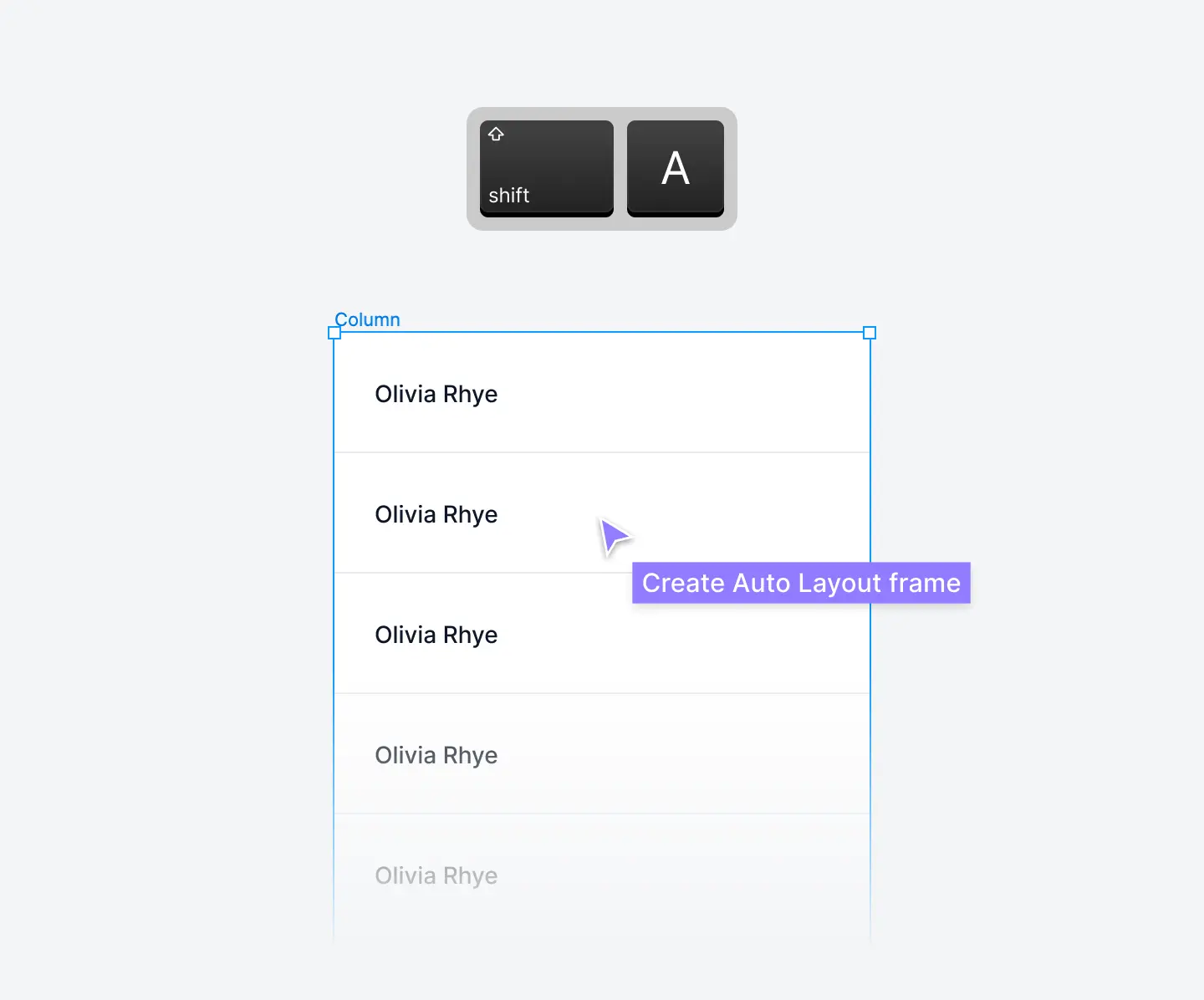
Duplicate this component instance again and place it below. Repeat this duplication process until you have eleven table cells stacked vertically. Once you've copied one, you can use the keyboard shortcut ⌘ command + D to speed this up:

Select all eleven table cells and wrap them in an Auto Layout frame using the keyboard shortcut ⇧ Shift + A or click the + icon next to Auto Layout. This groups them into a table column which you can rename Column:
Step 13: Add in a column header
You can easily add a column header to this frame by selecting the top table cell and switching the style to Column header in the Current variant properties section:
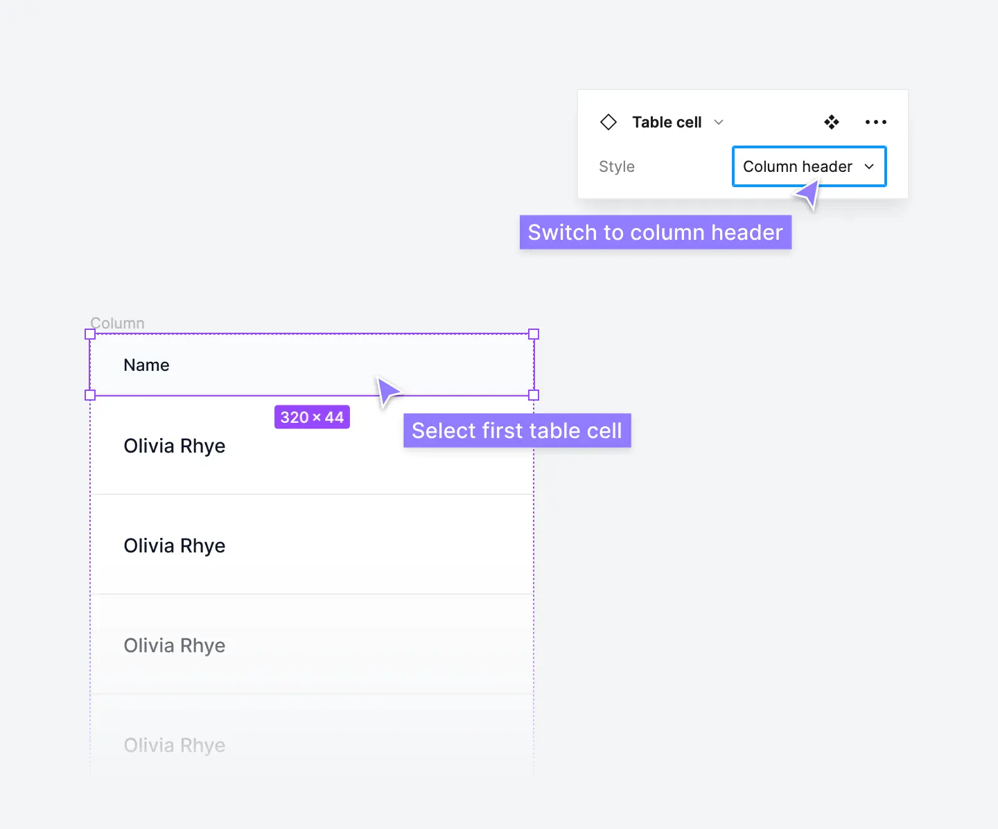
This is the power of using component property variants—you can quickly switch between different table cells within a single component.
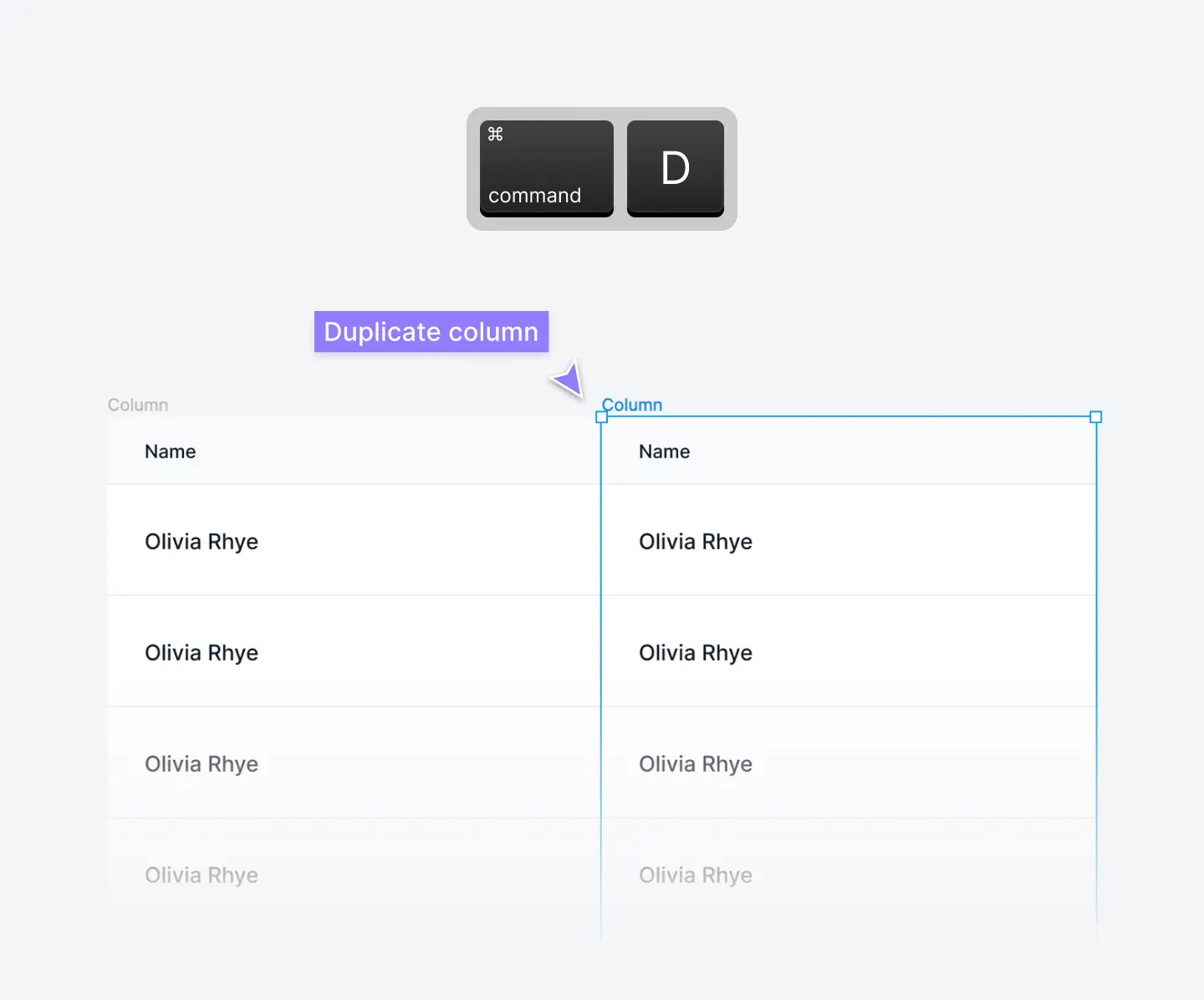
Step 14: Create secondary columns for your table component
The column we just created acts as the lead or primary column in your table component. You can duplicate this entire column (including the ten table cells inside of it) by holding ⌥ option as you drag:
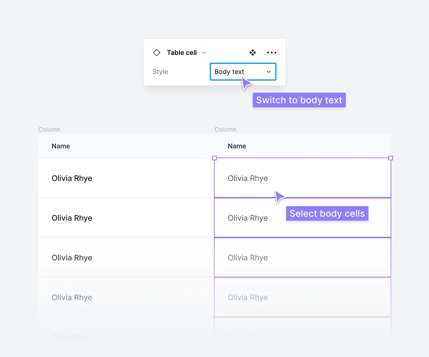
Select the ten Lead text table cells inside of this column and switch the style to Body text in the Current variant properties section:
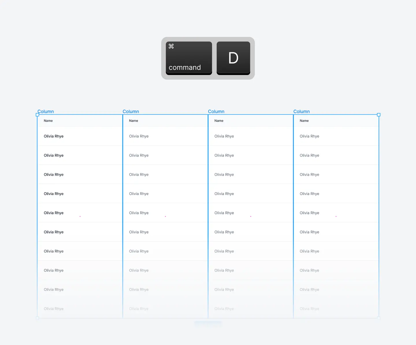
Then, duplicate this column so you have four total table columns stacked horizontally (including the primary column):
Step 15: Group these columns together with Auto Layout
Select all four table columns and wrap them in an Auto Layout frame using the keyboard shortcut ⇧ Shift + A or click the + icon next to Auto Layout. This groups them into a basic table component which you can rename Content:
Step 16: Add a table header
Create a simple table header to add to the top of the table component.
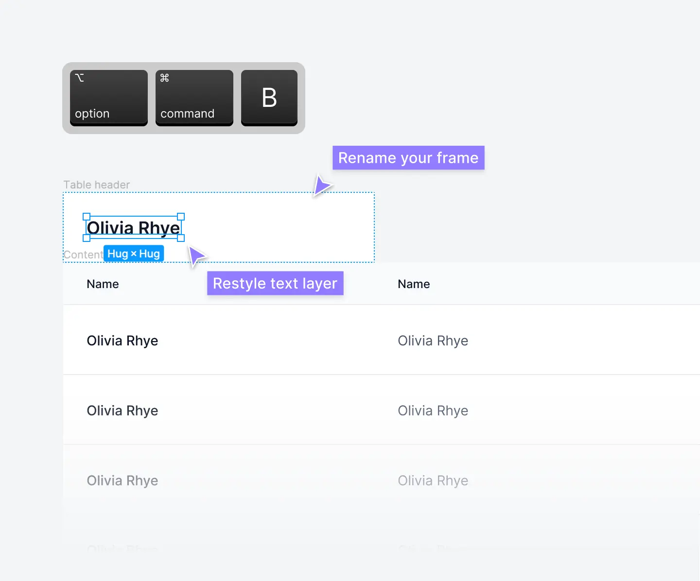
A quick hack to create a table header is to duplicate an instance of the Lead text table cell components and detach the instance. You can do this by clicking detach instance in the Current variant properties section. You can use the keyboard shortcut ⌥ option + ⌘ command + B:
Detaching a component removes any connections to the master component (the table cell component). We now have an Auto Layout frame we can use to turn into a table header.
Rename this frame to Table header. Select the text layer and change the text size to 18px and the text weight to semibold. 16px to 18px text is a good default size for table headers in UI design:
Step 17: Group everything together with Auto Layout
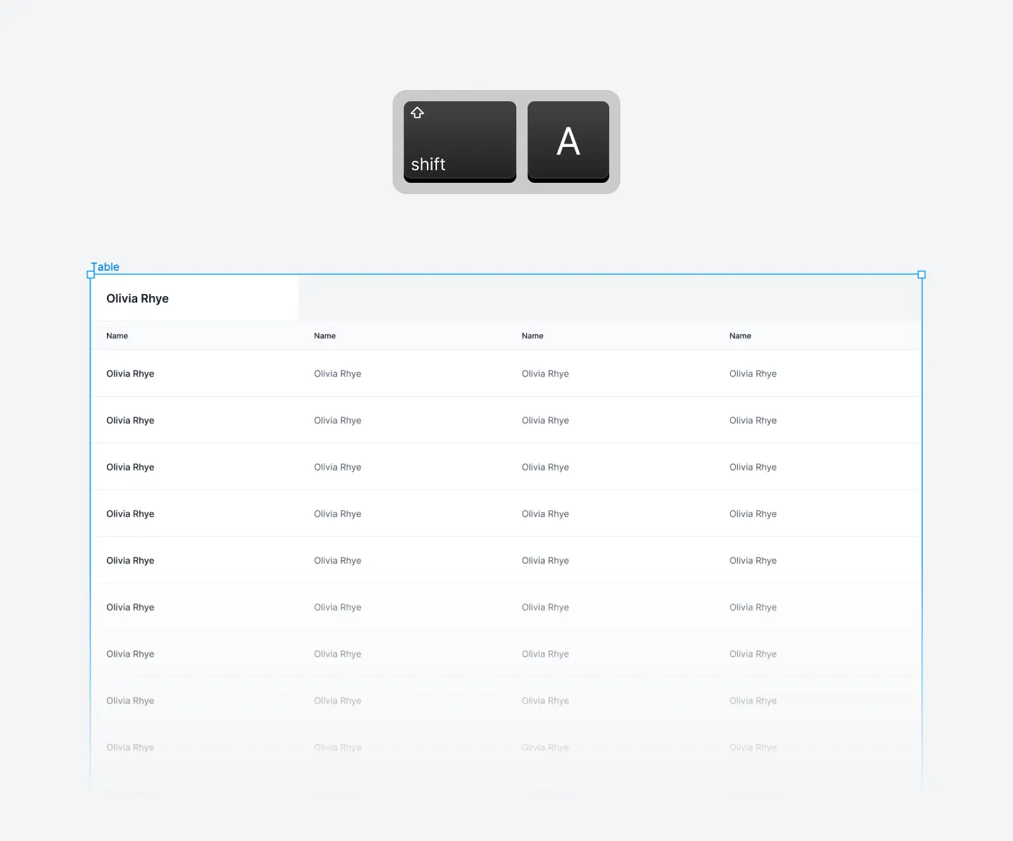
Stack your new card header directly above your table cells. Wrap them in an Auto Layout frame using the keyboard shortcut ⇧ Shift + A or click the + icon next to Auto Layout. This groups them into a table component which you can rename Table:
Step 18: Make your table component responsive
The next step is to add basic responsiveness to your table component using Auto Layout. This will ensure each column width responds to changes in table size and screen size in your designs.
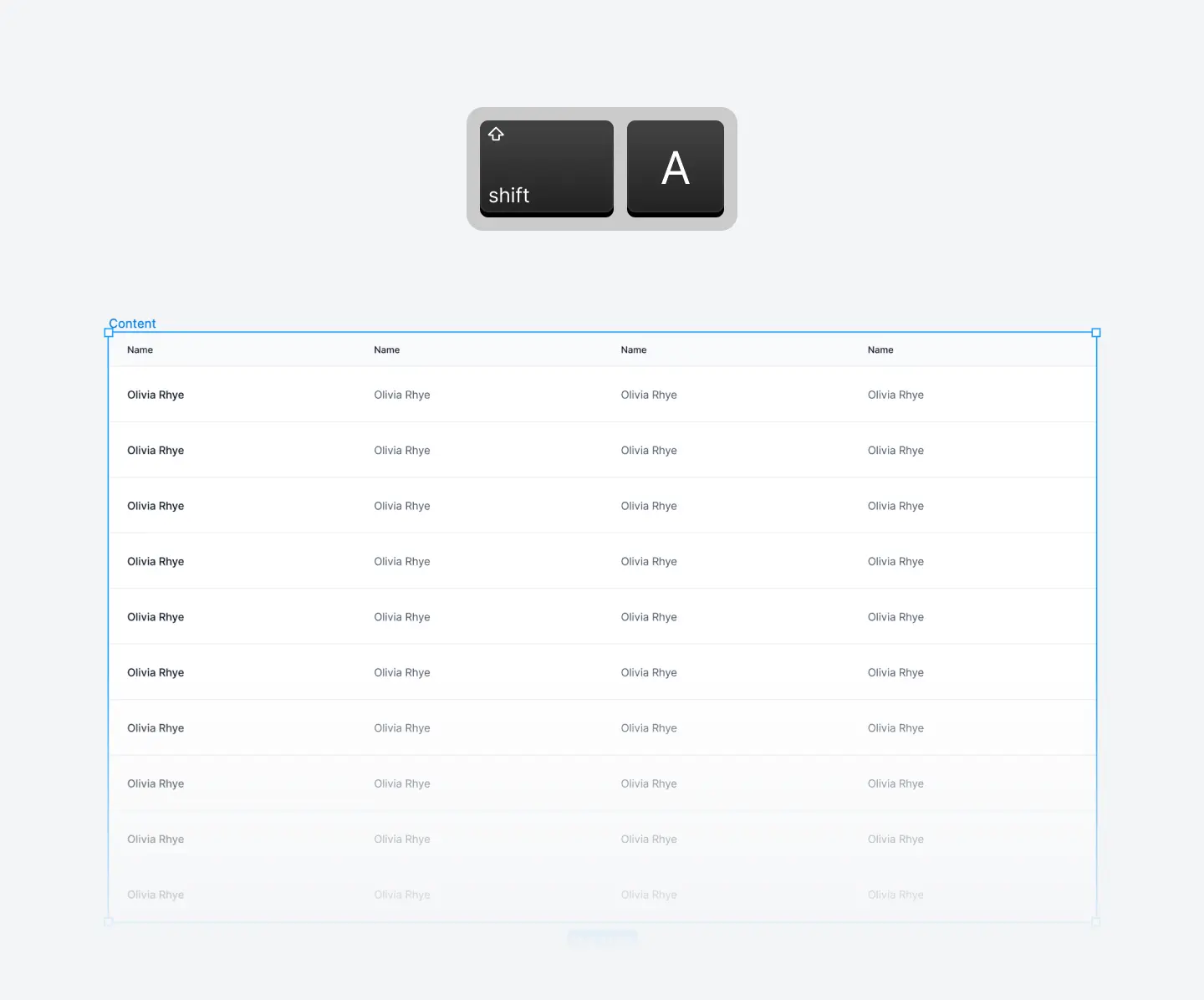
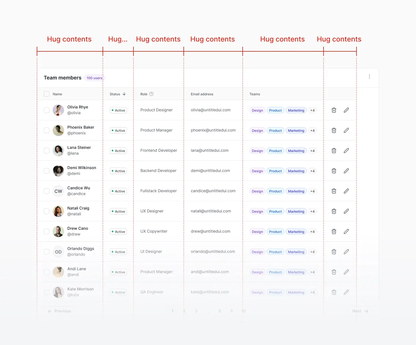
While you have the entire table component selected, switch the width from hug contents to fixed width. Then, press enter to select the child layers (Table header and Content). In the Frame properties section, switch the horizontal resizing to fill container:

Press enter again to select all the child elements (table columns) and switch the horizontal resizing to fill container as well to evenly distribute each column width. Repeat once more by pressing enter to select the individual table cells and switch these to fill container:
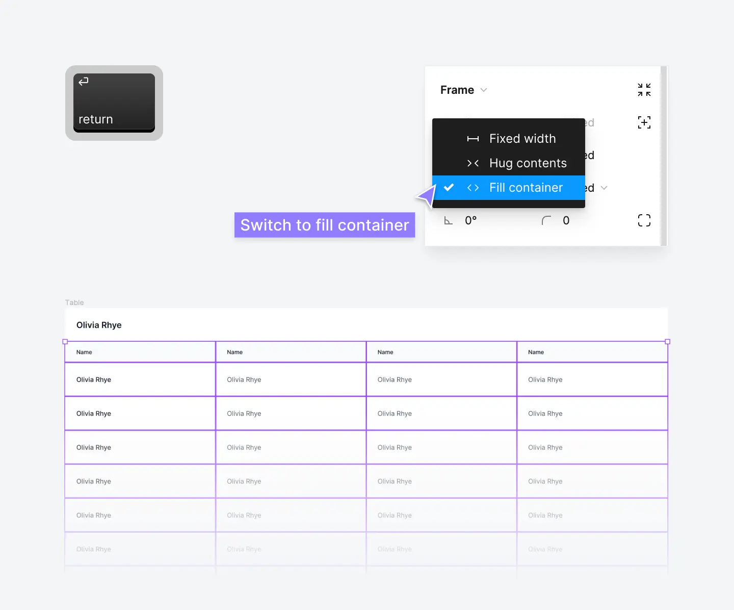
Setting these to fill container will force the table columns and table cells to grow and shrink automatically as the table is resized. Select the entire table component and set the width to 1,216px and watch everything resize like magic!
Step 19: Style your table component
We're almost there! Select your table component and add some basic styling. Try adding a 12px corner radius, a 1px light gray stroke (border), and a subtle drop shadow:
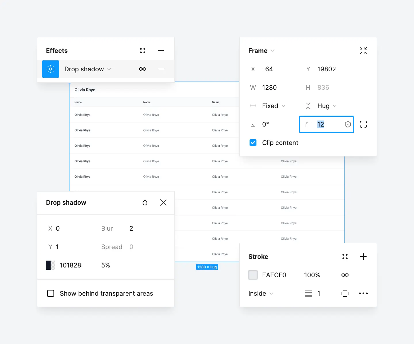
You now have a fully-responsive table component set up in Figma!
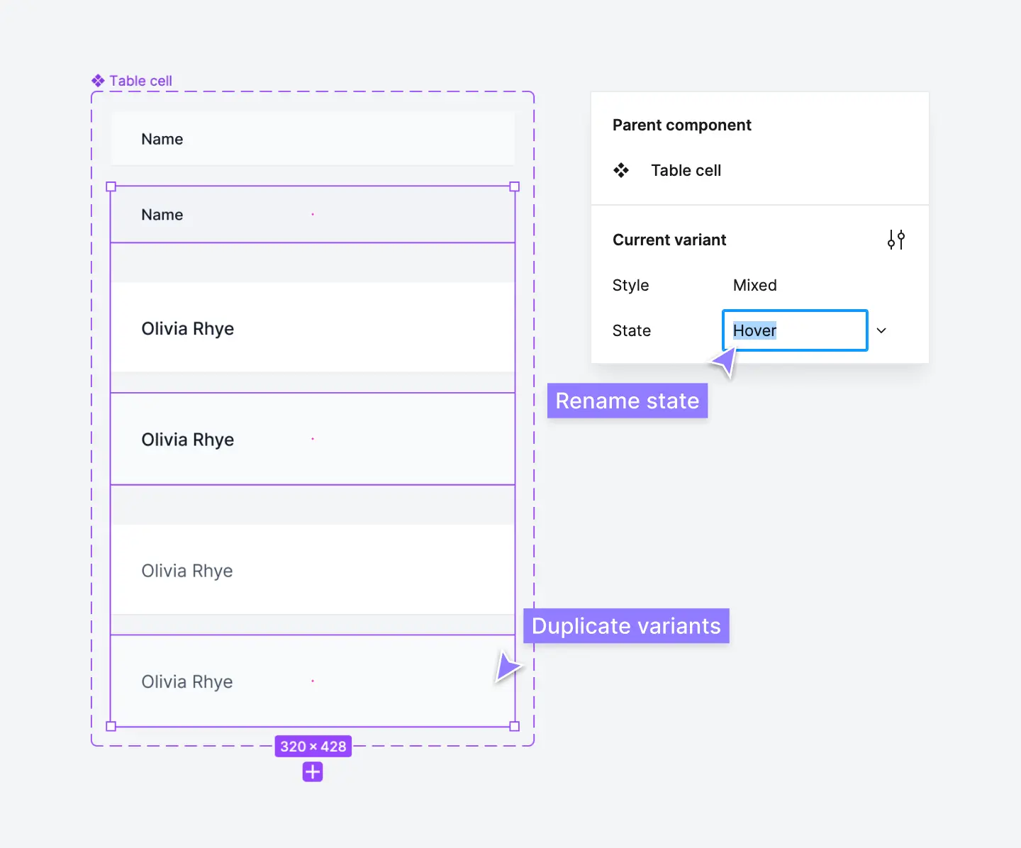
Step 20: Add different states to your table cell components
This step is optional, but it's a good idea to add different states to your table cell components. Different states define how components behave under different circumstances, such as when the user hovers or clicks on them, or when they're disabled in a user interface.
We recommend adding some simple hover state component variants of your table cells. Select your Table cell component and add a component variant by clicking the + icon in the Properties section of the right panel and selecting Variant. You can also Right-click the component > Main component > Add variant.
From here, double-click on the variant property name and rename this to State:
You can now use this new State variant property to create new variants of your table cells for different states, such as hover. Add a different color background color (fill color) to show how these cells should behave when the user hovers over them:
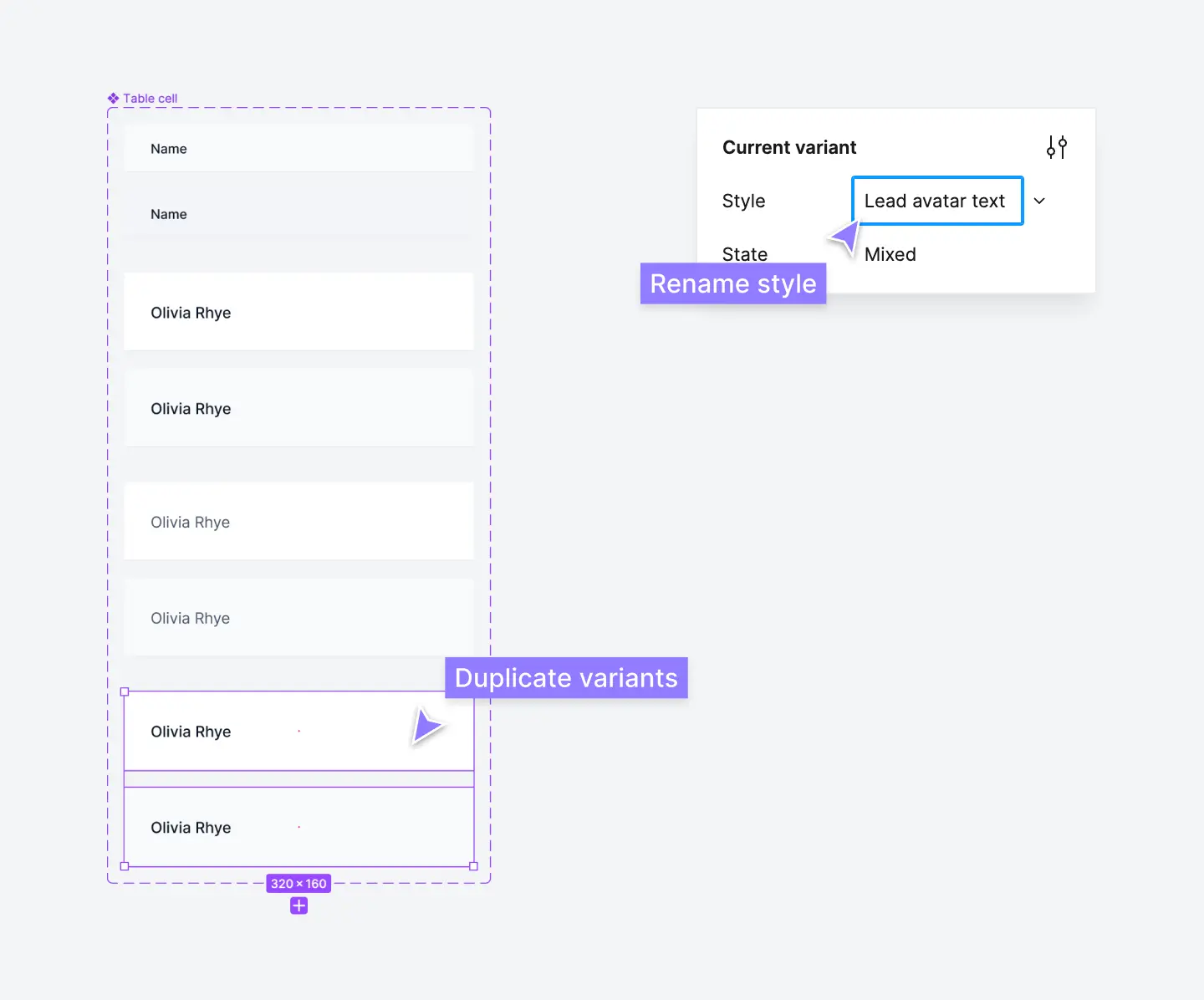
Step 21: Add more variants to your table cell component
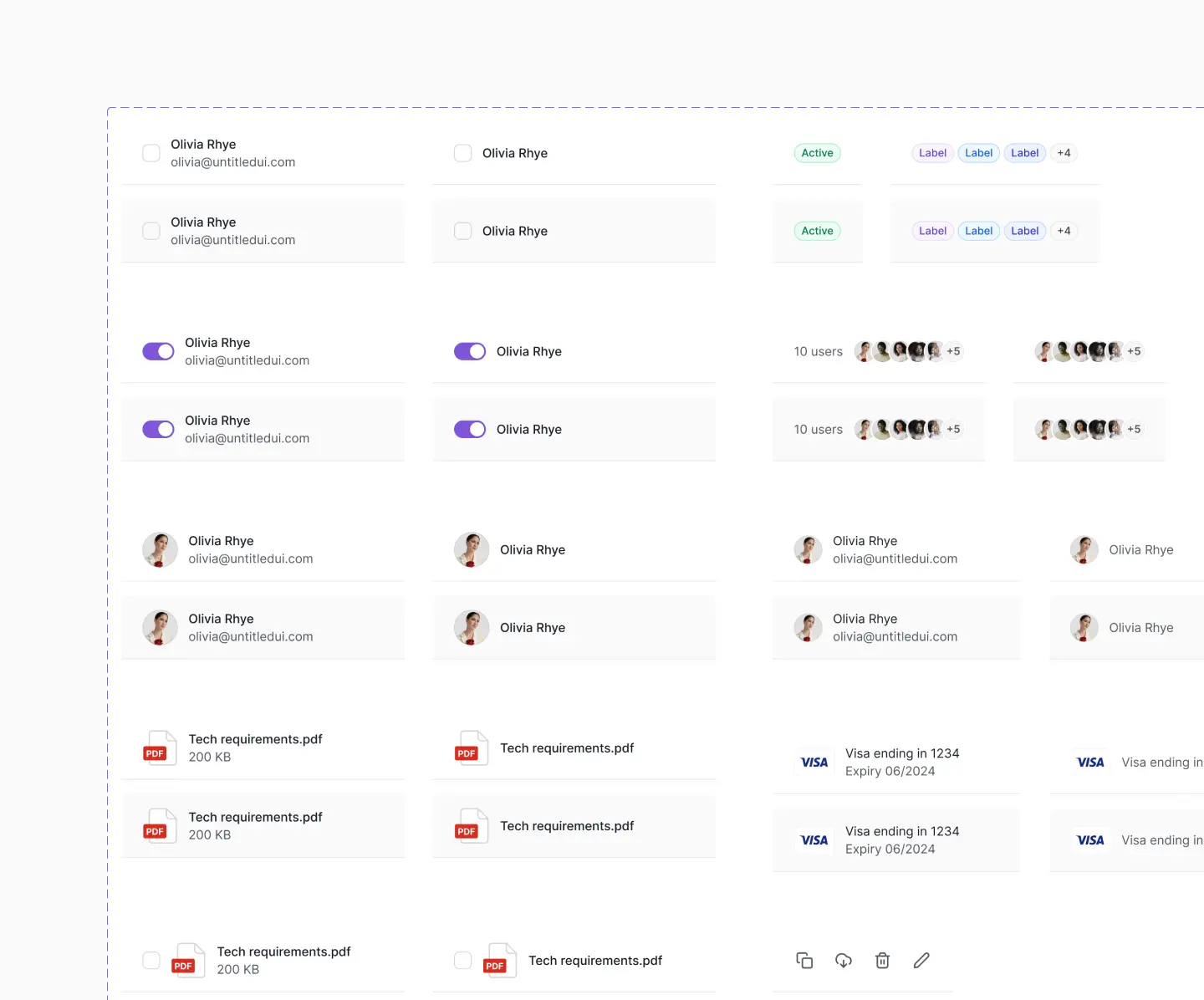
Once you've got your table components set up, you can add more variants to your table cell component, depending on what you need. The number of table cell variants you need depends on how complex your table components will need to be.
The great thing about component variants in Figma is that you can always add new variants later on! For example, you may decide you need a variant of the Lead text table cell component that includes a user avatar or different icons.
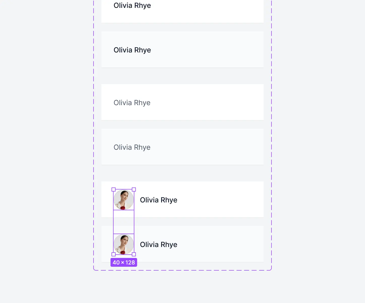
Because the table cell component is already set up, you can just follow the same steps. Return to your Table cell component and duplicate the Lead text variants to create two new variants. Rename the style property to Lead avatar text by editing the name in the Current variant properties section:
Once this is set up, you can simply paste an avatar component inside the table cell variant and begin using it in your table components! The same applies to adding different icons, checkboxes, buttons, a status icon etc.
The same goes for any type of table cell component you need, whether it's checkboxes, dual-text layer cells, or star ratings. As your design system and your table components grow in complexity, just add table cell variants that suit your needs.
Build table components with columns instead of rows
A common approach we see to building table components in Figma is to use table rows as separate components instead of the columns approach above:
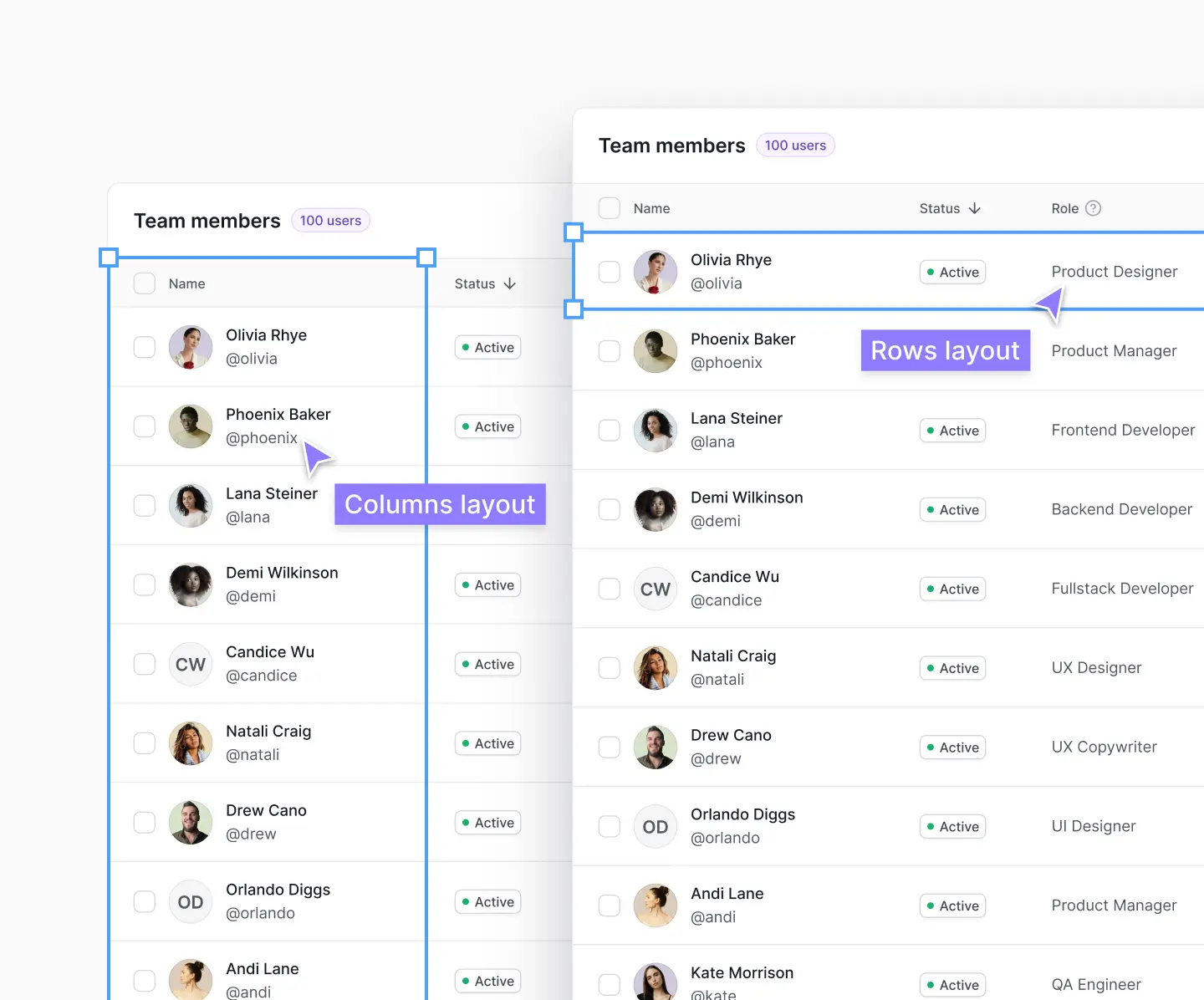
While both approaches will work just fine, we strongly recommend the column approach to building table components, especially when using Auto Layout and designing responsive layouts for different screen sizes.
Using columns in your tables is a much more flexible approach and they are much easier to manage in the long run. We experimented for a long time when we were building v1.0 of Untitled UI and found this to be a much better best practice.
Advanced responsiveness in table components
In our guide above, we set each table column to fill container to evenly distribute each column width uniformly when your table components are resized with different screen sizes:
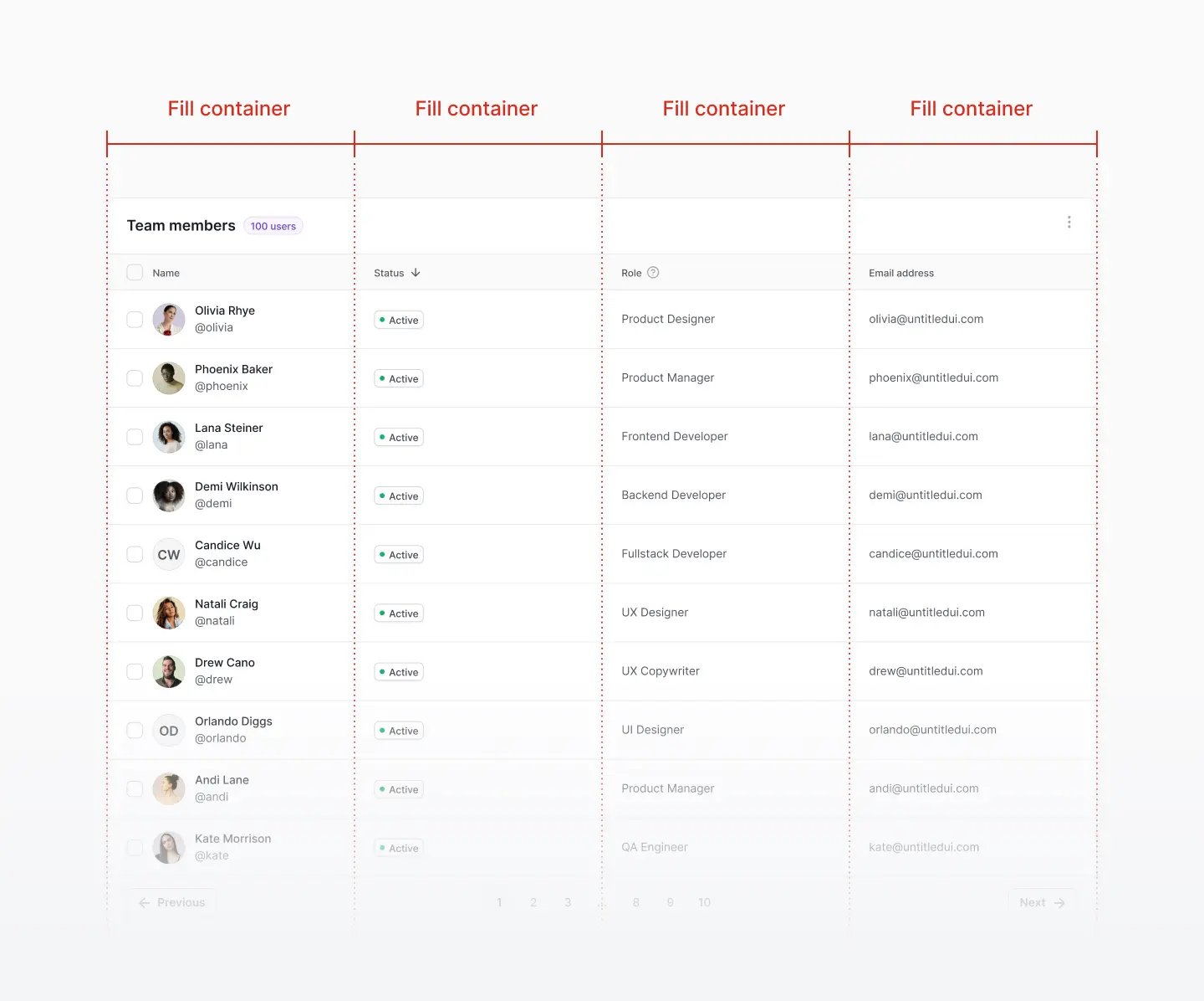
This works perfectly fine for simple tables but can become a limitation when creating densely populated tables with a lot of data. The reason for this is because each table column takes up an even amount of space, regardless of their table cell contents:
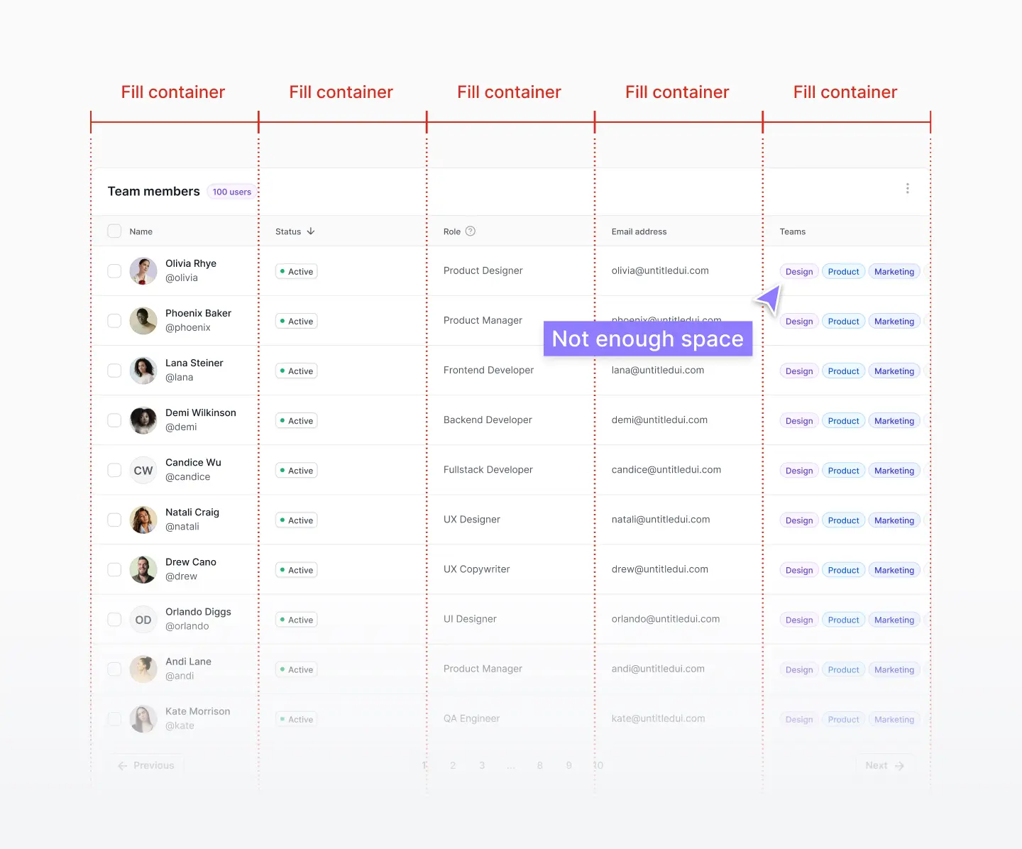
Once you're comfortable with Auto Layout, we recommend experimenting with an alternative approach that works more efficiently and quickly to organize data in densely populated tables. This approach instructs the secondary columns to take up as little space as possible, and the primary column to fill the remaining space:
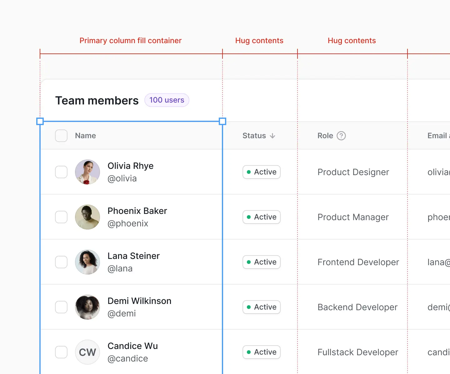
Begin by selecting all columns in your table and switch the horizontal resizing to hug contents. This means they will take up the least amount of space possible, depending on their cell contents:
Next, select the lead or primary column and switch the horizontal resizing back to fill container. This allows it to fill the remaining space:
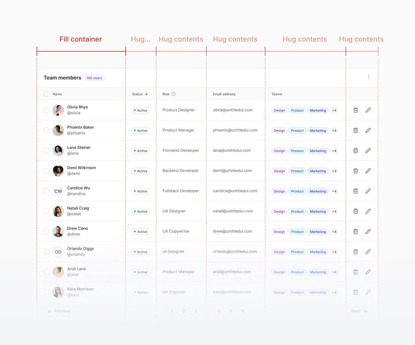
This isn’t always the best approach, but generally does a much better job of resizing table cells to use available space more efficiently. It also helps to create additional visual hierarchy between the primary column and secondary columns.
Conclusion
We hope you found this guide useful! Designing tables in Figma is difficult and can take a long time to get right, simply because they're such complex components in your design system. With a little practice, it gets much easier! Table components are a great way to learn Auto Layout in Figma.
Remember that first and foremost, tables should be usable and readable. The key here is simply ensuring that tables are easy to navigate and read with clear visual hierarchy between the table header, columns header cells, and individual table cells and rows. Some basic styling—borders, background colors (fill colors), and font size and weight—can improve your table user experience 100x.
Get the free data tables UI kit in Figma Community
To make things easy for you, we've put together a free Figma data tables UI kit that you can use to follow along and use in your designs.
This Figma file includes all the components we created above, as well as more advanced table cell types and layouts. Create a copy of this file in your Figma account and pull apart how the components are created.
Duplicate this file via Figma Community → ❖ Figma data tables UI kit – Untitled UI
More best practice guides
This post is an exert from Untitled UI Figma, the largest and most popular Figma UI kit and design system in the world. Untitled UI includes tips and best practices right in the Figma file to help you level up as a designer.
Untitled UI Figma is the largest and most popular Figma UI kit and design system in the world. It's meticulously crafted with 100% Auto Layout 5.0, super-smart variants, Figma's newest variables features, and with accessibility in mind.
It's a great example of Figma design system best practices and is the most popular and highest-rated Figma UI kit on the internet with 2,200+ 5-star reviews!
They've also released Untitled UI Figma PRO LITE, which is a premium and lightweight version of the full Untitled UI Figma PRO STYLES kit and have included it for free. It's 55% lighter, faster, and is designed to include everything you need and nothing you don't. It's perfect for moving fast and for smaller projects!
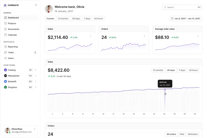
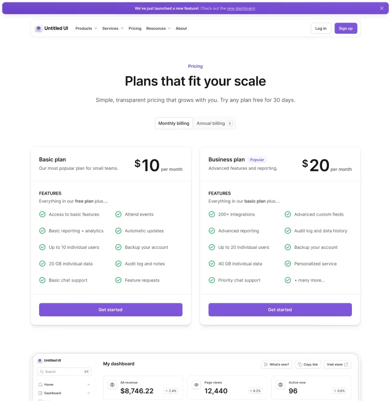
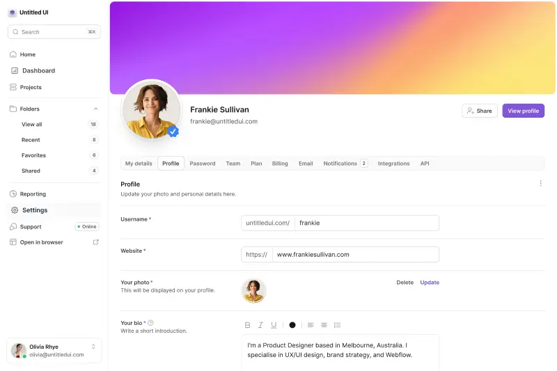
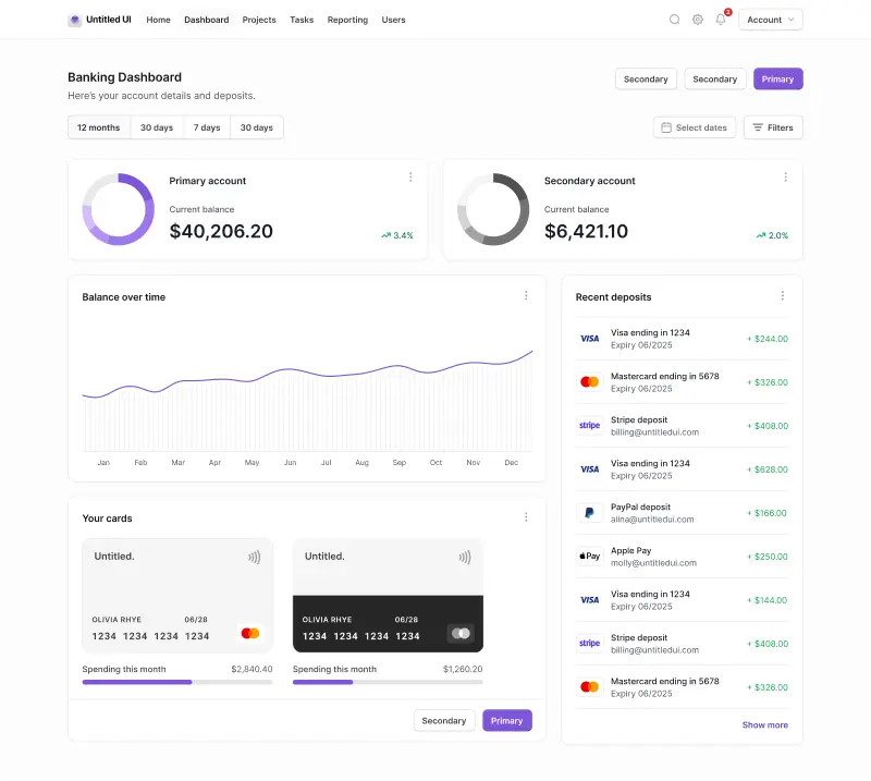
Untitled UI was designed to be the "ultimate" UI kit and the perfect starting point for any kind of project—from beautiful marketing landing pages, all the way to complex dashboards and web apps—Untitled UI has thought of absolutely everything so you don't have to.
The team behind Untitled UI are constantly making updates and improvements to the UI kit and recently announced they've completely refactored Untitled UI to take advantage of Figma's latest features released at Config 2023, Framework 2024, Config 2024, and Config 2025. This includes all the latest Figma features such as color variables (dark mode), spacing, radius, typography, and effects variables, Auto Layout 5.0, min/max widths, Auto Layout wrapping, and much more.
You can check out a full preview of the design kit, or check out the 100% free UI kit here (which is more advanced than most UI kits in its own right!). If you're short on time, here's a 60-second overview:
Untitled UI blog
More design resources


Untitled UI is the best $ I've spent on my business in a long time. I'm going to keep using it and recommending it to every designer I know.
Over the years we've featured hundreds of UI kits on UXCrush, but Untitled UI is by far the most comprehensive and detailed I've seen yet. A must have for any designer!
I've used all UI kits on the market. I can say without a doubt that the Untitled UI kit is the best on the market. It covers everything a designer needs in a modern and efficient way.
Incredible, and keeps getting better. I’ve tried dozens of UI kits and Untitled UI is the only name you should care about. It stands head and shoulders above the rest.
Such a beautiful, detailed, and extensive UI kit. Untitled UI is the perfect foundation for any project. I highly recommend this huge time saver.
Untitled UI has been an amazing resource that I'm learning to rely upon to spin up ideas in no time. I think I might launch a startup pretty soon by mistake here!
The sheer scale, details, and organization of this kit is mind-blowing. It covers nearly everything a Designer could need in a modern, efficient and systematic way.
I'm super impressed with this. I love poking around in other peoples UI Kits to see how they think. This is probably one of the most comprehensive I've seen.
I'm super excited to use this for quick mockups of ideas in Figma. We're always trying to streamline our design process so we can move fast! Definitely recommend.
Untitled UI is easily the best UI kit I've used so far. It has an insane amount of components that are all incredibly well-built. I don't even know how many hours this will save.
The attention to detail and thought Jordan has put into this UI kit is unparalleled.
Untitled UI is incredibly well-organized and the attention to detail is great. I highly recommend this kit to any designer that wants to create beautiful designs fast.
What an awesome Figma kit... it's an absolute game changer. This is the perfect base for any design system. The size and attention to detail is next level.
We've been using Untitled to build Himalayas 2.0 and have finished a complete redesign in just a few days. It has everything we need already pixel-perfect.