A design system is a single source of truth for how a product looks, feels, and gets built: a shared library of reusable UI components, design tokens (colors, typography, spacing), and usage guidelines, backed by documentation and matching code, so designers and developers create consistent user experiences at scale.
As UI design and development has evolved over the last few decades, so too has the complexity and scale of websites and digital products. It's not uncommon for digital products to have thousands of pages, design patterns, and individual design components. So how do companies like Apple, Google, and Spotify build and scale their digital experiences efficiently with thousands of employees worldwide? They run on design systems.
Key takeaways
- A design system is more than a UI kit. It combines components, design tokens, patterns, documentation, and code into one governed source of truth.
- Its job is consistency at scale: a shared language for the same button, the same spacing, and the same tone of voice across every screen, platform, and team.
- You don't need a big team to benefit. Even a small design system prevents design debt, and most teams should adopt or adapt an existing one rather than start from scratch.
- Style guides, pattern libraries, and component libraries are parts of a design system, not synonyms for it. A brand style guide alone is not a design system.
In this guide we define design systems, break down what one contains, compare them to UI kits, style guides, and component libraries, walk through the best public examples, and explain how to build (or adopt) one.
What is a design system?
A design system is a collection of reusable UI elements, standards, and documentation that product teams use and build on to create a consistent user experience across digital products. It keeps the visual design, visual language, and brand identity of a product consistent, acting as a single source of truth and a shared language for designers, developers, product managers, and writers.
A useful way to think about a design system is as the design language and design philosophy of a product or company, made concrete. It typically includes:
- Reusable UI components (buttons, input fields, navigation, tables, modals)
- Design tokens and foundations (color palettes, typography scales, spacing, radius, shadows)
- Matching code components and code snippets
- Design files and visual elements (Figma libraries, icons, illustrations)
- Style guides and design guidelines (design patterns, visual styles, accessibility rules, best practices)
- Content guidelines, a brand style guide, and writing style guides
- Design principles, process documentation, and governance (who owns it, how changes ship)
A design system is more than the building blocks of a product. As a single source of truth, an effective design system keeps entire product and design teams on track and consistent while reducing design debt along the way. When teams have clear best practices to reference, great user experiences become the default rather than the exception, and new team members can contribute to product design from their first week.

What does a design system include?
Design systems vary in size, from a single Figma file with light documentation to a dedicated product with its own team. Most effective design systems are built in layers, and the layers are what turn a collection of design elements into systematic design.
1. Design tokens and foundations
Design tokens are the smallest building blocks in a system, each one a named decision: a primary color, a spacing unit, a font size, a border radius. They're stored as variables (in Figma and in code) so a single change cascades everywhere. Foundations also cover typography scales, color palettes for light and dark mode, grids and spacing, iconography, and elevation.
2. Components
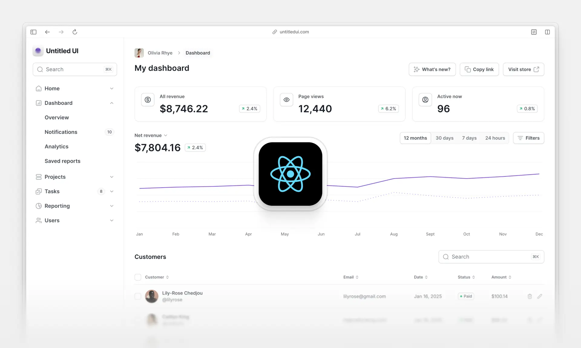
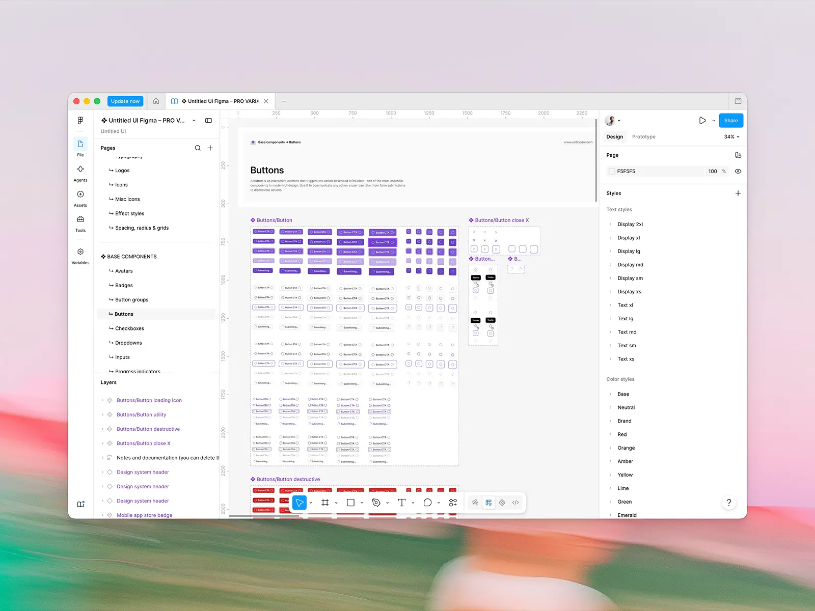
Reusable UI elements built from those tokens: buttons, input fields, checkboxes, dropdowns, navigation, cards, tables, modals, and so on. Each component has defined variants (size, state, style) and accessibility behavior. In a good system, the Figma component and the coded component match one to one (compare the Figma button with the React button for an example).
3. Patterns and templates
Patterns are recurring solutions to common problems: how a form handles validation, how empty states work, how a settings page is laid out. They're the building blocks one level up from components, combining visual elements into flows. Templates and page layouts (dashboards, onboarding flows, marketing pages) sit at this level too, in Figma and in code (see the React dashboard examples or our roundup of React dashboard templates).
4. Guidelines and documentation
This is what separates a design system from a UI kit: written guidance on when and how to use each component, accessibility requirements, content and tone-of-voice rules, brand guidelines, and design principles. Documentation is what lets someone who didn't build the system use it correctly, and it's what turns a component library into a unified language that design teams and engineering share.
5. Code and tooling
A component library in code (React, Vue, Web Components, Tailwind) with code snippets for every component, token pipelines that sync Figma variables to CSS, and the versioning and release process around them.
6. Governance
Who owns the system, how contributions are proposed and reviewed, how changes are communicated, and how adoption is measured. Small teams do this informally; large ones have a dedicated design system team that owns the design process for the system itself.

How are design systems used?
Design systems act as a north star and a unified language that can be referenced by a company's UX designers, UI designers, developers, and even marketers and content writers simultaneously, giving every team member instructions on developing a product's design consistently.
For example, suppose a developer needs to add a dropdown menu to a new feature. Small components like dropdowns and input fields may seem simple on the surface, but they contain dozens of small design decisions. The developer will quickly run into questions:
- What does this component look like, and how big is it?
- What is the color palette for each UI element, and how are they spaced?
- How does it open? What is the hover transition?
- What icons, typography, and colors should I use?
- What should the copy say? Are there content guidelines?
- What does the empty state look like?
- Do I need a designer to create one from scratch, and where are the design files and code snippets?
These are important questions, but chances are a designer has already answered them and built a dropdown component for another page. With a good design system in place, the developer can grab the code snippet for the existing dropdown and know that every aspect of it (spacing, typography, UX, hover states) behaves exactly as the designer intended.
Similarly, if product designers want to change the dropdown, they change it in one place and the code components update so the change is reflected everywhere that component is used.
Working from a design system may sound like a constraint. In practice it removes decision fatigue and lets product teams work faster and build better. Without one, you end up with messy, inconsistent visual styles and a user interface that feels stitched together. If a simple dropdown looks and behaves differently across a product, it creates a confusing and poor user experience.

Design system vs UI kit vs style guide vs pattern library vs component library
These terms get used interchangeably, and that's where most of the confusion around "what is a design system" comes from. They're related, but they're not the same thing, and an effective design system depends on knowing which is which. A design system is the umbrella; the others are parts of it, and a good design system contains all of them.
- Design system vs UI kit. A UI kit is the components and styles. A design system includes the UI kit plus the documentation, guidelines, patterns, and code that tell a whole team how and when to use them. Our guide to UI kits covers this in depth.
- Design system vs style guide. A style guide (or brand style guide) documents visual and brand rules (colors, fonts, spacing, voice). It rarely includes working components or code. A design system contains a style guide and builds on it with design components, design patterns, and a shared language for using them.
- Design system vs pattern library. A pattern library catalogs solutions to recurring UX problems. It's one layer of a design system, not a replacement for it.
- Design system vs component library. A component library is the coded implementation of the components. Without tokens, guidelines, and a design counterpart, it's a code library, not a design system. Untitled UI React is the code layer of the Untitled UI system, for example.

Do you need a design system?
Building and maintaining a design system can be a lot of work. Some are simple and easy to maintain. Some are large enough that companies hire dedicated design teams and developers to look after them. So do you actually need one?
For most teams, the answer comes down to avoiding design debt. Design debt is the accumulation of all the inconsistencies, imperfections, poor user experiences, and skipped design processes that build up when a team takes shortcuts to hit short-term goals. It's every "we'll fix it later" that never got fixed.
Accumulating some design debt is natural and happens to every product. The important thing is that it's understood and managed before the cost of going back to fix it becomes too high. Plenty of companies ignore it for too long and get flanked by competitors with far better design and user experience.
Signs you need a design system now:
- The same component (a button, a modal, a table) exists in three or more slightly different versions across your product.
- Designers and developers argue about what "the" primary color or spacing value is.
- New features take longer to ship because basic UI keeps getting rebuilt.
- You're supporting multiple platforms or themes (web and mobile, light and dark mode, several brands).
- Onboarding new team members takes weeks because nothing is documented.
- Marketing, product design, and engineering each keep their own version of the brand style guide.
Building and maintaining a design system from the start, even a simple one, lets product teams spot and address design debt as it arises by keeping the design process consistent. That's the difference between systematic design and a pile of one-off design efforts.
You also don't have to build one from scratch. Starting from a high-quality existing system like Untitled UI gives you a large library of UI components, design guidelines, Figma files, and matching code components on day one. Designers can focus on prototypes and usability instead of recreating the same design components, developers don't rebuild existing code, and product managers spend less time putting out fires and more time shipping new features.
If your team isn't using a design system to speed up design and development, chances are a competitor is, and those small efficiencies compound.

The pros and cons of using a design system
Pros
- Design and develop faster. Your team won't redesign and rebuild components repeatedly, so it moves much faster than competitors.
- Focus on important details. Save time on tiny details and spend it on meaningful design decisions, systematic design improvements, and the product's design language.
- Improved consistency. Keep visual elements, spacing, and copy consistent, organized, and maintainable from the start, so everyone involved in the design process stays on the same page.
- Make changes in one place. Update a component or token once and cascade the change everywhere across the product.
- A unified, polished brand identity. A design system unifies a product's branding faster and gives marketing and product design one shared language for the brand.
- Simpler quality control. Designers and developers reference one source of truth, which simplifies design reviews and makes inconsistencies obvious.
- Lower development costs. Product development is expensive. Working from an existing system saves the time and money usually spent on inefficient development and fixing design debt.
- Better accessibility. Accessible color contrast, focus states, and keyboard behavior get solved once in the component and inherited everywhere. Good typography choices and a consistent icon set get locked in the same way.
- Cross-functional collaboration. Everyone involved in product design can participate and stay up to date, not just designers, and new team members ramp up faster because the building blocks are documented.
Cons
- Takes time to maintain. Design systems, like companies, are always evolving. Teams need to dedicate time and resources to maintaining and improving them.
- Can feel like it limits creativity. With established rules, content guidelines, and reusable components, a system can feel constraining. In practice the constraint is the point, and exploration should happen at the pattern and product level rather than by redrawing buttons.
- Less exploration by default. When large teams use a design system, designers and developers can feel less inclined to research alternatives. Good governance leaves room for proposals and experiments.
- Takes time to learn. Adopting or adapting a system means some team members will need time to get used to the new approach and the new design files (a good Figma course shortens this). This slows things briefly, and then speeds them up.
Examples of design systems
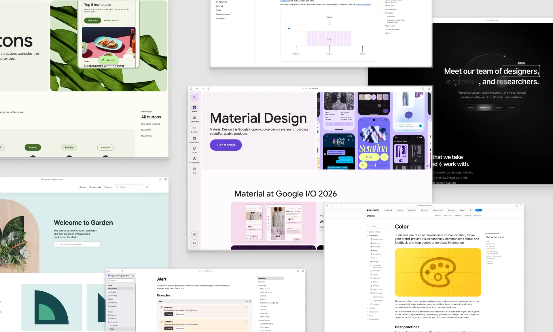
Many companies make their design systems publicly available and even open source. They're excellent resources for seeing how world-class teams think about design, documentation, and process. Here are the best public design system examples to study, each a good design system in its own right for a different reason.
Google Material Design 3
Google Material Design 3
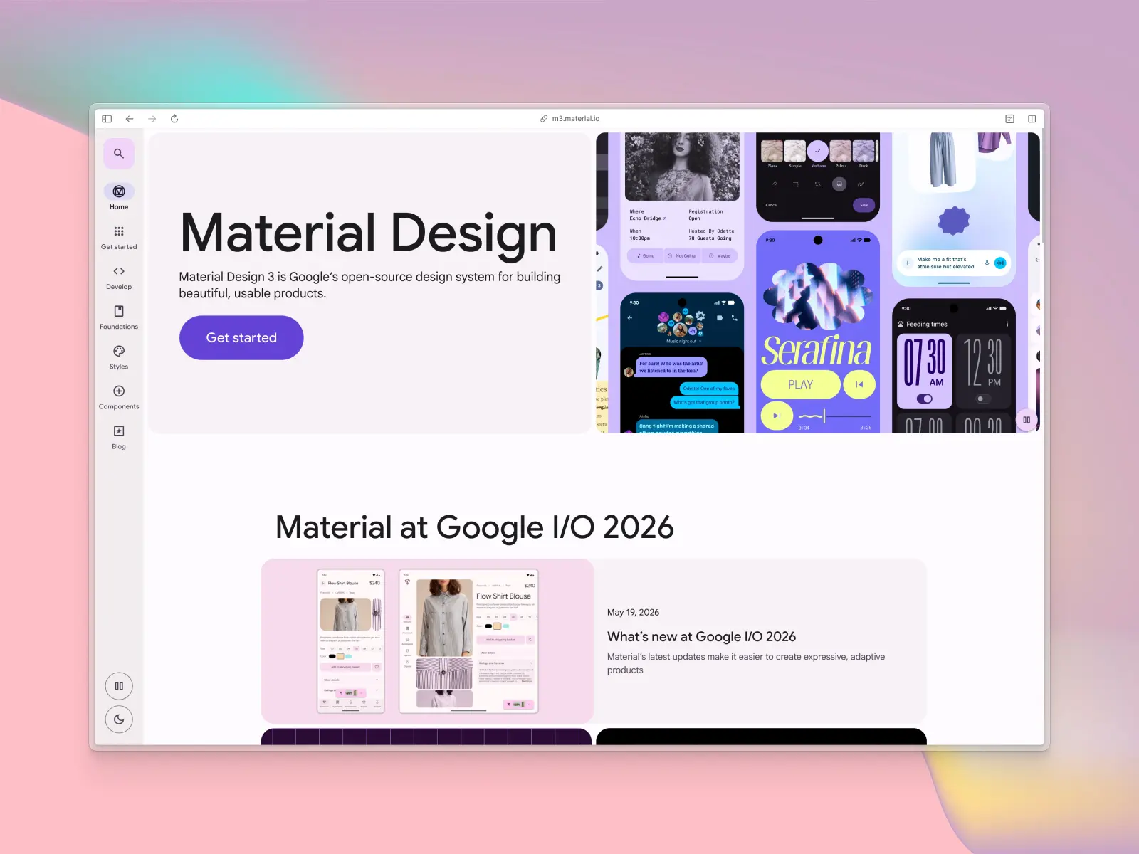
Material Design by Google is a unified system that combines theory, resources, and tools for crafting digital experiences. Material 3 is the latest version of Google's open-source design system and contains a huge library of UI components, icons, styles, source files, starter kits, and code components, plus dynamic color theming that generates a full palette from a single seed color. It powers Android and thousands of third-party products, and it's one of the free UI kits available directly inside Figma (see our Figma UI kits roundup).
Apple Human Interface Guidelines
Apple Human Interface Guidelines
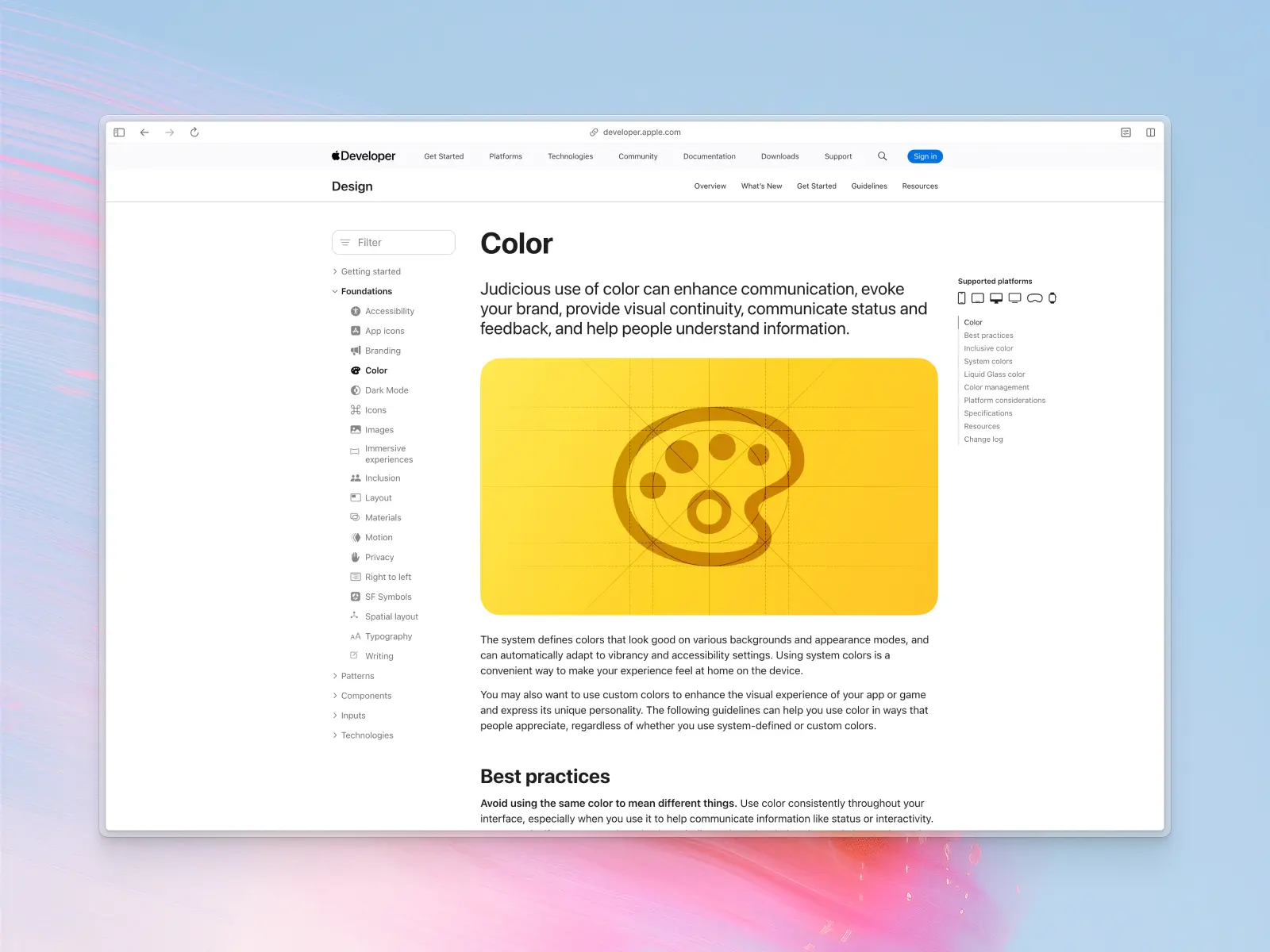
In-depth guidelines and UI resources for designing apps that integrate seamlessly with Apple platforms. The HIG covers iOS, iPadOS, macOS, watchOS, tvOS, and visionOS, with downloadable Figma and Sketch UI kits, SF Symbols, and detailed guidance on platform conventions. It's the reference for how an effective design system documents principles rather than just UI elements.
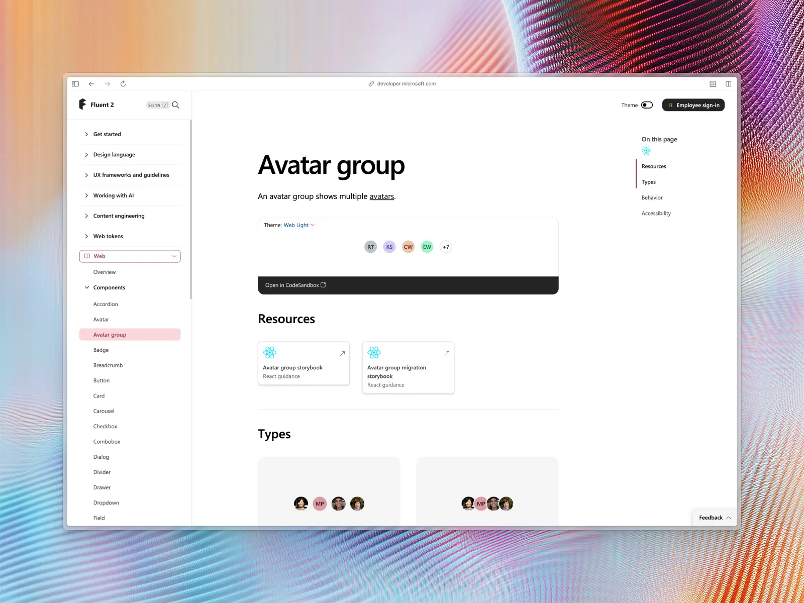
Microsoft Fluent 2
Microsoft Fluent Design System
Fluent is Microsoft's open-source, cross-platform design system. Fluent 2 gives designers and developers shared design tokens and components across web, Windows, iOS, Android, and macOS, with hundreds of free design elements (colors, layouts, motion, iconography, typography), design files, and matching code libraries with code snippets.
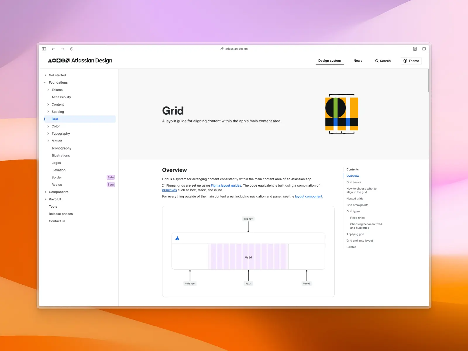
Atlassian Design System
Atlassian Design System
Atlassian's system unifies Jira, Confluence, Trello, and Bitbucket. It's a good example of a token-first architecture with semantic naming, plus thorough content and accessibility guidelines, and it's worth studying for how a multi-product company keeps everything consistent.
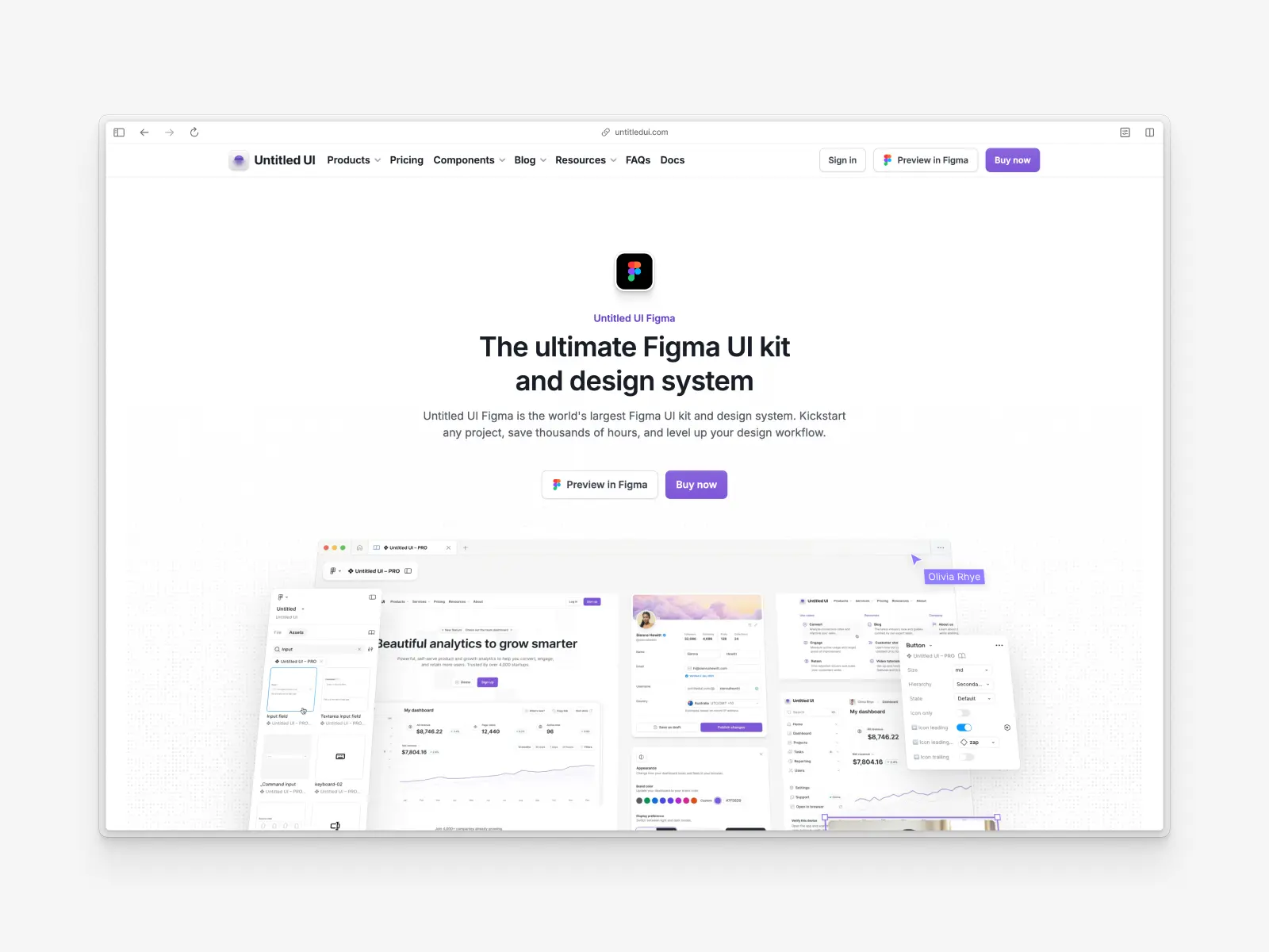
Untitled UI Design System (Figma and React)
Untitled UI Figma + Untitled UI React
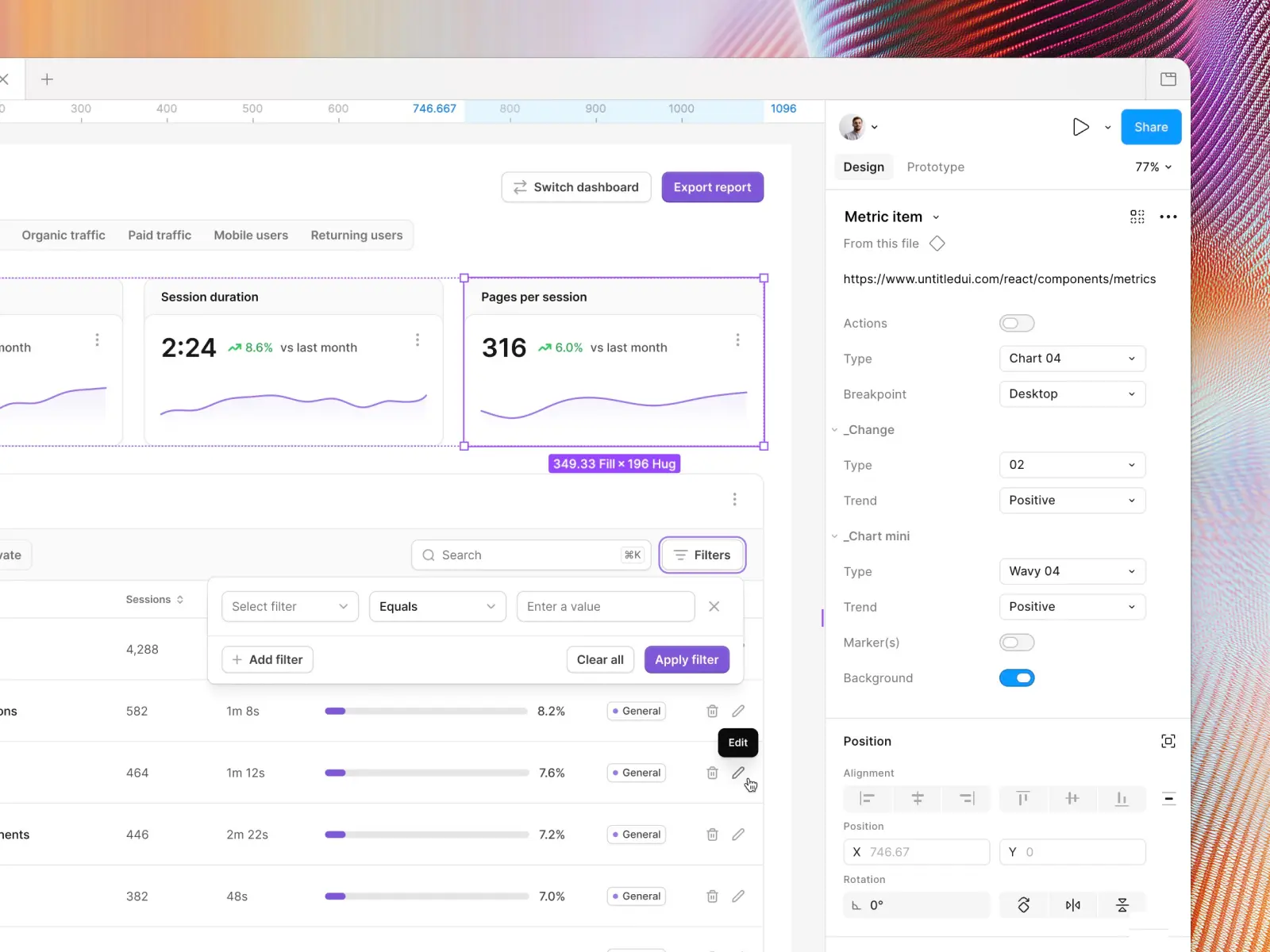
Untitled UI is a complete design system made up of two matched halves: Untitled UI Figma, the design library, and Untitled UI React, the coded component library. They share the same components, variants, naming, and design tokens, so a designer working in Figma and a developer working in code are working from one source of truth.
Untitled UI Figma is the largest and most popular Figma UI kit and design system in the world, with 10,000+ components and variants. It's meticulously crafted with 100% Auto Layout 5.0, super-smart variants, Figma's newest variables features (color variables with dark mode, spacing, radius, typography, and effects), and with accessibility in mind. It's the most popular and highest-rated Figma UI kit on the internet, with 3,650+ 5-star reviews, and it covers everything from marketing landing pages to complex dashboards and web apps.
Untitled UI React is the code side: the world's largest collection of open-source React components, with 5,000+ components and sections and 250+ page examples (dashboards, settings pages, log in pages, and more), built with React, Tailwind CSS, TypeScript, and React Aria for accessibility. The base components are MIT-licensed and free to use in unlimited projects, with PRO tiers for the full library. You copy and paste components into your own codebase (or add them through the CLI), and the theming and dark mode setup mirrors the Figma variables so the two sides change together. The React docs cover installation, starter kits for Next.js and Vite, and Untitled UI Icons.
Together they're a good example of what this article describes: tokens, components, patterns, and code kept in sync, with the documentation and changelog to go with it. The team constantly updates and improves both sides, and recently announced a complete refactor of the Figma UI kit to take advantage of features released at Config 2023, Framework 2024, Config 2024, Config 2025, and Config 2026: Auto Layout 5.0, min/max widths, Auto Layout wrapping, and the full set of variables.
They've also released Untitled UI Figma PRO LITE, a premium, lightweight version of the full Untitled UI Figma PRO STYLES UI kit, included free. It's 55% lighter, faster, and designed to include everything you need and nothing you don't. It's perfect for moving fast and for smaller projects.
You can check out a full preview of the UI kit, grab the 100% free UI kit here (which is more advanced than most paid UI kits in its own right), or browse the open-source React components and start with the free tier.
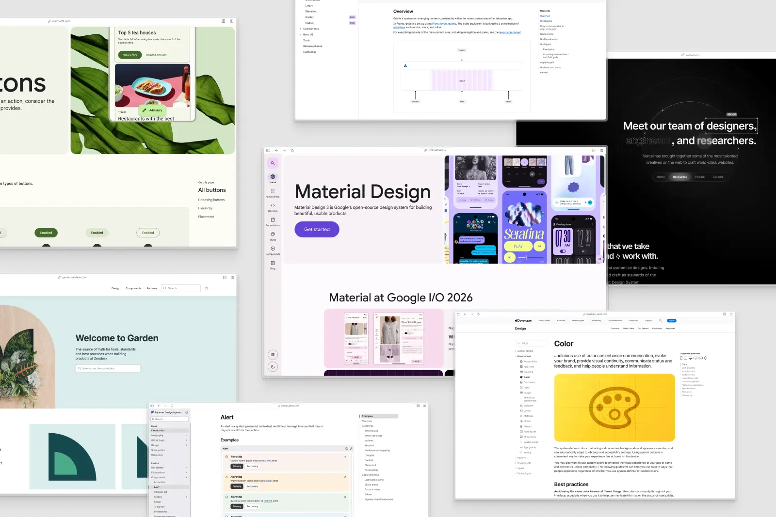
More examples of design systems
A few more publicly available design systems worth studying:
- Polaris by Shopify, notable for its content guidelines
- Carbon by IBM, framework-agnostic with strong data visualization guidance
- Garden by Zendesk
- Pajamas by GitLab, fully open source with public governance
- Evergreen by Segment
- Primer by GitHub
- Protocol by Mozilla
- Geist by Vercel
- Lightning Design System by Salesforce
Governments often have their own design systems too, used to keep hundreds of departments consistent and unified:
- U.S. Web Design System (USWDS)
- GOV.UK Design System
- NHS design system
- Canada.ca design system
- City of Philadelphia
- Bristol City Council
For a ranked comparison of Figma-based systems and UI kits you can actually download and use, see our post on the best Figma UI kits and design systems, and for the code side, the best React component libraries.

How to create a design system
Whether you're starting a new project or midway through an existing one, there are three approaches to getting a design system:
- Adopt an existing design system as-is.
- Adapt an existing design system and modify it to suit your brand and needs.
- Create your own design system from scratch.
Creating one from scratch involves considerably more time and money, and it can be the right call if your product is unusual or you have something very specific in mind. For most teams, it's far easier to adopt and adapt an existing system like Untitled UI and customize it. Existing systems have been thought through and improved over years of use, so they save hundreds of hours of building and fixing mistakes.
If you are building from scratch, these are the essential steps:
- 1. Inventory audit. Audit your existing product and its design files. Screenshot every button, input field, modal, and table variation you can find. This gives you a library of the visual features and reusable components that need to be in the system, and usually a sobering view of your design debt.
- 2. Define design principles and a design language. Decide what your product should feel like and write it down, including how it expresses your brand identity. Then define the visual language and visual style: typography, color palettes, imagery, and the building blocks (HTML/CSS, framework) you'll build on. This design language becomes the shared language for every design decision that follows.
- 3. Set up design tokens. Turn the foundations into named variables: primary color, neutral scale, semantic colors, type scale, spacing scale, radius, shadows. Set them up as Figma variables and in code so a single change cascades everywhere. Our color palettes guide is a good starting point for the color layer.
- 4. Build the component and pattern library. Build reusable components on top of the tokens, with variants, states, and code snippets, then document the design patterns (forms, navigation, empty states, data tables) that combine them. Patterns can be perceptual (visual style and aesthetics, such as typography and color palettes) or functional (structure and behavior).
- 5. Write the guidelines. Document each element: what it's for, when to use it, when not to, accessibility requirements, and content rules. Fold in your brand style guide so brand identity and product design live in one place, and make sure the guidelines are readable by design teams and developers alike. Anyone using the system should be able to find why a component exists and how to use it properly. This is the step most teams skip, and it's the one that makes it a design system.
- 6. Set up governance and maintenance. Decide who owns the system, how contributions and changes get proposed and reviewed, how versions are released, and how you'll measure adoption. Without this, the system drifts, design efforts fragment, and design debt creeps back.
Design tokens explained
Design tokens come up in every conversation about design systems, so they deserve a closer look. A token is a named design decision stored as a variable: color-brand-600, spacing-md, radius-lg, font-size-text-sm. Instead of typing a hex value into a button, you reference the token, and when the decision changes the update flows through every component and screen that uses it.
Most systems split tokens into two layers:
- Primitive tokens are the raw palette: every shade of every color, every step in the spacing and type scales. They describe what a value is, not what it's for. Our Figma color palettes guide covers how to build the color layer.
- Semantic tokens point at primitives and describe intent:
text-primary,bg-error-subtle,border-brand. Components only ever use semantic tokens, which is what makes theming and dark mode possible. Swap whatbg-primarypoints to and the whole product switches themes without touching a single component.
In Figma, tokens live as variables with modes (light and dark, or brand A and brand B). In code they become CSS custom properties or a Tailwind theme. Untitled UI ships its color, spacing, radius, typography, and effect decisions as Figma variables with a built-in dark mode, and the React theming setup exposes the same brand palette as CSS variables (25 through 950), with dark mode handled the same way, so both sides change together.
Two practical rules keep a token set usable. Name tokens by purpose, not by appearance (text-secondary, never gray-600-text), and keep the semantic layer small enough that a designer can hold it in their head. A palette with 200 semantic tokens is a sign the system is being used to store decisions that should have been made once.
Accessibility in a design system
Accessibility is one of the strongest arguments for a design system, because it lets you solve each problem once and inherit the fix everywhere. Handled component by component across a product, it's a never-ending cleanup. Handled at the system level, it's a property of every screen built on it.
The parts that belong in the system rather than in individual designs:
- Color contrast. Semantic color tokens should be pre-validated so every approved text and background pairing meets WCAG 2.1 AA (4.5:1 for body text, 3:1 for large text and UI elements). If the pairing lives in the token set, designers can't accidentally ship a failing combination.
- Focus, hover, and disabled states. Every interactive component needs a visible focus ring and defined states as variants, so keyboard users can see where they are. Buttons, inputs, checkboxes, and toggles are the usual suspects, and the same states need to exist in code (the React checkbox and toggle, for example).
- Target sizes and spacing. Minimum touch and click targets (44px on mobile is the common baseline) baked into component dimensions, not left to each designer.
- Semantics in code. Correct HTML elements, ARIA attributes, and keyboard interaction patterns for dropdowns, modals, and tooltips. This is where a coded component library earns its keep, because a Figma component can't enforce it.
- Documentation. Guidelines that say when to use a tooltip versus inline help text, how to write alt text, and how error messages should read.
Untitled UI Figma is designed with accessibility in mind on the Figma side, and Untitled UI React is built on React Aria so keyboard navigation, focus management, and screen reader support come with the components rather than being bolted on later.
Keeping Figma and code in sync
The most common way a design system fails is drift: the Figma library says one thing, the codebase says another, and designers stop trusting either. A few habits prevent it:
- One source of truth per decision. Tokens are defined once and exported to both Figma variables and code, whether through a token pipeline or by treating one side as canonical and mirroring it.
- Matching component APIs. If the Figma button has size, hierarchy, and icon-position variants, the coded button should take the same props with the same names. Developers can then read a design and know exactly which component and props to reach for.
- Release together. Ship Figma library updates and code releases as a pair, with a shared changelog, so nobody is designing with a component that doesn't exist in code yet (or the reverse).
- Review across the boundary. Design reviews check against the coded library, and code reviews check against the Figma spec. Tools like Storybook and Figma Dev Mode make this a quick side-by-side rather than a scavenger hunt.
This is the reason Untitled UI Figma and Untitled UI React are built as a matched pair, with the same components, variants, and naming on both sides (the input field in Figma and the input field in React, say), so the sync work is already done before your team starts.
Design system tools
You don't need much to get started, but these are the tools most teams end up using:
- Figma for the design library: components, variants, variables with modes, and shared libraries. It's the default for a reason, and every system on the examples list above has a Figma UI kit.
- Storybook for the coded component library, giving developers and designers a browsable catalog of every component and state outside the product.
- Zeroheight, Supernova, or a docs site for guidelines and documentation. Zeroheight and Supernova pull directly from Figma and code; a plain docs site (Docusaurus, Next.js) is fine if you'd rather own it.
- Tokens Studio (Figma plugin) or Style Dictionary for the token pipeline that turns design decisions into CSS variables, iOS and Android values, and back.
- An icon set that's consistent in stroke, grid, and corner radius. See our roundups of the best free icon sets and best premium icon sets.
- A starting UI kit unless you're building every component from scratch. The best Figma UI kits post compares the options.
Keeping a design system alive
A design system is a product, not a project, and it needs the same things any product needs: an owner, a roadmap, a release process, and a way to know whether it's working.
Ownership. Small teams get by with one designer and one developer who care about it and have a few hours a week protected for it. Past around 20 people building on the system, that usually becomes a part-time or dedicated design system team.
Contribution. Write down how a new component or change gets proposed, reviewed, and merged. The most common model is a small core team that owns the system plus contributions from product teams, reviewed against the guidelines before they land.
Versioning and deprecation. Release the Figma library and code library in numbered versions, keep a public changelog, and give deprecated components a clear migration path and a removal date instead of deleting them.
Measuring success. The metrics that actually tell you whether the system is working:
- Adoption rate. The share of screens or code that uses system components versus one-off custom ones. Figma's library analytics and a simple code scan get you most of the way.
- Detach rate. How often designers detach instances from the library. A high rate means components don't cover real needs.
- Time to ship. How long a standard screen takes to design and build before and after the system.
- Consistency and accessibility issues found in QA and audits, which should trend down.
- Contributions and questions. Whether teams outside the core group are proposing changes and asking about the system. Silence usually means they've stopped using it.
If these numbers are moving the wrong way, the fix is rarely more components. It's usually documentation, communication, or removing friction from how people get the system into their files.
What is a UI kit?
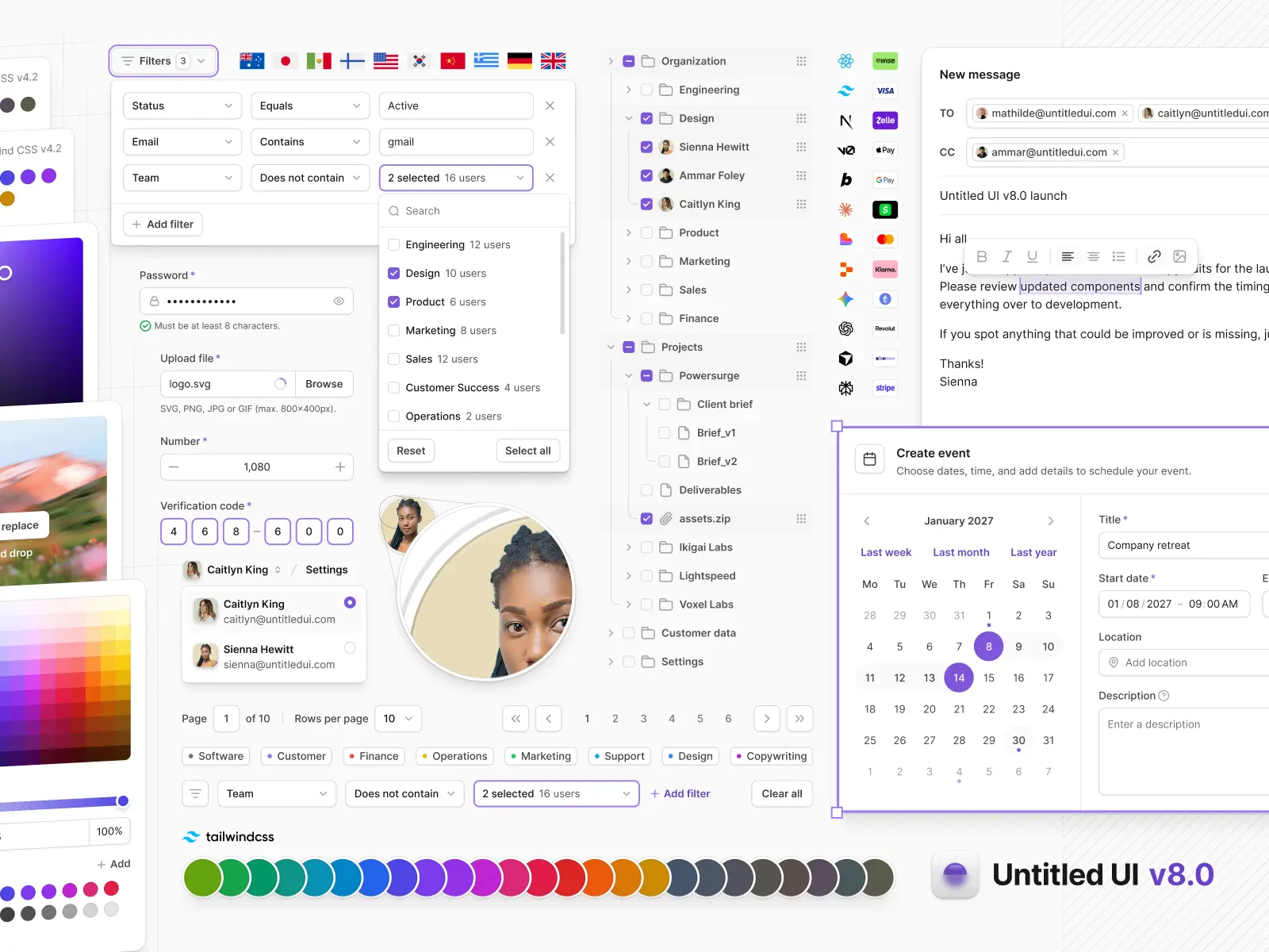
A UI kit is a large collection of reusable, ready-to-use UI components, templates, styles, and other design assets used to create user interface designs for websites, apps, and other digital products. UI kits are also referred to as user interface kits and UI design kits, and they typically include:
- Icons
- Buttons, badges, and avatars
- Input fields, checkboxes, and toggles
- Tooltips and progress bars
- Text styles, color styles, and effect styles
- Design elements (images and graphics), widgets, and other UI elements
- Templates and layouts
- Code components (in some UI kits, such as Untitled UI React)
Not sure which one to pick? Our roundup of the best Figma UI kits and design systems compares the top options side by side.
By using a UI kit, designers finish projects faster because they don't need to recreate components they can reuse from the UI kit. Instead of spending hours building social media buttons or icons for a project, you apply them from the UI kit and spend the time on the parts of the product that are actually unique.
Like design systems, UI kits vary in size and visual style and are often platform-specific: built for a tool (like Figma) or a framework (like React). Many UI kits are built for designers only and don't include code components. A design system, on the other hand, usually does. We cover all of this in our full guide on what a UI kit is, and you can compare the most popular options in our list of the best Figma UI kits.
What is the difference between a UI kit and a design system?
The first and most obvious difference is that a design system contains far more documentation and design resources than a UI kit. A design system usually contains a UI kit, plus everything else that makes up the visual language of a product or company.
Design systems include clear documentation (guidelines, examples, and frameworks for how to use the UI kit and reusable components correctly) so product teams can design and develop faster and more consistently. A few key distinctions:
- Versatility and usability. UI kits are mostly used by UI and product design teams. Design systems cover everything non-designers on the team need to do their job, such as developer documentation, content guidelines, design principles, and design guidelines for the user interface as a whole.
- Library updates and adjustments. A UI kit can be modified easily, especially in Figma. If it's constructed well, a change to a single component or style instantly updates the whole library. Changes to a design system typically require more work because they involve updating documentation and code components too, depending on the complexity of the change.
- Project duration. UI kits are ideal for short-term projects that don't need further instructions and documentation. A design system helps team members organize the whole design and development process of a long-term product and keep every modification consistent as new features ship. On long-term, complex products, a fully developed design system becomes a necessity for designers, developers, and project managers to collaborate effectively.
Many teams start with a UI kit and grow it into a design system as the product and team scale, which is exactly what Untitled UI's Figma UI kit and React library are built for.

Recap
Whether you're a small startup or a large company with hundreds of employees, building and maintaining a good design system is the most reliable way to avoid design debt, unify your design efforts, and deliver a polished, consistent user experience.
Design systems are more than a compilation of reusable components, design tokens, style guides, and design guidelines. They're a living representation of your design philosophy, a unified language that design teams, developers, and new team members can all reference and improve over time. If you're not ready to build one, start by adopting one: the free Untitled UI Figma UI kit is a solid foundation, and it scales up to the full Untitled UI design system when you need it.
More best practice guides
This post is an excerpt from Untitled UI Figma, world's largest Figma UI kit and design system. Untitled UI includes tips and best practices right in the Figma file to help you level up as a designer. You can preview Untitled UI Figma here.
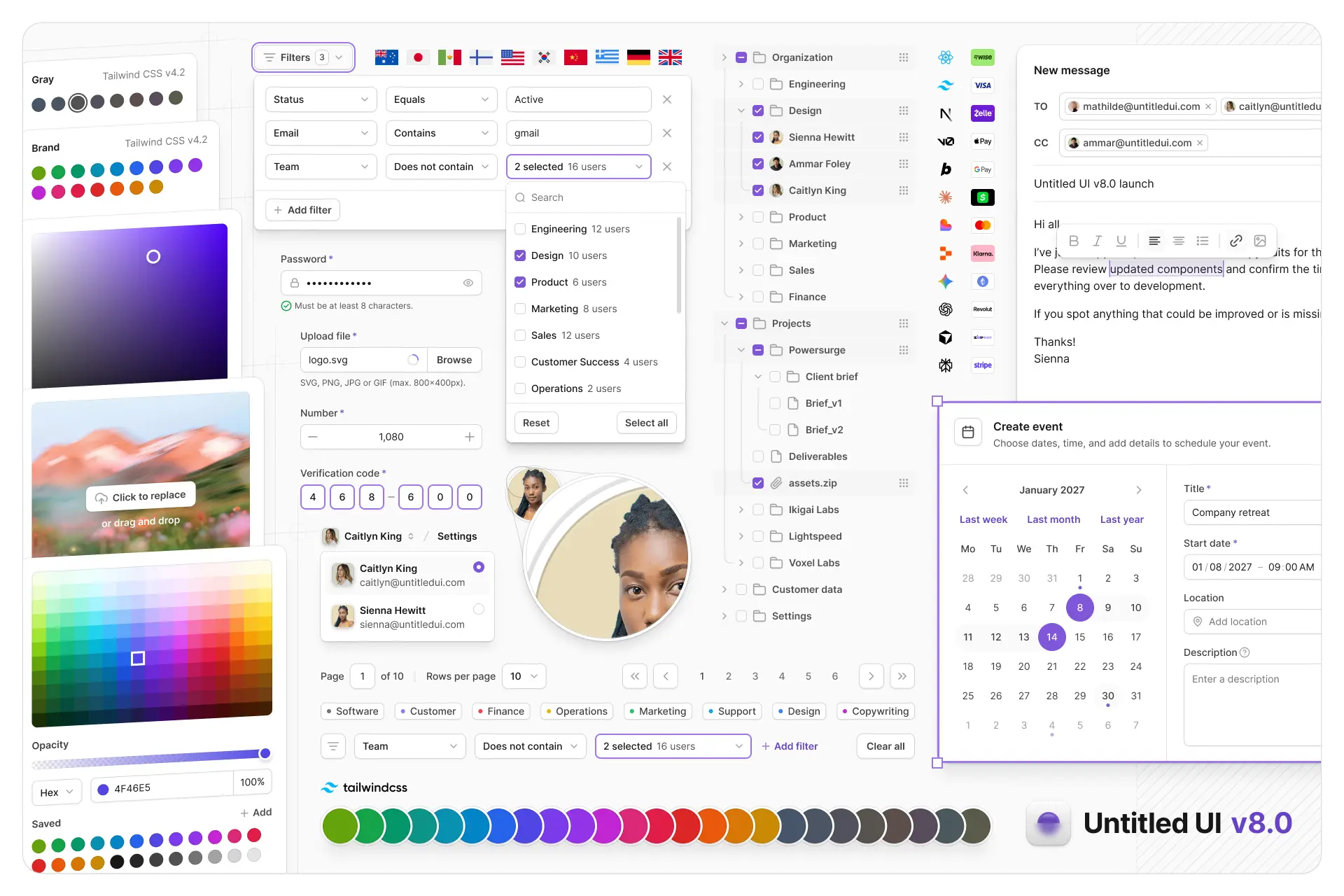
Untitled UI Figma is meticulously crafted with 100% Auto Layout 5.0, super-smart variants, Figma's newest variables features, and with accessibility in mind.
It's a great example of Figma design system best practices and is the most popular and highest-rated Figma UI kit on the internet with 3,650+ 5-star reviews!
We've also released Untitled UI Figma PRO LITE, which is a premium and lightweight version of the full Untitled UI Figma PRO STYLES kit and have included it for free. It's 55% lighter, faster, and is designed to include everything you need and nothing you don't. It's perfect for moving fast and for smaller projects!
Untitled UI was designed to be the "ultimate" UI kit and the perfect starting point for any kind of project—from beautiful marketing landing pages, all the way to complex dashboards and web apps—Untitled UI has thought of absolutely everything so you don't have to.
We're constantly making updates and improvements to the UI kit and recently announced that we've completely refactored Untitled UI to take advantage of Figma's latest features released at Config 2023, Framework 2024, Config 2024, Config 2025, and Config 2026. This includes all the latest Figma features such as color variables (dark mode), spacing, radius, typography, and effects variables, Auto Layout 5.0, min/max widths, Auto Layout wrapping, and much more.
You can check out a full preview of the design kit, or check out the 100% free UI kit here (which is more advanced than most UI kits in its own right!). If you're short on time, here's a 60-second overview: