


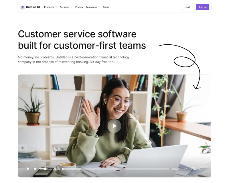
Vibe coding and coding agents have flipped the script on frontend development. Instead of writing every line by hand, you describe what you want to vibe coding tools or an AI assistant — Cursor, Claude, v0, Bolt.new, Lovable — and iterate in natural language prompts until it's right. Whether you're a designer or developer, vibe coding workflows are becoming an essential part of how real products get built.
But here's what most people miss: any AI assistant/coding agent's output is only as good as the building blocks you give it. Point an AI at a well-structured component library with clean APIs, structured metadata, and components that designers and developers can both understand, and you get production-ready UI design. Point it at something poorly documented or architecturally complex, and you get hallucinated props, broken imports, and hours of debugging with coding tools.
Your choice of UI component library is the single biggest lever you have over the quality of AI-generated working code.
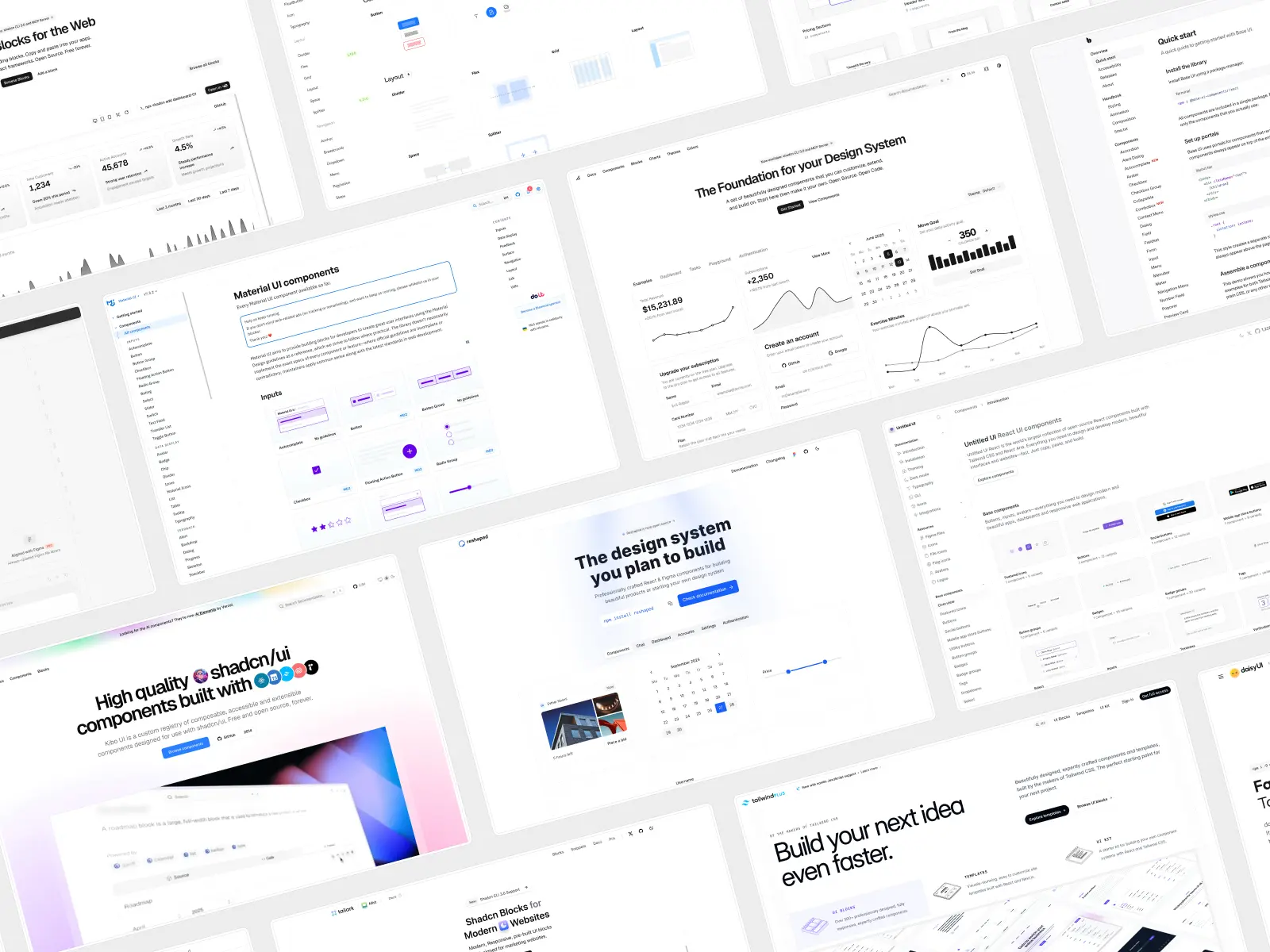
We evaluated 20 UI component libraries specifically through the lens of vibe coding tools for designers and developers. Here's what we found.
What makes a UI component library great for vibe coding?
Before we get into the list, here's the framework we used to evaluate each UI component library in this list:
- Model Context Protocol (MCP) support: MCPs lets AI agents and AI tools dynamically query a library's live documentation and API contracts. Instead of working from (potentially outdated) training data, AI tools can discover UI components, check props, and validate usage in real-time using fewer AI credits. This is the biggest differentiator in 2026.
- AI instructions (CLAUDE.md, .cursorrules, etc.): The best libraries now ship files specifically written for AI consumption — CLAUDE.md, .cursorrules, AGENTS.md, .fragment.tsx metadata files. These tell AI tools and coding agents exactly how to use UI components, which patterns to follow, and what to avoid. Without them, the AI guesses. And it guesses wrong a lot, wasting time and AI credits.
- Copy-paste architecture: Modern AI tools, models, and coding agents are phenomenal at modifying code they can see in your project and even your entire codebase — Tailwind CSS classes in a components/ui folder — rather than guessing how to override complex npm packages with opaque internals. Libraries that put source code in your repo win.
- Design quality: AI tools and coding agents can structure code. They can't design. UI libraries with beautiful defaults, built by professional designers, produce output and working code that you'd actually ship. Libraries with ugly design defaults produce output you'll spend hours fixing or will require a designer to fix — defeating the whole point of vibe coding.
- Tailwind CSS support: AI models are incredibly proficient with Tailwind CSS because it's text-based, utility-first, and massively represented in training data. If your UI library uses Tailwind CSS, your AI and coding agents write better working code. It's that simple.
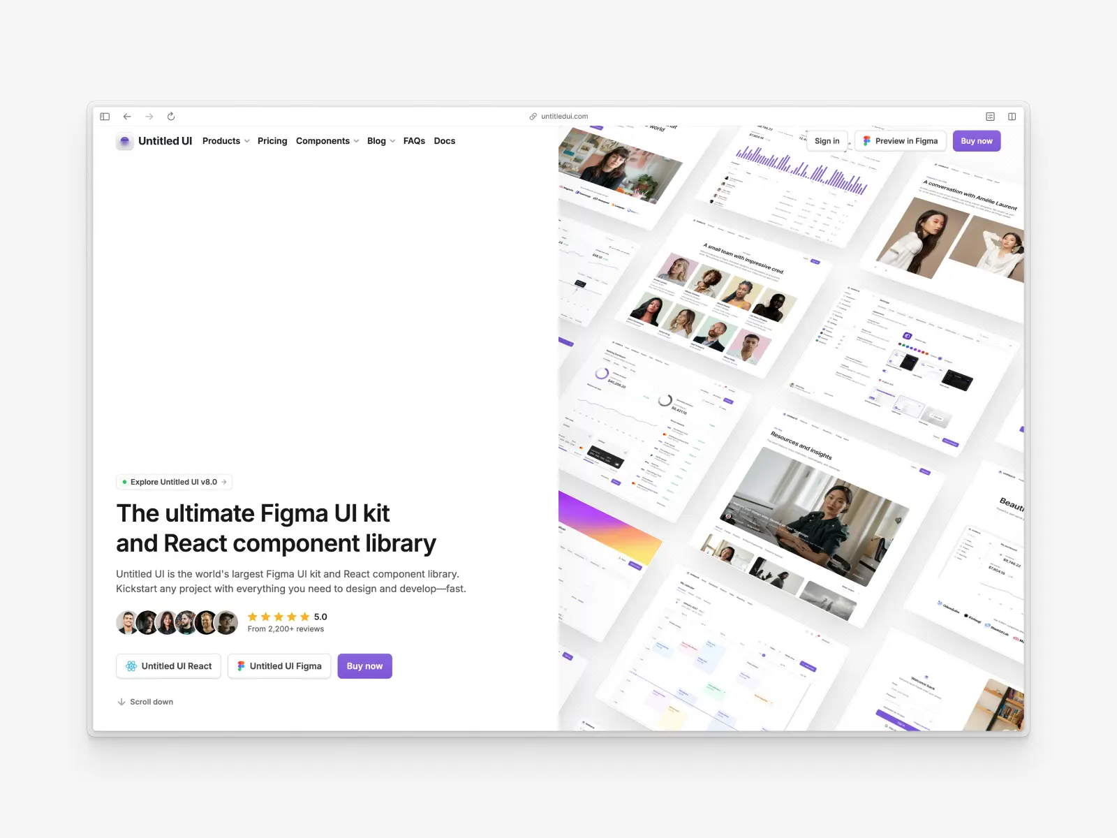
1. Untitled UI
untitledui.com — Open source + paid from $139 (lifetime access)
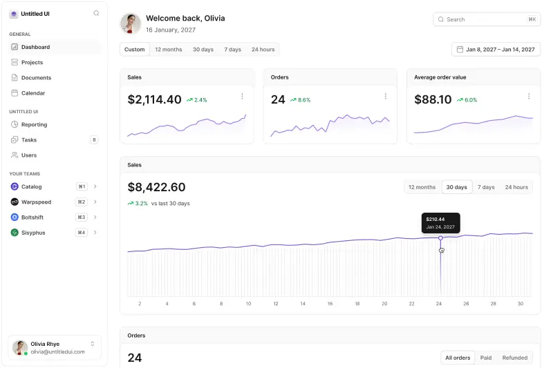
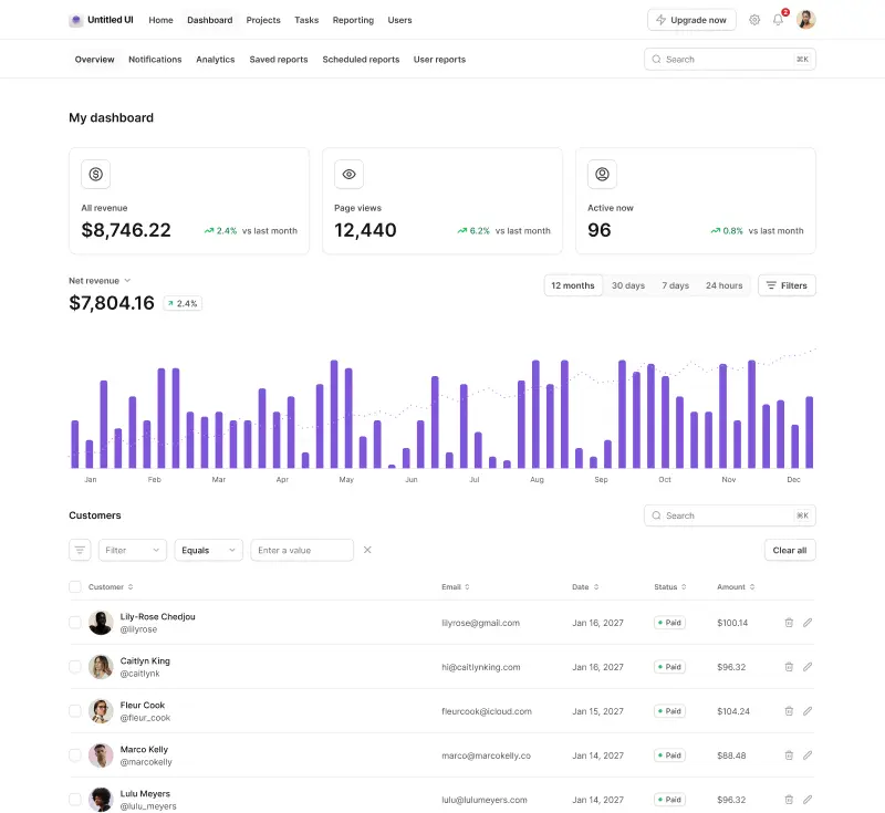
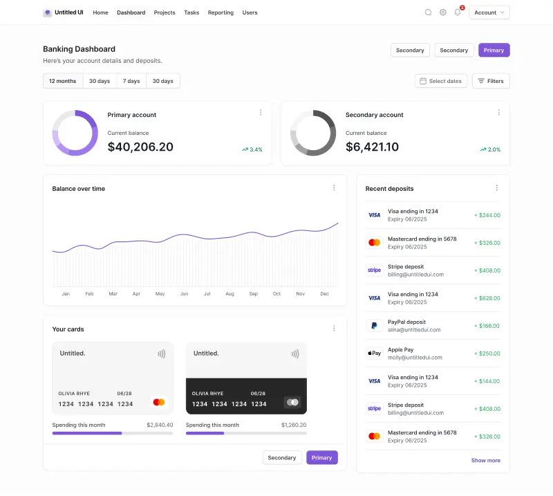
Untitled UI is the world's largest and most popular Figma UI kit and React component library. 10,000+ Figma components, 5,000+ React components, 420+ page examples, 4,600+ icons. Built with React v19.2, Tailwind CSS v4.2, TypeScript v5.9, and React Aria.
What makes it incredible for vibe coding isn't just the volume — it's the design+code quality and infrastructure. Untitled UI was built by professional designers and developers, and ships CLAUDE.md and AGENT.md rules that keep AI agents strictly adhering to Tailwind CSS and React Aria best practices. Plus, a dedicated MCP server that connects your AI assistant and vibe coding tools directly to the component documentation.
Dedicated integration guides cover Claude Code, Cursor, Codex, Gemini CLI, and OpenCode, and one-click project launches into v0, Bolt, and StackBlitz take you from prompt to running app in seconds. The Figma UI kit and React UI component library stays synced, so design and development never drift apart, with free updates for life.
When you prompt AI coding tools to build quick prototypes, having 420+ real page examples built by designers as reference means the output is significantly closer to what you'd actually ship with a single prompt.
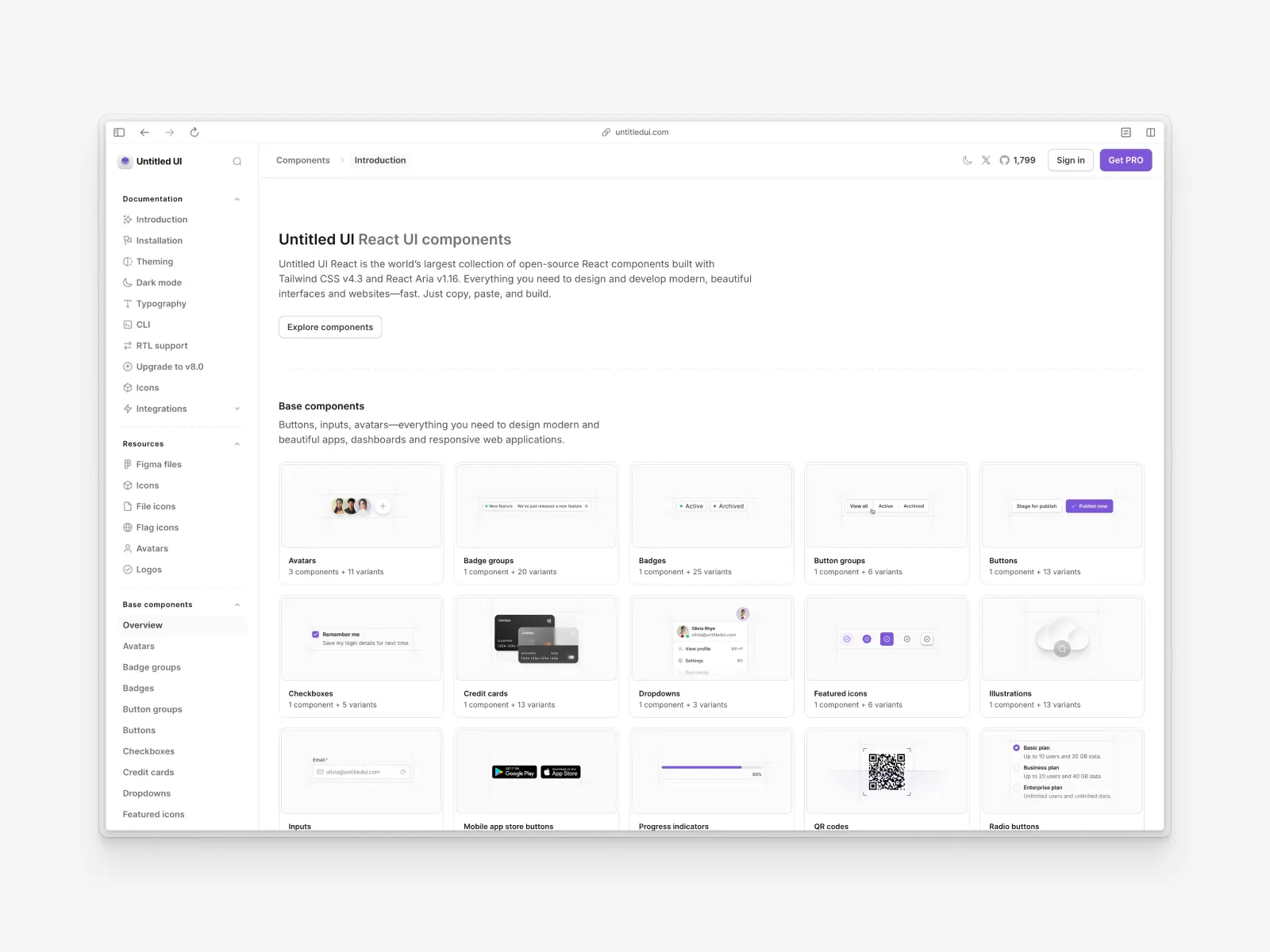
Untitled UI key features:
- MCP support: Dedicated MCP server for connecting AI assistants to component docs.
- AI instructions: Ships CLAUDE.md, GEMINI.md, and AGENT.md rules, plus integration guides for Claude Code, Cursor, Codex, Gemini CLI, and OpenCode.
- AI tool integrations: One-click launches into v0, Bolt, and StackBlitz.
- Components & templates: 5,000+ React components, 420+ page examples, 10,000+ Figma components built by professional designers.
- Design quality: Unparalleled and built by professional designers and developers. Pixel-perfect, modern, backed by the most popular Figma UI kit in the world.
- Tech stack: The entire codebase is built with React v19.2, Tailwind CSS v4.2, TypeScript v5.9, and React Aria.
- What makes it unique: World-class design with full code ownership, Figma-to-React sync, and the deepest AI tooling of any UI library — from coding agent rule files to MCP to one-click platform launches.
- Pricing: There are 100% free versions of all Untitled UI products:
- Untitled UI Figma: Try the free UI kit. You can duplicate it and use it in unlimited personal or commercial projects.
- Untitled UI React: All base components and many more are completely free to use in your projects, including commercial projects.
- Untitled UI Icons: Browse and copy free Untitled UI Icons directly from our site, or download the free Figma icon library for your projects.
Need more features, components, or icons? Upgrade anytime — Untitled UI Figma from $139, Untitled UI React from $349, and Untitled UI Icons from $59. Every purchase includes lifetime access with free updates.
As we've mentioned, a huge part of Untitled UI React is 100% free and open source. Use the free Untitled UI React components in unlimited commercial projects and React applications to try them out.
Check out the Untitled UI React documentation and explore the free React UI components to get started.
This library is particularly ideal for teams already using Tailwind CSS who want production-ready React components out of the box that don't rely on external dependencies and libraries. If you're short on time, here's a 60-second overview:
Vibe coding tools readiness: ★★★★★ 5/5 stars
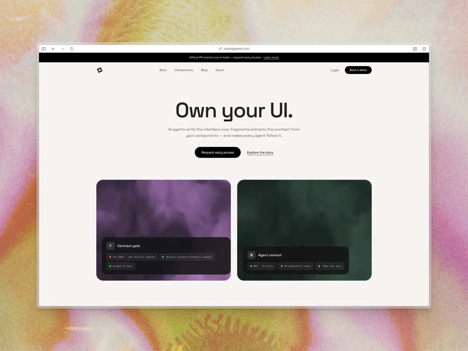
2. Fragments UI
usefragments.com — Free / open source
Fragments UI is the most explicitly AI-native design system we've seen. It ships 66 accessible React components, 80 design tokens, and — critically — 11 MCP tools that give AI assistants and coding agents live access to your actual component APIs. Every component includes a .fragment.tsx metadata file with structured usage guidance, prop contracts, and composition hints that AI coding tools read instead of guessing.
It gives AI tools a database of your design system rather than forcing them to read a static text document. The MCP tools let AI agents discover components, render them in a real browser, audit accessibility, and fix token drift. If you're building a team workflow where AI is a first-class participant in your design system, this is the most forward-thinking option available.
Fragments UI key features:
- MCP support: Yes — 11 dedicated MCP tools for design system component discovery, rendering, and validation.
- AI instructions: Ships .fragment.tsx files with structured metadata, rules, and composition hints for AI.
- Components & templates: 66 components, 30 composition patterns, 80 design tokens.
- Design quality: Clean, neutral, and highly professional.
- Tech stack: React, Base UI primitives, CSS variables, TypeScript.
- What makes it unique: Quite literally built for vibe coding — the most complete MCP integration for coding agents of any library.
- Pricing: Free / open source.
Vibe coding tools readiness: ★★★★★ 5/5 stars
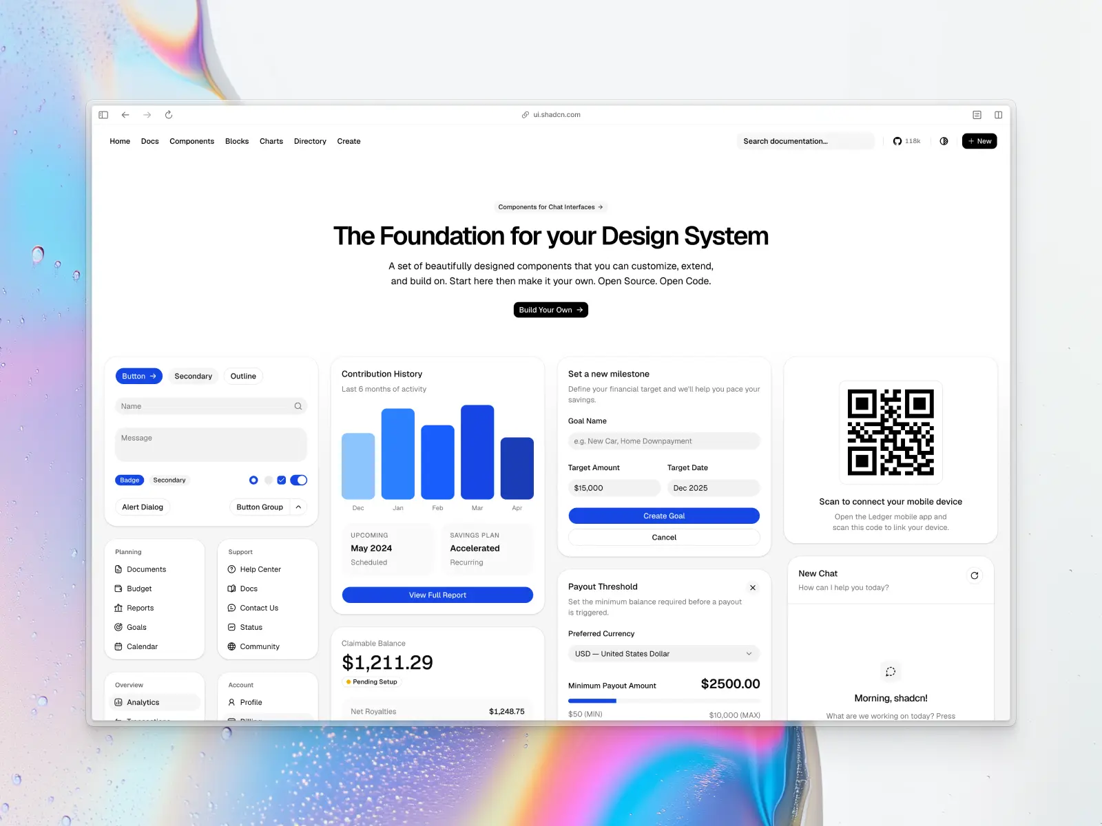
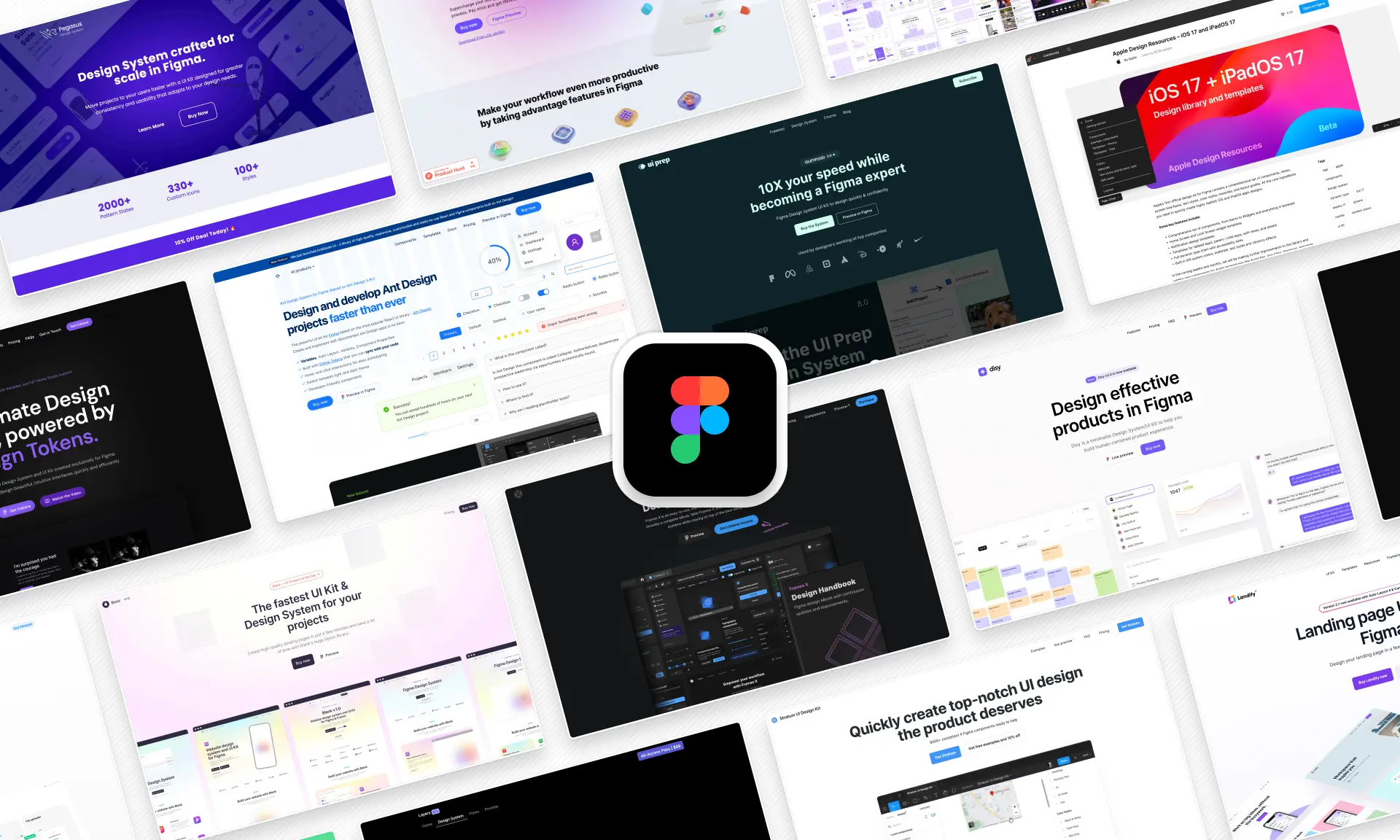
3. shadcn/ui
ui.shadcn.com — Free / open source
The undisputed king of the copy-paste component era. shadcn/ui gives you the source code for every component, dropped directly into your codebase — which is the perfect architecture for AI since it can read and modify the actual files in your repo. Built with Radix UI primitives and styled with Tailwind CSS, it's become the de facto standard that many other libraries on this list build upon.
The registry pattern it popularized has completely reshaped how we build React apps with AI. Every major AI coding tool — Cursor, Claude, v0, Bolt, Lovable — has deep familiarity with shadcn/ui patterns. When you ask an AI to build a component, there's a very high chance it defaults to shadcn/ui conventions. Of the 21 libraries reviewed here, at least 10 are built on or extend shadcn/ui. That network effect is massive.
shadcn/ui key features:
- MCP support: Broad community support with various open-source MCP servers indexing shadcn/ui docs.
- AI instructions: Implicitly supported by virtually every AI model — it's the default knowledge base for tools like v0 and Lovable.
- Components & templates: 50+ core components, plus thousands of community blocks and extensions.
- Design quality: Minimalist, clean, and highly recognizable.
- Tech stack: React, Tailwind CSS v4, Radix UI, TypeScript.
- What makes it unique: The ecosystem standard. Every AI tool knows it, and the copy-paste model gives you full code ownership.
- Pricing: Free / open source.
Vibe coding tools readiness: ★★★★★ 5/5 stars
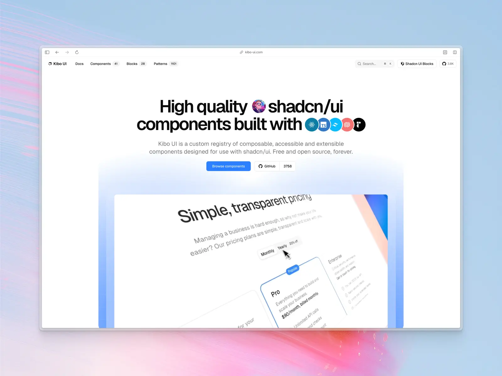
4. Kibo UI
kibo-ui.com — Free / open source
Created by the talented Hayden Bleasel (@haydenbleasel), Kibo UI is the "extended universe" of shadcn/ui — filling gaps with advanced, niche components like color pickers, image zoom, QR code generators, code blocks with syntax highlighting, drag-and-drop file uploaders, comparison tables, and mini-calendars. 41 components, 6 blocks, and 1,101 patterns.
For vibe coding, Kibo UI is valuable because it extends shadcn/ui with the complex, interactive components that AI often struggles to build from scratch. A color picker or a code block with line numbers — these are components where having a tested implementation saves enormous time. It's also one of the first community registries with built-in MCP integration.
Kibo UI key features:
- MCP support: Yes — built-in MCP integration.
- AI instructions: Designed with AI-driven workflows in mind, inherits shadcn/ui's AI familiarity.
- Components & templates: 41 components, 6 blocks, 1,101 patterns.
- Design quality: Exceptionally high — beautiful animations and polished interactions.
- Tech stack: React, Tailwind CSS, Radix UI, Lucide (shadcn/ui ecosystem).
- What makes it unique: Provides complex interactive blocks that usually take days to build, instantly deployable via CLI.
- Pricing: Free / open source (recent acquisition may introduce a paid tier).
Vibe coding tools readiness: ★★★★☆ 4/5 stars
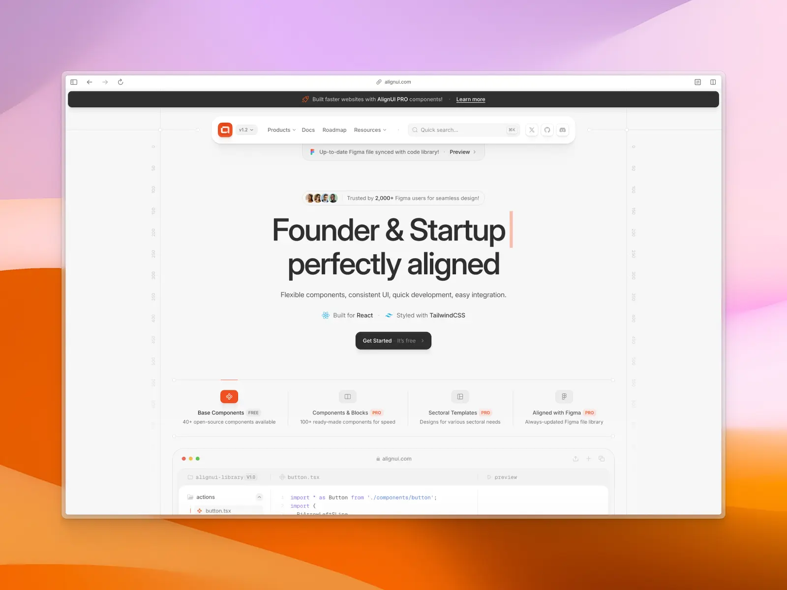
5. AlignUI
alignui.com — Open source + paid from $299
AlignUI bridges design and development with a flexible, composable component system. The code uses a slot-based architecture with components like FancyButton, LinkButton, and clean, readable APIs — both human-friendly and AI tool friendly. The default styles are genuinely beautiful.
Predictable patterns mean fewer hallucinations and more accurate code generation. The standard Tailwind CSS/Radix UI stack is easily understood by AI even without custom instruction files, though it would benefit from shipping CLAUDE.md or .cursorrules.
AlignUI key features:
- MCP support: No official MCP support.
- AI instructions: No official AI instruction files, but standard Tailwind CSS/Radix UI patterns are well-understood by AI.
- Components & templates: 180+ React components and multiple templates, plus full Figma UI kit.
- Design quality: World-class. One of the most aesthetically refined libraries on this list.
- Tech stack: React, Tailwind CSS, Radix UI, TypeScript.
- What makes it unique: Bridges a high-end Figma UI kit with production React code beautifully.
- Pricing: 40+ free components + pro from $299.
Vibe coding tools readiness: ★★★★☆ 4/5 stars
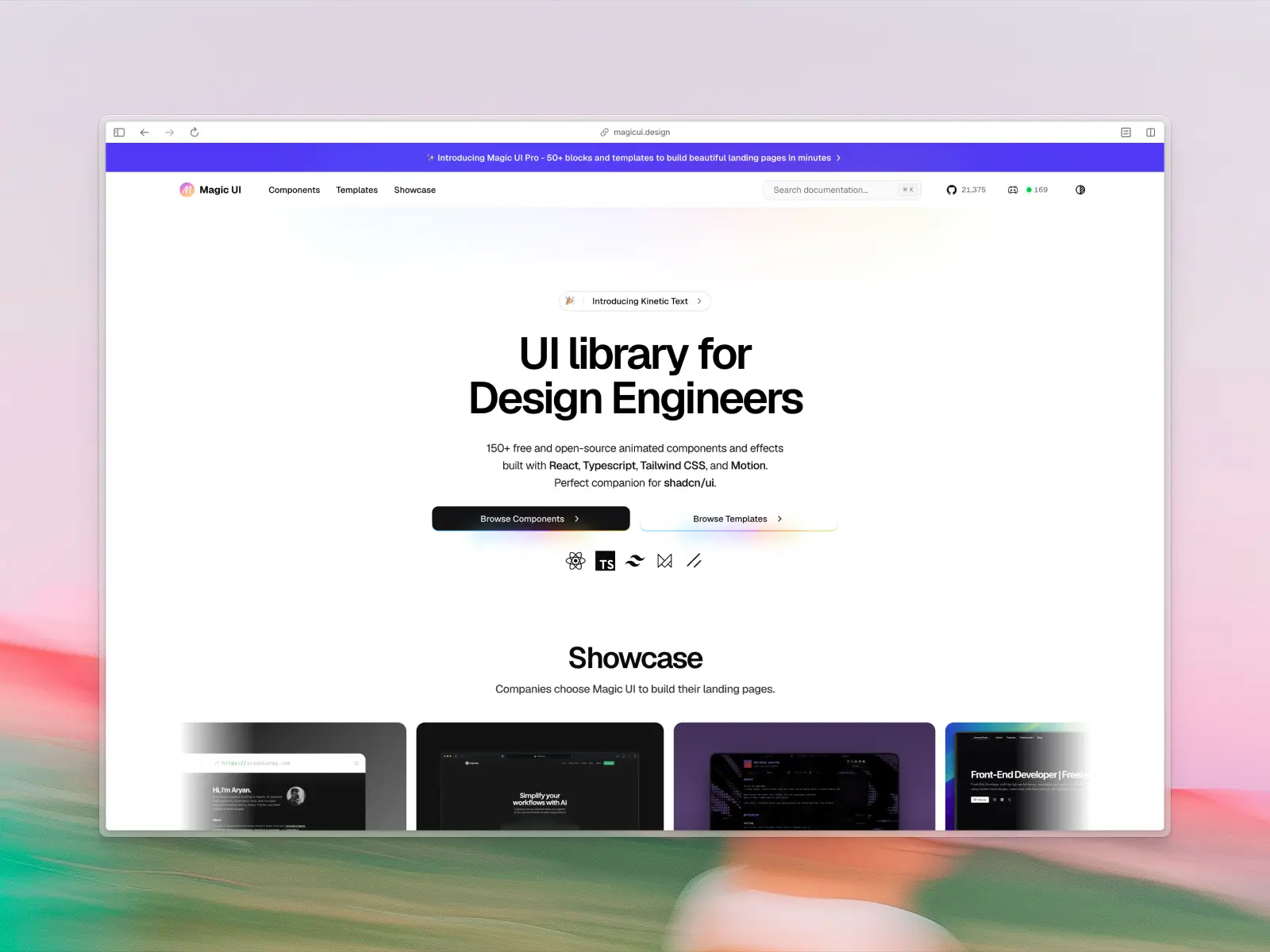
6. Magic UI
magicui.design — Open source + paid from $199
Magic UI is 150+ animated UI components and effects built with React, TypeScript, Tailwind CSS, and Motion (Framer Motion). It positions itself as the perfect companion for shadcn/ui — adding the visual flair and micro-interactions that make interfaces feel alive.
AI assistants are great at generating functional layouts but often produce static, lifeless interfaces. Magic UI fills that gap. Prompt "add a marquee testimonial section" or "animate the hero with a text reveal" and get polished results. The copy-paste nature works well with AI, provided the AI understands Framer Motion patterns.
Magic UI key features:
- MCP support: No official MCP support.
- AI instructions: Copy-paste architecture is inherently AI-friendly; works best when AI knows Framer Motion.
- Components & templates: 150+ animated UI components and effects.
- Design quality: Stunning. Motion-heavy, trendy, and visually impressive.
- Tech stack: React, TypeScript, Tailwind CSS, Motion (Framer Motion).
- What makes it unique: The best way to add complex animations to a shadcn/ui project via vibe coding.
- Pricing: Free components + premium templates.
Vibe coding tools readiness: ★★★★☆ 4/5 stars
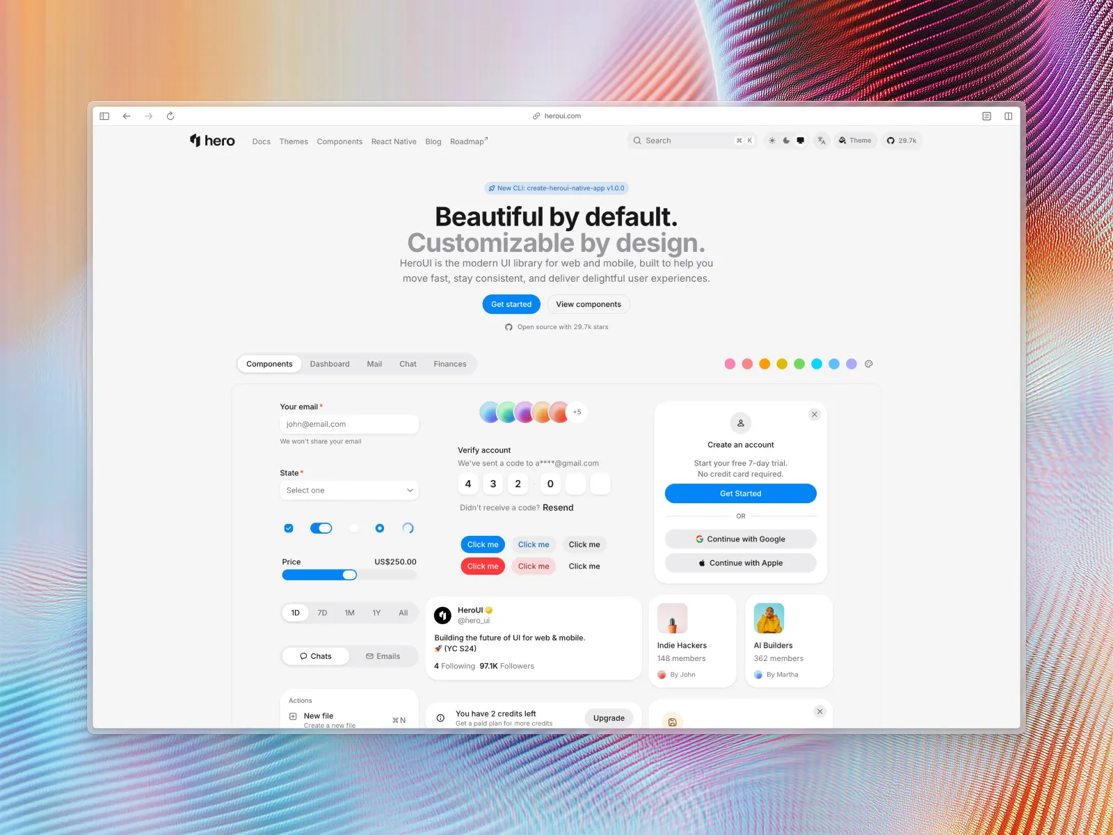
7. HeroUI (formerly NextUI)
heroui.com — Free / open source
HeroUI is a beautiful, fast React UI library built on Tailwind CSS and React Aria. It features automatic dark mode, a custom Tailwind CSS plugin for theming, and uses Tailwind Variants for clean component slot customization. The components are visually polished out of the box with smooth animations and thoughtful design.
The theming system is a standout for vibe coding — describe a brand aesthetic and AI can configure the entire theme through the Tailwind CSS plugin. The React Aria foundation handles accessibility automatically. One caveat: you need to explicitly tell the AI to use HeroUI imports, otherwise it'll try to write raw Tailwind CSS.
HeroUI key features:
- MCP support: No official MCP support.
- AI instructions: Requires explicit prompting to use HeroUI imports; no shipped AI instruction files.
- Components & templates: 50+ styled components with comprehensive theming.
- Design quality: Vibrant, modern, and highly polished by default.
- Tech stack: React, Tailwind CSS, React Aria, Framer Motion.
- What makes it unique: Premium UI kit aesthetics with Tailwind CSS performance, all free and open source.
- Pricing: Free / open source.
Vibe coding tools readiness: ★★★★☆ 4/5 stars
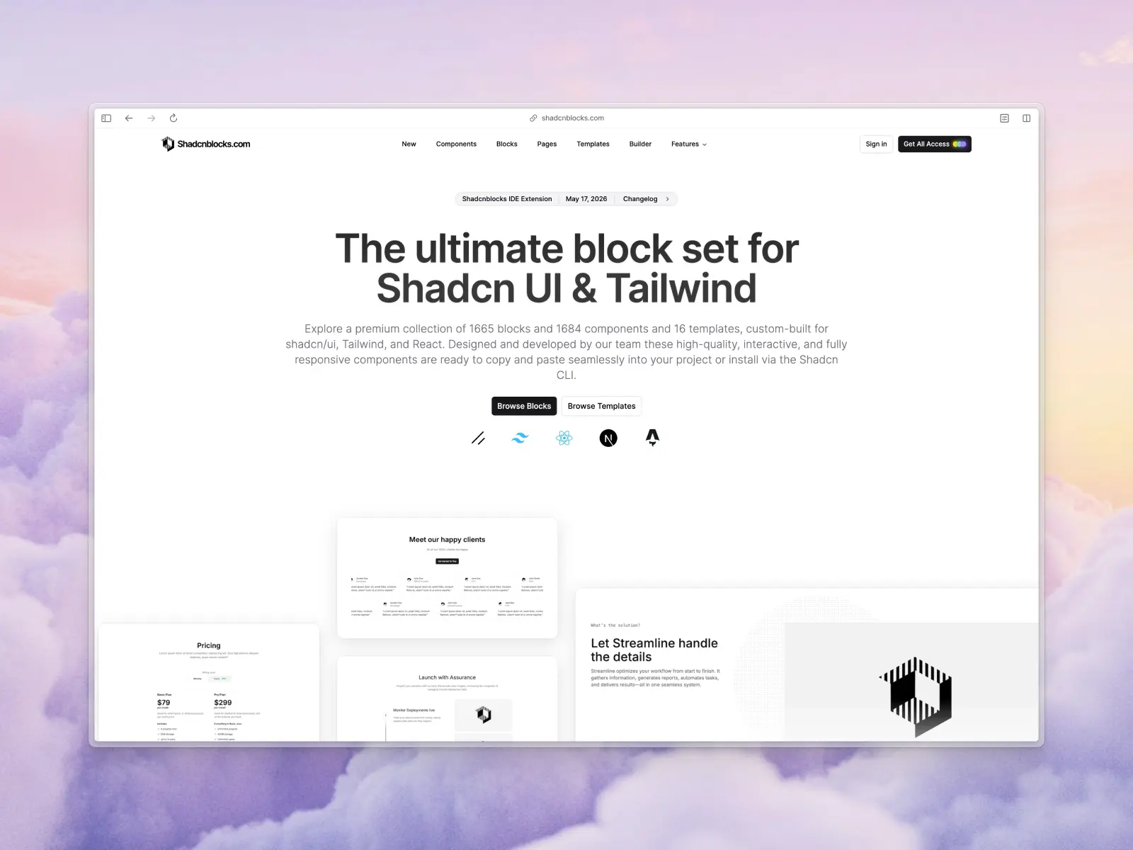
8. ShadcnBlocks
shadcnblocks.com — Free + paid from $149 or $299
The largest collection of pre-built blocks for shadcn/ui — 1,350 blocks, 1,189 component variants, and 12 templates. These aren't individual buttons and inputs. They're full-width, production-ready sections: hero areas, pricing tables, testimonial grids, feature showcases. Copy-paste directly.
For vibe coding, blocks are arguably more useful than individual components. When you tell an AI "build me a landing page," having 1,350 pre-designed sections means the AI can compose an entire page from battle-tested building blocks rather than improvising from primitives. The sheer volume lets you vibe-code complex dashboards in minutes.
ShadcnBlocks key features:
- MCP support: No official MCP support.
- AI instructions: Highly compatible with AI due to standard shadcn/ui foundation.
- Components & templates: 1,350 blocks, 1,189 component variants, 12 templates.
- Design quality: Consistent, functional, and vast.
- Tech stack: React, Next.js, Astro, shadcn/ui, Tailwind CSS.
- What makes it unique: Pure volume — the biggest block collection in the shadcn/ui ecosystem.
- Pricing: Free + paid from $149 or $299 (including templates).
Vibe coding tools readiness: ★★★★☆ 4/5 stars
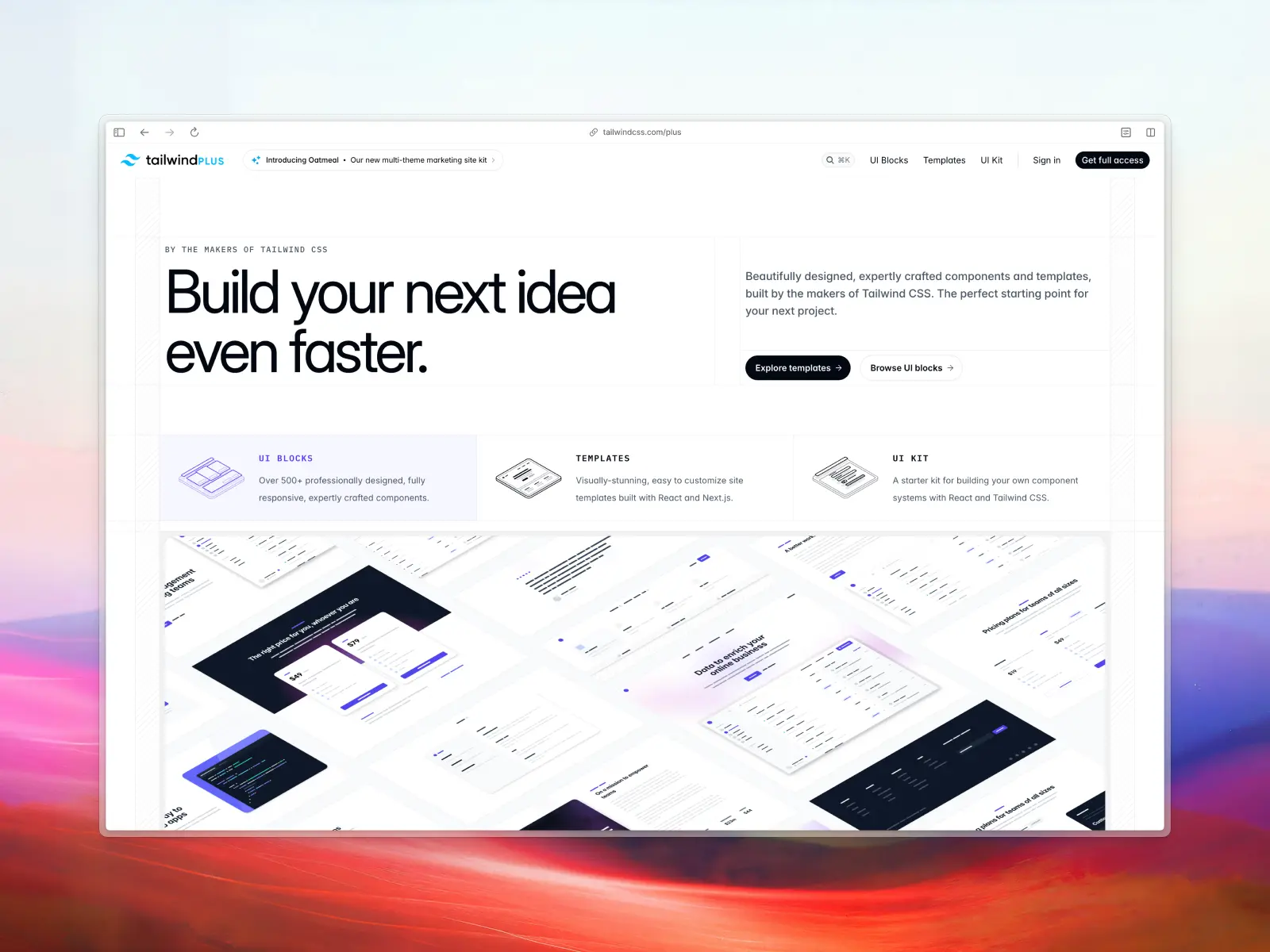
9. Tailwind Plus (formerly Tailwind UI)
tailwindcss.com/plus — Paid from $299
From the makers of Tailwind CSS themselves. 500+ professionally designed UI blocks and modern website templates — hero sections, pricing tables, CTAs, team pages, and full website templates built with React, Vue, and Next.js.
The pedigree matters. Tailwind Plus components represent the gold standard for Tailwind CSS patterns. AI models trained on vast amounts of Tailwind CSS documentation produce code that aligns closely with these conventions. The trade-off: it's a closed, paid product, so you need to manually feed the downloaded code to your AI rather than providing access to your entire codebase.
Tailwind Plus key features:
- MCP support: No official MCP support.
- AI instructions: Requires manually feeding downloaded code to your AI agent or AI tools.
- Components & templates: 500+ UI blocks (marketing, application, e-commerce), 20+ templates.
- Design quality: Flawless. The industry standard for Tailwind design.
- Tech stack: HTML, React, Vue, Next.js, Tailwind CSS, Headless UI.
- What makes it unique: Created by the Tailwind CSS team — the gold standard.
- Pricing: Paid from $299.
Vibe coding tools readiness: ★★★★☆ 4/5 stars
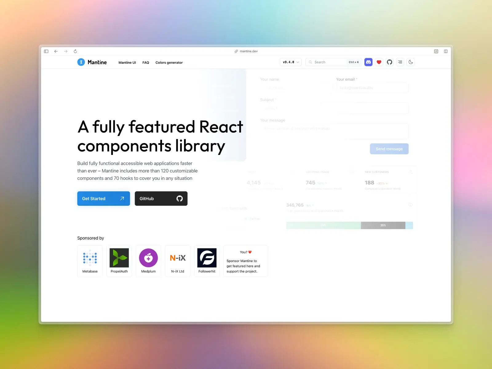
10. Mantine
mantine.dev — Free / open source
Mantine is a fully featured React component library: 120+ components, 70+ hooks, built-in form library, PostCSS preset, and extension ecosystem. It covers everything from basic inputs to date pickers, rich text editors, notifications, modals, and charts. The 50+ Combobox examples alone cover virtually every select/autocomplete pattern you'd need.
For vibe coding, Mantine's breadth is its strength — whatever you prompt AI tools to build, Mantine probably has a component for it. Fair warning though: AI models are well-trained on Mantine's v6 API but often hallucinate when prompted for the newer v7 API. You'll want to provide version-specific context in your text prompts.
Mantine key features:
- MCP support: No official MCP support.
- AI Instructions: No official AI instruction files; be explicit about v7 API to avoid v6 hallucinations.
- Components & templates: 120+ components, 70+ hooks, extensions.
- Design quality: Clean, highly functional — slightly less trendy than Tailwind-first libraries.
- Tech stack: React, native CSS (no runtime overhead), TypeScript.
- What makes it unique: The most complete all-in-one React component library available.
- Pricing: Free / open source.
Vibe coding tools readiness: ★★★★☆ 4/5 stars
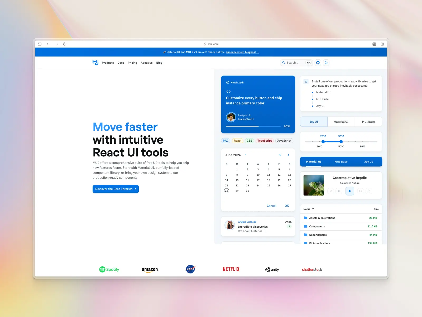
11. Material UI (MUI)
mui.com — Open source + paid from $657 or $299 per year
Material UI (MUI) has been around since 2014, making it the verteran on this list. ~100k GitHub stars and the most widely adopted React component library in existence. Material UI follows Google's Material Design, plus MUI X for advanced data grids, date pickers, and charts.
For vibe coding, MUI benefits from being the single most represented component library in AI training data. AI generates highly accurate MUI code — in theory. In practice, AI is too well-trained on MUI. It frequently mixes v4, v5, and v6 syntax in the same file, leading to frustrating debugging sessions. You need strict version pinning in your text prompts. The Material Design aesthetic can also feel generic without heavy customization.
MUI key features:
- MCP support: No official MCP support.
- AI instructions: No official files; must explicitly specify MUI version to prevent v4/v5/v6 syntax mixing.
- Components & templates: 60+ core components, advanced (MUI X), templates, design kits.
- Design quality: Standard Material Design — functional but can feel dated.
- Tech stack: React, Emotion (CSS-in-JS), TypeScript.
- What makes it unique: Unbeatable robustness for data-heavy enterprise applications.
- Pricing: Open source (core), paid (MUI X Pro/Premium) from $657 or $299 per year.
Vibe coding tools readiness: ★★★★☆ 4/5 stars
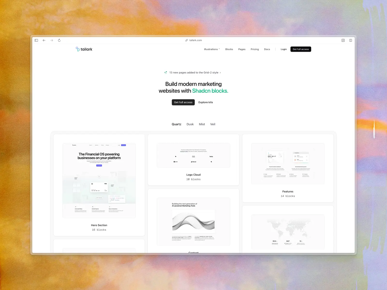
12. Tailark
tailark.com — Open source + paid from $249
Beautifully designed marketing blocks built on shadcn/ui. Enterprise-grade website sections — heroes, features, pricing, CTAs — crafted for speed and conversion. Their Pro tier includes complete pages, blocks, and illustrations.
Tailark fills the marketing-site void in the shadcn/ui ecosystem. If you're vibe-coding a landing page in 10 minutes, this is where you grab your sections. It inherits shadcn/ui's AI-friendly nature, so AI tools handle it well out of the box.
Tailark key features:
- MCP support: No official MCP support.
- AI instructions: Inherits shadcn/ui's broad AI compatibility.
- Components & templates: Marketing blocks, page templates, and illustrations.
- Design quality: Extremely high-quality, conversion-focused marketing design.
- Tech stack: React, shadcn/ui, Tailwind CSS.
- What makes it unique: The best marketing block collection in the shadcn/ui ecosystem.
- Pricing: Open source + paid from $249.
Vibe coding tools readiness: ★★★☆☆ 3/5 stars
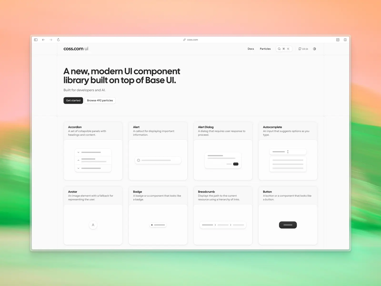
13. COSS
coss.com — Free / open source
Built by the team behind Cal.com, COSS is an ambitious project that combines a modern React UI component library with a broader vision for full-stack application development. Its long-term goal is the "COSS stack"—a single npm install @coss package that bundles infrastructure like email, SMS, calendar APIs, scheduling, notifications, and more behind a unified developer experience.
Today, the standout offering is COSS UI (formerly Origin UI): a collection of copy-and-paste React components built on Base UI and Tailwind CSS, designed to be easy for both developers and AI coding assistants to understand. The wider infrastructure platform is still evolving, making COSS one of the more interesting projects to watch in the AI development space.
COSS key features:
- MCP support: No official MCP support.
- AI instructions: Built specifically with AI-assisted development in mind, with copy-and-paste components, clear APIs.
- Components & templates: ~500 React UI components ("Particles") built on Base UI and Tailwind CSS.
- Design quality: Modern, developer-focused design system with production-ready components.
- Tech stack: React, TypeScript, Base UI, Tailwind CSS.
- What makes it unique: Aims to unify frontend components and backend infrastructure into a single AI-friendly development platform.
- Pricing: Free / open source.
Vibe coding tools readiness: ★★★☆☆ 3/5 stars
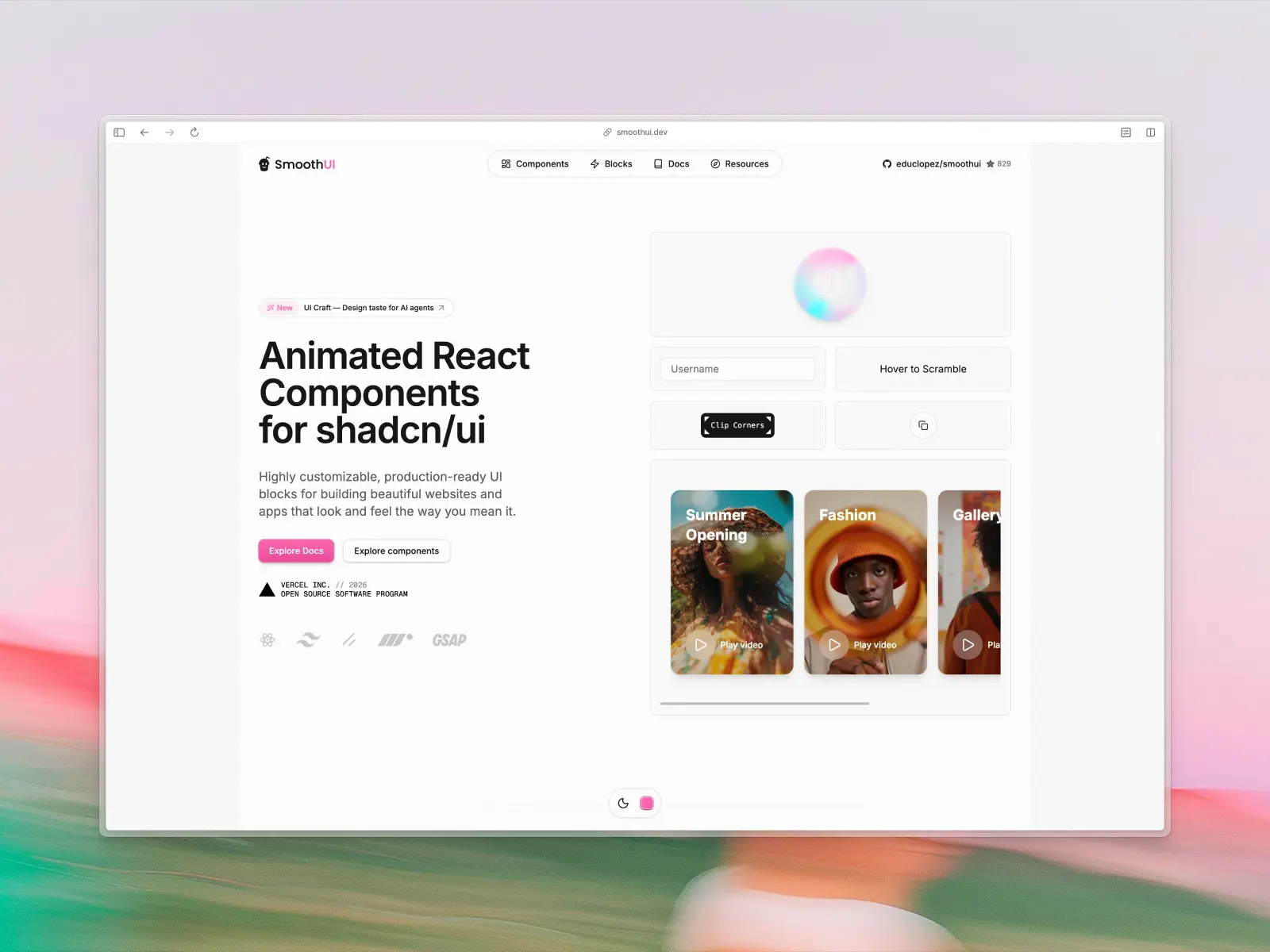
14. Smooth UI
smoothui.dev — Free / open source
Animated React components designed to drop into shadcn/ui projects. Built with Motion and GSAP, it brings scroll-triggered animations and buttery-smooth transitions to the Tailwind CSS ecosystem. Fully compatible with shadcn/ui, built with Tailwind CSS v4, includes a CLI.
Like Magic UI, Smooth UI addresses the animation gap — but leans harder into GSAP-level scroll animations. The shadcn/ui compatibility means AI assistants familiar with shadcn patterns can use these components seamlessly.
Smooth UI key features:
- MCP support: No official MCP support.
- AI instructions: Relies on passing SmoothUI CLI or source code to your AI agent.
- Components & templates: Animated blocks and components.
- Design quality: High-end, buttery-smooth animations.
- Tech stack: React, Tailwind CSS v4, shadcn/ui, Motion, GSAP.
- What makes it unique: Brings GSAP-level scroll animations into the shadcn/ui ecosystem.
- Pricing: Free / open source.
Vibe coding tools readiness: ★★★☆☆ 3/5 stars
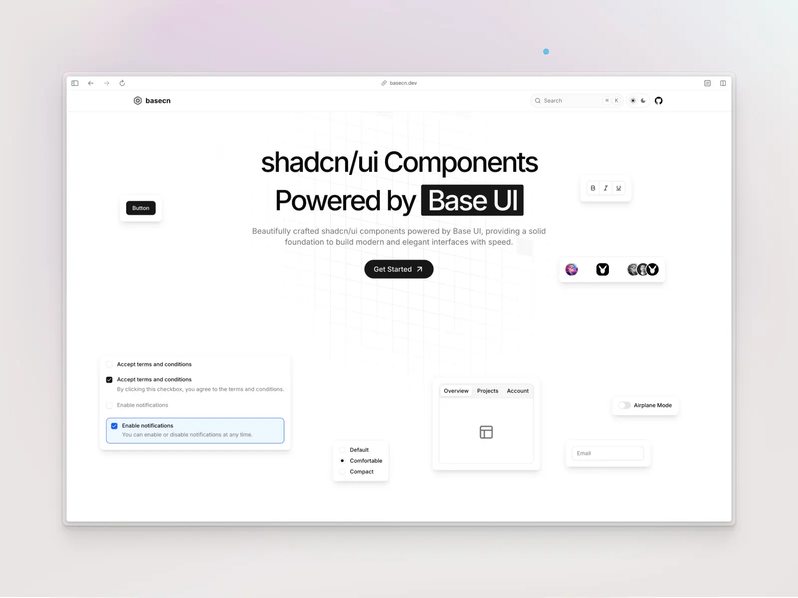
15. basecn
basecn.dev — Free / open source
A brilliant evolution of shadcn/ui: same copy-paste component patterns, but powered by Base UI primitives instead of Radix UI under the hood. It future-proofs the copy-paste architecture by adopting Base UI, which is actively maintained by the team behind Radix.
For vibe coding, basecn benefits from AI familiarity with shadcn/ui patterns while getting Base UI's robust engineering. One important note: you'll need to instruct your AI that it's using Base UI primitives, not Radix — otherwise it'll hallucinate Radix props.
basecn key features:
- MCP support: No official MCP support, but standard Base UI docs can be fed to AI.
- AI instructions: Requires explicit context — AI must know it's Base UI, not Radix, to avoid hallucinations.
- Components & templates: Core shadcn/ui components rebuilt on Base UI.
- Design quality: Matches the clean shadcn/ui aesthetic.
- Tech stack: React, Base UI, Tailwind CSS, TypeScript.
- What makes it unique: The forward-looking evolution of shadcn/ui's architecture.
- Pricing: Free / open source.
Vibe coding tools readiness: ★★★☆☆ 3/5 stars
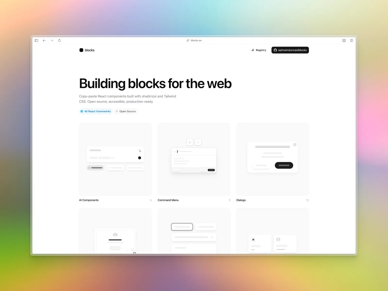
16. Blocks.so
blocks.so — Free / open source
60+ clean, modern building blocks for React — covering AI components, command menus, dialogs, file uploads, form layouts, grid lists, login flows, onboarding, sidebars, stats, and tables. Everything is open source and works across React frameworks.
The focused, well-organized categories make it easy to describe what you need. "Add a file upload block" or "create a stats dashboard" maps directly to their component categories. A completely free alternative for essential app blocks.
Blocks.so key features:
- MCP support: No official MCP support.
- AI instructions: Simple copy-paste integration for AI.
- Components & templates: 60+ blocks across 11 categories.
- Design quality: Clean and modern.
- Tech stack: React, shadcn/ui, Tailwind CSS.
- What makes it unique: Completely free, well-categorized blocks for common app patterns.
- Pricing: Free / open source.
Vibe coding tools readiness: ★★★☆☆ 3/5 stars
17. Base UI
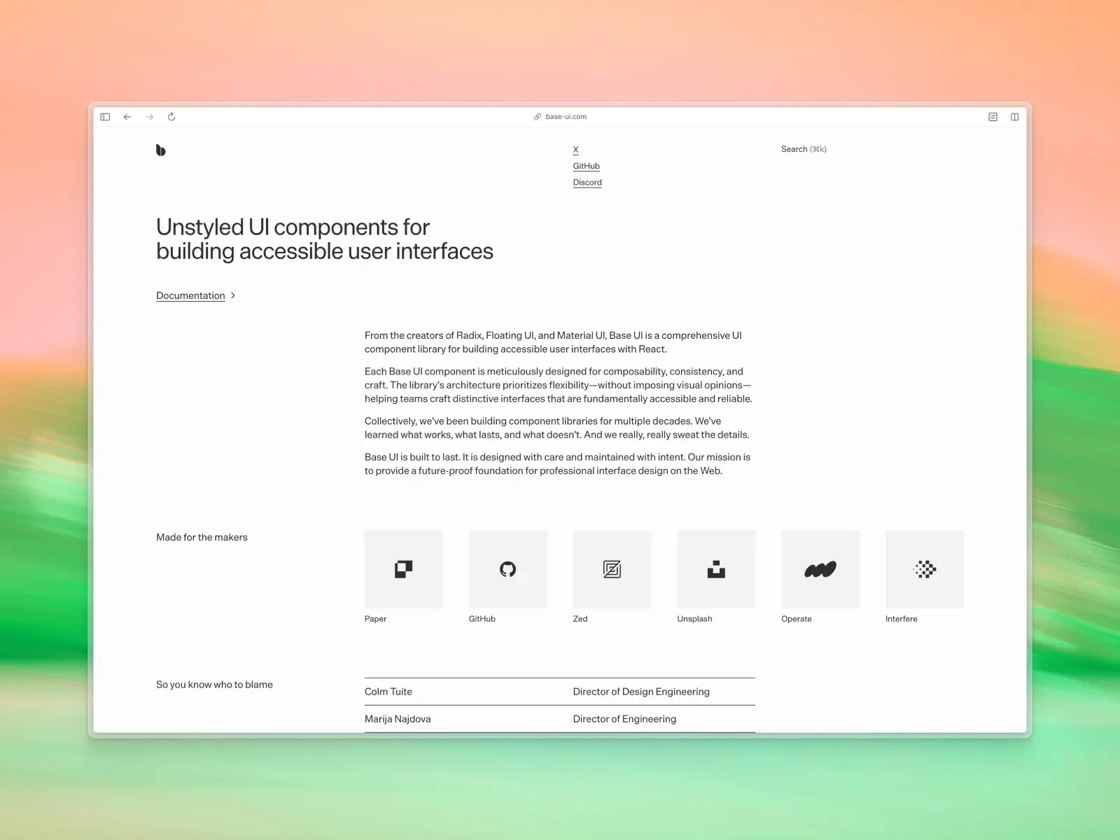
base-ui.com — Free / open source
From the creators of Radix UI, Base UI is a comprehensive unstyled component library for building accessible interfaces. Each component provides behavior and accessibility without imposing visual opinions. Decades of collective component library experience behind it.
When you want AI to generate components that match your exact design system, starting from unstyled primitives gives you maximum control. The pedigree (Radix + MUI team) means the component logic is battle-tested. But since the API is new, you'll need to feed explicit context via .cursorrules to prevent AI from hallucinating Radix props.
Base UI key features:
- MCP support: No official MCP support.
- AI instructions: New API requires explicit context feeding to avoid Radix prop hallucinations.
- Components & templates: Comprehensive set of headless primitives.
- Design quality: Unstyled by design — you bring the aesthetics.
- Tech stack: React, TypeScript, performance-focused isolated packages.
- What makes it unique: The spiritual successor to Radix — the best headless foundation available.
- Pricing: Free / open source.
Vibe coding tools readiness: ★★★☆☆ 3/5 stars
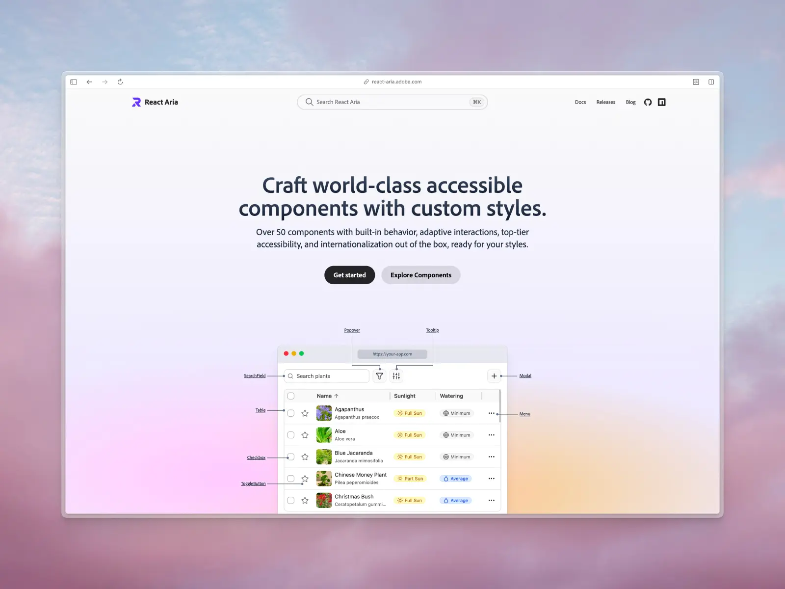
18. React Aria
react-aria.adobe.com — Free / open source
Adobe's library of unstyled, accessible React components and hooks. Handles all the complex ARIA patterns, keyboard navigation, focus management, and internationalization that are notoriously hard to get right. It's the accessibility backbone behind Untitled UI, HeroUI, and others on this list.
React Aria is less of a "grab and use" library and more of an infrastructure choice. If you're building custom components with AI, starting from React Aria primitives ensures accessibility by default — something AI consistently gets wrong when building from scratch. AI models understand it reasonably well, but can struggle with its slot-based API without a CLAUDE.md file.
React Aria key features
- MCP support: No official MCP support, but strict TypeScript contracts are highly parsable.
- AI instructions: No official files; AI can struggle with the slot-based API without explicit guidance.
- Components & templates: 40+ accessible component primitives and hooks.
- Design quality: Unstyled — you bring the aesthetics.
- Tech stack: React, TypeScript, style-agnostic.
- What makes it unique: Unbeatable accessibility (WAI-ARIA compliance) and internationalization out of the box.
- Pricing: Free / open source (Adobe).
Vibe coding tools readiness: ★★★☆☆ 3/5 stars
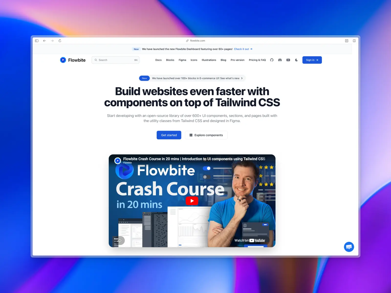
19. Flowbite
flowbite.com — Open source + paid from $299
An ecosystem of 600+ UI components built entirely with Tailwind CSS utility classes. Dark mode, Figma design system, multiple themes (default, minimal, enterprise, playful, mono), works as a Tailwind CSS plugin, and supports Tailwind CSS v4. Available for React, Vue, Svelte, and plain HTML.
Framework-agnostic is the key selling point. It works just as well in plain HTML as it does in React. AI handles Flowbite's raw HTML/Tailwind CSS approach perfectly, and the multiple theme presets let you prompt "use the enterprise theme" for different aesthetics.
Flowbite key features
- MCP support: No official MCP support.
- AI instructions: AI handles the raw HTML/Tailwind CSS approach well without special instructions.
- Components & templates: 600+ UI components and pages, multiple themes.
- Design quality: Clean, practical, and accessible.
- Tech stack: Tailwind CSS v4, vanilla JS/TS, React/Vue/Svelte adapters.
- What makes it unique: True framework-agnostic approach — works in plain HTML through React.
- Pricing: Open source + paid from $299.
Vibe coding tools readiness: ★★★☆☆ 3/5 stars
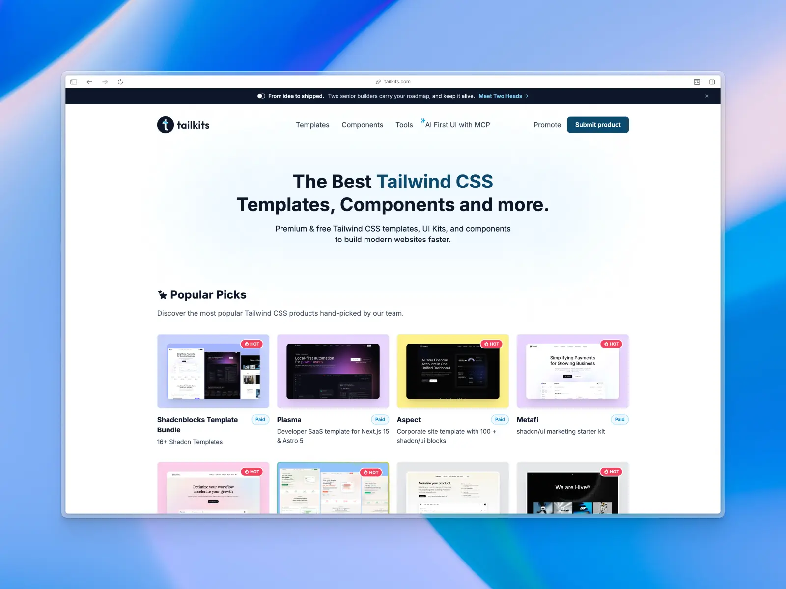
20. Tailkits
tailkits.com — Free directory to browse
Not a library — a curated directory of Tailwind CSS templates, components, and tools. Aggregates and reviews offerings from across the ecosystem, including many libraries on this list. A discovery platform for finding exactly the right building blocks for your project.
For vibe coding, Tailkits is a research tool. When you're evaluating which library to feed your AI workflow, it provides a centralized view with filtering by price, framework, and use case. An excellent place to find specific sections to feed into your AI.
Tailkits key features
- MCP support: N/A (directory, not a library).
- AI instructions: N/A (directory, not a library).
- Components & templates: Index of 100+ libraries and thousands of curated resources.
- Design quality: Varies by listing.
- Tech stack: Everything Tailwind CSS.
- What makes it unique: The best search engine for finding the exact Tailwind CSS block you need.
- Pricing: Free directory to browse.
Vibe coding tools readiness: ★★☆☆☆ 2/5 stars (discovery tool)
More best practice guides
This post is an exert from Untitled UI Figma, the largest and most popular Figma UI kit and design system in the world. Untitled UI includes tips and best practices right in the Figma file to help you level up as a designer.
Untitled UI Figma is the largest and most popular Figma UI kit and design system in the world. It's meticulously crafted with 100% Auto Layout 5.0, super-smart variants, Figma's newest variables features, and with accessibility in mind.
It's a great example of Figma design system best practices and is the most popular and highest-rated Figma UI kit on the internet with 2,200+ 5-star reviews!
They've also released Untitled UI Figma PRO LITE, which is a premium and lightweight version of the full Untitled UI Figma PRO STYLES kit and have included it for free. It's 55% lighter, faster, and is designed to include everything you need and nothing you don't. It's perfect for moving fast and for smaller projects!
Untitled UI was designed to be the "ultimate" UI kit and the perfect starting point for any kind of project—from beautiful marketing landing pages, all the way to complex dashboards and web apps—Untitled UI has thought of absolutely everything so you don't have to.
The team behind Untitled UI are constantly making updates and improvements to the UI kit and recently announced they've completely refactored Untitled UI to take advantage of Figma's latest features released at Config 2023, Framework 2024, Config 2024, and Config 2025. This includes all the latest Figma features such as color variables (dark mode), spacing, radius, typography, and effects variables, Auto Layout 5.0, min/max widths, Auto Layout wrapping, and much more.
You can check out a full preview of the design kit, or check out the 100% free UI kit here (which is more advanced than most UI kits in its own right!). If you're short on time, here's a 60-second overview:
Untitled UI blog
More design resources


Untitled UI is the best $ I've spent on my business in a long time. I'm going to keep using it and recommending it to every designer I know.
Over the years we've featured hundreds of UI kits on UXCrush, but Untitled UI is by far the most comprehensive and detailed I've seen yet. A must have for any designer!
I've used all UI kits on the market. I can say without a doubt that the Untitled UI kit is the best on the market. It covers everything a designer needs in a modern and efficient way.
Incredible, and keeps getting better. I’ve tried dozens of UI kits and Untitled UI is the only name you should care about. It stands head and shoulders above the rest.
Such a beautiful, detailed, and extensive UI kit. Untitled UI is the perfect foundation for any project. I highly recommend this huge time saver.
Untitled UI has been an amazing resource that I'm learning to rely upon to spin up ideas in no time. I think I might launch a startup pretty soon by mistake here!
The sheer scale, details, and organization of this kit is mind-blowing. It covers nearly everything a Designer could need in a modern, efficient and systematic way.
I'm super impressed with this. I love poking around in other peoples UI Kits to see how they think. This is probably one of the most comprehensive I've seen.
I'm super excited to use this for quick mockups of ideas in Figma. We're always trying to streamline our design process so we can move fast! Definitely recommend.
Untitled UI is easily the best UI kit I've used so far. It has an insane amount of components that are all incredibly well-built. I don't even know how many hours this will save.
The attention to detail and thought Jordan has put into this UI kit is unparalleled.
Untitled UI is incredibly well-organized and the attention to detail is great. I highly recommend this kit to any designer that wants to create beautiful designs fast.
What an awesome Figma kit... it's an absolute game changer. This is the perfect base for any design system. The size and attention to detail is next level.
We've been using Untitled to build Himalayas 2.0 and have finished a complete redesign in just a few days. It has everything we need already pixel-perfect.