Powerful and customizable React empty state components built for modern applications and websites. These empty states are built using React Aria and styled with Tailwind CSS.
No projects found
Your search “Landing page design” did not match any projects. Please try again.
Installation
You can add this empty states component using our CLI or manually:
npx untitledui@latest add empty-state
Empty states examples
Below are examples and variations of this empty states component:
No projects found
Your search “Landing page design” did not match any projects. Please try again.
No projects found
Your search “Landing page design” did not match any projects. Please try again.
No projects found
Your search “Landing page design” did not match any projects. Please try again.







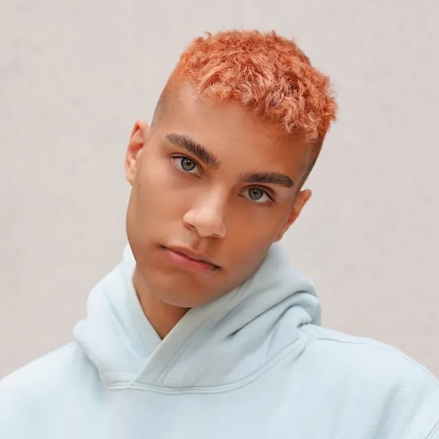
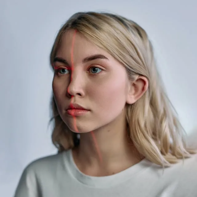
No users found
Your search did not match any users.

Invite your first user
Add your team members and external users.








Sorry, no results!
We couldn't find any apps or commands.
Please try again or browse all apps.
API reference
Import the parts and assemble them:
import { EmptyState } from "@/components/application/empty-state/empty-state";

<EmptyState>
    <EmptyState.Header>
        <EmptyState.FeaturedIcon />
    </EmptyState.Header>

    <EmptyState.Content>
        <EmptyState.Title />
        <EmptyState.Description />
    </EmptyState.Content>

    <EmptyState.Footer />
</EmptyState>
EmptyState
Renders a <div> element.
Also accepts all standard HTML attributes, all aria-* attributes, all standard React DOM event handlers.
EmptyState.AvatarGrid
Renders a <div> element.
Also accepts all standard HTML attributes, all aria-* attributes, all standard React DOM event handlers.
EmptyState.AvatarRadius
Renders a <div> element.
Also accepts all standard HTML attributes, all aria-* attributes, all standard React DOM event handlers.
EmptyState.AvatarRow
Renders a <div> element.
Also accepts all standard HTML attributes, all aria-* attributes, all standard React DOM event handlers.
EmptyState.Content
Renders a <main> element.
Also accepts all standard HTML attributes, all aria-* attributes, all standard React DOM event handlers.
EmptyState.Description
Renders a <p> element.
Also accepts all standard HTML attributes, all aria-* attributes, all standard React DOM event handlers.
EmptyState.FeaturedIcon
Renders FeaturedIcon.
EmptyState.FileTypeIcon
Renders a <div> element.
Also accepts all standard HTML attributes, all aria-* attributes, all standard React DOM event handlers.
EmptyState.Header
Renders a <header> element.
Also accepts all standard HTML attributes, all aria-* attributes, all standard React DOM event handlers.
EmptyState.Illustration
Renders Illustration.
Also accepts all standard HTML attributes, all aria-* attributes, all standard React DOM event handlers.
EmptyState.Title
Renders a <h1> element.
Also accepts all standard HTML attributes, all aria-* attributes, all standard React DOM event handlers.
FAQs
Please refer to our frequently asked questions page for more.
The size prop on the EmptyState root accepts "sm", "md" and "lg" and defaults to "lg". It flows through context to the title, description, spacing, EmptyState.Illustration, EmptyState.AvatarRow and EmptyState.AvatarGrid. EmptyState.FeaturedIcon renders at "xl" under a "lg" root and "lg" otherwise unless you set its own size, while EmptyState.Illustration only honors its own size when the root is "lg".
Nest the parts inside EmptyState: EmptyState.Header holds the visual, EmptyState.Content wraps EmptyState.Title and EmptyState.Description, and EmptyState.Footer holds your action buttons in a row. Every part also accepts a className for one-off adjustments.
Use EmptyState.FeaturedIcon (defaults to the SearchLg icon with color="gray" and theme="modern"), EmptyState.Illustration with type set to "cloud" (the default), "box", "documents" or "credit-card", or EmptyState.FileTypeIcon with a type such as "folder" (the default) and a theme of "solid" (the default), "default" or "gray".
EmptyState.Header takes a pattern prop that accepts "circle" (the default), "square", "grid", "grid-check", or "none" to drop the pattern entirely. patternSize controls its scale with "sm", "md" (the default) or "lg".
EmptyState.AvatarRadius, EmptyState.AvatarRow and EmptyState.AvatarGrid each take an avatars array of { src, alt? } objects. AvatarRadius places up to nine avatars on concentric rings, AvatarRow splits them into a left and right cluster around its children, and AvatarGrid splits them across two scrolling marquee rows.
Yes. EmptyState.Title renders an <h1> and EmptyState.Content renders a <main>, which suits a full-page empty state but duplicates both inside a page that already has them. Both spread your props onto the element, so <EmptyState.Title role="heading" aria-level={2}> demotes the heading and <EmptyState.Content role="presentation"> drops the landmark. The avatar decorations are aria-hidden, so keep the meaningful copy in the title and description.
Yes. The marquee rows in EmptyState.AvatarGrid are marked motion-reduce:animate-none, so the animation stops for users who have the reduced-motion preference enabled while the layout stays intact.