export const title = "Upgrade to v8.0"
export const description = "How to upgrade your Untitled UI React project from v7.0 to v8.0. Includes CLI automation, AI agent instructions, and manual migration steps."
## What's new in v8.0
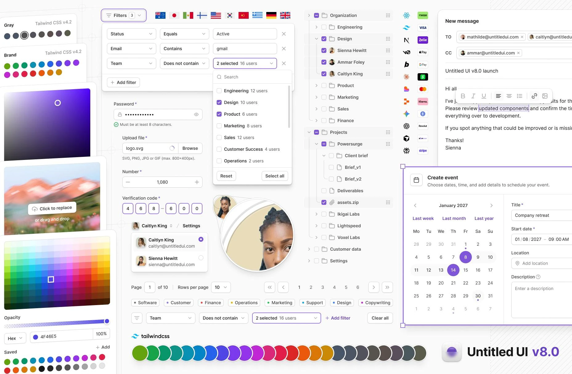
v8 is a significant release that makes the design system lighter, more accessible, and future-ready. Here's what you get:
### Tailwind CSS v4.3 color palette
We switched the entire color palette over to Tailwind CSS colors. This improves alignment between design and development, making it easier for teams to integrate Untitled UI components directly into Tailwind-based projects while keeping the resulting CSS simpler and more predictable.
As part of this change, we chose `neutral` as the default gray palette. Neutral gray is completely desaturated and flat, making it highly versatile and giving interfaces a minimal, modern, and clean aesthetic — the perfect starting point for any project.
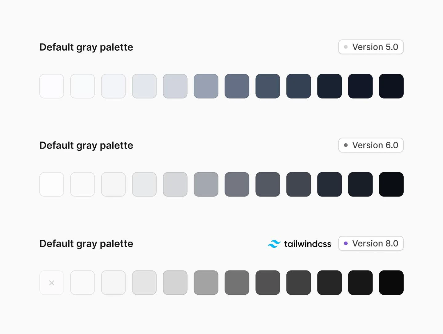
This also made the theme significantly lighter. We removed 436 redundant color variables by leveraging Tailwind CSS 4's native palettes instead of redeclaring them. The theme file went from **65KB to 45KB** and from **1,093 to 657 CSS variables** — a **40% reduction in design tokens**.
Semantic color names like `utility-error-*` and `utility-gray-*` are now raw color names (`utility-red-*`, `utility-neutral-*`) that map directly to Tailwind's built-in palette. Less custom CSS, faster builds. Of course, if you want to revert your color palette back to v7.0, you can do so easily by editing your color variables in `theme.css`.
### MCP server
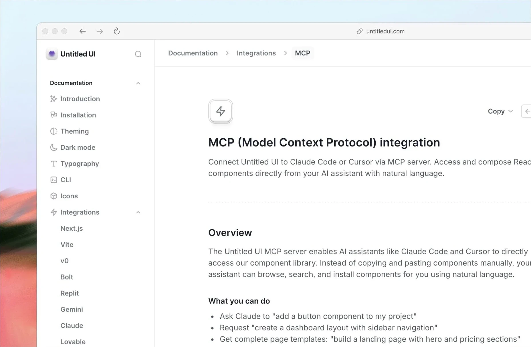
Untitled UI now supports [MCP (Model Context Protocol)](/integrations/mcp), allowing AI tools like Claude Code and Cursor to browse, search, and install components using natural language.
### Copy as markdown
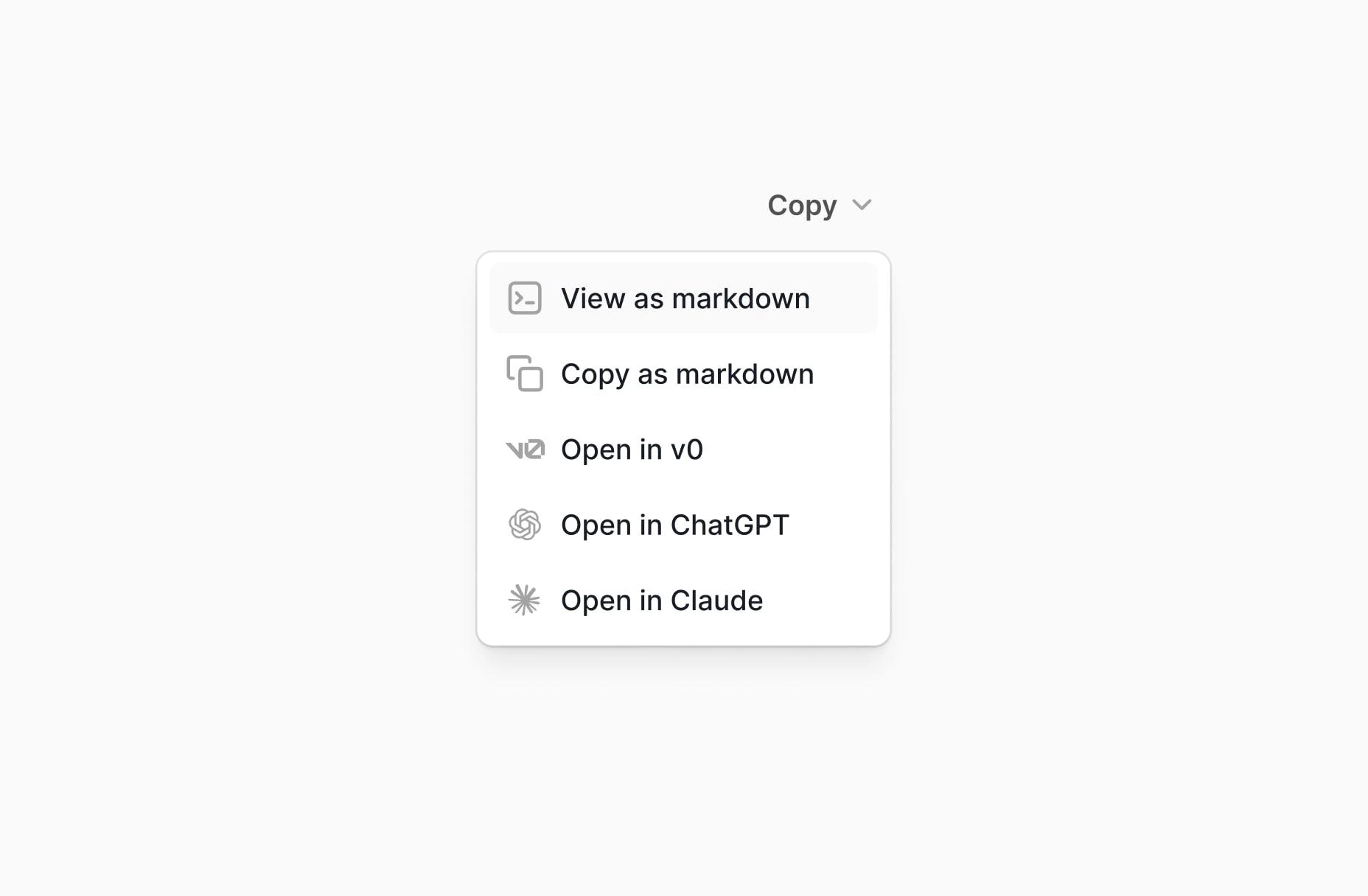
Use the new "Copy as" dropdown on the docs site to copy React components and layouts as markdown. Open them directly in v0, ChatGPT, or Claude to generate or modify interfaces with AI.
### RTL support
v8 introduces [RTL (right-to-left) tooling](/docs/rtl) for building multilingual applications. This includes:
- An `rtl:` variant for Tailwind classes
- A `migrate` CLI command that converts physical classes to logical properties
- Storybook RTL toggle with React Aria's `I18nProvider` for testing
- All base components built on logical properties (`ms-`, `me-`, `ps-`, `pe-`, `start-`, `end-`)
**Note:** RTL support doesn't require v8.0. The `migrate` CLI command works with v7.0 projects as well.
{/*
### Open-source CLI
The Untitled UI CLI is now fully open-source. Add components, scaffold projects, upgrade between versions, and migrate to RTL — all from the command line. Contributions welcome.
- [**untitledui**](https://www.npmjs.com/package/untitledui) — npm package
- [**GitHub repository**](https://github.com/untitleduico/cli) — source code */}
{/* ### Country flag icons package
We've published [`@untitledui/country-flags`](https://www.npmjs.com/package/@untitledui/country-flags) — a new npm package with flag icons for 261 countries in 3 styles (rounded, square, and circle). Works as standalone React components with full TypeScript support.
- [**@untitledui/country-flags**](https://www.npmjs.com/package/@untitledui/country-flags) — npm package
- [**GitHub repository**](https://github.com/untitleduico/country-flags) — source code
- [**Browse flags**](/resources/flag-icons) — preview all 261 flags */}
### Updated starter kits
Both official starter kits have been updated:
- [**Next.js starter kit**](https://github.com/untitleduico/untitledui-nextjs-starter-kit) — upgraded to Next.js 16 with Turbopack as the default bundler
- [**Vite starter kit**](https://github.com/untitleduico/untitledui-vite-starter-kit) — upgraded to Vite 8.0 with the latest React plugin
### 5 new application components
- [**Color Picker**](/components/color-pickers) — Full-featured color selection with solid, hex, RGB, and swatch modes
- [**Gradient Picker**](/components/gradient-pickers) — Gradient editor with draggable stops, angle control, and presets
- [**Image Picker**](/components/image-pickers) — Image selection with upload, URL input, and gallery
- [**Tree View**](/components/tree-views) — Collapsible tree structure with drag-and-drop reordering
- [**Filter Bar**](/components/filter-bars) — Advanced filtering interface with dropdown menus and tag-based active filters
### New modals and slideout menus
New [modal](/components/modals) variants including create event, integration, new message (empty and filled states), and share project modals — all with tighter spacing and horizontally stacked buttons. New [slideout menus](/components/drawers) including create event, advanced filters, integration, and share project menus.
### 16 new dropdown variants
Account dropdowns (breadcrumb, button, card in 3 sizes), avatar dropdowns, integration dropdowns, search dropdowns (simple + advanced), icon dropdowns (simple + advanced), button dropdowns (simple + advanced + link), and new context menus (simple + advanced) with sub-menu support. See [Dropdown components](/components/dropdowns).
### New input and select variants
- [**Date and time input**](/components/date-pickers) — Date-formatted input with available times variant
- [**Number counter input**](/components/inputs) — Numeric input with increment/decrement controls
- [**Tag input**](/components/inputs) — Input with tag chips for multi-value entry
- [**Tag select**](/components/select) — The v7.0 MultiSelect (tag-chip style) has been renamed to TagSelect
- [**Multi-select**](/components/select) — New multi-select component with autocomplete field
- [**OTP input**](/components/verification-code-inputs) — Verification code input with new `"sm"` size
### New empty state variants
Four new [empty state](/components/empty-states) variants with avatar radius, avatar row, avatar grid, and file type icon patterns.
### New pagination variants
[Pagination](/components/pagination) now supports specific page navigation and adjusting rows per page.
### 76 new icon components
- **58 [**payment icons**](/resources/icons)** — Google Pay, Apple Pay, Visa, Mastercard, Bitcoin, Stripe, Klarna, and 50+ more
- **18 [**integration icons**](/resources/icons)** — Claude, ChatGPT, Cursor, Figma, GitHub, Gemini, Replit, V0, and more
- **New [**country flag icons**](/resources/flag-icons)** — 261 countries in 3 styles
### Modernized component APIs
- **Select and Input** now support 3 sizes: `"sm"`, `"md"`, `"lg"` (default changed to `"md"`)
- **Button** gains an `"xs"` size (32px height) for compact interfaces
- **Social buttons** gain a new `"md"` size (40px height)
- **Tabs** accept an `icon` prop for icon-labeled tabs
- **Avatar** gains `border`, `rounded`, and `count` props with subtle skeuomorphic effects
- **Dropdown items** support `avatarUrl` and `selectionIndicator` (`"checkmark"` | `"checkbox"` | `"radio"` | `"toggle"` | `"none"`)
- **Toggle** improved with better contrast and subtle ring
- **Command menu** simplified component structure
- **Sidebar and header navigation** simplified with tighter spacing
### Consolidated modal styles
Common dialog styles (`rounded`, `bg-primary`, `shadow-xl`, scroll behavior) have been moved from individual modal files into the base `Modal` and `Dialog` components. This removes a repeated wrapper `
` from every modal, flattens the component tree, and fixes a bug where clicking the visible overlay area around a modal would not dismiss it. If you have custom modals, see the [migration step below](#step-6-update-modal-structure).
### Unified disabled states
All components now use a single `opacity-50` pattern for disabled states instead of 12 individual disabled color tokens. Simpler to customize, consistent across the system.
### Latest dependency stack
The library and starter kits track the current releases: Next.js 16.3, Tailwind CSS 4.3, Storybook 10.6, Vite 8, ESLint 10, React 19.3, React Aria Components 1.21, TypeScript 6.0.
The `upgrade` command pins the minimum versions v8.0 needs (Next.js 16.2.0, Tailwind CSS ^4.2.2, React Aria Components ^1.16.0, React ^19.2.4, Storybook ^10.3.0, Vite ^8.0.0), which can lag the latest releases. Bump them afterwards with your package manager if you want the newest versions.
## Upgrade with an AI agent
If you use Claude Code, Cursor, Codex, or another AI coding assistant, you can paste these instructions to have the agent handle the entire upgrade for you:
```markdown
## Upgrade Untitled UI React from v7.0 to v8.0
1. Read the full upgrade guide at https://www.untitledui.com/react/docs/upgrade
to understand what changed.
2. Run the automated upgrade:
npx untitledui@latest upgrade -y
3. Read `upgrade-report.json` in the project root. For each item
in `manualReview`, navigate to the file and line number, read
the `description`, and check that the `before` → `after` change
the CLI applied is correct in context. For each item in
`structuralPatterns`, apply the change described in its
`instruction` field. Also read the `notes` array for manual
API changes.
4. Ignore pre-existing type errors and linting issues. Focus only
on errors caused by the migration. If `tsc --noEmit` reports
errors, check whether they existed before the upgrade.
5. Run `tsc --noEmit` to verify there are no new type errors from
the migration.
6. Run the project build command to verify everything compiles.
7. Delete `UPGRADE-INSTRUCTIONS.md` from the project root when done.
```
The CLI generates `UPGRADE-INSTRUCTIONS.md` automatically after the upgrade. AI agents that read project files (like Claude Code) will pick it up and use it to guide the review process.
## Upgrade with the CLI
Our CLI handles class renames, Badge color prop renames, import fixes, theme replacement, and dependency updates automatically. Other prop changes (such as Select `placeholderIcon` → `icon`) are listed in the report for you to apply by hand.
Make sure your git working tree is clean so you can revert if needed:
```bash
git add -A && git commit -m "Pre-upgrade snapshot"
```
Run the upgrade command in dry-run mode to see what will change:
```bash
npx untitledui@latest upgrade --dry-run
```
```bash
yarn dlx untitledui@latest upgrade --dry-run
```
```bash
bunx untitledui@latest upgrade --dry-run
```
This scans your project and shows a summary of all changes without modifying any files.
Once you're satisfied with the preview, run the upgrade:
```bash
npx untitledui@latest upgrade
```
The CLI will:
- Replace `theme.css` (preserving your brand colors)
- Update `tsconfig.json` and `package.json`
- Install updated dependencies
- Apply class renames, prop changes, and import path fixes
- Generate `upgrade-report.json` with any items that need manual review
Check `upgrade-report.json` in your project root. It lists any changes that need manual review. Each item includes the file, line number, and instructions.
Run your build to confirm everything works:
```bash
npm run build
```
If something went wrong, revert with `git checkout .` and try again.
**Monorepo?** Run the upgrade from the directory where your `components.json` lives (e.g., `packages/ui/`). For app-level files that use Untitled UI classes, run it again with `--path`:
```bash
cd packages/ui && npx untitledui@latest upgrade
npx untitledui@latest upgrade --path ../../apps/web
```
## Manual upgrade
If you prefer to upgrade manually, follow these steps in order.
### Step 1: Update theme.css
Replace your `styles/theme.css` with the [v8 version](https://github.com/untitleduico/react/blob/main/styles/theme.css). The key changes:
- All color palettes (`--color-error-*`, `--color-warning-*`, `--color-success-*`, `--color-gray-*`) removed from the `@theme` block. Only `--color-brand-*` remains. Tailwind CSS 4 provides the other colors natively.
- Utility color variable renames: `utility-gray` to `utility-neutral`, `utility-error` to `utility-red`, `utility-warning` to `utility-yellow`, `utility-success` to `utility-green`, `utility-gray-blue` to `utility-slate`, `utility-blue-light` to `utility-sky`.
- Shadow typo fixed: `skeumorphic` to `skeuomorphic`.
- All disabled-specific color variables removed (replaced by `opacity-50` pattern).
Re-apply your custom brand color values after replacing the file.
### Step 2: Find and replace classes
Run these replacements across your source files:
```
shadow-skeumorphic → shadow-skeuomorphic
utility-gray- → utility-neutral-
utility-error- → utility-red-
utility-warning- → utility-yellow-
utility-success- → utility-green-
utility-gray-blue- → utility-slate-
utility-blue-light- → utility-sky-
outline-none → outline-hidden
bg-disabled_subtle → opacity-50
bg-disabled → opacity-50
bg-active → bg-primary_hover
text-button-primary-icon → text-white/60
bg-avatar-bg → bg-tertiary
ring-bg-brand-solid → ring-brand-solid
```
Remove these classes where they appear (they're now covered by `opacity-50`):
```
text-disabled
ring-disabled
ring-disabled_subtle
border-disabled
border-disabled_subtle
text-fg-disabled
text-fg-disabled_subtle
bg-toggle-button-fg_disabled
```
Remove `text-placeholder_subtle` as well; it has no v8.0 equivalent (use `text-placeholder`).
### Step 3: Update component props
```tsx
// Select: rename placeholderIcon to icon
// was: placeholderIcon={User01}
// Badge: rename colors
// was: color="gray-blue"
// was: color="blue-light"
```
Note: Select and Input default size changed from `"sm"` to `"md"`. If you relied on the default, add `size="sm"` explicitly.
Two more manual changes flagged in the upgrade report's `notes`:
- **Avatar** size `"xxs"` was removed. Use `"xs"` instead.
- **Dropdown** no longer defaults to `selectionMode="single"`. Set it explicitly where you relied on the default.
### Step 4: Update import paths
```tsx
// Pin input moved
import { PinInput } from "@/components/base/input/pin-input";
// was: "@/components/base/pin-input/pin-input"
// Nav button renamed
import { NavButton } from "@/components/application/app-navigation/base-components/nav-button";
// was: "nav-item-button"
// MultiSelect renamed to TagSelect (the new MultiSelect is a different component)
import { TagSelect } from "@/components/base/select/tag-select";
// was: import { MultiSelect } from "@/components/base/select/multi-select"
```
### Step 5: Update dependencies and config
Update your `package.json` with the new dependency versions listed under [Latest dependency stack](#latest-dependency-stack). Update `tsconfig.json`: change `"jsx": "preserve"` to `"jsx": "react-jsx"`.
### Step 6: Update modal structure
The base `Modal` and `Dialog` components now handle `rounded`, `bg-primary`, `shadow-xl`, and scroll behavior. If you have custom modals, remove the wrapper `
 ## What's new in v8.0
v8 is a significant release that makes the design system lighter, more accessible, and future-ready. Here's what you get:
### Tailwind CSS v4.3 color palette
We switched the entire color palette over to Tailwind CSS colors. This improves alignment between design and development, making it easier for teams to integrate Untitled UI components directly into Tailwind-based projects while keeping the resulting CSS simpler and more predictable.
As part of this change, we chose `neutral` as the default gray palette. Neutral gray is completely desaturated and flat, making it highly versatile and giving interfaces a minimal, modern, and clean aesthetic — the perfect starting point for any project.

This also made the theme significantly lighter. We removed 436 redundant color variables by leveraging Tailwind CSS 4's native palettes instead of redeclaring them. The theme file went from **65KB to 45KB** and from **1,093 to 657 CSS variables** — a **40% reduction in design tokens**.
Semantic color names like `utility-error-*` and `utility-gray-*` are now raw color names (`utility-red-*`, `utility-neutral-*`) that map directly to Tailwind's built-in palette. Less custom CSS, faster builds. Of course, if you want to revert your color palette back to v7.0, you can do so easily by editing your color variables in `theme.css`.
### MCP server
Untitled UI now supports [MCP (Model Context Protocol)](/integrations/mcp), allowing AI tools like Claude Code and Cursor to browse, search, and install components using natural language.

### Copy as markdown
Use the new "Copy as" dropdown on the docs site to copy React components and layouts as markdown. Open them directly in v0, ChatGPT, or Claude to generate or modify interfaces with AI.

### RTL support
v8 introduces [RTL (right-to-left) tooling](/docs/rtl) for building multilingual applications. This includes:
- An `rtl:` variant for Tailwind classes
- A `migrate` CLI command that converts physical classes to logical properties
- Storybook RTL toggle with React Aria's `I18nProvider` for testing
- All base components built on logical properties (`ms-`, `me-`, `ps-`, `pe-`, `start-`, `end-`)
**Note:** RTL support doesn't require v8.0. The `migrate` CLI command works with v7.0 projects as well.
{/*
### Open-source CLI
The Untitled UI CLI is now fully open-source. Add components, scaffold projects, upgrade between versions, and migrate to RTL — all from the command line. Contributions welcome.
- [**untitledui**](https://www.npmjs.com/package/untitledui) — npm package
- [**GitHub repository**](https://github.com/untitleduico/cli) — source code */}
{/* ### Country flag icons package
We've published [`@untitledui/country-flags`](https://www.npmjs.com/package/@untitledui/country-flags) — a new npm package with flag icons for 261 countries in 3 styles (rounded, square, and circle). Works as standalone React components with full TypeScript support.
- [**@untitledui/country-flags**](https://www.npmjs.com/package/@untitledui/country-flags) — npm package
- [**GitHub repository**](https://github.com/untitleduico/country-flags) — source code
- [**Browse flags**](/resources/flag-icons) — preview all 261 flags */}
### Updated starter kits
Both official starter kits have been updated:
- [**Next.js starter kit**](https://github.com/untitleduico/untitledui-nextjs-starter-kit) — upgraded to Next.js 16 with Turbopack as the default bundler
- [**Vite starter kit**](https://github.com/untitleduico/untitledui-vite-starter-kit) — upgraded to Vite 8.0 with the latest React plugin
### 5 new application components
- [**Color Picker**](/components/color-pickers) — Full-featured color selection with solid, hex, RGB, and swatch modes
- [**Gradient Picker**](/components/gradient-pickers) — Gradient editor with draggable stops, angle control, and presets
- [**Image Picker**](/components/image-pickers) — Image selection with upload, URL input, and gallery
- [**Tree View**](/components/tree-views) — Collapsible tree structure with drag-and-drop reordering
- [**Filter Bar**](/components/filter-bars) — Advanced filtering interface with dropdown menus and tag-based active filters
### New modals and slideout menus
New [modal](/components/modals) variants including create event, integration, new message (empty and filled states), and share project modals — all with tighter spacing and horizontally stacked buttons. New [slideout menus](/components/drawers) including create event, advanced filters, integration, and share project menus.
### 16 new dropdown variants
Account dropdowns (breadcrumb, button, card in 3 sizes), avatar dropdowns, integration dropdowns, search dropdowns (simple + advanced), icon dropdowns (simple + advanced), button dropdowns (simple + advanced + link), and new context menus (simple + advanced) with sub-menu support. See [Dropdown components](/components/dropdowns).
### New input and select variants
- [**Date and time input**](/components/date-pickers) — Date-formatted input with available times variant
- [**Number counter input**](/components/inputs) — Numeric input with increment/decrement controls
- [**Tag input**](/components/inputs) — Input with tag chips for multi-value entry
- [**Tag select**](/components/select) — The v7.0 MultiSelect (tag-chip style) has been renamed to TagSelect
- [**Multi-select**](/components/select) — New multi-select component with autocomplete field
- [**OTP input**](/components/verification-code-inputs) — Verification code input with new `"sm"` size
### New empty state variants
Four new [empty state](/components/empty-states) variants with avatar radius, avatar row, avatar grid, and file type icon patterns.
### New pagination variants
[Pagination](/components/pagination) now supports specific page navigation and adjusting rows per page.
### 76 new icon components
- **58 [**payment icons**](/resources/icons)** — Google Pay, Apple Pay, Visa, Mastercard, Bitcoin, Stripe, Klarna, and 50+ more
- **18 [**integration icons**](/resources/icons)** — Claude, ChatGPT, Cursor, Figma, GitHub, Gemini, Replit, V0, and more
- **New [**country flag icons**](/resources/flag-icons)** — 261 countries in 3 styles
### Modernized component APIs
- **Select and Input** now support 3 sizes: `"sm"`, `"md"`, `"lg"` (default changed to `"md"`)
- **Button** gains an `"xs"` size (32px height) for compact interfaces
- **Social buttons** gain a new `"md"` size (40px height)
- **Tabs** accept an `icon` prop for icon-labeled tabs
- **Avatar** gains `border`, `rounded`, and `count` props with subtle skeuomorphic effects
- **Dropdown items** support `avatarUrl` and `selectionIndicator` (`"checkmark"` | `"checkbox"` | `"radio"` | `"toggle"` | `"none"`)
- **Toggle** improved with better contrast and subtle ring
- **Command menu** simplified component structure
- **Sidebar and header navigation** simplified with tighter spacing
### Consolidated modal styles
Common dialog styles (`rounded`, `bg-primary`, `shadow-xl`, scroll behavior) have been moved from individual modal files into the base `Modal` and `Dialog` components. This removes a repeated wrapper `
## What's new in v8.0
v8 is a significant release that makes the design system lighter, more accessible, and future-ready. Here's what you get:
### Tailwind CSS v4.3 color palette
We switched the entire color palette over to Tailwind CSS colors. This improves alignment between design and development, making it easier for teams to integrate Untitled UI components directly into Tailwind-based projects while keeping the resulting CSS simpler and more predictable.
As part of this change, we chose `neutral` as the default gray palette. Neutral gray is completely desaturated and flat, making it highly versatile and giving interfaces a minimal, modern, and clean aesthetic — the perfect starting point for any project.

This also made the theme significantly lighter. We removed 436 redundant color variables by leveraging Tailwind CSS 4's native palettes instead of redeclaring them. The theme file went from **65KB to 45KB** and from **1,093 to 657 CSS variables** — a **40% reduction in design tokens**.
Semantic color names like `utility-error-*` and `utility-gray-*` are now raw color names (`utility-red-*`, `utility-neutral-*`) that map directly to Tailwind's built-in palette. Less custom CSS, faster builds. Of course, if you want to revert your color palette back to v7.0, you can do so easily by editing your color variables in `theme.css`.
### MCP server
Untitled UI now supports [MCP (Model Context Protocol)](/integrations/mcp), allowing AI tools like Claude Code and Cursor to browse, search, and install components using natural language.

### Copy as markdown
Use the new "Copy as" dropdown on the docs site to copy React components and layouts as markdown. Open them directly in v0, ChatGPT, or Claude to generate or modify interfaces with AI.

### RTL support
v8 introduces [RTL (right-to-left) tooling](/docs/rtl) for building multilingual applications. This includes:
- An `rtl:` variant for Tailwind classes
- A `migrate` CLI command that converts physical classes to logical properties
- Storybook RTL toggle with React Aria's `I18nProvider` for testing
- All base components built on logical properties (`ms-`, `me-`, `ps-`, `pe-`, `start-`, `end-`)
**Note:** RTL support doesn't require v8.0. The `migrate` CLI command works with v7.0 projects as well.
{/*
### Open-source CLI
The Untitled UI CLI is now fully open-source. Add components, scaffold projects, upgrade between versions, and migrate to RTL — all from the command line. Contributions welcome.
- [**untitledui**](https://www.npmjs.com/package/untitledui) — npm package
- [**GitHub repository**](https://github.com/untitleduico/cli) — source code */}
{/* ### Country flag icons package
We've published [`@untitledui/country-flags`](https://www.npmjs.com/package/@untitledui/country-flags) — a new npm package with flag icons for 261 countries in 3 styles (rounded, square, and circle). Works as standalone React components with full TypeScript support.
- [**@untitledui/country-flags**](https://www.npmjs.com/package/@untitledui/country-flags) — npm package
- [**GitHub repository**](https://github.com/untitleduico/country-flags) — source code
- [**Browse flags**](/resources/flag-icons) — preview all 261 flags */}
### Updated starter kits
Both official starter kits have been updated:
- [**Next.js starter kit**](https://github.com/untitleduico/untitledui-nextjs-starter-kit) — upgraded to Next.js 16 with Turbopack as the default bundler
- [**Vite starter kit**](https://github.com/untitleduico/untitledui-vite-starter-kit) — upgraded to Vite 8.0 with the latest React plugin
### 5 new application components
- [**Color Picker**](/components/color-pickers) — Full-featured color selection with solid, hex, RGB, and swatch modes
- [**Gradient Picker**](/components/gradient-pickers) — Gradient editor with draggable stops, angle control, and presets
- [**Image Picker**](/components/image-pickers) — Image selection with upload, URL input, and gallery
- [**Tree View**](/components/tree-views) — Collapsible tree structure with drag-and-drop reordering
- [**Filter Bar**](/components/filter-bars) — Advanced filtering interface with dropdown menus and tag-based active filters
### New modals and slideout menus
New [modal](/components/modals) variants including create event, integration, new message (empty and filled states), and share project modals — all with tighter spacing and horizontally stacked buttons. New [slideout menus](/components/drawers) including create event, advanced filters, integration, and share project menus.
### 16 new dropdown variants
Account dropdowns (breadcrumb, button, card in 3 sizes), avatar dropdowns, integration dropdowns, search dropdowns (simple + advanced), icon dropdowns (simple + advanced), button dropdowns (simple + advanced + link), and new context menus (simple + advanced) with sub-menu support. See [Dropdown components](/components/dropdowns).
### New input and select variants
- [**Date and time input**](/components/date-pickers) — Date-formatted input with available times variant
- [**Number counter input**](/components/inputs) — Numeric input with increment/decrement controls
- [**Tag input**](/components/inputs) — Input with tag chips for multi-value entry
- [**Tag select**](/components/select) — The v7.0 MultiSelect (tag-chip style) has been renamed to TagSelect
- [**Multi-select**](/components/select) — New multi-select component with autocomplete field
- [**OTP input**](/components/verification-code-inputs) — Verification code input with new `"sm"` size
### New empty state variants
Four new [empty state](/components/empty-states) variants with avatar radius, avatar row, avatar grid, and file type icon patterns.
### New pagination variants
[Pagination](/components/pagination) now supports specific page navigation and adjusting rows per page.
### 76 new icon components
- **58 [**payment icons**](/resources/icons)** — Google Pay, Apple Pay, Visa, Mastercard, Bitcoin, Stripe, Klarna, and 50+ more
- **18 [**integration icons**](/resources/icons)** — Claude, ChatGPT, Cursor, Figma, GitHub, Gemini, Replit, V0, and more
- **New [**country flag icons**](/resources/flag-icons)** — 261 countries in 3 styles
### Modernized component APIs
- **Select and Input** now support 3 sizes: `"sm"`, `"md"`, `"lg"` (default changed to `"md"`)
- **Button** gains an `"xs"` size (32px height) for compact interfaces
- **Social buttons** gain a new `"md"` size (40px height)
- **Tabs** accept an `icon` prop for icon-labeled tabs
- **Avatar** gains `border`, `rounded`, and `count` props with subtle skeuomorphic effects
- **Dropdown items** support `avatarUrl` and `selectionIndicator` (`"checkmark"` | `"checkbox"` | `"radio"` | `"toggle"` | `"none"`)
- **Toggle** improved with better contrast and subtle ring
- **Command menu** simplified component structure
- **Sidebar and header navigation** simplified with tighter spacing
### Consolidated modal styles
Common dialog styles (`rounded`, `bg-primary`, `shadow-xl`, scroll behavior) have been moved from individual modal files into the base `Modal` and `Dialog` components. This removes a repeated wrapper `